
Much has been made of the fact that Trump’s revised tax plan cuts its implications for deficits in half (from ten to five trillion). Oddly, there’s less attention to the equity implications, which border on the obscene. Trump’s plan gives the top bracket a tax cut ten times bigger (as percentage of income) than that given to the bottom three fifths of the income distribution.
That makes the difference in absolute $ tax cuts between the richest and poorest pretty spectacular – a factor of 5000 to 10,000:
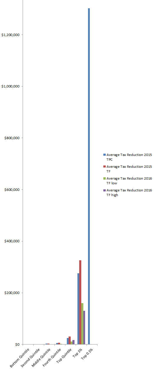
Trump tax cut distribution, by income quantile.
To see one pixel of the bottom quintile’s tax cut on this chart, it would have to be over 5000 pixels tall!
For comparison, here are the Trump & Clinton proposals. The Clinton plan proposes negligible increases on lower earners (e.g., $4 on the bottom fifth) and a moderate increase (5%) on top earners:
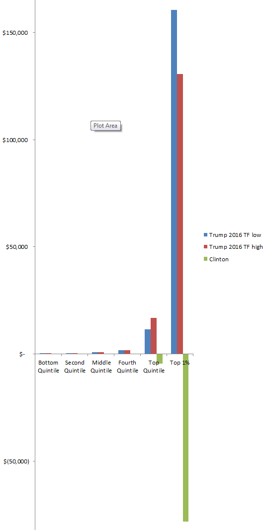
Trump & Clinton tax cut distributions, by income quantile.
Sources:
http://www.taxpolicycenter.org/publications/analysis-donald-trumps-tax-plan/full
http://taxfoundation.org/article/details-and-analysis-donald-trump-tax-reform-plan-september-2016
http://www.taxpolicycenter.org/publications/analysis-hillary-clintons-tax-proposals/full