Other bathtubs – capital

China is rapidly eliminating old coal generating capacity, according to Technology Review.

Draining Bathtub

Coal still meets 70 percent of China’s energy needs, but the country claims to have shut down 60 gigawatts’ worth of inefficient coal-fired plants since 2005. Among them is the one shown above, which was demolished in Henan province last year. China is also poised to take the lead in deploying carbon capture and storage (CCS) technology on a large scale. The gasifiers that China uses to turn coal into chemicals and fuel emit a pure stream of carbon dioxide that is cheap to capture, providing “an excellent opportunity to move CCS forward globally,” says Sarah Forbes of the World Resources Institute in Washington, DC.

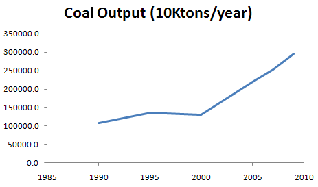
That’s laudable. However, the inflow of new coal capacity must be even greater. Here’s the latest on China’s coal output:

ChinaCoalOutput

China Statistical Yearbook 2009 & 2009 main statistical data update

That’s just a hair short of 3 billion tons in 2009, with 8%/yr growth from ’07-’09, in spite of the recession. On a per capita basis, US output and consumption is still higher, but at those staggering growth rates, it won’t take China long to catch up.

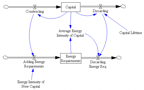
A simple model of capital turnover involves two parallel bathtubs, a “coflow” in SD lingo:

CapitalTurnover

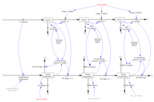
Every time you build some capital, you also commit to the energy needed to run it (unless you don’t run it, in which case why build it?). If you get fancy, you can consider 3rd order vintaging and retrofits, as here:

Capital Turnover 3o

To get fancier still, see the structure in John Sterman’s thesis, which provides for limited retrofit potential (that Gremlin just isn’t going to be a Prius, no matter what you do to the carburetor).

The basic challenge is that, while it helps to retire old dirty capital quickly (increasing the outflow from the energy requirements bathtub), energy requirements will go up as long as the inflow of new requirements is larger, which is likely when capital itself is growing and the energy intensity of new capital is well above zero. In addition, when capital is growing rapidly, there just isn’t much old stuff around (proportionally) to throw away, because the age structure of capital will be biased toward new vintages.

Hat tip: Travis Franck

Would you like fries with that?

Education is a mess, and well-motivated policy changes are making it worse.

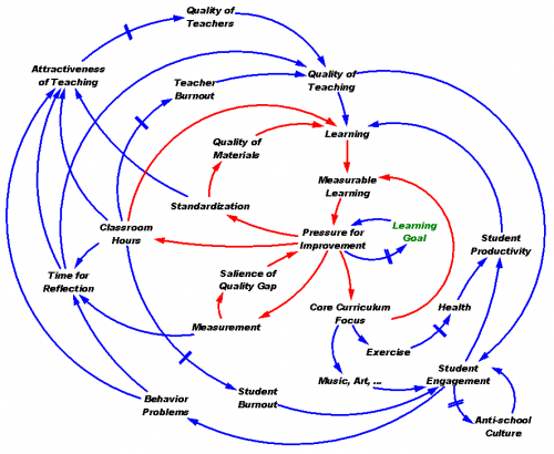
I was just reading this and this, and the juices got flowing, so my wife and I brainstormed this picture:
Education CLD

Click to enlarge

Yep, it’s spaghetti, like a lot of causal brainstorming efforts. The underlying problem space is very messy and hard to articulate quickly, but I think the essence is simple. Educational outcomes are substandard, creating pressure to improve. In at least some areas, outcomes slipped a lot because the response to pressure was to erode learning goals rather than to improve (blue loop through the green goal). One benefit of No Child Left Behind testing is to offset that loop, by making actual performance salient and restoring the pressure to improve. Other intuitive responses (red loops) also have some benefit: increasing school hours provides more time for learning; standardization yields economies of scale in materials and may improve teaching of low-skill teachers; core curriculum focus aligns learning with measured goals.

The problem is that these measures have devastating side effects, especially in the long run. Measurement obsession eats up time for reflection and learning. Core curriculum focus cuts out art and exercise, so that lower student engagement and health diminishes learning productivity. Low engagement means more sit-down-and-shut-up, which eats up teacher time and makes teaching unattractive. Increased hours lead to burnout of both students and teachers. Long hours and standardization make teaching unattractive. Degrading the attractiveness of teaching makes it hard to attract quality teachers. Students aren’t mindless blank slates; they know when they’re being fed rubbish, and check out. When a bad situation persists, an anti-intellectual culture of resistance to education evolves.

The nest of reinforcing feedbacks within education meshes with one in broader society. Poor education diminishes future educational opportunity, and thus the money and knowledge available to provide future schooling. Economic distress drives crime, and prison budgets eat up resources that could otherwise go to schools. Dysfunction reinforces the perception that government is incompetent, leading to reduced willingness to fund schools, ensuring future dysfunction. This is augmented by flight of the rich and smart to private schools.

I’m far from having all the answers here, but it seems that standard SD advice on the counter-intuitive behavior of social systems applies. First, any single policy will fail, because it gets defeated by other feedbacks in the system. Perhaps that’s why technology-led efforts haven’t lived up to expectations; high tech by itself doesn’t help if teachers have no time to reflect on and refine its use. Therefore intervention has to be multifaceted and targeted to activate key loops. Second, things get worse before they get better. Making progress requires more resources, or a redirection of resources away from things that produce the short-term measured benefits that people are watching.

I think there are reasons to be optimistic. All of the reinforcing feedback loops that currently act as vicious cycles can run the other way, if we can just get over the hump of the various delays and irreversibilities to start the process. There’s enormous slack in the system, in a variety of forms: time wasted on discipline and memorization, burned out teachers who could be re-energized and students with unmet thirst for knowledge.

The key is, how to get started. I suspect that the conservative approach of privatization half-works: it successfully exploits reinforcing feedback to provide high quality for those who opt out of the public system. However, I don’t want to live in a two class society, and there’s evidence that high inequality slows economic growth. Instead, my half-baked personal prescription (which we pursue as homeschooling parents) is to make schools more open, connecting students to real-world trades and research. Forget about standardized pathways through the curriculum, because children develop at different rates and have varied interests. Replace quantity of hours with quality, freeing teachers’ time for process improvement and guidance of self-directed learning. Suck it up, and spend the dough to hire better teachers. Recover some of that money, and avoid lengthy review, by using schools year ’round. I’m not sure how realistic all of this is as long as schools function as day care, so maybe we need some reform of work and parental attitudes to go along.

[Update: There are of course many good efforts that can be emulated, by people who’ve thought about this more deeply than I. Pegasus describes some here. Two of note are the Waters Foundation and Creative Learning Exchange. Reorganizing education around systems is a great way to improve productivity through learner-directed learning, make learning exciting and relevant to the real world, and convey skills that are crucial for society to confront its biggest problems.]
Dynamics on the iPhone

Scott Johnson asks about C-LITE, an ultra-simple version of C-ROADS, built in Processing – a cool visually-oriented language.

C-LITE

(Click the image to try it).

With this experiment, I was striving for a couple things:

  • A reduced-form version of the climate model, with “good enough” accuracy and interactive speed, as in Vensim’s Synthesim mode (no client-server latency).
  • Tufte-like simplicity of the UI (no grids or axis labels to waste electrons). Moving the mouse around changes the emissions trajectory, and sweeps an indicator line that gives the scale of input and outputs.
  • Pervasive representation of uncertainty (indicated by shading on temperature as a start).

This is just a prototype, but it’s already more fun than models with traditional interfaces.

I wanted to run it on the iPhone, but was stymied by problems translating the model to Processing.js (javascript) and had to set it aside. Recently Travis Franck stepped in and did a manual translation, proving the concept, so I took another look at the problem. In the meantime, a neat export tool has made it easy. It turns out that my code problem was as simple as replacing “float []” with “float[]” so now I have a javascript version here. It runs well in Firefox, but there are a few glitches on Safari and iPhones – text doesn’t render properly, and I don’t quite understand the event model. Still, it’s cool that modest dynamic models can run realtime on the iPhone. [Update: forgot to mention that I sued Michael Schieben’s touchmove function modification to processing.js.]

The learning curve for all of this is remarkably short. If you’re familiar with Java, it’s very easy to pick up Processing (it’s probably easy coming from other languages as well). I spent just a few days fooling around before I had the hang of building this app. The core model is just standard Euler ODE code:

initialize parameters
initialize levels
do while time < final time
compute rates & auxiliaries
compute levels

The only hassle is that equations have to be ordered manually. I built a Vensim prototype of the model halfway through, in order to stay clear on the structure as I flew seat-of-the pants.

With the latest Processing.js tools, it’s very easy to port to javascript, which runs on nearly everything. Getting it running on the iPhone (almost) was just a matter of discovering viewport meta tags and a line of CSS to set zero margins. The total codebase for my most complicated version so far is only 500 lines. I think there’s a lot of potential for sharing model insights through simple, appealing browser tools and handheld platforms.

As an aside, I always wondered why javascript didn’t seem to have much to do with Java. The answer is in this funny programming timeline. It’s basically false advertising.

Complexity is not the enemy

Following its misguided attack on complex CLDs, a few of us wrote a letter to the NYTimes. Since they didn’t publish, here it is:

Dear Editors, Systemic Spaghetti Slide Snookers Scribe. Powerpoint Pleases Policy Players

“We Have Met the Enemy and He Is PowerPoint” clearly struck a deep vein of resentment against mindless presentations. However, the lead “spaghetti” image, while undoubtedly too much to absorb quickly, is in fact packed with meaning for those who understand its visual lingo. If we can’t digest a mere slide depicting complexity, how can we successfully confront the underlying problem?

The diagram was not created in Powerpoint. It is a “causal loop diagram,” one of a several ways to describe relationships that influence the evolution of messy problems like the war in the Middle East. It’s a perfect illustration of General McMaster’s observation that, “Some problems in the world are not bullet-izable.” Diagrams like this may not be intended for public consumption; instead they serve as a map that facilitates communication within a group. Creating such diagrams allows groups to capture and improve their understanding of very complex systems by sharing their mental models and making them open to challenge and modification. Such diagrams, and the formal computer models that often support them, help groups to develop a more robust understanding of the dynamics of a problem and to develop effective and elegant solutions to vexing challenges.

It’s ironic that so many call for a return to pure verbal communication as an antidote for Powerpoint. We might get a few great speeches from that approach, but words are ill-suited to describe some data and systems. More likely, a return to unaided words would bring us a forgettable barrage of five-pagers filled with laundry-list thinking and unidirectional causality.

The excess supply of bad presentations does not exist in a vacuum. If we want better presentations, then we should determine why organizational pressures demand meaningless propaganda, rather than blaming our tools.

Tom Fiddaman of Ventana Systems, Inc. & Dave Packer, Kristina Wile, and Rebecca Niles Peretz of The Systems Thinking Collaborative

Other responses of note:

We have met an ally and he is Storytelling (Chris Soderquist)

Why We Should be Suspect of Bullet Points and Laundry Lists (Linda Booth Sweeney)

Diagrams vs. Models

Following Bill Harris’ comment on Are causal loop diagrams useful? I went looking for Coyle’s hybrid influence diagrams. I didn’t find them, but instead ran across this interesting conversation in the SDR:

The tradition, one might call it the orthodoxy, in system dynamics is that a problem can only be analysed, and policy guidance given, through the aegis of a fully quantified model. In the last 15 years, however, a number of purely qualitative models have been described, and have been criticised, in the literature. This article briefly reviews that debate and then discusses some of the problems and risks sometimes involved in quantification. Those problems are exemplified by an analysis of a particular model, which turns out to bear little relation to the real problem it purported to analyse. Some qualitative models are then reviewed to show that they can, indeed, lead to policy insights and five roles for qualitative models are identified. Finally, a research agenda is proposed to determine the wise balance between qualitative and quantitative models.

… In none of this work was it stated or implied that dynamic behaviour can reliably be inferred from a complex diagram; it has simply been argued that describing a system is, in itself, a useful thing to do and may lead to better understanding of the problem in question. It has, on the other hand, been implied that, in some cases, quantification might be fraught with so many uncertainties that the model’s outputs could be so misleading that the policy inferences drawn from them might be illusory. The research issue is whether or not there are circumstances in which the uncertainties of simulation may be so large that the results are seriously misleading to the analyst and the client. … This stream of work has attracted some adverse comment. Lane has gone so far as to assert that system dynamics without quantified simulation is an oxymoron and has called it ‘system dynamics lite (sic)’. …

Coyle (2000) Qualitative and quantitative modelling in system dynamics: some research questions

Jack Homer and Rogelio Oliva aren’t buying it:

Geoff Coyle has recently posed the question as to whether or not there may be situations in which computer simulation adds no value beyond that gained from qualitative causal-loop mapping. We argue that simulation nearly always adds value, even in the face of significant uncertainties about data and the formulation of soft variables. This value derives from the fact that simulation models are formally testable, making it possible to draw behavioral and policy inferences reliably through simulation in a way that is rarely possible with maps alone. Even in those cases in which the uncertainties are too great to reach firm conclusions from a model, simulation can provide value by indicating which pieces of information would be required in order to make firm conclusions possible. Though qualitative mapping is useful for describing a problem situation and its possible causes and solutions, the added value of simulation modeling suggests that it should be used for dynamic analysis whenever the stakes are significant and time and budget permit.

Homer & Oliva (2001) Maps and models in system dynamics: a response to Coyle

Coyle rejoins:

This rejoinder clarifies that there is significant agreement between my position and that of Homer and Oliva as elaborated in their response. Where we differ is largely to the extent that quantification offers worthwhile benefit over and above analysis from qualitative analysis (diagrams and discourse) alone. Quantification may indeed offer potential value in many cases, though even here it may not actually represent ‘‘value for money’’. However, even more concerning is that in other cases the risks associated with attempting to quantify multiple and poorly understood soft relationships are likely to outweigh whatever potential benefit there might be. To support these propositions I add further citations to published work that recount effective qualitative-only based studies, and I offer a further real-world example where any attempts to quantify ‘‘multiple softness’’ could have lead to confusion rather than enlightenment. My proposition remains that this is an issue that deserves real research to test the positions of Homer and Oliva, myself, and no doubt others, which are at this stage largely based on personal experiences and anecdotal evidence.

Coyle (2001) Rejoinder to Homer and Oliva

My take: I agree with Coyle that qualitative models can often lead to insight. However, I don’t buy the argument that the risks of quantification of poorly understood soft variables exceeds the benefits. First, if the variables in question are really too squishy to get a grip on, that part of the modeling effort will fail. Even so, the modeler will have some other working pieces that are more physical or certain, providing insight into the context in which the soft variables operate. Second, as long as the modeler is doing things right, which means spending ample effort on validation and sensitivity analysis, the danger of dodgy quantification will reveal itself as large uncertainties in behavior subject to the assumptions in question. Third, the mere attempt  to quantify the qualitative is likely to yield some insight into the uncertain variables, which exceeds that derived from the purely qualitative approach. In fact, I would argue that the greater danger lies in the qualitative approach, because it is quite likely that plausible-looking constructs on a diagram will go unchallenged, yet harbor deep conceptual problems that would be revealed by modeling.

I see this as a cost-benefit question. With infinite resources, a model always beats a diagram. The trouble is that in many cases time, money and the will of participants are in short supply, or can’t be justified given the small scale of a problem. Often in those cases a qualitative approach is justified, and diagramming or other elicitation of structure is likely to yield a better outcome than pure talk. Also, where resources are limited, an overzealous modeling attempt could lead to narrow focus, overemphasis on easily quantifiable concepts, and implementation failure due to too much model and not enough process. If there’s a risk to modeling, that’s it – but that’s a risk of bad modeling, and there are many of those.

Are causal loop diagrams useful?

Reflecting on the Afghanistan counterinsurgency diagram in the NYTimes, Scott Johnson asked me whether I found causal loop diagrams (CLDs) to be useful. Some system dynamics hardliners don’t like them, and others use them routinely.

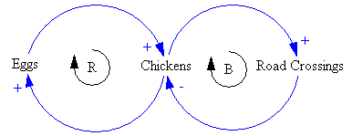
Here’s a CLD:

Chicken CLD

And here’s it’s stock-flow sibling:

Chicken Stock Flow

My bottom line is:

  • CLDs are very useful, if developed and presented with a little care.
  • It’s often clearer to use a hybrid diagram that includes stock-flow “main chains”. However, that also involves a higher burden of explanation of the visual language.
  • You can get into a lot of trouble if you try to mentally simulate the dynamics of a complex CLD, because they’re so underspecified (but you might be better off than talking, or making lists).
  • You’re more likely to know what you’re talking about if you go through the process of building a model.
  • A big, messy picture of a whole problem space can be a nice complement to a focused, high quality model.

Here’s why:

Continue reading “Are causal loop diagrams useful?”

Hypnotizing chickens, Afghan insurgents, and spaghetti

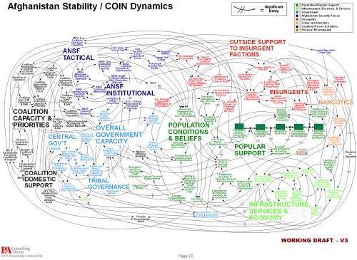
The NYT is about 4 months behind the times picking up on a spaghetti diagram of Afghanistan situation, which it uses to lead off a critique of Powerpoint use in the military. The reporter is evidently cheesed off at being treated like a chicken:

Senior officers say the program does come in handy when the goal is not imparting information, as in briefings for reporters.

The news media sessions often last 25 minutes, with 5 minutes left at the end for questions from anyone still awake. Those types of PowerPoint presentations, Dr. Hammes said, are known as “hypnotizing chickens.”

Afghanistan Stability: COIN (Counterinsurgency) Model
Click to enlarge

The Times reporter seems unaware of the irony of her own article. Early on, she quotes a general, “Some problems in the world are not bullet-izable.” But isn’t the spaghetti diagram an explicit attempt to get away from bullets, and present a rich, holistic picture of a complicated problem? The underlying point – that presentations are frequently awful and waste time – is well taken, but hardly news. If there’s a problem here, it’s not the fault of Powerpoint, and we’d do well to identify the real issue.

For those unfamiliar with the lingo, the spaghetti is actually a Causal Loop Diagram (CLD), a type of influence diagram. It’s actually a hybrid, because the Popular Support sector also has a stock-flow chain. Between practitioners, a good CLD can be an incredibly efficient communication device – much more so than the “five-pager” cited in the article. CLDs occupy a niche between formal mathematical models and informal communication (prose or ppt bullets). They’re extremely useful for brainstorming (which is what seems to have been going on here) and for communicating selected feedback insights from a formal model. They also tend to leave a lot to the imagination – if you try to implement a CLD in equations, you’ll discover many unstated assumptions and inconsistencies along the way. Still, the CLD is likely to be far more revealing of the tangle of assumptions that lie in someone’s head than a text document or conversation.

Evidently the Times has no prescription for improvement, but here’s mine:

  • If the presenters were serious about communicating with this diagram, they should have spent time introducing the CLD lingo and walking through the relationships. That could take a long time, i.e. a whole presentation could be devoted to the one slide. Also, the diagram should have been built up in digestible chunks, without overlapping links, and key feedback loops that lead to success or disaster should be identified.
  • If the audience were serious about understanding what’s going on, they shouldn’t shut off their brains and snicker when unconventional presentations appear. If reporters stick their fingers in their ears and mumble “not listening … not listening … not listening …” at the first sign of complexity, it’s no wonder DoD treats them like chickens.

Writing a good system dynamics paper II

It’s SD conference paper review time again. Last year I took notes while reviewing, in an attempt to capture the attributes of a good paper. A few additional thoughts:

  • No model is perfect, but it pays to ask yourself, will your model stand up to critique?
  • Model-data comparison is extremely valuable and too seldom done, but trivial tests are not interesting. Fit to data is a weak test of model validity; it’s often necessary, but never sufficient as a measure of quality. I’d much rather see the response of a model to a step input or an extreme conditions test than a model-data comparison. It’s too easy to match the model to the data with exogenous inputs, so unless I see a discussion of a multi-faceted approach to validation, I get suspicious. You might consider how your model meets the following criteria:
    • Do decision rules use information actually available to real agents in the system?
    • Would real decision makers agree with the decision rules attributed to them?
    • Does the model conserve energy, mass, people, money, and other physical quantities?
    • What happens to the behavior in extreme conditions?
    • Do physical quantities always have nonnegative values?
    • Do units balance?
  • If you have time series output, show it with graphs – it takes a lot of work to “see” the behavior in tables. On the other hand, tables can be great for other comparisons of outcomes.
  • If all of your graphs show constant values, linear increases (ramps), or exponentials, my eyes glaze over, unless you can make a compelling case that your model world is really that simple, or that people fail to appreciate the implications of those behaviors.
  • Relate behavior to structure. I don’t care what happens in scenarios unless I know why it happens. One effective way to do this is to run tests with and without certain feedback loops or sectors of the model active.
  • Discuss what lies beyond the boundary of your model. What did you leave out and why? How does this limit the applicability of the results?
  • If you explore a variety of scenarios with your model (as you should), introduce the discussion with some motivation, i.e. why are the particular scenarios tested important, realistic, etc.?
  • Take some time to clean up your model diagrams. Eliminate arrows that cross unnecessarily. Hide unimportant parameters. Use clear variable names.
  • It’s easiest to understand behavior in deterministic experiments, so I like to see those. But the real world is noisy and uncertain, so it’s also nice to see experiments with stochastic variation or Monte Carlo exploration of the parameter space. For example, there are typically many papers on water policy in the ENV thread. Water availability is contingent on precipitation, which is variable on many time scales. A system’s response to variation or extremes of precipitation is at least as important as its mean behavior.
  • Modeling aids understanding, which is intrinsically valuable, but usually the real endpoint of a modeling exercise is a decision or policy change. Sometimes, it’s enough to use the model to characterize a problem, after which the solution is obvious. More often, though, the model should be used to develop and test decision rules that solve the problem you set out to conquer. Show me some alternative strategies, discuss their limitations and advantages, and describe how they might be implemented in the real world.
  • If you say that an SD model can’t predict or forecast, be very careful. SD practitioners recognized early on that forecasting was often a fool’s errand, and that insight into behavior modes for design of robust policies was a worthier goal. However, SD is generally about building good dynamic models with appropriate representations of behavior and so forth, and good models are a prerequisite to good predictions. An SD model that’s well calibrated can forecast as well as any other method, and will likely perform better out of sample than pure statistical approaches. More importantly, experimentation with the model will reveal the limits of prediction.
  • It never hurts to look at your paper the way a reviewer will look at it.

NUMMI – an innovation killed by its host's immune system?

This American Life had a great show on the NUMMI car plant, a remarkable joint venture between Toyota and GM. It sheds light on many of the reasons for the decline of GM and the American labor movement. More generally, it’s a story of a successful innovation that failed to spread, due to policy resistance, inability to confront worse-before-better behavior and other dynamics.

I noticed elements of a lot of system dynamics work in manufacturing. Here’s a brief reading list: