Things are bouncing back this morning, but it’s been an ugly week. The broad market is a sea of red:
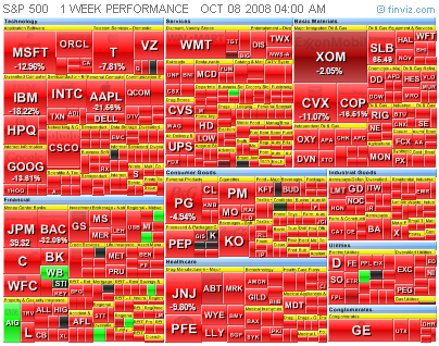
This is a treemap visualization of market movements, courtesy of FinViz.

Don't just do something, stand there! Reflections on the counterintuitive behavior of complex systems, seen through the eyes of System Dynamics, Systems Thinking and simulation.
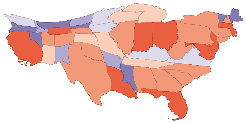
Nature had a nice article on a new tool that uses a diffusion algorithm to produce cartograms, maps rescaled in proportion to spatial variables. I know a bit about diffusion algorithms for image processing, and I can’t resist cool, free GIS software, so I downloaded a copy of the tool, ScapeToad, and tried it myself. First I grabbed a shapefile for US states from the Census’ TIGER/Line product. I clipped that to just the lower 48 states, using MapWindow. Also in MapWindow, I added a column to the shapefile’s attribute table to contain state emissions. In Excel, I used a lookup to insert state emissions from the Vulcan project into my emissions column in the attribute dbf. After a minute or two of chugging in ScapeToad (much more if you want higher resolution), I had this cartogram of state CO2 emissions:
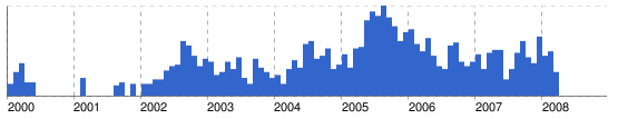
I’ve found trends on Google news interesting for some time. For example, did net news predict a housing bubble?
As online sources of such social data get richer, and control and normalization issues are solved or at least made transparent, they could become a useful input to behavioral models. Already, I find them to be a useful reality check, for seeing how long it takes for events to show up on popular radar, and whether things that seem big are really big in the public mind.
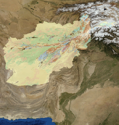
A cool portal for worldwide geological map information has just been launched. OneGeology is a portal, into which regional geologic survey agencies can link their data through a map interface. Users can access map info through a web interface akin to Google Maps. Regional and global layers can be added easily, as in a GIS tool. Here’s a map of rock age for Afghanistan, overlayed on NASA Modis imagery, generated in just a minute or two:
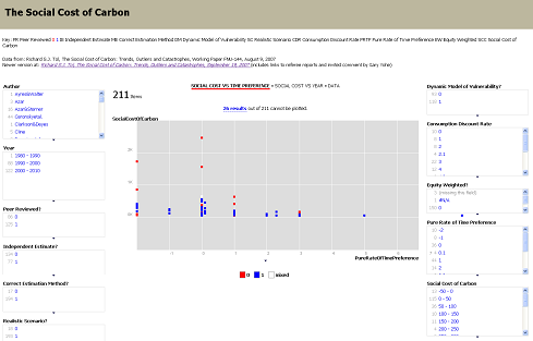
I recently discovered a cool set of tools from MIT’s Simile project. My favorites are Timeline and Exhibit, which provide a fairly easy way to create web sites where visitors can interact with data. As a test, I built an Exhibit containing Richard Tol’s survey of assessments of the social cost of carbon (SCC):