Like spreadsheets, open-loop models are popular but flawed tools. An open loop model is essentially a scenario-specification tool. It translates user input into outcomes, without any intervening dynamics. These are common in public discourse. An example turned up in the very first link when I googled “regional growth forecast”:
The growth forecast is completed in two stages. During the first stage SANDAG staff produces a forecast for the entire San Diego region, called the regionwide forecast. This regionwide forecast does not include any land use constraints, but simply projects growth based on existing demographic and economic trends such as fertility rates, mortality rates, domestic migration, international migration, and economic prosperity.
In other words, there’s unidirectional causality from inputs to outputs, ignoring the possible effects of the outputs (like prosperity) on the inputs (like migration). Sometimes such scenarios are useful as a starting point for thinking about a problem. However, with no estimate of the likelihood of realization of such a scenario, no understanding of the feedback that would determine the outcome, and no guidance about policy levers that could be used to shape the future, such forecasts won’t get you very far (but they might get you pretty deep – in trouble).
The key question for any policy, is “how do you get there from here?” Models can help answer such questions. In California, one key part of the low-carbon fuel standard (LCFS) analysis was VISION-CA. I wondered what was in it, so I took it apart to see. The short answer is that it’s an open-loop model that demonstrates a physically-feasible path to compliance, but leaves the user wondering what combination of vehicle and fuel prices and other incentives would actually get consumers and producers to take that path.
First, it’s laudable that the model is publicly available for critique, and includes macros that permit replication of key results. That puts it ahead of most analyses right away. Unfortunately, it’s a spreadsheet, which makes it tough to know what’s going on inside.
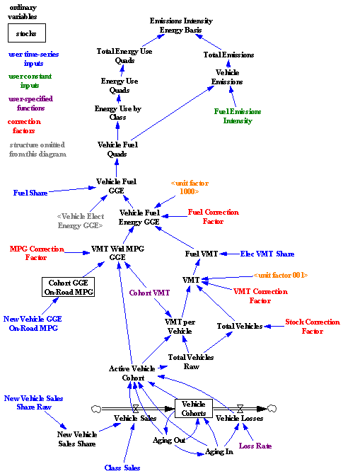
I translated some of the model core to Vensim for clarity. Here’s the structure:

Bringing the structure into the light reveals that it’s basically a causal tree – from vehicle sales, fuel efficiency, fuel shares, and fuel intensity to emissions. There is one pair of minor feedback loops, concerning the aging of the fleet and vehicle losses. So, this is a vehicle accounting tool that can tell you the consequences of a particular pattern of new vehicle and fuel sales. That’s already a lot of useful information. In particular, it enforces some reality on scenarios, because it imposes the fleet turnover constraint, which imposes a delay in implementation from the time it takes for the vehicle capital stock to adjust. No overnight miracles allowed.
What it doesn’t tell you is whether a particular measure, like an LCFS, can achieve the desired fleet and fuel trajectory with plausible prices and other conditions. It also can’t help you to decide whether an LCFS, emissions tax, or performance mandate is the better policy. That’s because there’s no consumer choice linking vehicle and fuel cost and performance, consumer knowledge, supplier portfolios, and technology to fuel and vehicle sales. Since equilibrium analysis suggests that there could be problems for the LCFS, and disequilibrium generally makes things harder rather than easier, those omissions are problematic.
Some other issues come to light as well. Generally, the spreadsheet is of high quality – it’s peer-reviewed heritage and careful construction shows. I only found one issue that I’d consider to be an outright error, but there are some other weaknesses:
- Fudge factors are used to make confusing units conversions and sweep model-data inconsistencies under the rug. One is used to “correct” for the fact that vehicle fleet dynamics don’t match data, because the fleet is initialized to zero and loss rates are not calibrated.
- Possible disparities in data streams (e.g., between reported sales and vehicle registrations) are not addressed. In our experience, closed-loop models reveal data problems more often than not. Uncritical use of data in open-loop models permits data problems to go unchallenged.
- A number of functional relationships in the model are extremely difficult to understand, even for an expert.
- While the model captures vehicle miles traveled (VMT) variation across vehicle age cohorts, it does not capture VMT variation over time. Since there have been large changes in VMT since the 70s, this would appear to be a significant omission.
- The treatment of fuel components and blends is rather inflexible (a better outcome can be achieved with arrays in a more structured modeling environment).
This inventory could be incomplete, because the spreadsheet model contains generic structure replicated across multiple worksheets. Auditing the structure of one sheet doesn’t guarantee that others are sound.
The bottom line? From a report we wrote detailing our findings (available on request):
In spite of the issues above, the model seems generally appropriate to the purpose of accounting for physically feasible pathways that achieve efficiency or intensity goals. It seems obvious, though, that physical feasibility is not sufficient for policy feasibility. To develop workable policies and avoid “can’t get there from here” situations, it would be desirable to have a model that linked changes in new vehicle and fuel shares to driving forces (availability, cost, and other elements of attractiveness). That would mean closing a number of feedback loops that are missing from the tree structure above, including:
• Effects of the LCFS on the internal taxes and subsidies fuel providers would have to impose in order to balance their portfolios
• Market clearing for fuels, i.e. effects of fuel prices on supply investment incentives and demand for driving, efficiency, etc.
• Vehicle manufacturer behavior, particularly the incentive to innovate to create new vehicle platforms in response to potential fuel price and consumer preference developments
• Fueling infrastructure behavior, similar to the above, and perhaps including a geographic component.
While the structure and parameters defining some of these feedbacks may be uncertain, ignoring them is not a sound alternative. Omitting feedbacks is to assume that they have zero gain – the one value which we know to be wrong.
It’s actually quite straightforward to construct an alternative model that captures the same dynamics as VISION, but with greater transparency, efficient and flexible use of arrays, calibration to data, and separation of data and structure. That provides a platform for elaboration and exploration of the missing dynamics. It’s possible to have greater dynamic complexity and a more intuitive model at the same time, because a lot of the detail complexity (like annual vehicle cohorts) really isn’t needed for most purposes. We’ve had a number of interesting conversations around a very simple model of transportation, including only a first-order fleet, refining and import capacity, market clearing through fuel price, road congestion, and the consumer’s decision to drive.
For a really compelling look at the dynamics of vehicles and fuels, my next installment will take a look at Jeroen Struben’s thesis work.
