Believing Exponential Growth

Verghese: You were prescient about the shape of the BA.5 variant and how that might look a couple of months before we saw it. What does your crystal ball show of what we can expect in the United Kingdom and the United States in terms of variants that have not yet emerged?

Pagel: The other thing that strikes me is that people still haven’t understood exponential growth 2.5 years in. With the BA.5 or BA.3 before it, or the first Omicron before that, people say, oh, how did you know? Well, it was doubling every week, and I projected forward. Then in 8 weeks, it’s dominant.

It’s not that hard. It’s just that people don’t believe it. Somehow people think, oh, well, it can’t happen. But what exactly is going to stop it? You have to have a mechanism to stop exponential growth at the moment when enough people have immunity. The moment doesn’t last very long, and then you get these repeated waves.

You have to have a mechanism that will stop it evolving, and I don’t see that. We’re not doing anything different to what we were doing a year ago or 6 months ago. So yes, it’s still evolving. There are still new variants shooting up all the time.

At the moment, none of these look devastating; we probably have at least 6 weeks’ breathing space. But another variant will come because I can’t see that we’re doing anything to stop it.

Medscape, We Are Failing to Use What We’ve Learned About COVID, Eric J. Topol, MD; Abraham Verghese, MD; Christina Pagel, PhD

Mask Mandates and One Study Syndrome

The evidence base for Montana’s new order promoting parental opt-out from school mask mandates relies heavily on two extremely weak studies.

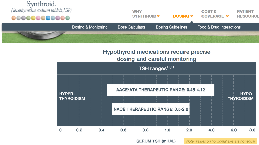
Montana Governor Gianforte just publicized a new DPHHS order requiring schools to provide a parental opt-out for mask requirements.

Underscoring the detrimental impact that universal masking may have on children, the rule cites a body of scientific literature that shows side effects and dangers from prolonged mask wearing.

The order purports to be evidence based. But is the evidence any good?

Mask Efficacy

The order cites:

The scientific literature is not conclusive on the extent of the impact of
masking on reducing the spread of viral infections. The department understands
that randomized control trials have not clearly demonstrated mask efficacy against
respiratory viruses, and observational studies are inconclusive on whether mask use
predicts lower infection rates, especially with respect to children.
1

The supporting footnote is basically a dog’s breakfast,

1 See, e.g., Guerra, D. and Guerra, D., Mask mandate and use efficacy for COVID-19 containment in
US States, MedRX, Aug. 7, 2021, https://www.medrxiv.org/content/10.1101/2021.05.18.21257385v2
(“Randomized control trials have not clearly demonstrated mask efficacy against respiratory viruses,
and observational studies conflict on whether mask use predicts lower infection rates.”). Compare
CDC, Science Brief: Community Use of Cloth Masks to Control the Spread of SARS-CoV-2, last
updated May 7, 2021, https://www.cdc.gov/coronavirus/2019-ncov/science/science-briefs/masking-
science-sars-cov2.html, last visited Aug. 30, 2021 (mask wearing reduces new infections, citing
studies)
….

(more stuff of declining quality)

This is not an encouraging start; it’s blatant cherry picking. Guerra & Guerra is an observational statistical test of mask mandates. The statement DPHHS quotes, “Randomized control trials have not clearly demonstrated mask efficacy…” isn’t even part of the study; it’s merely an introductory remark in the abstract.

Much worse, G&G isn’t a “real” model. It’s just a cheap regression of growth rates against mask mandates, with almost no other controls. Specifically, it omits NPIs, weather, prior history of the epidemic in each state, and basically every other interesting covariate, except population density. It’s not even worth critiquing the bathtub statistics issues.

G&G finds no effects of mask mandates. But is that the whole story? No. Among the many covariates they omit is mask compliance. It turns out that matters, as you’d expect. From Leech et al. (one of many better studies DPHHS ignored):

Across these analyses, we find that an entire population wearing masks in public leads to a median reduction in the reproduction number R of 25.8%, with 95% of the medians between 22.2% and 30.9%. In our window of analysis, the median reduction in R associated with the wearing level observed in each region was 20.4% [2.0%, 23.3%]1. We do not find evidence that mandating mask-wearing reduces transmission. Our results suggest that mask-wearing is strongly affected by factors other than mandates.

We establish the effectiveness of mass mask-wearing, and highlight that wearing data, not mandate data, are necessary to infer this effect.

Meanwhile, the DPHHS downplays its second citation, the CDC Science Brief, which cites 65 separate papers, including a number of observational studies that are better than G&G. It concludes that masks work, by a variety of lines of evidence, including mechanistic studies, CFD simulations and laboratory experiments.

Verdict: Relying on a single underpowered, poorly designed regression to make sweeping conclusions about masks is poor practice. In effect, DPHHS has chosen the one earwax-flavored jellybean from a bag of more attractive choices.

Mask Safety

The department order goes on,

The department
understands, however, that there is a body of literature, scientific as well as
survey/anecdotal, on the negative health consequences that some individuals,
especially some children, experience as a result of prolonged mask wearing.
2

The footnote refers to Kisielinski et al. – again, a single study in a sea of evidence. At least this time it’s a meta-analysis. But was it done right? I decided to spot check.

K et al. tabulate a variety of claims conveniently in Fig. 2:

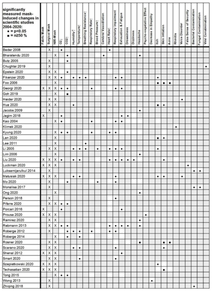
The first claim assessed is that masks reduce O2, so I followed those citations.

Citation Claim Assessment/Notes
Beder 2008 Effect Effect, but you can’t draw any causal conclusion because there’s no control group.
Butz 2005 No effect PhD Thesis, not available for review
Epstein 2020 No effect No effect (during exercise)
Fikenzer 2020 Effect Effect
Georgi 2020 Effect Gray literature, not available for review
Goh 2019 No effect No effect; RCT n~=100 children
Jagim 2018 Effect Not relevant – this concerns a mask designed for elevation training, i.e. deliberately impeding O2
Kao 2004 Effect Effect. End stage renal patients.
Kyung 2020 Effect Dead link. Flaky journal? COPD patients.
Liu 2020 Effect Small effect – <1% SpO2. Nonmedical conference paper, so dubious peer review. N=12.
Mo 2020 No effect No effect. Gray lit. COPD patients.
Person 2018 No effect No effect. 6 minute walking test.
Pifarre 2020 Effect Small effect. Tiny sample (n=8). Questionable control of order of test conditions. Exercise.
Porcari 2016 Effect Irrelevant – like Jagim, concerns an elevation training mask.
Rebmann 2013 Effect No effect. “There were no changes in nurses’ blood pressure, O2 levels, perceived comfort, perceived thermal comfort, or complaints of visual difficulties compared with baseline levels.” Also, no control, as in Beder.
Roberge 2012 No effect No effect. N=20.
Roberge 2014 No effect No effect. N=22. Pregnancy.
Tong 2015 Effect Effect. Exercise during regnancy.

If there’s a pattern here, it’s lots of underpowered small sample studies with design defects. Morover, there are some blatant errors in assessment of relevance (Jagim, Porcari) and inclusion of uncontrolled studies (Beder, Rebmann, maybe Pifarre). In other words, this is 30% rubbish, and the rubbish is all on the “effect” side of the scale.

If the authors did a poor job assessing the studies they included, I also have to wonder whether they did a bad screening job. That turns out to be hard to determine without more time. But a quick search does reveal that there has been an explosion of interest in the topic, with a number of new studies in high-quality journals with better control designs. Regrettably, sample sizes still tend to be small, but the results are generally not kind to the assertions in the health order:

Mapelli et al. 2021:

Conclusions Protection masks are associated with significant but modest worsening of spirometry and cardiorespiratory parameters at rest and peak exercise. The effect is driven by a ventilation reduction due to an increased airflow resistance. However, since exercise ventilatory limitation is far from being reached, their use is safe even during maximal exercise, with a slight reduction in performance.

Chan, Li & Hirsch 2020:

In this small crossover study, wearing a 3-layer nonmedical face mask was not associated with a decline in oxygen saturation in older participants. Limitations included the exclusion of patients who were unable to wear a mask for medical reasons, investigation of 1 type of mask only, Spo2 measurements during minimal physical activity, and a small sample size. These results do not support claims that wearing nonmedical face masks in community settings is unsafe.

Lubrano et al. 2021:

This cohort study among infants and young children in Italy found that the use of facial masks was not associated with significant changes in Sao2 or Petco2, including among children aged 24 months and younger.

Shein et al. 2021:

The risk of pathologic gas exchange impairment with cloth masks and surgical masks is near-zero in the general adult population.

A quick trip to PubMed or Google Scholar provides many more.

Verdict: a sloppy meta-analysis is garbage-in, garbage-out.

Bottom Line

Montana DPHHS has failed to verify its sources, ignores recent literature and therefore relies on far less than the best available science in the construction of its flawed order. Its sloppy work will fan the flames of culture-war conspiracies and endanger the health of Montanans.

Confusing the decision rule with the system

In the NYT:

To avoid quarantining students, a school district tries moving them around every 15 minutes.

Oh no.

To reduce the number of students sent home to quarantine after exposure to the coronavirus, the Billings Public Schools, the largest school district in Montana, came up with an idea that has public health experts shaking their heads: Reshuffling students in the classroom four times an hour.

The strategy is based on the definition of a “close contact” requiring quarantine — being within 6 feet of an infected person for 15 minutes or more. If the students are moved around within that time, the thinking goes, no one will have had “close contact” and be required to stay home if a classmate tests positive.

For this to work, there would have to be a nonlinearity in the dynamics of transmission. For example, if the expected number of infections from 2 students interacting with an infected person for 10 minutes each were less than the number from one student interacting with an infected person for 20 minutes, there might be some benefit. This would be similar to a threshold in a dose-response curve. Unfortunately, there’s no evidence for such an effect – if anything, increasing the number of contacts by fragmentation makes things worse.

Scientific reasoning has little to do with the real motivation:

Greg Upham, the superintendent of the 16,500-student school district, said in an interview that contact tracing had become a huge burden for the district, and administrators were looking for a way to ease the burden when they came up with the movement idea. It was not intended to “game the system,” he said, but rather to encourage the staff to be cognizant of the 15-minute window.

Regardless of the intent, this is absolutely an example of gaming the system. However, you game rules, but you can’t fool mother nature. The 15-minute window is a decision rule for prioritizing contact tracing, invented in the context of normal social mixing. Administrators have confused it with a physical phenomenon. Whether or not they intended to game the system, they’re likely to get what they want: less contact tracing. This makes the policy doubly disastrous: it increases transmission, and it diminishes the preventive effects of contact tracing and quarantine. In short order, that means more infections. A few doublings of cases will quickly overwhelm any reduction in contact tracing burden from shuffling students around.

I think the administrators who came up with this might want to consider adding systems thinking to the curriculum.


MSU Covid Evaluation

Well, my prediction of 10/9 covid cases at MSU, made on 10/6 using 10/2 data, was right on the money: I extrapolated 61 from cumulative cases, and the actual number was 60. (I must have made a typo or mental math error in reporting the expected cumulative cases, because 157+61 <> 207. The number I actually extrapolated was 157*e^.33 = 218 = 157 + 61.)

That’s pretty darn good, though I shouldn’t take too much credit, because my confidence bounds would have been wide, had I included them in the letter. Anyway, it was a fairly simpleminded exercise, far short of calibrating a real model.

Interestingly, the 10/16 release has 65 new cases, which is lower than the next simple extrapolation of 90 cases. However, Poisson noise in discrete events like this is large (the variance equals the mean, so this result is about two and a half standard deviations low), and we still don’t know how much testing is happening. I would still guess that case growth is positive, with R above 1, so it’s still an open question whether MSU will make it to finals with in-person classes.

Interestingly, the increased caseload in Gallatin County means that contact tracing and quarantine resources are now strained. This kicks off a positive feedback: increased caseload means that fewer contacts are traced and quarantined. That in turn means more transmission from infected people in the wild, further increasing caseload. MSU is relying on county resources for testing and tracing, so presumably the university is caught in this loop as well.


MSU Covid – what will tomorrow bring?

The following is a note I posted to a local listserv earlier in the week. It’s an example of back-of-the-envelope reasoning informed by experience with models, but without actually calibrating a model to verify the results. Often that turns out badly. I’m posting this to archive it for review and discussion later, after new data becomes available (as early as tomorrow, I expect).

I thought about responding to this thread two weeks ago, but at the time numbers were still very low, and data was scarce. However, as an MSU parent, I’ve been watching the reports closely. Now the picture is quite different.

If you haven’t discovered it, Gallatin County publishes MSU stats at the end of the weekly Surveillance Report, found here:

https://www.healthygallatin.org/about-us/press-releases/

For the weeks ending 9/10, 9/17, 9/24, and 10/2, MSU had 3, 7, 66, and 43 new cases. Reported active cases are slightly lower, which indicates that the active case duration is less than a week. That’s inconsistent with the two-week quarantine period normally recommended. It’s hard to see how this could happen, unless quarantine compliance is low or delays cause much of the infectious period to be missed (not good either way).

The huge jump two weeks ago is a concern. That’s growth of 32% per day, faster than the typical uncontrolled increase in the early days of the epidemic. That could happen from a superspreader event, but more likely reflects insufficient testing to detect a latent outbreak.

Unfortunately they still don’t publish the number of tests done at MSU, so it’s hard to interpret any of the data. We know the upper bound, which is the 2000 or so tests per week reported for all of Gallatin county. Even if all of those were dedicated to MSU, it still wouldn’t be enough to put a serious dent in infection through testing, tracing and isolation. Contrast this with Colby College, which tests everyone twice a week, which is a test density about 100x greater than Gallatin County+MSU.

In spite of the uncertainty, I think it’s wrong to pin Gallatin County’s increase in cases on MSU. First, COVID prevalence among incoming students was unlikely to be much higher than in the general population. Second, Gallatin County is much larger than MSU, and students interact largely among themselves, so it would be hard for them to infect the broad population. Third, the county has its own reasons for an increase, like reopening schools. Depending on when you start the clock, MSU cases are 18 to 28% of the county total, which is at worst 50% above per capita parity. Recently, there is one feature of concern – the age structure of cases (bottom of page 3 of the surveillance report). This shows that the current acceleration is driven by the 10-19 and 20-29 age groups.

As a wild guess, reported cases might understate the truth by a factor of 10. That would mean 420 active cases at MSU when you account for undetected asymptomatics and presymptomatic untested contacts. That’s out of a student/faculty population of 20,000, so it’s roughly 2% prevalence. A class of 10 would have a 1/5 chance of a positive student, and for 20 it would be 1/3. But those #s could easily be off by a factor of 2 or more.

Just extrapolating the growth rate (33%/week for cumulative cases), this Friday’s report would be for 61 new cases, 207 cumulative. If you keep going to finals, the cumulative would grow 10x – which basically means everyone gets it at some point, which won’t happen. I don’t know what quarantine capacity is, but suppose that MSU can handle a 300-case week (that’s where things fell apart at UNC). If so, the limit is reached in less than 5 weeks, just short of finals.

I’d say these numbers are discouraging. As a parent, I’m not yet concerned enough to pull my kids out, but they’re nonresidential so their exposure is low. Around classrooms on campus, compliance with masks, sanitizing and distancing is very good – certainly better than it is in town. My primary concern at present is that we don’t know what’s going on, because the published statistics are insufficient to make reliable judgments. Worse, I suspect that no one knows what’s going on, because there simply isn’t enough testing to tell. Tests are pretty cheap now, and the disruption from a surprise outbreak is enormous, so that seems penny wise and pound foolish. The next few weeks will reveal whether we are seeing random variation or the beginning of a large outbreak, but it would be far better to have enough surveillance and data transparency to know now.

Coronavirus Roundup II

Some things I’ve found interesting and useful lately:

R0

What I think is a pretty important article from LANL: High Contagiousness and Rapid Spread of Severe Acute Respiratory Syndrome Coronavirus 2. This tackles the questions I wondered about in my steady state growth post, i.e. that high observed growth rates imply high R0 if duration of infectiousness is long.

Earlier in the epidemic, this was already a known problem:

The time scale of asymptomatic transmission affects estimates of epidemic potential in the COVID-19 outbreak

The reproductive number of COVID-19 is higher compared to SARS coronavirus

Data

Epiforecasts’ time varying R0 estimates

CMMID’s time varying reporting coverage estimates

NECSI’s daily update for the US

The nifty database of US state policies from Raifman et al. at BU

A similar policy tracker for the world

The covidtracking database. Very useful, if you don’t mind a little mysterious turbulence in variable naming.

The Kinsa thermometer US health weather map

Miscellaneous

Nature’s Special report: The simulations driving the world’s response to COVID-19

Pandemics Depress the Economy, Public Health Interventions Do Not: Evidence from the 1918 Flu

Projecting the transmission dynamics of SARS-CoV-2 through the postpandemic period has some interesting dynamics, including seasonality.

Quantifying SARS-CoV-2 transmission suggests epidemic control with digital contact tracing looks at requirements for contact tracing and isolation

Models for Count Data With Overdispersion has important considerations for calibration

Variolation: hmm. Filed under “interesting but possibly crazy.”

Creative, and less obviously crazy: An alternating lock-down strategy for sustainable mitigation of COVID-19

How useful are antibody tests?

I just ran across this meta-analysis of antibody test performance on medrxiv:

Antibody tests in detecting SARS-CoV-2 infection: a meta-analysis

In total, we identified 38 eligible studies that include data from 7,848 individuals. The analyses showed that tests using the S antigen are more sensitive than N antigen-based tests. IgG tests perform better compared to IgM ones, andshow better sensitivity when the samples were taken longer after the onset of symptoms. Moreover, irrespective of the method, a combined IgG/IgM test seems to be a better choice in terms of sensitivity than measuring either antibody type alone. All methods yielded high specificity with some of them (ELISA and LFIA) reaching levels around 99%. ELISA-and CLIA-based methods performed better in terms of sensitivity (90-94%) followed by LFIA and FIA with sensitivities ranging from 80% to 86%.

The sensitivity results are interesting, but I’m more interested in timing:

Sample quality, low antibody concentrations and especially timing of the test -too soon after a person is infected when antibodies have not been developed yet or toolate when IgM antibodies have decreased or disappeared -could potentially explain the low ability of the antibody tests to identify people with COVID-19. According to kinetic measurements of some of the included studies 22, 49, 54 IgM peaks between days 5 and 12 and then drops slowly. IgGs reach peak concentrations after day 20 or so as IgM antibodies disappear. This meta-analysis showed, through meta-regression, that IgG tests did have better sensitivity when the samples were taken longer after the onset of symptoms. This is further corroborated by the lower specificity of IgM antibodies compared to IgG 15. Only few of the included studies provided data stratified by the time of onset of symptoms, so a separate stratified analysis was not feasible, but this should be a goal for future studies.

This is an important knowledge gap. Timing really matters, because tests that aren’t sensitive to early asymptomatic transmission have limited utility for preventing spread. Consider the distribution of serial infection times (Ferretti et al., Science):

Testing by itself doesn’t do anything to reduce the spread of infection. It’s an enabler: transmission goes down only if coronavirus-positive individuals identified through testing change their behavior. That implies a chain of delays:

  • Conduct the test and get the results
  • Inform the positive person
  • Get them into a situation where they won’t infect their coworkers, family, etc.
  • Trace their contacts, test them, and repeat

A test that only achieves peak sensitivity at >5 days may not leave much time for these delays to play out, limiting the effectiveness of contact tracing and isolation. A test that peaks at day 20 would be pretty useless (though interesting for surveillance and other purposes).

Consider Long et al., Antibody responses to SARS-CoV-2 in COVID-19 patients: the perspective application of serological tests in clinical practice:

Seroconversion rates of 30% at onset of symptoms seem problematic, given the significant pre-symptomatic transmission implied by the Ferretti, Liu & Nishiura results on serial infection times. I hope the US testing strategy relies on lots of fast tests, not just lots of tests.

See also:

Potential Rapid Diagnostics, Vaccine and Therapeutics for 2019 Novel Coronavirus (2019-nCoV): A Systematic Review.

Antibody surveys suggesting vast undercount of coronavirus infections may be unreliable in Science

h/t Yioryos Stamboulis

A coronavirus prediction you can bank on

How many cases will there be on June 1? Beats me. But there’s one thing I’m sure of.

My confidence bounds on future behavior of the epidemic are still pretty wide. While there’s good reason to be optimistic about a lot of locations, there are also big uncertainties looming. No matter how things shake out, I’m confident in this:

The antiscience crowd will be out in force. They’ll cherry-pick the early model projections of an uncontrolled epidemic, and use that to claim that modelers predicted a catastrophe that didn’t happen, and conclude that there was never a problem. This is the Cassandra’s curse of all successful modeling interventions. (See Nobody Ever Gets Credit for Fixing Problems that Never Happened for a similar situation.)

But it won’t stop there. A lot of people don’t really care what the modelers actually said. They’ll just make stuff up. Just today I saw a comment at the Bozeman Chronicle to the effect of, “if this was as bad as they said, we’d all be dead.” Of course that was never in the cards, or the models, but that doesn’t matter in Dunning Krugerland.

Modelers, be prepared for a lot more of this. I think we need to be thinking more about defensive measures, like forecast archiving and presentation of results only with confidence bounds attached. However, it’s hard to do that and to produce model results at a pace that keeps up with the evolution of the epidemic. That’s something we need more infrastructure for.

Coronavirus Curve-fitting OverConfidence

This is a follow-on to The Normal distribution is a bad COVID19 model.

I understand that the IHME model is now more or less the official tool of the Federal Government. Normally I’m happy to see models guiding policy. It’s better than the alternative: would you fly in a plane designed by lawyers? (Apparently we have been.)

However, there’s nothing magic about a model. Using flawed methods, bad data, the wrong boundary, etc. can make the results GIGO. When a bad model blows up, the consequences can be just as harmful as any other bad reasoning. In addition, the metaphorical shrapnel hits the rest of us modelers. Currently, I’m hiding in my foxhole.

On top of the issues I mentioned previously, I think there are two more problems with the IHME model:

First, they fit the Normal distribution to cumulative cases, rather than incremental cases. Even in a parallel universe where the nonphysical curve fit was optimal, this would lead to understatement of the uncertainty in the projections.

Second, because the model has no operational mapping of real-world concepts to equation structure, you have no hooks to use to inject policy changes and the uncertainty associated with them. You have to construct some kind of arbitrary index and translate that to changes in the size and timing of the peak in an unprincipled way. This defeats the purpose of having a model.

For example, from the methods paper:

A covariate of days with expected exponential growth in the cumulative death rate was created using information on the number of days after the death rate exceeded 0.31 per million to the day when different social distancing measures were mandated by local and national government: school closures, non-essential business closures including bars and restaurants, stay-at-home recommendations, and travel restrictions including public transport closures. Days with 1 measure were counted as 0.67 equivalents, days with 2 measures as 0.334 equivalents and with 3 or 4 measures as 0.

This postulates a relationship that has only the most notional grounding. There’s no concept of compliance, nor any sense of the effect of stringency and exceptions.

In the real world, there’s also no linear relationship between “# policies implemented” and “days of exponential growth.” In fact, I would expect this to be extremely nonlinear, with a threshold effect. Either your policies reduce R0 below 1 and the epidemic peaks and shrinks, or they don’t, and it continues to grow at some positive rate until a large part of the population is infected. I don’t think this structure captures that reality at all.

That’s why, in the IHME figure above (retrieved yesterday), you don’t see any scenarios in which the epidemic fizzles, because we get lucky and warm weather slows the virus, or there are many more mild cases than we thought. You also don’t see any runaway scenarios in which measures fail to bring R0 below 1, resulting in sustained growth. Nor is there any possibility of ending measures too soon, resulting in an echo.

For comparison, I ran some sensitivity runs my model for North Dakota last night. I included uncertainty from fit to data (for example, R0 constrained to fit observations via MCMC) and some a priori uncertainty about effectiveness and duration of measures, and from the literature about fatality rates, seasonality, and unobserved asymptomatics.

I found that I couldn’t exclude the IHME projections from my confidence bounds, so they’re not completely crazy. However, they understate the uncertainty in the situation by a huge margin. They forecast the peak at a fairly definite time, plus or minus a factor of two. With my hybrid-SEIR model, the 95% bounds include variation by a factor of 10. The difference is that their bounds are derived only from curve fitting, and therefore omit a vast amount of structural uncertainty that is represented in my model.

Who is right? We could argue, but since the IHME model is statistically flawed and doesn’t include any direct effect of uncertainty in R0, prevalence of unobserved mild cases, temperature sensitivity of the virus, effectiveness of measures, compliance, travel, etc., I would not put any money on the future remaining within their confidence bounds.