It’s hard to work under these conditions.
Month: September 2016
Climate and Competitiveness
Trump gets well-deserved criticism for denying having claimed that the Chinese invented climate change to make US manufacturing non-competitive.
The idea is absurd on its face. Climate change was proposed long before (or long after) China figured on the global economic landscape. There was only one lead author from China out of the 34 in the first IPCC Scientific Assessment. The entire climate literature is heavily dominated by the US and Europe.
But another big reason to doubt its veracity is that climate policy, like emissions pricing, would make Chinese manufacturing less competitive. In fact, at the time of the first assessment, China was the most carbon-intensive economy in the world, according to the World Bank:

Today, China’s carbon intensity remains more than twice that of the US. That makes a carbon tax with a border adjustment an attractive policy for US competitiveness. What conspiracy theory makes it rational for China to promote that?
Feedback and project schedule performance
Yasaman Jalili and David Ford look take a deeper look at project model dynamics in the January System Dynamics Review. An excerpt:
Quantifying the impacts of rework, schedule pressure, and ripple effect loops on project schedule performance
Schedule performance is often critical to construction project success. But many times projects experience large unforeseen delays and fail to meet their schedule targets. The failure of large construction projects has enormous economic consequences. …
… the persistence of large project delays implies that their importance has not been fully recognized and incorporated into practice. Traditional project management methods do not explicitly consider the effects of feedback (Pena-Mora and Park, 2001). Project managers may intuitively include some impacts of feedback loops when managing projects (e.g. including buffers when estimating activity durations), but the accuracy of the estimates is very dependent upon the experience and judgment of the scheduler (Sterman, 1992). Owing to the lack of a widely used systematic approach to incorporating the impacts of feedback loops in project management, the interdependencies and dynamics of projects are often ignored. This may be due to a failure of practicing project managers to understand the role and significance of commonly experienced feedback structures in determining project schedule performance. Practitioners may not be aware of the sizes of delays caused by feedback loops in projects, or even the scale of impacts. …
In the current work, a simple validated project model has been used to quantify the schedule impacts of three common reinforcing feedback loops (rework cycle, “haste makes waste”, and ripple effects) in a single phase of a project. Quantifying the sizes of different reinforcing loop impacts on project durations in a simple but realistic project model can be used to clearly show and explain the magnitude of these impacts to project management practitioners and students, and thereby the importance of using system dynamics in project management.
This is a more formal and thorough look at some issues that I raised a while ago, here and here.
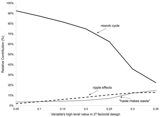
I think one important aspect of the model outcome goes unstated in the paper. The results show dominance of the rework parameter:
The graph shows that, regardless of the value of the variables, the rework cycle has the most impact on project duration, ranging from 1.2 to 26.5 times more than the next most influential loop. As the high level of the variables increases, the impact of “haste makes waste” and “ripple effects” loops increases.
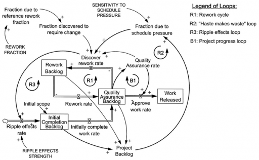
Yes, but why? I think the answer is in the nonlinear relationships among the loops. Here’s a simplified view (omitting some redundant loops for simplicity):
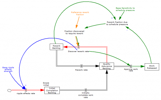
Project failure occurs when it crosses the tipping point at which completing one task creates more than one task of rework (red flows). Some rework is inevitable due to the error rate (“rework fraction” – orange), i.e. the inverse of quality. A high rework fraction, all by itself, can torpedo the project.
The ripple effect is a little different – it creates new tasks in proportion to the discovery of rework (blue). This is a multiplicative relationship,
ripple work ≅ rework fraction * ripple strength
which means that the ripple effect can only cause problems if quality is poor to begin with.
Similarly, schedule pressure (green) only contributes to rework when backlogs are large and work accomplished is small relative to scheduled ambitions. For that to happen, one of two things must occur: rework and ripple effects delay completion, or the schedule is too ambitious at the outset.
With this structure, you can see why rework (quality) is a problem in itself, but ripple and schedule effects are contingent on the rework trigger. I haven’t run the simulations to prove it, but I think that explains the dominance of the rework parameter in the results. (There’s a followup article here!)
Update, H/T Michael Bean:
Update II
There’s a nice description of the tipping point dynamics here.
Paul Romer on The Trouble with Macroeconomics
Paul Romer (of endogenous growth fame) has a new, scathing critique of macroeconomics.
For more than three decades, macroeconomics has gone backwards. The treatment of identification now is no more credible than in the early 1970s but escapes challenge because it is so much more opaque. Macroeconomic theorists dismiss mere facts by feigning an obtuse ignorance about such simple assertions as “tight monetary policy can cause a recession.” Their models attribute fluctuations in aggregate variables to imaginary causal forces that are not influenced by the action that any person takes. A parallel with string theory from physics hints at a general failure mode of science that is triggered when respect for highly regarded leaders evolves into a deference to authority that displaces objective fact from its position as the ultimate determinant of scientific truth.
Notice the Kuhnian finish: “a deference to authority that displaces objective fact from its position as the ultimate determinant of scientific truth.” This is one of the key features of Sterman & Wittenberg’s model of Path Dependence, Competition, and Succession in the Dynamics of Scientific Revolution:
The focal point of the model is a construct called “confidence.” Confidence captures the basic beliefs of practitioners regarding the epistemological status of their paradigm—is it seen as a provisional model or revealed truth? Encompassing logical, cultural, and emotional factors, confidence influences how anomalies are perceived, how practitioners allocate research effort to different activities (puzzle solving versus anomaly resolution, for example), and recruitment to and defection from the paradigm. …. Confidence rises when puzzle-solving progress is high and when anomalies are low. The impact of anomalies and progress is mediated by the level of confidence itself. Extreme levels of confidence hinder rapid changes in confidence because practitioners, utterly certain of the truth, dismiss any evidence contrary to their beliefs. ….
The external factors affecting confidence encompass the way in which practitioners in one paradigm view the accomplishments and claims of other paradigms against which they may be competing. We distinguish between the dominant paradigm, defined as the school of thought that has set the norms of inquiry and commands the allegiance of the most practitioners, and alternative paradigms, the upstart contenders. The confidence of practitioners in a new paradigm tends to increase if its anomalies are less than those of the dominant paradigm, or if it has greater explanatory power, as measured by cumulative solved puzzles. Confidence tends to decrease if the dominant paradigm has fewer anomalies or more solved puzzles. Practitioners in alternative paradigms assess their paradigms against one another as well as against the dominant paradigm. Confidence in an alternative paradigm tends to decrease (increase) if it has more (fewer) anomalies or fewer (more) solved puzzles than the most successful of its competitors.
In spite of its serious content, Romer’s paper is really quite fun, particularly if you get a little Schadenfreude from watching Real Business Cycles and Dynamic Stochastic General Equilibrium take a beating:
To allow for the possibility that monetary policy could matter, empirical DSGE models put sticky-price lipstick on this RBC pig.
But let me not indulge too much in hubris. Every field is subject to the same dynamics, and could benefit from Romer’s closing advice.
A norm that places an authority above criticism helps people cooperate as members of a belief field that pursues political, moral, or religious objectives. As Jonathan Haidt (2012) observes, this type of norm had survival value because it helped members of one group mount a coordinated defense when they were attacked by another group. It is supported by two innate moral senses, one that encourages us to defer to authority, another which compels self-sacrifice to defend the purity of the sacred.
Science, and all the other research fields spawned by the enlightenment, survive by “turning the dial to zero” on these innate moral senses. Members cultivate the conviction that nothing is sacred and that authority should always be challenged. In this sense, Voltaire is more important to the intellectual foundation of the research fields of the enlightenment than Descartes or Newton.
Tax cuts visualized
Much has been made of the fact that Trump’s revised tax plan cuts its implications for deficits in half (from ten to five trillion). Oddly, there’s less attention to the equity implications, which border on the obscene. Trump’s plan gives the top bracket a tax cut ten times bigger (as percentage of income) than that given to the bottom three fifths of the income distribution.
That makes the difference in absolute $ tax cuts between the richest and poorest pretty spectacular – a factor of 5000 to 10,000:
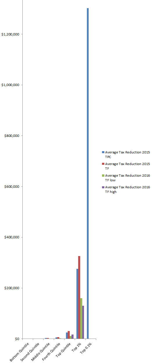
Trump tax cut distribution, by income quantile.
To see one pixel of the bottom quintile’s tax cut on this chart, it would have to be over 5000 pixels tall!
For comparison, here are the Trump & Clinton proposals. The Clinton plan proposes negligible increases on lower earners (e.g., $4 on the bottom fifth) and a moderate increase (5%) on top earners:
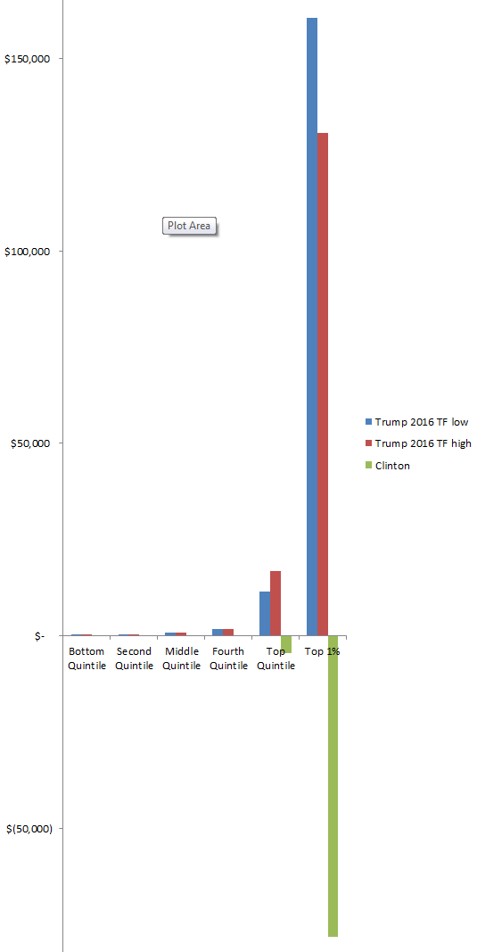
Trump & Clinton tax cut distributions, by income quantile.
Sources:
http://www.taxpolicycenter.org/publications/analysis-donald-trumps-tax-plan/full
http://taxfoundation.org/article/details-and-analysis-donald-trump-tax-reform-plan-september-2016
http://www.taxpolicycenter.org/publications/analysis-hillary-clintons-tax-proposals/full
Politics & growth
Trump pledges 4%/yr economic growth (but says his economists don’t want him to). His economists are right – political tinkering with growth is a fantasy:
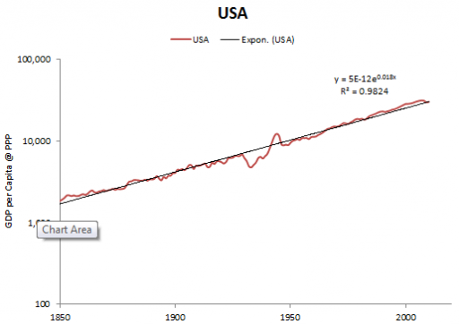
Source: Maddison
The growth rate of real per capita GDP in the US, and all leading industrial nations, has been nearly constant since the industrial revolution, at about 2% per year. Over that time, marginal tax rates, infrastructure investments and a host of other policies have varied dramatically, without causing the slightest blip.
On the other hand, there are ways you can screw up, like having a war or revolution, or failing to provide rule of law and functioning markets. The key is to preserve the conditions that allow the engine of growth – innovation – to function. Trump seems utterly clueless about innovation. His view of the economy is zero-sum: that value is something you extract from your suppliers and customers, not something you create. That view, plus an affinity for authoritarianism and conflict and neglect of the Constitution, bodes ill for a Trump economy.
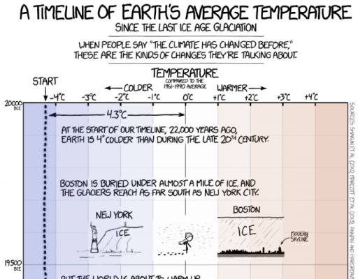
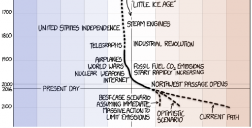
Models, data and hidden hockey sticks
NPR takes a harder look at the much-circulated xkcd temperature reconstruction cartoon.
The criticism:
Epic Climate Cartoon Goes Viral, But It Has One Key Problem
[…]
As you scroll up and down the graphic, it looks like the temperature of Earth’s surface has stayed remarkably stable for 10,000 years. It sort of hovers around the same temperature for some 10,000 years … until — bam! The industrial revolution begins. We start producing large amounts of carbon dioxide. And things heat up way more quickly.
Now look a bit closer at the bottom of the graphic. See how all of a sudden, around 150 years ago, the dotted line depicting average Earth temperature changes to a solid line. Munroe makes this change because the data used to create the lines come from two very different sources.
The solid line comes from real data — from scientists actually measuring the average temperature of Earth’s surface. These measurements allow us to see temperature fluctuations that occur over a very short timescale — say, a few decades or so.
But the dotted line comes from computer models — from scientists reconstructing Earth’s surface temperature. This gives us very, very coarse information. It averages Earth’s temperature over hundreds of years. So we can see temperature fluctuations that occur only over longer periods of time, like a thousand years or so. Any upticks, spikes or dips that occur in shorter time frames get smoothed out.
So in a way the graphic is really comparing apples and oranges: measurements of the recent past versus reconstructions of more ancient times.
Here’s the bit in question:
The fundamental point is well taken, that fruit are mixed here. The cartoon even warns of that:
I can’t fault the technical critique, but I take issue with a couple aspects of the tone of the piece. It gives the impression that “real data” is somehow exalted and models are inferior, thereby missing the real issues. And it lends credence to the “sh!t happens” theory of climate, specifically that the paleoclimate record could be full of temperature “hockey sticks” like the one we’re in now.
There’s no such thing as pure, assumption free “real data.” Measurement processes involve – gasp! – models. Even the lowly thermometer requires a model to be read, with the position of a mercury bubble converted to temperature via a calibrated scale, making various assumptions about physics of thermal expansion, linearity, etc.
There are no infallible “scientists actually measuring the average temperature of Earth’s surface.” Earth is a really big place, measurements are sparse, and instruments and people make mistakes. Reducing station observations to a single temperature involves reconstruction, just as it does for longer term proxy records. (If you doubt this, check the methodology for the Berkeley Earth Surface Temperature.)
Data combined with a model gives a better measurement than the raw data alone. That’s why a GPS unit combines measurements from satellites with a model of the device’s motion and noise processes to estimate position with greater accuracy than any single data point can provide.
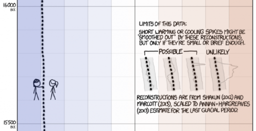
In fact, there are three sources here:
- recent global temperature, reconstructed from land and sea measurements with high resolution in time and space (the solid line)
- long term temperature, reconstructed from low resolution proxies (the top dotted line)
- projections from models that translate future emissions scenarios into temperature
If you take the recent, instrumental global temperature record as the gold standard, there are then two consistency questions of interest. Does the smoothing in the long term paleo record hide previous hockey sticks? Are the models accurate prognosticators of the future?
On the first point, the median temporal resolution of the records contributing to the Marcott 11,300 year reconstruction used is 120 years. So, a century-scale temperature spike would be attenuated by a factor of 2. There is then some reason to think that missing high frequency variation makes the paleo record look different. But there are also good reasons to think that this is not terribly important. Marcott et al. address this:
Our results indicate that global mean temperature for the decade 2000 – 2009 ( 34 ) has not yet exceeded the warmest temperatures of the early Holocene (5000 to 10,000 yr B.P.). These temperatures are, however, warmer than 82% of the Holocene distribution as represented by the Standard 5×5 stack, or 72% after making plausible corrections for inherent smoothing of the high frequencies in the stack. In contrast, the decadal mean global temperature of the early 20th century (1900 – 1909) was cooler than >95% of the Holocene distribution under both the Standard 5×5 and high-frequency corrected scenarios. Global temperature, therefore, has risen from near the coldest to the warmest levels of the Holocene within the past century, reversing the long-term cooling trend that began ~5000 yr B.P.
Even if there were hockey sticks in the past, that’s not evidence for a natural origin for today’s warming. We know little about paleo forcings, so it would be hard to discern the origin of those variations. One might ask, if they are happening now, why can’t we observe them? Similarly, evidence for higher natural variability is evidence for less damping of the climate system, which favors higher climate sensitivity.
Finally, the question of the validity of model projections is too big to tackle, but I should point out that the distinction between a model that generates future projections and a model that assimilates historic measurements is not as great as one might think. Obviously the future hasn’t happened yet, so future projections are subject to an additional source of uncertainty, which is that we don’t know all the inputs (future solar output, volcanic eruptions, etc.), whereas in the past those have been realized, even if we didn’t measure them. Also, models the project may have somewhat different challenges (like getting atmospheric physics right) than data-driven models (which might focus more on statistical methods). But future-models and observational data-models also have one thing in common: there’s no way to be sure that the model structure is right. In one case, it’s because the future hasn’t happened yet, and in the other because there’s no oracle to reveal the truth about what did happen.
So, does the “one key problem” with the cartoon invalidate the point, that something abrupt and unprecedented in the historical record is underway or about to happen? Not likely.
Structure First!
One of the central tenets of system dynamics and systems thinking is that structure causes behavior. This is often described as an iceberg, with events at as the visible tip, and structure as greater submerged bulk. Patterns of behavior, in the middle, are sequences of events that may signal the existence of the underlying structure.
The header of the current Wikipedia article on the California electricity crisis is a nice illustration of the difference between event and structural descriptions of a problem.
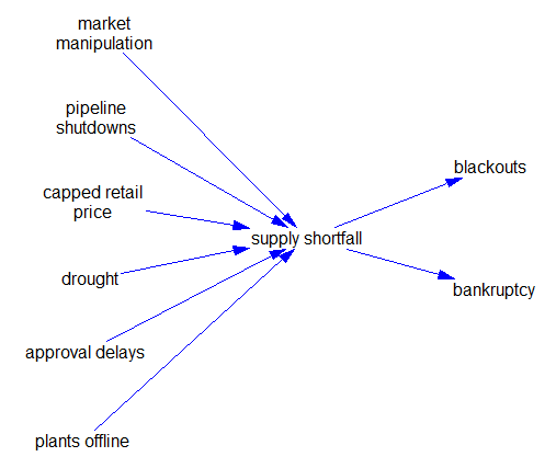
The California electricity crisis, also known as the Western U.S. Energy Crisis of 2000 and 2001, was a situation in which the United States state of California had a shortage of electricity supply caused by market manipulations, illegal[5] shutdowns of pipelines by the Texas energy consortium Enron, and capped retail electricity prices.[6] The state suffered from multiple large-scale blackouts, one of the state’s largest energy companies collapsed, and the economic fall-out greatly harmed GovernorGray Davis’ standing.
Drought, delays in approval of new power plants,[6]:109 and market manipulation decreased supply.[citation needed] This caused an 800% increase in wholesale prices from April 2000 to December 2000.[7]:1 In addition, rolling blackouts adversely affected many businesses dependent upon a reliable supply of electricity, and inconvenienced a large number of retail consumers.
California had an installed generating capacity of 45GW. At the time of the blackouts, demand was 28GW. A demand supply gap was created by energy companies, mainly Enron, to create an artificial shortage. Energy traders took power plants offline for maintenance in days of peak demand to increase the price.[8][9] Traders were thus able to sell power at premium prices, sometimes up to a factor of 20 times its normal value. Because the state government had a cap on retail electricity charges, this market manipulation squeezed the industry’s revenue margins, causing the bankruptcy of Pacific Gas and Electric Company (PG&E) and near bankruptcy of Southern California Edison in early 2001.[7]:2-3
The financial crisis was possible because of partial deregulation legislation instituted in 1996 by the California Legislature (AB 1890) and Governor Pete Wilson. Enron took advantage of this deregulation and was involved in economic withholding and inflated price bidding in California’s spot markets.[10]
The crisis cost between $40 to $45 billion.[7]:3-4
This is mostly a dead buffalo description of the event:
It offers only a few hints about the structure that enabled these events to unfold. It would be nice if the article provided a more operational description of the problem up front. (It does eventually get there.) Here’s a stab at it:
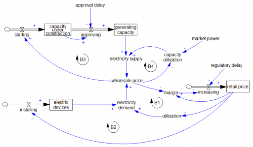
A normal market manages supply and demand through four balancing loops. On the demand side, in the short run utilization of electricity-consuming devices falls with increasing price (B1). In the long run, higher prices also suppress installation of new devices (B2). In parallel on the supply side, higher prices increase utilization in the short run (B4) and provide an incentive for capacity investment in the long run (B3).
The California crisis happened because these market-clearing mechanisms were not functioning. Retail pricing is subject to long regulatory approval lags, so there was effectively no demand price elasticity response in the short run, i.e. B1 and B2 were ineffective. The system might still function if it had surplus capacity, but evidently long approval delays prevented B3 from creating that. Even worse, the normal operation of B4 was inverted when Enron amassed sufficient market power. That inverted the normal competitive market incentive to increase capacity utilization when prices are high. Instead, Enron could deliberately lower utilization to extract monopoly prices. If any of B1-B3 had been functioning, Enron’s ability to exploit B4 would have been greatly diminished, and the crisis might not have occurred.
I find it astonishing that deregulation created such a dysfunctional market. The framework for electricity markets was laid out by Caramanis, Schweppe, Tabor & Bohn – they literally wrote the book on Spot Pricing of Electricity. Right in the introduction, page 5, it cautions:
Five ingredients for a successful marketplace are
- A supply side with varying supply costs that increase with demand
- A demand side with varying demands which can adapt to price changes
- A market mechanism for buying and selling
- No monopsonistic behavior on the demand side
- No monopolistic behavior on the supply side
I guess the market designers thought these were optional?
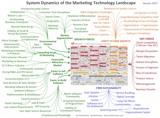
Dead buffalo diagrams
I think it was George Richardson who coined the term “dead buffalo” to refer to a diagram that surrounds a central concept with a hail of inbound causal arrows explaining it. This arrangement can be pretty useful as a list of things to think about, but it’s not much help toward solving a systemic problem from an endogenous point of view.
I recently found the granddaddy of them all: