Climate Causality Confusion

A newish set of papers (1. Theory (preprint); 2. Applications (preprint); 3. Extension) is making the rounds on the climate skeptic sites, with – ironically – little skepticism applied.

The claim is bold:

… According to the commonly assumed causality link, increased [CO2] causes a rise in T. However, recent developments cast doubts on this assumption by showing that this relationship is of the hen-or-egg type, or even unidirectional but opposite in direction to the commonly assumed one. These developments include an advanced theoretical framework for testing causality based on the stochastic evaluation of a potentially causal link between two processes via the notion of the impulse response function. …. All evidence resulting from the analyses suggests a unidirectional, potentially causal link with T as the cause and [CO2] as the effect.

Galileo complex seeps in when the authors claim that absence of correlation or impulse response from CO2 -> temperature proves absence of causality:

Clearly, the results […] suggest a (mono-directional) potentially causal system with T as the cause and [CO2] as the effect. Hence the common perception that increasing [CO2] causes increased T can be excluded as it violates the necessary condition for this causality direction.

Unfortunately, these claims are bogus. Here’s why.

The authors estimate impulse response functions between CO2 and temperature (and back), using the following formalism:


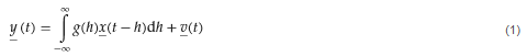
where g(h) is the response at lag h. As the authors point out, if

the IRF is zero for every lag except for the specific lag 0, then Equation (1) becomes y(t)=bx(t-h0) +v(t). This special case is equivalent to simply correlating  y(t) with x(t-h0) at any time instance . It is easy to find (cf. linear regression) that in this case the multiplicative constant is the correlation coefficient of y(t) and  x(t-h0) multiplied by the ratio of the standard deviations of the two processes.

Now … anyone who claims to have an “advanced theoretical framework for testing causality” should be aware of the limitations of linear regression. There are several possible issues that might lead to misleading conclusions about causality.

Problem #1 here is bathtub statistics. Temperature integrates the radiative forcing from CO2 (and other things). This is not debatable – it’s physics. It’s old physics, and it’s experimental, not observational. If you question the existence of the effect, you’re basically questioning everything back to the Enlightenment. The implication is that no correlation is expected between CO2 and temperature, because integration breaks pattern matching. The authors purport to avoid integration by using first differences of temperature and CO2. But differencing both sides of the equation doesn’t solve the integration problem; it just kicks the can down the road. If y integrates x, then patterns of the integrals or derivatives of y and x won’t match either. Even worse differencing filters out the signals of interest.

Problem #2 is that the model above assumes only equation error (the term v(t) on the right hand side). In most situations, especially dynamic systems, both the “independent” (a misnomer) and dependent variables are subject to measurement error, and this dilutes the correlation or slope of the regression line (aka attenuation bias), and therefore also the IRF in the authors’ framework. In the case of temperature, the problem is particularly acute, because temperature also integrates internal variability of the climate system (weather) and some of this variability is autocorrelated on long time scales (because for example oceans have long time constants). That means the effective number of data points is a lot less than the 60 years or 720 months you’d expect from simple counting.

Dynamic variables are subject to other pathologies, generally under the heading of endogeneity bias, and related features with similar effects like omitted variable bias. Generalizing the approach to distributed lags in no way mitigates these. The bottom line is that absence of correlation doesn’t prove absence of causation.

Admittedly, even Nobel Prize winners can screw up claims about causality and correlation and estimate dynamic models with inappropriate methods. But causality confusion isn’t really a good way to get into that rarefied company.

I think methods purporting to assess causality exclusively from data are treacherous in general. The authors’ proposed method is provably wrong in some cases, including this one, as is Granger Causality. Even if you have pretty good assumptions, you’ll always find a system that violates them. That’s why it’s so important to take data-driven results with a grain of salt, and look for experimental control (where you can get it) and mechanistic explanations.

One way to tell if you’ve gotten causality wrong is when you “discover” mechanisms that are physically absurd. That happens on a spectacular scale in the third paper:

… we find Δ=23.5 and 8.1 Gt C/year, respectively, i.e., a total global increase in the respiration rate of Δ=31.6 Gt C/year. This rate, which is a result of natural processes, is 3.4 times greater than the CO2 emission by fossil fuel combustion (9.4 Gt C /year including cement production).

To put that in perspective, the authors propose a respiration flow that would put the biosphere about 30% out of balance. This implies a mass flow of trees harvested, soils destroyed, etc. 3.4 times as large as the planetary flow of fossil fuels. That would be about 4 cubic kilometers of wood, for example. In the face of the massive outflow from the biosphere, the 9.4 GtC/yr from fossil fuels went where, exactly? Extraordinary claims require extraordinary evidence, but the authors apparently haven’t pondered how these massive novel flows could be squared with other lines of evidence, like C isotopes, ocean Ph, satellite CO2, and direct estimates of land use emissions.

This “insight” is used to construct a model of the temperature->CO2 process:

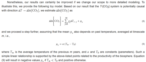
In this model, the trend in CO2 is explained almost exclusively by the mean temperature effect mu_v = alpha*(T-T0). That effect is entirely ad hoc, with no basis in the impulse response framework.

How do we get into this pickle? I think the simple answer is that the authors’ specification of the system is incomplete. As above, they define a causal system,

y(t) = ∫g1(h)x(t-h)dh

x(t) = ∫g2(h)y(t-h)dh

where g(.) is an impulse response function weighting lags h and the integral is over h from 0 to infinity (because only nonnegative lags are causal). In their implementation, x and y are first differences, so in their climate example, Δlog(CO2) and ΔTemp. In the estimation of the impulse lag structures g(.), the authors impose nonnegativity and (optionally) smoothness constraints.

A more complete specification is roughly:

Y = A*X + U

dX/dt = B*X + E

where

  • X is a vector of system states (e.g., CO2 and temperature)
  • Y is a vector of measurements (observed CO2 and temperature)
  • A and B are matrices of coefficients (this is a linear view of the system, but could easily be generalized to nonlinear functions)
  • E is driving noise perturbing the state, and therefore integrated into it
  • U is measurement error

My notation could be improved to consider covariance and state-dependent noise, though it’s not really necessary here. Fred Schweppe wrote all this out decades ago in Uncertain Dynamic Systems, and you can now find it in many texts like Stengel’s Optimal Control and Estimation. Dixit and Pindyck transplanted it to economics and David Peterson brought it to SD where it found its way into Vensim as the combination of Kalman filtering and optimization.

How does this avoid the pitfalls of the Koutsoyiannis et al. approach?

  • An element of X can integrate any other element of X, including itself.
  • There are no arbitrary restrictions (like nonnegativity) on the impulse response function.
  • The system model (A, B, and any nonlinear elements augmenting the framework) can incorporate a priori structural knowledge (e.g., physics).
  • Driving noise and measurement error are recognized and can be estimated along with everything else.

Does the difference matter? I’ll leave that for a second post with some examples.


Computer Collates Climate Contrarian Claims

Coan et al. in Nature have an interesting text analysis of climate skeptics’ claims.

I’ve been at this long enough to notice that a few perennial favorites are missing, perhaps because they date from the 90s, prior to the dataset.

The big one is “temperature isn’t rising” or “the temperature record is wrong.” This has lots of moving parts. Back in the 90s, a key idea was that satellite MSU records showed falling temperatures, implying that the surface station record was contaminated by Urban Heat Island (UHI) effects. That didn’t end well, when it turned out that the UAH code had errors and the trend reversed when they were fixed.

Later UHI made a comeback when the SurfaceStations project crowdsourced an assessment of temperature station quality. Some turned out to be pretty bad. But again, when the dust settled, it turned out that the temperature trend was bigger, not smaller, when poor sites were excluded and TOD was corrected. This shouldn’t have been a surprise, because windy day analsyses and a dozen other things already ruled out UHI, but …

I consider this a reminder of the fact that part of the credibility of mainstream climate science arises not from the fact that models are so good, but because so many alternatives have been tried, and proved so bad, only to rise again and again.

Climate Skeptics in Search of Unity

The most convincing thing about mainstream climate science is not that the models are so good, but that the alternatives are so bad.

Climate skeptics have been at it for 40 years, but have produced few theories or predictions that have withstood the test of time. Even worse, where there were once legitimate measurement issues and model uncertainties to discuss, as those have fallen one by one, the skeptics are doubling down on theories that rely on “alternative” physics. The craziest ideas get the best acronyms and metaphors. The allegedly skeptical audience welcomes these bizarre proposals with enthusiasm. As they turn inward, they turn on each other.

The latest example is in the Lungs of Gaia at WUWT:

A fundamental concept at the heart of climate science is the contention that the solar energy that the disk of the Earth intercepts from the Sun’s irradiance must be diluted by a factor of 4. This is because the surface area of a globe is 4 times the interception area of the disk silhouette (Wilde and Mulholland, 2020a).

This geometric relationship of divide by 4 for the insolation energy creates the absurd paradox that the Sun shines directly onto the surface of the Earth at night. The correct assertion is that the solar energy power intensity is collected over the full surface area of a lit hemisphere (divide by 2) and that it is the thermal radiant exhaust flux that leaves from the full surface area of the globe (divide by 4).

Setting aside the weird pedantic language that seems to infect those with Galileo syndrome, these claims are simply a collection of errors. The authors seem to be unable to understand the geometry of solar flux, even though this is taught in first-year physics.

Some real college physics (divide by 4).

The “divide by 4” arises because the solar flux intercepted by the earth is over an area pi*r^2 (the disk of the earth as seen from the sun) while the average flux normal to the earth’s surface is over an area 4*pi*r^2 (the area of a sphere).

The authors’ notion of “divide by 2” resulting in 1368/2 = 684 w/m^2 average is laughable because it implies that the sun is somehow like a luminous salad bowl that delivers light at 1368 w/m^2 normal to the surface of one side of the earth only. That would make for pretty interesting sunsets.

In any case, none of this has much to do with the big climate models, which don’t “dilute” anything, because they have explicit geometry of the earth and day/night cycles with small time steps. So, all of this is already accounted for.

To his credit, Roy Spencer – a hero of the climate skeptics movement of the same magnitude as Richard Lindzen – arrives early to squash this foolishness:

How can some people not comprehend that the S/4 value of solar flux does NOT represent the *instantaneous* TOA illumination of the whole Earth, but instead the time-averaged (1-day or longer) solar energy available to the whole Earth. There is no flat-Earth assumption involved (in fact, dividing by 4 is because the Earth is approximately spherical). It is used in only simplistic treatments of Earth’s average energy budget. Detailed calculations (as well as 4D climate models as well as global weather forecast models) use the full day-night (and seasonal) cycle in solar illumination everywhere on Earth. The point isn’t even worth arguing about.

Responding to the clueless authors:

Philip Mulholland, you said: “Please confirm that the TOA solar irradiance value in a climate model cell follows the full 24 hour rotational cycle of daytime illumination and night time darkness.”

Oh, my, Philip… you cannot be serious.

Every one of the 24+ climate models run around the world have a full diurnal cycle at every gridpoint. This is without question. For example, for models even 20+ years ago start reading about the diurnal cycles in the models on page 796 of the following, which was co-authored by representatives from all of the modeling groups: https://www.ipcc.ch/site/assets/uploads/2018/02/WG1AR5_Chapter09_FINAL.pdf

Finally:

Philip, Ed Bo has hit the nail on the head. Your response to him suggests you do not understand even the basics of climate modeling, and I am a little dismayed that your post appeared on WUWT.

Undeterred, the WUWT crowd then proceeds to savage anyone, including their erstwhile hero Spencer, who dares to challenge the new “divide by 2” orthodoxy.

Dr roy with his fisher price cold warms hot physics tried to hold the line for the luke-warmers, but soon fecked off when he knew he would be embarrassed by the grown-ups in the room…..

This is not the first time a WUWT post has claimed to overturn climate science. There are others, like the 2011 Unified Theory of Climate. It’s basically technobabble, notable primarily for its utter obscurity in the nine years following. It’s not really worth analyzing, though I am a little curious how a theory driven by static atmospheric mass explains dynamics. Also, I notice that the perfect fit to the data for 7 planets in Fig. 5 has 7 parameters – ironic, given that accusations of overparameterization are a perennial favorite of skeptics. Amusingly, one of the authors of the “divide by two” revolution (Wilde) appears in the comments to point out his alternative “Unifying” Theory of Climate.

Are these alternate theories in agreement, mutually exclusive, or just not even wrong? It would be nice if skeptics would get together and decide which of their grand ideas is the right one. Does atmospheric pressure run the show, or is it sunspots? And which fundamentals that mathematicians and physicists screwed up have eluded verification for all these years? Is it radiative transfer, or the geometry of spheres and disks? Is energy itself misdefined? Inquiring minds want to know.

The bottom line is that Roy Spencer is right. It isn’t worth arguing about these things, any more than its worth arguing with flat earthers or perpetual motion enthusiasts. Engaging will just leave you wondering if proponents are serious, as in seriously deluded, or just yanking your chain while keeping a straight face.


Climate Bathtub Chartjunk

I just ran across Twist and Shout: Images and Graphs in Skeptical Climate Media, a compendium of cherry picking and other chartjunk abuses.

I think it misses a large class of (often willful) errors: ignoring the climate bathtub. Such charts typically plot CO2 emissions or concentration against temperature, with the implication that any lack of correlation indicates a problem with the science. But this engages in a combination of a pattern matching fallacy and fallacy of the single cause. Sometimes these things make it into the literature, but most live on swampy skeptic sites.

An example, reportedly from John Christy, who should know better:

Notice how we’re supposed to make a visual correlation between emissions and temperature (even though two integrations separate them, and multiple forcings and noise influence temperature). Also notice how the nonzero minimum axis crossing for CO2 exaggerates the effect. That’s in addition to the usual tricks of inserting an artificial trend break at the 1998 El Nino and truncating the rest of history.

Silver Lining to the White House Climate Panel?

The White House is reportedly convening a panel to reexamine the scientific consensus on climate. How does that work, exactly? Are they going to publish thousands of new papers to shift the apparent balance of opinion in the scientific literature? And hasn’t analysis of consensus already been done to death, with a null result for the skeptics?

The problem is that there isn’t much for skeptics to work with. There aren’t any models that make useful predictions with very low climate sensitivity. In fact, skeptical predictions haven’t really panned out at all. Lindzen’s Adaptive Iris is still alive – sort of – but doesn’t result in a strong negative feedback. The BEST reanalysis didn’t refute previous temperature data. The surfacestations.org effort used crowdsourcing to reveal some serious weather station siting problems, which ultimately amounted to nothing.

And those are really the skeptics’ Greatest Hits. After that, it’s a rapid fall from errors to nuts. No, satellites temperatures don’t show a negative trend. Yes, Fourier and wavelet analyses are typically silly, but fortunately tend to refute themselves quickly. This list could grow long quickly, though skeptics are usually pretty reluctant to make testable models or predictions. That’s why even prominent outlets for climate skepticism have to resort to simple obfuscation.

So, if there’s a silver lining to the proposed panel, it’s that they’d have to put the alleged skeptics’ best foot forward, by collecting and identifying the best models, data and predictions. Then it would be readily apparent what a puny body of evidence that yielded.


Fancy Stats and Silly Climate Contests

Climate skeptics seem to have a thing for contests and bets. For example, there’s Armstrong’s proposed bet, baiting Al Gore. Amusingly (for data nerds anyway), the bet, which pitted a null forecast against the taker’s chosen climate model, could have been beaten easily by either a low-order climate model or a less-naive null forecast. And, of course, it completely fails to understand that climate science is not about fitting a curve to the global temperature record.

Another instance of such foolishness recently came to my attention. It doesn’t have a name that I know of, but here’s the basic idea:

  • The author generates 1000 time series:

Each series has length 135: the same length as that of the most commonly studied series of global temperatures (which span 1880–2014). The 1000 series were generated as follows. First, 1000 random series were obtained (for more details, see below). Then, some of those series were randomly selected and had a trend added to them. Each added trend was either 1°C/century or −1°C/century. For comparison, a trend of 1°C/century is greater than the trend that is claimed for global temperatures.

  • The challenger pays $10 for the privilege of attempting to detect which of the 1000 series are perturbed by a trend, winning $100,000 for correctly identifying 90% or more.

The best challenger managed to identify 860 series, so the prize went unclaimed. But only two challenges are described, so I have to wonder how many serious attempts were made. Had I known about the contest in advance, I would not have tried it. I know plenty about fitting dynamic models to data, though abstract statistical methods aren’t really my thing. But I still have to ask myself some questions:

  • Is there really money to be made, or will the author simply abscond to the pub with my $10? For the sake of argument, let’s assume that the author really has $100k at stake.
  • Is it even possible to win? The author did not reveal the process used to generate the series in advance. That alone makes this potentially a sucker bet. If you’re in control of the noise and structure of the process, it’s easy to generate series that are impossible to reliably disentangle. (Tellingly, the author later revealed the code to generate the series, but it appears there’s no code to successfully identify 90%!)

For me, the statistical properties of the contest make it an obvious non-starter. But does it have any redeeming social value? For example, is it an interesting puzzle that has something to do with actual science? Sadly, no.

The hidden assumption of the contest is that climate science is about estimating the trend of the global temperature time series. Yes, people do that. But it’s a tiny fraction of climate science, and it’s a diagnostic of models and data, not a real model in itself. Science in general is not about such things. It’s about getting a good model, not a good fit. In some places the author talks about real physics, but ultimately seems clueless about this – he’s content with unphysical models:

Moreover, the Contest model was never asserted to be realistic.

Are ARIMA models truly appropriate for climatic time series? I do not have an opinion. There seem to be no persuasive arguments for or against using ARIMA models. Rather, studying such models for climatic series seems to be a worthy area of research.

Liljegren’s argument against ARIMA is that ARIMA models have a certain property that the climate system does not have. Specifically, for ARIMA time series, the variance becomes arbitrarily large, over long enough time, whereas for the climate system, the variance does not become arbitrarily large. It is easy to understand why Liljegren’s argument fails.

It is a common aphorism in statistics that “all models are wrong”. In other words, when we consider any statistical model, we will find something wrong with the model. Thus, when considering a model, the question is not whether the model is wrong—because the model is certain to be wrong. Rather, the question is whether the model is useful, for a particular application. This is a fundamental issue that is commonly taught to undergraduates in statistics. Yet Liljegren ignores it.

As an illustration, consider a straight line (with noise) as a model of global temperatures. Such a line will become arbitrarily high, over long enough time: e.g. higher than the temperature at the center of the sun. Global temperatures, however, will not become arbitrarily high. Hence, the model is wrong. And so—by an argument essentially the same as Liljegren’s—we should not use a straight line as a model of temperatures.

In fact, a straight line is commonly used for temperatures, because everyone understands that it is to be used only over a finite time (e.g. a few centuries). Over a finite time, the line cannot become arbitrarily high; so, the argument against using a straight line fails. Similarly, over a finite time, the variance of an ARIMA time series cannot become arbitrarily large; so, Liljegren’s argument fails.

Actually, no one in climate science uses straight lines to predict future temperatures, because forcing is rising, and therefore warming will accelerate. But that’s a minor quibble, compared to the real problem here. If your model is:

global temperature = f( time )

you’ve just thrown away 99.999% of the information available for studying the climate. (Ironically, the author’s entire point is that annual global temperatures don’t contain a lot of information.)

No matter how fancy your ARIMA model is, it knows nothing about conservation laws, robustness in extreme conditions, dimensional consistency, or real physical processes like heat transfer. In other words, it fails every reality check a dynamic modeler would normally apply, except the weakest – fit to data. Even its fit to data is near-meaningless, because it ignores all other series (forcings, ocean heat, precipitation, etc.) and has nothing to say about replication of spatial and seasonal patterns. That’s why this contest has almost nothing to do with actual climate science.

This is also why data-driven machine learning approaches have a long way to go before they can handle general problems. It’s comparatively easy to learn to recognize the cats in a database of photos, because the data spans everything there is to know about the problem. That’s not true for systemic problems, where you need a web of data and structural information at multiple scales in order to understand the situation.

Climate and Competitiveness

Trump gets well-deserved criticism for denying having claimed that the Chinese invented climate change to make  US manufacturing non-competitive.

climatechinesehoax

The idea is absurd on its face. Climate change was proposed long before (or long after) China figured on the global economic landscape. There was only one lead author from China out of the 34 in the first IPCC Scientific Assessment. The entire climate literature is heavily dominated by the US and Europe.

But another big reason to doubt its veracity is that climate policy, like emissions pricing, would make Chinese manufacturing less competitive. In fact, at the time of the first assessment, China was the most carbon-intensive economy in the world, according to the World Bank:

chinaintensity

Today, China’s carbon intensity remains more than twice that of the US. That makes a carbon tax with a border adjustment an attractive policy for US competitiveness. What conspiracy theory makes it rational for China to promote that?

How many things can you get wrong on one chart?

Let’s count:

  1. stupidGraphTruncate records that start ca. 1850 at an arbitrary starting point.
  2. Calculate trends around a breakpoint cherry-picked to most favor your argument.
  3. Abuse polynomial fits generally. (See this series.)
  4. Report misleading linear trends by simply dropping the quadratic term.
  5. Fail to notice the obvious: that temperature in the second period is, on average, higher than in the first.
  6. Choose a loaded color scheme that emphasizes #5.
  7. Fail to understand that temperature integrates CO2.
  8. Fallacy of the single cause (only CO2 affects temperature – in good company with Burt Rutan).

Summary for Suckers

The NIPCC critique is, ironically, a compelling argument in favor of the IPCC assessment. Why? Well, science is about evaluation of competing hypotheses. The NIPCC report collects a bunch of alternatives to mainstream climate science in one place, where it’s easy to see how pathetic they are. If this is the best climate skeptics can muster, their science must be exceedingly weak.

The NIPCC (Nongovernmental International Panel on Climate Change, a.k.a. Not IPCC) is the Heartland Institute’s rebuttal of the IPCC assessments. Apparently the latest NIPCC report has been mailed to zillions of teachers. As a homeschooling dad, I’m disappointed that I didn’t get mine. Well, not really.

It would probably take more pages to debunk the NIPCC report than it occupies, but others are chipping away at it. Some aspects, like temperature cherry-picking, are like shooting fish in a barrel.

The SPM, and presumably the entire report that it summarizes, seems to labor under the misapprehension that the IPCC is itself a body that conducts science. In fact, the IPCC assessments are basically a giant literature review. So, when the Heartland panel writes,

In contradiction of the scientific method, the IPCC assumes its implicit hypothesis is correct and that its only duty is to collect evidence and make plausible arguments in the hypothesis’s favor.

we must remember that “the IPCC” is shorthand for a vast conspiracy of scientists, coordinated by an invisible hand.

The report organizes the IPPC argument into 3 categories: “Global Climate Model (GCM) projections,” “postulates,” and “circumstantial evidence.” This is a fairly ridiculous caricature of the actual body of work. Most of what is dismissed as postulates could better be described as, “things we’re too lazy to explore properly,” for example. But my eye strays straight to the report’s misconceptions about modeling.

First, the NIPCC seems to have missed the fact that GCMs are not the only models in use. There are EMICS (models of intermediate complexity) and low-order energy balance models as well.

The NIPCC has taken George Box’s “all models are wrong, some are useful” and run with it:

… Global climate models produce meaningful results only if we assume we already know perfectly how the global climate works, and most climate scientists say we do not (Bray and von Storch, 2010).

How are we to read this … all models are useless, unless they’re perfect? Of course, no models are perfect, therefore all models are useless. Now that’s science!

NIPCC trots out a von Neumann quote that’s almost as tired as Box:

with four parameters I can fit an elephant, and with five I can make him wiggle his trunk

In models with lots of reality checks available (i.e. laws of physics), it just isn’t that easy. And the earth is a very big elephant, which means that there’s a rather vast array of data to be fit.

The NIPCC seems to be aware of only a few temperature series, but the AR5 report devotes 200 pages (Chapter 9) to model evaluation, with results against a wide variety of spatial and temporal distributions of physical quantities. Models are obviously far from perfect, but a lot of the results look good, in ways that exceed the wildest dreams of social system modelers.

NIPCC doesn’t seem to understand how this whole “fit” thing works.

Model calibration is faulty as it assumes all temperature rise since the start of the industrial revolution has resulted from human CO2 emissions.

This is blatantly false, not only because it contradicts the actual practice of attribution, but because there is no such parameter as “fraction of temp rise due to anthro CO2.” One can’t assume the answer to the attribution question without passing through a lot of intermediate checks, like conforming to physics and data other than global temperature. In complex models, where the contribution of any individual parameter to the outcome is likely to be unknown to the modeler, and the model is too big to calibrate by brute force, the vast majority of parameters must be established bottom up, from physics or submodels, which makes it extremely difficult for the modeler to impose preconceptions on the complete model.

Similarly,

IPCC models stress the importance of positive feedback from increasing water vapor and thereby project warming of ~3-6°C, whereas empirical data indicate an order of magnitude less warming of ~0.3-1.0°C.

Data by itself doesn’t “indicate” anything. Data only speaks insofar as it refutes (or fails to refute) a model. So where is the NIPCC model that fits available data and yields very low climate sensitivity?

The bottom line is that, if it were really true that models have little predictive power and admit many alternative calibrations (a la the elephant), it should be easy for skeptics to show model runs that fit the data as well as mainstream results, with assumptions that are consistent with low climate sensitivity. They wouldn’t necessarily need a GCM and a supercomputer; modest EBMs or EMICs should suffice. This they have utterly failed to demonstrate.


Equation Soup

Most climate skepticism I encounter these days has transparently crappy technical content, if it has any at all. It’s become boring to read.

But every once in a while a paper comes along that is sufficiently complex and free of immediately obvious errors that it becomes difficult to evaluate. One recent example that came across my desk is,

Polynomial cointegration tests of anthropogenic impact on global warming Continue reading “Equation Soup”