Diagrams vs. Models

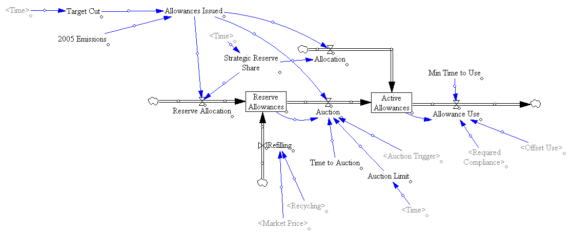
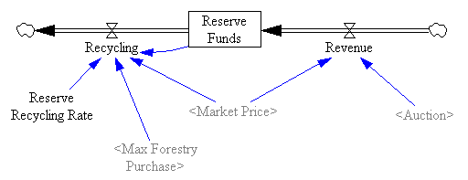
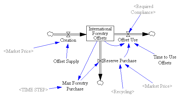
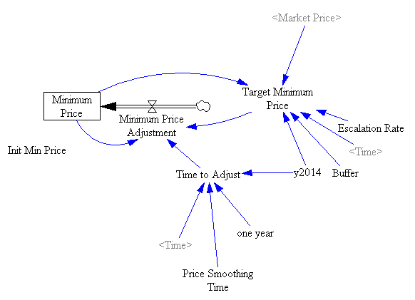
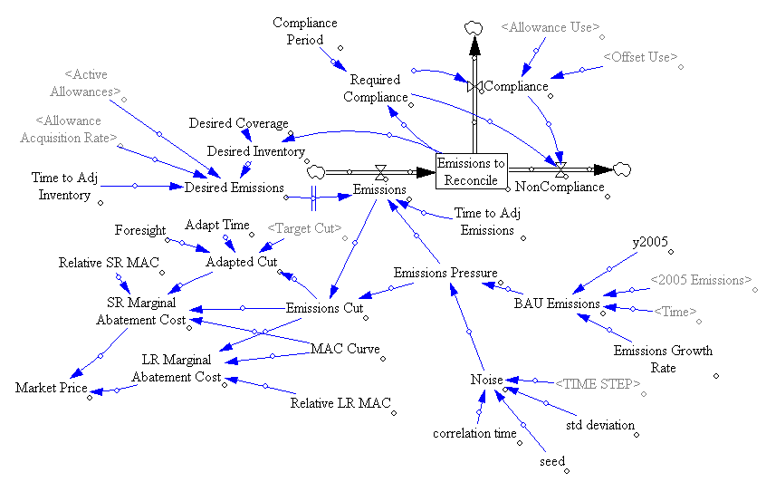
Following Bill Harris’ comment on Are causal loop diagrams useful? I went looking for Coyle’s hybrid influence diagrams. I didn’t find them, but instead ran across this interesting conversation in the SDR:

The tradition, one might call it the orthodoxy, in system dynamics is that a problem can only be analysed, and policy guidance given, through the aegis of a fully quantified model. In the last 15 years, however, a number of purely qualitative models have been described, and have been criticised, in the literature. This article briefly reviews that debate and then discusses some of the problems and risks sometimes involved in quantification. Those problems are exemplified by an analysis of a particular model, which turns out to bear little relation to the real problem it purported to analyse. Some qualitative models are then reviewed to show that they can, indeed, lead to policy insights and five roles for qualitative models are identified. Finally, a research agenda is proposed to determine the wise balance between qualitative and quantitative models.

… In none of this work was it stated or implied that dynamic behaviour can reliably be inferred from a complex diagram; it has simply been argued that describing a system is, in itself, a useful thing to do and may lead to better understanding of the problem in question. It has, on the other hand, been implied that, in some cases, quantification might be fraught with so many uncertainties that the model’s outputs could be so misleading that the policy inferences drawn from them might be illusory. The research issue is whether or not there are circumstances in which the uncertainties of simulation may be so large that the results are seriously misleading to the analyst and the client. … This stream of work has attracted some adverse comment. Lane has gone so far as to assert that system dynamics without quantified simulation is an oxymoron and has called it ‘system dynamics lite (sic)’. …

Coyle (2000) Qualitative and quantitative modelling in system dynamics: some research questions

Jack Homer and Rogelio Oliva aren’t buying it:

Geoff Coyle has recently posed the question as to whether or not there may be situations in which computer simulation adds no value beyond that gained from qualitative causal-loop mapping. We argue that simulation nearly always adds value, even in the face of significant uncertainties about data and the formulation of soft variables. This value derives from the fact that simulation models are formally testable, making it possible to draw behavioral and policy inferences reliably through simulation in a way that is rarely possible with maps alone. Even in those cases in which the uncertainties are too great to reach firm conclusions from a model, simulation can provide value by indicating which pieces of information would be required in order to make firm conclusions possible. Though qualitative mapping is useful for describing a problem situation and its possible causes and solutions, the added value of simulation modeling suggests that it should be used for dynamic analysis whenever the stakes are significant and time and budget permit.

Homer & Oliva (2001) Maps and models in system dynamics: a response to Coyle

Coyle rejoins:

This rejoinder clarifies that there is significant agreement between my position and that of Homer and Oliva as elaborated in their response. Where we differ is largely to the extent that quantification offers worthwhile benefit over and above analysis from qualitative analysis (diagrams and discourse) alone. Quantification may indeed offer potential value in many cases, though even here it may not actually represent ‘‘value for money’’. However, even more concerning is that in other cases the risks associated with attempting to quantify multiple and poorly understood soft relationships are likely to outweigh whatever potential benefit there might be. To support these propositions I add further citations to published work that recount effective qualitative-only based studies, and I offer a further real-world example where any attempts to quantify ‘‘multiple softness’’ could have lead to confusion rather than enlightenment. My proposition remains that this is an issue that deserves real research to test the positions of Homer and Oliva, myself, and no doubt others, which are at this stage largely based on personal experiences and anecdotal evidence.

Coyle (2001) Rejoinder to Homer and Oliva

My take: I agree with Coyle that qualitative models can often lead to insight. However, I don’t buy the argument that the risks of quantification of poorly understood soft variables exceeds the benefits. First, if the variables in question are really too squishy to get a grip on, that part of the modeling effort will fail. Even so, the modeler will have some other working pieces that are more physical or certain, providing insight into the context in which the soft variables operate. Second, as long as the modeler is doing things right, which means spending ample effort on validation and sensitivity analysis, the danger of dodgy quantification will reveal itself as large uncertainties in behavior subject to the assumptions in question. Third, the mere attempt  to quantify the qualitative is likely to yield some insight into the uncertain variables, which exceeds that derived from the purely qualitative approach. In fact, I would argue that the greater danger lies in the qualitative approach, because it is quite likely that plausible-looking constructs on a diagram will go unchallenged, yet harbor deep conceptual problems that would be revealed by modeling.

I see this as a cost-benefit question. With infinite resources, a model always beats a diagram. The trouble is that in many cases time, money and the will of participants are in short supply, or can’t be justified given the small scale of a problem. Often in those cases a qualitative approach is justified, and diagramming or other elicitation of structure is likely to yield a better outcome than pure talk. Also, where resources are limited, an overzealous modeling attempt could lead to narrow focus, overemphasis on easily quantifiable concepts, and implementation failure due to too much model and not enough process. If there’s a risk to modeling, that’s it – but that’s a risk of bad modeling, and there are many of those.

The Obscure Art of Datamodeling in Vensim

There are lots of good reasons for building models without data. However, if you want to measure something (i.e. estimate model parameters), produce results that are closely calibrated to history, or drive your model with historical inputs, you need data. Most statistical modeling you’ll see involves static or dynamically simple models and well-behaved datasets: nice flat files with uniform time steps, units matching (or, alarmingly, ignored), and no missing points. Things are generally much messier with a system dynamics model, which typically has broad scope and (one would hope) lots of dynamics. The diversity of data needed to accompany a model presents several challenges:

  • disagreement among sources
  • missing data points
  • non-uniform time intervals
  • variable quality of measurements
  • diverse source formats (spreadsheets, text files, databases)

The mathematics for handling the technical estimation problems were developed by Fred Schweppe and others at MIT decades ago. David Peterson’s thesis lays out the details for SD-type models, and most of the functionality described is built into Vensim. It’s also possible, of course, to go a simpler route; even hand calibration is often effective and reasonably quick when coupled with Synthesim.

Either way, you have to get your data corralled first. For a simple model, I’ll build the data right into the dynamic model. But for complicated models, I usually don’t want the main model bogged down with units conversions and links to a zillion files. In that case, I first build a separate datamodel, which does all the integration and passes cleaned-up series to the main model as a fast binary file (an ordinary Vensim .vdf). In creating the data infrastructure, I try to maximize three things:

  1. Replicability. Minimize the number of manual steps in the process by making the data model do everything. Connect the datamodel directly to primary sources, in formats as close as possible to the original. Automate multiple steps with command scripts. Never use hand calculations scribbled on a piece of paper, unless you’re scrupulous about lab notebooks, or note the details in equations’ documentation field.
  2. Transparency. Often this means “don’t do complex calculations in spreadsheets.” Spreadsheets are very good at some things, like serving as a data container that gives good visibility. However, spreadsheet calculations are error-prone and hard to audit. So, I try to do everything, from units conversions to interpolation, in Vensim.
  3. Quality.#1 and #2 already go a long way toward ensuring quality. However, it’s possible to go further. First, actually look at the data. Take time to build a panel of on-screen graphs so that problems are instantly visible. Use a statistics or visualization package to explore it. Lately, I’ve been going a step farther, by writing Reality Checks to automatically test for discontinuities and other undesirable properties of spliced time series. This works well when the data is simply to voluminous to check manually.

This can be quite a bit of work up front, but the payoff is large: less model rework later, easy updates, and higher quality. It’s also easier generate graphics or statistics that help others to gain confidence in the model, though it’s sometimes important to help them recognize that goodness of fit is a weak test of quality.

It’s good to build the data infrastructure before you start modeling, because that way your drivers and quality control checks are in place as you build structure, so you avoid the pitfalls of an end-of-pipe inspection process. A frequent finding in our corporate work has been that cherished data is in fact rubbish, or means something quite different that what users have historically assumed. Ventana colleague Bill Arthur argues that modern IT practices are making the situation worse, not better, because firms aren’t retaining data as long (perhaps a misplaced side effect of a mania for freshness).

Continue reading “The Obscure Art of Datamodeling in Vensim”

Strategic Excess? Insights

Model in hand, I tried some experiments (actually I built the model iteratively, while experimenting, but it’s hard to write that way, so I’m retracing my steps).

First, the “general equilbrium equivalent” version: no volatility, no SR marginal cost penalty for surprise, and firms see the policy coming. Result: smooth price escalation, and the strategic reserve is never triggered. Allowances just pile up in the reserve:

smoothallow.png

smoothprice.png

Since allowances accumulate, the de facto cap is 1-3% lower (by the share of allowances allocated to the reserve).

If there’s noise (SD=4.4%, comparable to petroleum demand), imperfect foresight, and short run adjustment costs, the market is more volatile:

volatileprice.png

However, something strange happens. The stock of reserve allowances actually increases, even though some reserves are auctioned intermittently. That’s due to the refilling mechanism. An early auction, plus overreaction by firms, triggers a near-collapse in allowance prices (as happened in the ETS). Thus revenues generated in the reserve auction at high prices used to buy a lot of forestry offsets at very low prices:

volatileallow.png

Could this happen in reality? I’m not sure – it depends on timing, behavior, and details of the recycling implementation. I think it’s safe to say that the current design is not robust to such phenomena. Fortunately, the market impact over the long haul is not great, because the extra accumulated allowances don’t get used (they pile up, as in the smooth case).

So, what is the reserve really accomplishing? Not much, it seems. Here’s the same trajectory, with volatility but no strategic reserve system:

noreserveprice.png

The mean price with the reserve (blue) is actually slightly higher, because the reserve mainly squirrels away allowances, without ever releasing them. Volatility is qualitatively the same, if not worse. That doesn’t seem like a good trade (unless you like the de facto emissions cut, which could be achieved more easily by lowering the cap and scrapping the reserve mechanism).

One reason the reserve fails to achieve its objectives is the recycling mechanism, which creates a perverse feedback loop that offsets the strategic reserve’s intended effect:

allowcld.png

The intent of the reserve is to add a balancing feedback loop (B2, green) that stabilizes price. The problem is, the recycling mechanism (R2, red) consumes international forestry offsets that would otherwise be available for compliance, thus working against normal market operations (B2, blue). Thus the mechanism is only helpful to the extent that it exploits clever timing (doubtful), has access to offsets unavailable to the broad market (also doubtful), or doesn’t recycle revenue to refill the reserve. If you have a reserve, but don’t refill, you get some benefit:

norecycleprice.png

Still, the reserve mechanism seems like a lot of complexity yielding little benefit. At best, it can iron out some wrinkles, but it does nothing about strong, sustained price excursions (due to picking an infeasible target, for example). Perhaps there is some other design that could perform better, by releasing and refilling the reserve in a more balanced fashion. That ideal starts to sound like “buy low, sell high” – which is what speculators in the market are supposed to do. So, again, why bother?

I suspect that a more likely candidate for stabilization, robust to uncertainty, involves some possible violation of the absolute cap (gasp!). Realistically, if there are sustained price excursions, congress will violate it for us, so perhaps its better to recognize that up front and codify some orderly process for adaptation. At the least, I think congress should scrap the current reserve, and write the legislation in such a way as to kick the design problem to EPA, subject to a few general goals. That way, at least there’d be time to think about the design properly.

Strategic Excess? The Model

It’s hard to get an intuitive grasp on the strategic reserve design, so I built a model (which I’m not posting because it’s still rather crude, but will describe in some detail). First, I’ll point out that the model has to be behavioral, dynamic, and stochastic. The whole point of the strategic reserve is to iron out problems that surface due to surprises or the cumulative effects of agent misperceptions of the allowance market. You’re not going to get a lot of insight about this kind of situation from a CGE or intertemporal optimization model – which is troubling because all the W-M analysis I’ve seen uses equilibrium tools. That means that the strategic reserve design is either intuitive or based on some well-hidden analysis.

Here’s one version of my sketch of market operations (click to enlarge):
Strategic reserve structure

It’s already complicated, but actually less complicated than the mechanism described in W-M. For one thing, I’ve made some process continuous (compliance on a rolling basis, rather than at intervals) that sound like they will be discrete in the real implementation.

The strategic reserve is basically a pool of allowances withheld from the market, until need arises, at which point they are auctioned and become part of the active allowance pool, usable for compliance:

m-allowances.png

Reserves auctioned are – to some extent – replaced by recycling of the auction revenue:

m-funds.png

Refilling the strategic reserve consumes international forestry offsets, which may also be consumed by firms for compliance. Offsets are created by entrepreneurs, with supply dependent on market price.

m-offsets.png

Auctions are triggered when market prices exceed a threshold, set according to smoothed actual prices:

m-trigger.png

(Actually I should have labeled this Maximum, not Minimum, since it’s a ceiling, not a floor.)

The compliance market is a bit complicated. Basically, there’s an aggregate firm that emits, and consumes offsets or allowances to cover its compliance obligation for those emissions (non-compliance is also possible, but doesn’t occur in practice; presumably W-M specifies a penalty). The firm plans its emissions to conform to the expected supply of allowances. The market price emerges from the marginal cost of compliance, which has long run and short run components. The LR component is based on eyeballing the MAC curve in the EPA W-M analysis. The SR component is arbitrarily 10x that, i.e. short term compliance surprises are 10x as costly (or the SR elasticity is 10x lower). Unconstrained firms would emit at a BAU level which is driven by a trend plus pink noise (the latter presumably originating from the business cyle, seasonality, etc.).

m-market.png

So far, so good. Next up: experiments.

Good modeling practices

Some thoughts I’ve been collecting, primarily oriented toward system dynamics modeling in Vensim, but relevant to any modeling endeavor:

  • Know why you’re building the model.
    • If you’re targeting a presentation or paper, write the skeleton first, so you know how the model will fill in the answers as you go.
  • Organize your data first.
    • No data? No problem. But surely you have some reference mode in mind, and some constraints on behavior, at least in extreme conditions.
    • In Vensim, dump it all into a spreadsheet, database, or text file and import it into a data model, using the Model>Import data… feature, GET XLS DATA functions, or ODBC.
    • Don’t put data in lookups (table functions) unless you must for some technical reason; they’re a hassle to edit and update, and lousy at distinguishing real data points from interpolation.
  • Keep a lab notebook. An open word processor while you work is useful. Write down hypotheses before you run, so that you won’t rationalize surprises. Continue reading “Good modeling practices”

Bonn – Are Developing Countries Asking For the Wrong Thing?

Yesterday’s news:

BONN, Germany (Reuters) – China, India and other developing nations joined forces on Wednesday to urge rich countries to make far deeper cuts in greenhouse gas emissions than planned by 2020 to slow global warming.

I’m sure that the mental model behind this runs something like, “the developed world created most of the problem up to this point, and they’re rich, so they should get busy making deep cuts, while we grow a little more to catch up.” Regardless of fairness considerations, that approach ignores the physics of the situation. If developing countries continue to increase emissions, it hardly matters how deep cuts are in the rich world. Either everyone plays along, or mitigation doesn’t work.

I fired up C-ROADS and ran a few scenarios to illustrate:

C-ROADS reduction scenarios

The top blue line is the AIFI business-as-usual, with rapid emissions growth. If rich nations stabilize emissions as of today, you get the red line – still much more than 2x CO2 at the end of the century. Whether the rich start cutting emissions a little (1%/yr, green) or a lot (5%/yr, green) after that makes relatively little difference, because emissions from the rich world quickly become a small share of the total. Getting everyone to merely stabilize emissions (at 2009 levels for the rich, 2020 for developing countries, black) makes a substantially bigger difference than deep cuts by the rich alone. Stabilizing CO2 in the atmosphere at a low level requires deep cuts by everyone (here 4%/year, brown).

If we’re serious about stabilization, it doesn’t make sense for the rich to decarbonize faster, so that the developing world can construct more carbon-dependent capital that will ultimately have to be deconstructed. It may sound “fair” in carbon-per-capita terms, but I don’t think that’s a very good measure of human welfare, and it’s unlikely to end up with a fair distribution of damages.

If the developing countries are really concerned about climate impacts (as they should be), they should be looking to the rich world for help getting onto a low-carbon path today, not in 20 years. They should also be willing to impose a carbon price on themselves. It won’t collapse their economies any more than it will ours. Without a price on carbon, rebound effects and leakage will eat up most gains, as the private sector responds to the real signal: “go green (but the price of carbon is zero, wink wink nudge nudge).” Their request to the rich should be about the transfers, property rights, and other changes it takes to get the job done with some measure of distributional fairness (a topic that won’t be popular in some circles).

Friendly Climate Science & Policy Models

Beth Sawin just presented our C-ROADS work in Copenhagen. The model will soon be available online and in other forms, for decision support and educational purposes. It helps people to understand the basic dynamics of the carbon cycle and climate, and to add up diverse regional proposals for emissions reductions, to see what they imply for the globe. It’s a small model, yet there are those who love it. No model can do everything, so I thought I’d point out a few other tools that are available online, fairly easy to use, and serve similar purposes.

FAIR

From MNP, Netherlands. Like C-ROADS, runs interactively. The downloadable demo version is quite sophisticated, but emphasizes discovery of emissions trajectories that meet goals and constraints, rather than characterization of proposals on the table. The full research version, with sector/fuel detail and marginal abatement costs, is available on a case-by-case basis. Backed up by some excellent publications.

JCM

Ben Matthews’ Java Climate Model. Another interactive tool. Generates visually stunning output in realtime, which is remarkable given the scale and sophistication of the underlying model. Very rich; it helps to know what you’re after when you start to get into the deeper levels.

MAGICC

The tool used in AR4 to summarize the behavior of 19 GCMs, facilitating more rapid scenario experimentation and sensitivity analysis. Its companion SCENGEN does nice regional maps, which I haven’t really explored. MAGICC takes a few seconds to run, and while it has a GUI, detailed input and output is buried in text files, so I’m stretching the term “friendly” here.

I think these are the premier accessible tools out there, but I’m sure I’ve forgotten a few, so I’ll violate my normal editing rules and update this post as needed.

Climate War Game – Is 2050 Temperature Locked In?

This slide became known as “the Angry Red Future” at the war game:
The Angry Red Future

Source: ORNL & Pew via Nature In the Field

After seeing the presentation around it, Eli Kintisch of Science asked me whether it was realistic to assume that 2050 climate is already locked in. (Keep in mind that we were living in 2015.) I guessed yes, then quickly ran a few simulations to verify. Then I lost my train of thought and lost track of Eli. So, for what it’s still worth, here’s the answer.

Continue reading “Climate War Game – Is 2050 Temperature Locked In?”