Don't just do something, stand there! Reflections on the counterintuitive behavior of complex systems, seen through the eyes of System Dynamics, Systems Thinking and simulation.
I’m not aware of a citation that’s on point to the question, but I suspect that digging into the economic roots of these alternatives would show that elasticity was (and is) typically employed in nondynamic situations, with proximate cause and effect, like the typical demand curve Q=P^e, where the first version is more convenient. In any case the economic notion of elasticity was introduced in 1890, long before econometrics, which is basically a child of the computational age. As a practical matter, in many situations the two interpretations will be functionally equivalent, but there are some important differences in edge cases.
If the relationship between x and y is black box, i.e. you don’t have or can’t solve the functional form, then the time-derivative (second) version may be the only possible approach. This seems rare. (It did come up from time to time in some early SD languages that lacked a function for extracting the slope from a lookup table.)
The time-derivative version however has a couple challenges. In a real simulation dt is a finite difference, so you will have an initialization problem: at the start of the simulation, observed dx/dt and dy/dt will be zero, with epsilon undefined. You may also have problems of small lags from finite dt, and sensitivity to noise.
The common constant-elasticity,
Y = Yr*(X/Xr)^elasticity
formulation itself is problematic in many cases, because it requires infinite price to extinguish demand, and produces infinite demand at 0 price. A more subtle problem is that the slope of this relationship is,
Y = elasticity*Yr/Xr*(X/Xr)^(elasticity-1)
for 0 < elasticity < 1, the slope of this relationship approaches infinity as X approaches 0 from the positive side. This gives feedback loops infinite gain around that point, and can lead to extreme behavior.
Constant elasticity with extreme slope near 0, e=.5
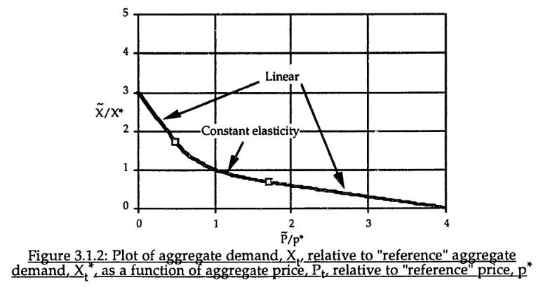
For robustness, an alternative functional form may be needed. For example, in market experiments Kampmann spliced linear segments onto a central constant-elasticity demand curve: https://dspace.mit.edu/handle/1721.1/13159?show=full (page 147):
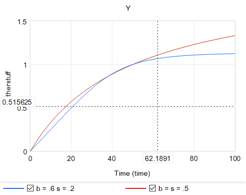
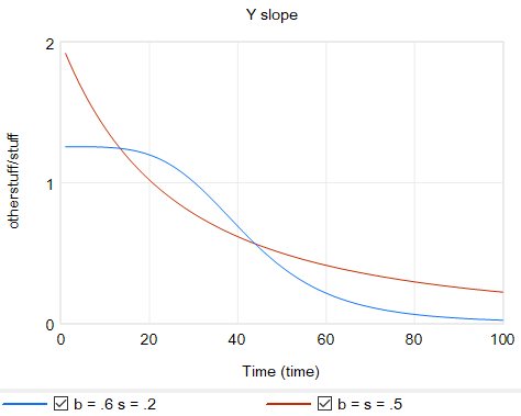
Another option is to change functional forms. It’s sensible to abandon the constant-elasticity assumption. One good way to do this for an upward-sloping supply curve or similar is with the CES (constant elasticity of substitution) production function, which ironically doesn’t have constant elasticity when used with a fixed factor. The equation is:
Y = Yr*(b + (1-b)*(X/Xr)^p)^(1/p)
with
p = (s-1)/s
where s is the elasticity of substitution. The production function interpretation of b is that it represents the share of a fixed factor in producing output Y. More generally, s and b control the shape of the curve, which conveniently passes through (0,0) and (Xr,Yr). There are two key differences between this shape and an elasticity formulation like Y=X^e:
The slope at 0,0 remains finite.
There’s an upper bound to Y for large X.
Output Y from CES with a fixed factor for two sets of b, s values.Slope for the same CES instances.
Another option that’s often useful is to use a sigmoid function.
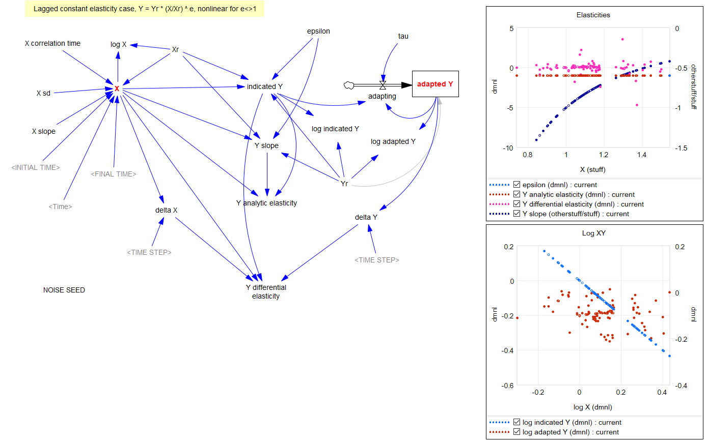
Returning to the original question, about the merits of (dy/y)/(dx/x) vs. the time-derivative form (dy/dt)/(dx/dt)*x/y, I think there’s one additional consideration: what if the causality isn’t exactly proximate, but rather involves an integration? For example, we might have something like:
Y* = Yr*(X/Xr)^elasticity ~ indicated Y
Y = SMOOTH( Y*, tau ) ~ actual Y with an adaptation lag tau
This is using quasi-Vensim notation of course. In this case, if we observe dY/dt, and compare it with dX/dt, we may be misled, because the effect of elasticity is confounded with the effect of the lag tau. This is especially true if tau is long relative to the horizon over which we observe the behavior.
Constant elasticity with noise and intervening stock.
This is a lot of words to potentially dodge Guido’s original question, but I hope it proves useful.
For completeness, here are some examples of some of the features discussed above. These should run in Vensim including free PLE (please comment if you find issues).
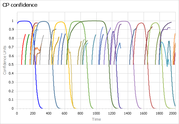
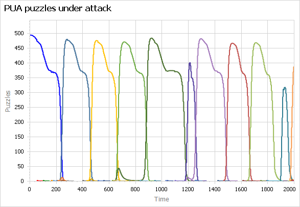
I’ve long wanted to translate the Sterman-Wittenberg model of Kuhnian paradigm revolutions to Ventity. The original was in Dynamo, and I translated that to Vensim, but neither is really satisfactory, because both require provisioning array space for new paradigms statically, before it’s needed. This means simulating lots of useless 0s, and even worse, looking at them in the output.
The model is about the lifecycle of scientific paradigms, so a central feature is the occasional introduction and evolution of new paradigms, which eventually accumulate enough anomalies to erode confidence, making them vulnerable to the next great idea. So ideally, you’d like to introduce new paradigms dynamically and delete them when they no longer have many adherents. Dynamic creation and deletion of entities is of course a core feature of Ventity – it’s the tool this model has been waiting for all those years.
I finally got around to translating my Vensim version to Ventity recently. It works beautifully:
Above, paradigm confidence, showing eight dominant paradigms as well as many smaller paradigms that never rise to dominance. They disappear when they run out of adherents. Below, puzzles under attack for the same paradigms.
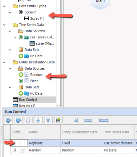
A minor note on use: the Run Config includes two setups: “replicate” and “random”. The “replicate” setup, which is inactive by default, launches paradigms at fixed times given by initialization data from a run of the Vensim version. This makes it possible to compare the simulations without divergence from randomness. However, the randomized run will normally be the more interesting way to work with this model.
The model (requires Ventity, which has a free trial license):
Most System Dynamics software includes a pair of TREND and FORECAST functions. For historic reasons, these are typically the simplest possible first-order structure, which is fine for continuous, deterministic models, but not the best for applications with noise or real data. The waters are further muddied by the fact that Excel has a TREND function that’s really FORECASTing, plus newer FORECAST functions with methods that may differ from typical SD practice. Business Dynamics describes a third-order TREND function that’s considerably better for real-world applications.
As a result of all this variety, I think trend measurement and forecasting remain unnecessarily mysterious, so I built the model below to compare several approaches.
Goal
The point of TREND and FORECAST functions is to model the formation of expectations in a way that closely matches what people in the model are really doing.
This could mean a wide variety of things. In many cases, people aren’t devoting formal thought to observing and predicting the phenomenon of interest. In that case, adaptive expectations may be a good model. The implementation in SD is the SMOOTH function. Using a SMOOTH to set expectations says that people expect the future to be like the past, and they perceive changes in conditions only gradually. This is great if the forecasted variable is in fact stationary, or at least if changes are slow compared to the perception time. On the other hand, for a fast-evolving situation like COVID19, delay can be fatal – literally.
For anything that is in fact changing (or that people perceive to be changing), it makes sense to project changes into the future with some kind of model. For a tiny fraction of reality, that might mean a sophisticated model: multiple regression, machine learning, or some kind of calibrated causal model, for example. However, most things are not subject to that kind of sophisticated scrutiny. Instead, expectations are likely to be formed by some kind of simple extrapolation of past trends into the future.
In some cases, things that are seemingly modeled in a sophisticated way may wind up looking a lot like extrapolation, due to human nature. The forecasters form a priori expectations of what “good” model projections look like, based on fairly naive adaptive-extrapolative expectations and social processes, and use those expectations to filter the results that are deemed acceptable. This makes the sophisticated results look a lot like extrapolation. However, the better the model, the harder it is for this to happen.
The goal, by the way, is generally not to use trend-like functions to make a forecast. Extrapolation may be perfectly reasonable in some cases, particularly where you don’t care too much about the outcome. But generally, you’re better off with a more sophisticated model – the whole point of SD and other methods is to address the feedback and nonlinearities that make extrapolation and other simpleminded methods go wrong. On the other hand, simple extrapolation may be great for creating a naive or null forecast to use as a benchmark for comparison with better approaches.
Basics
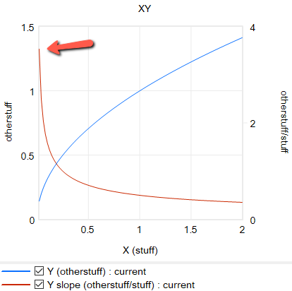
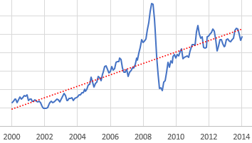
So, let’s suppose you want to model the expectations for something that people perceive to be (potentially) steadily increasing or decreasing. You can visit St. Louis FRED and find lots of economic series like this – GDP, prices, etc. Here’s the spot price of West Texas Intermediate crude oil:
Given this data, there are immediately lots of choices. Thinking about someone today making an investment conditional on future oil prices, should they extrapolate linearly (black and green lines) or exponentially (red line)? Should they use the whole series (black and red) or just the last few years (green)? Each of these implies a different forecast for the future.
Suppose we have some ideas about the forecast horizon, desired sensitivity to noise, etc. How do we actually establish a trend? One option is linear regression, which is just a formal way of eyeballing a straight line that fits some data. It works well, but has some drawbacks. First, it assigns equal weight to all the data throughout the interval, and zero weight to anything outside the interval. That may be a poor model for perceptual processes, where the most recent data has the greatest salience to the decision maker. Second, it’s computation- and storage-intensive: you have to do a lot of math, and keep track of every data point within the window of interest. That’s fine if it resides in a spreadsheet, but not if it resides in someone’s head.
Linear fit to a subset of the WTI spot price data.
The trend-like functions make an elegant simplification that addresses the drawbacks of regression. It’s based on the following observation:*
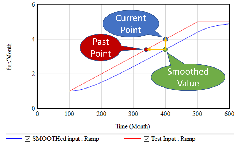
If, as above, you take a growing input (red line) and smooth it exponentially (using the SMOOTH function, or an equivalent first order goal-gap structure), you get the blue line: another ramp, that lags the input with a delay equal to the smoothing time. This means that, at month 400, we know two points: the current value of the input, and the current value of the smoothed input. But the smoothed value represents the past value of the input, in this case 60 months previous. So, we can use these two points to determine the slope of the red line:
(1) slope = (current - smoothed) / smoothing time
This is the slope in terms of input units per time. It’s often convenient to compute the fractional slope instead, expressing the growth as a fractional increase in the input per unit time:
This is what the simple TREND functions in SD software typically report. Note that it blows up if the smoothed quantity reaches 0, while the linear method (1) does not.
If we think the growth is exponential, rather than a linear ramp, we can compute the growth rate in continuous time:
(3) fractional growth rate = LN( current / smoothed ) / smoothing time
This has pros and cons. Obviously, if a quantity is really growing exponentially, it should be measured that way. But if we’re modeling how people actually think, they may extrapolate linearly when the underlying behavior is exponential, thereby greatly underestimating future growth. Note that the very idea of forecasting exponentially assumes that the values involved are positive.
Once you know the slope of the (estimated) line, you can extrapolate it into the future via a method that corresponds with the measurement:
(1b) future value = current + slope * forecast horizon
(2b) future value = current * (1 + fractional slope * forecast horizon)
(3b) future value = current * EXP( fractional growth rate * forecast horizon )
Typical FORECAST functions use (2b).
*There’s a nice discussion of this in Appendix L of Industrial Dynamics, around figure L-3.
Refinements
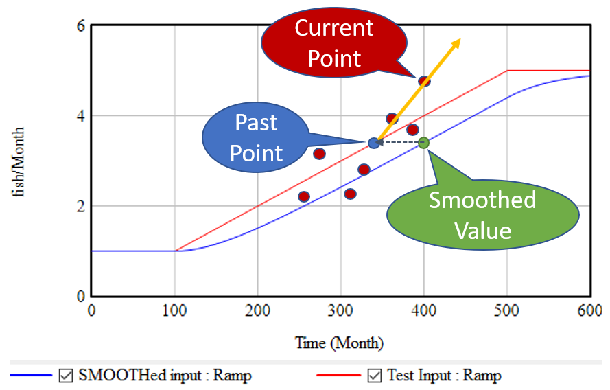
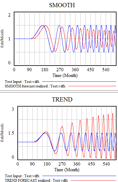
The strategy above has the virtue of great simplicity: you only need to keep track of one extra stock, and the computation needed to extrapolate is minimal. It works great for continuous models. Unfortunately, it’s not very resistant to noise and discontinuities. Consider what happens if the input is not a smooth line, but a set of noisy points scattered around the line:
The SMOOTH function filters the data, so the past point (blue) may still be pretty close to the underlying input trend (red line). However, the extrapolation (orange line) relies only on the past point and the single current point. Any noise or discontinuity in the current point therefore can dramatically influence the slope estimate and future projections. This is not good.
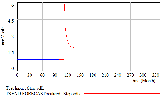
Similar perverse behaviors happen if the input is a pulse or step function. For example:
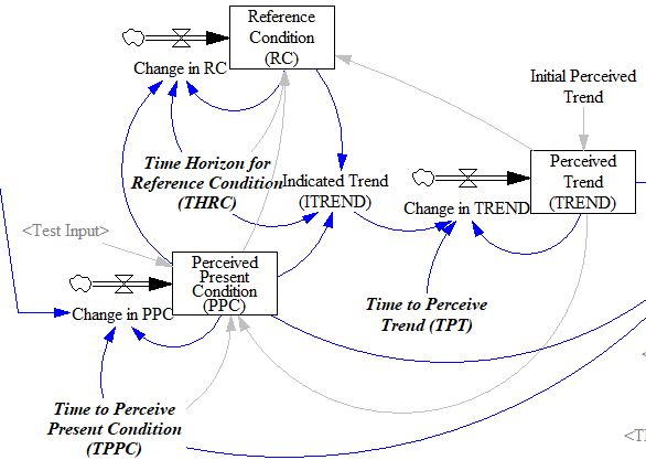
Fortunately, simple functions can be saved. In Expectation Formation in Behavioral Simulation Models, John Sterman describes an alternative third-order TREND function that improves robustness and realism. The same structure can be found in the excellent discussion of expectations in Business Dynamics, Chapter 16.
I’ll leave the details to the article, but the basic procedure is:
Recognize that the input is not perceived instantaneously, but only after some delay (represented by smoothing). This might capture the fact that formal accounting procedures only report results with a lag, or that you only see the price of cheese at the supermarket intermittently.
Track a historic point (the Reference Condition), by smoothing, as in the simpler methods.
Measure the Indicated Trend as the fractional slope between the Perceived Present Condition and the Reference Condition.
Smooth the Indicated Trend again to form the final Perceived Trend. The smoothing prevents abrupt changes in the indicated trend from causing dramatic overshoots or undershoots in the trend estimate and extrapolations that use it.
There’s an intermediate case that’s actually what I’m most likely to reach for when I need something like this: second-order smoothing. There are actually several very similar approaches (see double exponential smoothing for example) in the statistical literature. You have to be a little cautious, because these are often expressed in discrete time and therefore require a little thought to adapt to continuous time and/or unequal data intervals.
The version I use does the following:
(4) smoothed input = SMOOTH( input, smoothing time )

(5) linear trend = (input-smoothed input) / smoothing time
(6) smoothed trend = SMOOTH( linear trend, trend smoothing time )
(7) forecast = smoothed input + smoothed trend*(smoothing time + forecast horizon)
This provides most of what you want in a simple extrapolation method. It largely ignores a PULSE disturbance. Overshoot is mild when presented with a STEP input (as long as the smoothing times are long enough). It largely rejects noise, but still tracks a real RAMP accurately.
Back to regression
SD models typically avoid linear regression, for a reasons that are partly legitimate (as mentioned above). But it’s also partly cultural, as a reaction to incredibly stupid regressions that passed for models in other fields around the time of SD’s inception. We shouldn’t throw the baby out with that bathwater.
Fortunately, while most software doesn’t make linear regression particularly accessible, it turns out to be easy to implement an online regression algorithm with stocks and flows with no storage of data vectors required. The basic insight is that the regression slope (typically denoted beta) is given by:
(8) slope = covar(x,y) / var(x)
where x is time and y is the input to be forecasted. But var() and covar() are just sums of squares and cross products. If we’re OK with having exponential weighting of the regression, favoring more recent data, we can track these as moving sums (analogous to SMOOTHs). As a further simplification, as long as the smoothing window is not changing, we can compute var(x) directly from the smoothing window, so we only need to track the mean and covariance, yielding another second-order smoothing approach.
If the real decision makers inspiring your model are actually using linear regression, this may be a useful way to implement it. The implementation can be extended to equal weighting over a finite interval if needed. I find the second-order smoothing approach more intuitive, and it performs just as well, so I tend to prefer that in most cases.
Extensions
Most of what I’ve described above is linear, i.e. it assumes linear growth or decline of the quantity of interest. For a lot of things, exponential growth will be a better representation. Equations (3) and (3b) assume that, but any of the other methods can be adapted to assume exponential behavior by operating on the logarithm of the input, and then inverting that with exp(…) to form the final output.
All the models described here share one weakness: cyclical inputs.
When presented with a sin wave, the simplest approach – smoothing – just bulldozes through. The higher the frequency, the less of the signal passes into the forecast. The TREND function can follow a wave if the period is longer than the smoothing time. If the dynamics are faster, it starts to miss the turning points and overshoot dramatically. The higher-order methods are better, but still not really satisfactory. The bottom line is that your projection method must use a model capable of representing the signal, and none of the methods above embodies anything about cyclical behavior.
There are lots of statistical approaches to detection of seasonality, which you can google. Many involve binning techniques, similar to those described in Appendix N of Industrial Dynamics, Self Generated Seasonal Cycles.
The model
The Vensim model, with changes (.cin) files implementing some different experiments:
Beware of the interpretation of R0, and models that plug an R0 estimated in one context into a delay structure from another.
This started out as a techy post about infection models for SD practitioners interested in epidemiology. However, it has turned into something more important for coronavirus policy.
It began with a puzzle: I re-implemented my conceptual coronavirus model for multiple regions, tuning it for Italy and Switzerland. The goal was to use it to explore border closure policies. But calibration revealed a problem: using mainstream parameters for the incubation time, recovery time, and R0 yielded lukewarm growth in infections. Retuning to fit the data yields R0=5, which is outside the range of most estimates. It also makes control extremely difficult, because you have to reduce transmission by 1-1/R0 = 80% to stop the spread.
To understand why, I decided to solve the model analytically for the steady-state growth rate in the early infection period, when there are plenty of susceptible people, so the infection rate is unconstrained by availability of victims. That analysis is reproduced in the subsequent sections. It’s of general interest as a way of thinking about growth in SD models, not only for epidemics, but also in marketing (the Bass Diffusion model is essentially an epidemic model) and in growing economies and supply chains.
First, though, I’ll skip to the punch line.
The puzzle exists because R0 is not a complete description of the structure of an epidemic. It tells you some important things about how it will unfold, like how much you have to reduce transmission to stop it, but critically, not how fast it will go. That’s because the growth rate is entangled with the incubation and recovery times, or more generally the distribution of the generation time (the time between primary and secondary infections).
This means that an R0 value estimated with one set of assumptions about generation times (e.g., using the R package R0) can’t be plugged into an SEIR model with different delay structure assumptions, without changing the trajectory of the epidemic. Specifically, the growth rate is likely to be different. The growth rate is, unfortunately, pretty important, because it influences the time at which critical thresholds like ventilator capacity will be breached.
The mathematics of this are laid out clearly by Wallinga & Lipsitch. They approach the problem from generating functions, which give up simple closed-form solutions a little more readily than my steady-state growth calculations below. For example, for the SEIR model,
R0 = (1 + r/b1)(1 + r/b2) (Eqn. 3.2)
Where r is the growth rate, b1 is the inverse of the incubation time, and b2 is the inverse of the recovery time. If you plug in r = 0.3/day, b1 = 1/(5 days), b2 = 1/(10 days), R0 = 10, which is not plausible for COVID-19. Similarly, if you plug in the frequently-seen R0=2.4 with the time constants above, you get growth at 8%/day, not the observed 30%/day.
However, in almost every aspect that matters, R 0 is flawed. Diseases can persist with R 0 < 1, while diseases with R 0 > 1 can die out. We show that the same model of malaria gives many different values of R 0, depending on the method used, with the sole common property that they have a threshold at 1. We also survey estimated values of R 0 for a variety of diseases, and examine some of the alternatives that have been proposed. If R 0 is to be used, it must be accompanied by caveats about the method of calculation, underlying model assumptions and evidence that it is actually a threshold. Otherwise, the concept is meaningless.
Is this merely a theoretical problem? I don’t think so. Here’s how things stand in some online SEIR-type simulators:
*Observed in simulator; doesn’t match steady state calculation, so some feature is unknown.
**Est. from 6.5 day mean generation time, distributed around incubation time.
***Not reported; doubling time appears to be about 6 days.
I think this is certainly a Tower of Babel situation. It seems likely that the low-order age structure in the SEIR model is problematic for accurate representation of the dynamics. But it also seems like piecemeal parameter selection understates the true uncertainty in these values. We need to know the joint distribution of R0 and the generation time distribution in order to properly represent what is going on.
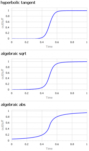
A question about sigmoid functions prompted me to collect a lot of small models that I’ve used over the years.
A sigmoid function is just a function with a characteristic S shape. (OK, you have to use your imagination a bit to get the S.) These tend to arise in two different ways:
As a nonlinear response, where increasing the input initially has little effect, then considerable effect, then saturates with little effect. Neurons, and transfer functions in neural networks, behave this way. Advertising is also thought to work like this: too little, and people don’t notice. Too much, and they become immune. Somewhere in the middle, they’re responsive.
Dynamically, as the behavior over time of a system with shifting dominance from growth to saturation. Examples include populations approaching carrying capacity and the Bass diffusion model.
Correspondingly, there are (at least) two modeling situations that commonly require the use of some kind of sigmoid function:
You want to represent the kind of saturating nonlinear effect described above, with some parameters to control the minimum and maximum values, the slope around the central point, and maybe symmetry features.
You want to create a simple scenario generator for some driver of your model that has logistic behavior, but you don’t want to bother with an explicit dynamic structure.
The examples in this model address both needs. They include:
I’m sure there are still a lot of alternatives I omitted. Cubic splines and Bezier curves come to mind. I’d be interested to hear of any others of interest, or just alternative parameterizations of things already here.
I’ve been working on a vehicle fleet model, re-implementing a spreadsheet in Ventity, using dynamic cohorts.
The vehicle lifetime in the spreadsheet is 11 years, and it’s discrete. This means that every vehicle retires precisely 11 years after it’s put into service. This raised a red flag for me, because it represents a rather short vehicle lifetime. I know from work in other jurisdictions that the average life of a vehicle is more like 16-18 years typically (and getting longer as quality improves).
So, where does the 11 year figure come from? We’re not sure. Other published data for the region indicates an average vehicle age of 8.5 years, so it’s not that. A Ventana colleague pointed out that it might be a steady-state estimate from combining vehicle fleet data with new vehicle sales data:
Given the data (red), assume that the vehicle stock is in equilibrium (inflow=outflow). Then it follows from Little’s Law that the average lifetime of vehicles must be 11 years. Little’s Law works regardless of the delay distribution, i.e. regardless of the delay order, but if you were formulating the fleet as a first-order system, that’s precisely how you’d write the outflow equation: outflow = fleet/lifetime, with lifetime=11 years.
… the long-term average number L of customers in a stationary system is equal to the long-term average effective arrival rate λ multiplied by the average time W that a customer spends in the system. – Wikipedia
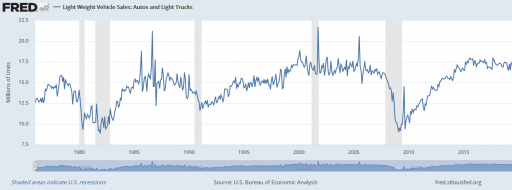
However, there’s a danger here. The system might not be in equilibrium. Then both the assumption of inflow=0utflow and the stationarity required in Little’s Law. Vehicle sales are, unfortunately, rather volatile, particularly around events like the 2008 recession:
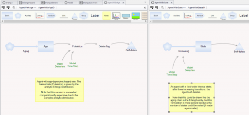
It’s tempting to use the average age of vehicles as another data point, but that turns out to be a bad idea. The average age of vehicles is sensitive to both variations in the inflow and the assumed distribution of the discard process. The following Ventity model illustrates this problem, using some of the same machinery as last week’s Erlang model.
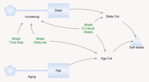
As before, there’s a population of entities (agents). Each has a cascade of N internal states, represented by a stock counter, and an age that increases continuously. An entity deletes itself when it’s too old, or its state count is too high.
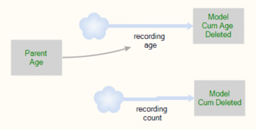
For accounting purposes, when an entity “dies” it records the event by incrementing counter stocks in the Model entity:
In this way, we can keep track of how old the average entity was at the time it deleted itself. This should be the average residence time in Little’s Law. We can also track the average age of existing entities, to see whether it’s the same.
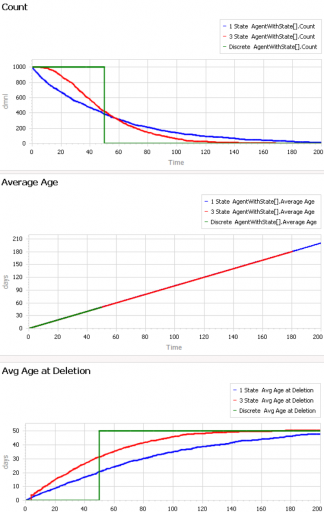
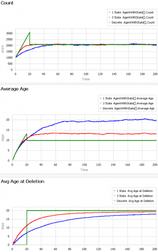
First, consider a very simple, very nonstationary special case, in which there’s no flow of entity turnover. There’s only an initial population of entities of age 0, who gradually leave the system. Here are three variants of that experiment:
Set Model.Delay tau = 50 and Model.Flow Start Time = 1000 to replicate this experiment.
The blue line is the stochastic population analog of the classic first-order delay. The probability of a given entity departing is constant over time, as for radioactive decay. Therefore we get exponential decay, with count = N0*exp(-time/Delay tau). The red line is the third-order equivalent, yielding an Erlang 3 distribution. The green line is the pipeline delay equivalent, in which all entities self-delete at a specified age, rather than with a random distribution. Therefore the population steps from 1000 to 0 at time 50.
The two lower panels compare the average age of surviving entities (middle) to the average age at which entities self-delete (bottom). At bottom, you can see that all variants eventually converge to (roughly) the expected 50-year entity lifespan. However, each trajectory initially indicates a shorter lifespan. This is due to a form of censoring bias – at a given point in time, the longest-lived entities have not yet been observed.
The middle panel indicates how average age can mislead. In this case, age=time for all entities, and therefore the average age increases linearly, even though the expected residence time is constant.
At the opposite extreme, here’s an experiment with a constant flow of new agents, so that the system is in equilibrium after a few time constants:
Set Model.Delay tau = 20 and Model.Flow Start Time = 0 to replicate this experiment.
After the initial transient has died out (by time 20 to 60), all 3 residence times (age at deletion) converge to the expected value of 20. But notice the ages. They converge, too, but the value is dependent on the distribution. For the 1st-order system (blue), the average age does equal the average residence time of 20 years. But the pipeline system (green) has an average age that’s half that, at 10 years. This makes sense, if you think about an equilibrium population composed of a uniform mix of ages between 0 and 20 years. The 3rd-order system is in between.
This uncertain relationship between age and residence time means that we can’t use the average age of the vehicle fleet to determine the rate of vehicle turnover. That’s too bad, because age is the one statistic that’s easy to compute from a database of vehicle registrations. To know more, we have to start making inferences about the inflows and outflows – but that’s tricky if data coverage varies with time. Unfortunately, this is a number that we care about, because the residence time of vehicles in the system is an important driver of future penetration of low-carbon technologies.
This model provides some similar insights – this time in Ventity. It’s a hybrid of classic continuous SD and agent equivalents.
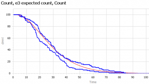
First, the Erlang3 entitytype compares the classic 3rd-order aging chain’s behavior to analytical equivalents, as in the Delay Sandbox. The analytic values are computed in a set of Ventity’s new macros:
Notice that the variances, which arise from Euler integration with a finite time step, are small enough to be uninteresting.
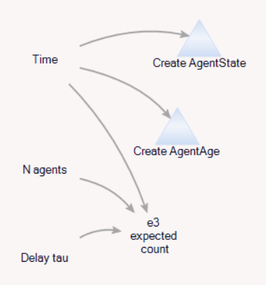
Second, the model compares the dynamics of discrete agent populations to the analytic Erlang results. To do this, the Model entity creates populations of agents at time 0, and (for comparison) computes the expected surviving population according to the Erlang distribution:
The agents live for a time, then self-delete according to two different strategies:
On the left, an agent tracks its own age, and has an age-specific probability of mortality (again, thanks to the hazard rate of the Erlang distribution). On the right, an agent has a state counter, and mortality occurs when the number of state transitions reaches 3.
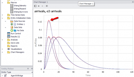
We can then compare the surviving agent populations (blue) to the Erlang expectation (red):
When the population is small (above, 100), there’s some stochastic variation around the expected result. But for larger populations, the difference is negligible.
Charles D. Brummitt, George Barnett and Raissa M. D’Souza
Abstract
An important challenge in several disciplines is to understand how sudden changes can propagate among coupled systems. Examples include the synchronization of business cycles, population collapse in patchy ecosystems, markets shifting to a new technology platform, collapses in prices and in confidence in financial markets, and protests erupting in multiple countries. A number of mathematical models of these phenomena have multiple equilibria separated by saddle-node bifurcations. We study this behaviour in its normal form as fast–slow ordinary differential equations. In our model, a system consists of multiple subsystems, such as countries in the global economy or patches of an ecosystem. Each subsystem is described by a scalar quantity, such as economic output or population, that undergoes sudden changes via saddle-node bifurcations. The subsystems are coupled via their scalar quantity (e.g. trade couples economic output; diffusion couples populations); that coupling moves the locations of their bifurcations. The model demonstrates two ways in which sudden changes can propagate: they can cascade (one causing the next), or they can hop over subsystems. The latter is absent from classic models of cascades. For an application, we study the Arab Spring protests. After connecting the model to sociological theories that have bistability, we use socioeconomic data to estimate relative proximities to tipping points and Facebook data to estimate couplings among countries. We find that although protests tend to spread locally, they also seem to ‘hop’ over countries, like in the stylized model; this result highlights a new class of temporal motifs in longitudinal network datasets.
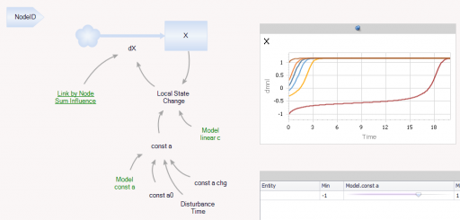
Ventity makes sense here because the system consists of a network of coupled states. Ventity makes it easy to represent a wide variety of network architectures. This means there are two types of entities in the system: “Nodes” and “Couplings.”
The Node entitytype contains a single state (X), with local feedback, as well as a remote influence from Coupling and a few global parameters referenced from the Model entity:
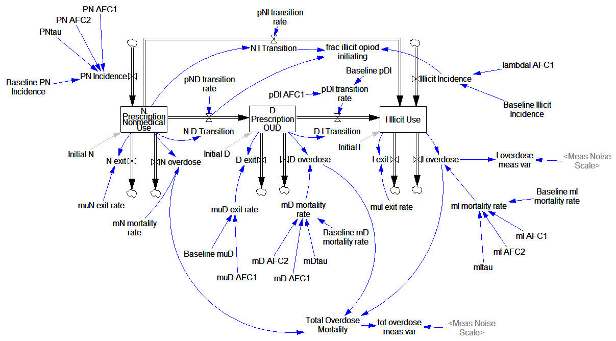
Prevention of Prescription Opioid Misuse and Projected Overdose Deaths in the United States
Qiushi Chen; Marc R. Larochelle; Davis T. Weaver; et al.
Importance Deaths due to opioid overdose have tripled in the last decade. Efforts to curb this trend have focused on restricting the prescription opioid supply; however, the near-term effects of such efforts are unknown.
Objective To project effects of interventions to lower prescription opioid misuse on opioid overdose deaths from 2016 to 2025.
Design, Setting, and Participants This system dynamics (mathematical) model of the US opioid epidemic projected outcomes of simulated individuals who engage in nonmedical prescription or illicit opioid use from 2016 to 2025. The analysis was performed in 2018 by retrospectively calibrating the model from 2002 to 2015 data from the National Survey on Drug Use and Health and the Centers for Disease Control and Prevention.
…
Conclusions and Relevance This study’s findings suggest that interventions targeting prescription opioid misuse such as prescription monitoring programs may have a modest effect, at best, on the number of opioid overdose deaths in the near future. Additional policy interventions are urgently needed to change the course of the epidemic.
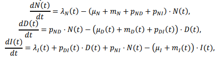
The model is fully described in supplementary content, but unfortunately it’s implemented in R and described in Greek letters, so it can’t be run directly:
That’s actually OK with me, because I think I learn more from implementing the equations myself than I do if someone hands me a working model.
While R gives you access to tremendous tools, I think it’s not a good environment for designing and testing dynamic models of significant size. You can’t easily inspect everything that’s going on, and there’s no easy facility for interactive testing. So, I was curious whether that would prove problematic in this case, because the model is small.
Here’s what it looks like, replicated in Vensim:
It looks complicated, but it’s not complex. It’s basically a cascade of first-order delay processes: the outflow from each stock is simply a fraction per time. There are no large-scale feedback loops. Continue reading “Opiod Epidemic Dynamics”
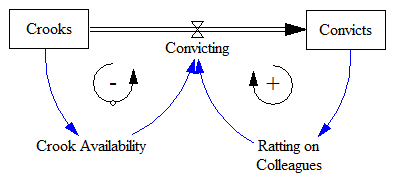
538 had this cool visualization of the Russia investigation in the context of Watergate, Whitewater, and other historic investigations.
The original is fun to watch, but I found it hard to understand the time dynamics from the animation. For its maturity (660 days and counting), has the Russia investigation yielded more or fewer indictments than Watergate (1492 days total)? Are the indictments petering out, or accelerating?
So, the interesting question is whether we can – from partway through the history of the system – estimate the ultimate number of indictments and convictions it will yield. This is fraught with danger, especially when you have no independent information about the “physics” of the system, especially the population of potential crooks to be caught. Continue reading “Modeling Investigations”

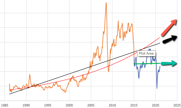
 Given the data (red), assume that the vehicle stock is in equilibrium (inflow=outflow). Then it follows from