The CO2 record is no surprise

The 2016 record in CO2 concentration and increment is exactly what you’d expect for a system driven by growing emissions.

Here’s the data. The CO2 concentration at Mauna Loa has increased steadily since records began in 1958. Superimposed on the trend is a seasonal oscillation, which you can remove by a moving average over a monthly window (red):

In a noiseless system driven by increasing, you’d expect every year to be a concentration record, and that’s nearly true here. Almost 99% of 12-month intervals exceed all previous records.

If you look at the year-on-year difference in monthly concentrations, you can see that not only is the concentration rising, but the rate of increase is increasing as well:

This first difference is noisier, but consistent. As a natural consequence, you’d expect a typical point to be higher than any average of the interval preceding.

In other words, a record concentration coinciding with a record increase is not unusual, dynamically or statistically. Until emissions decline significantly, news outlets might as well post a standing item to this effect.

The CO2 concentration trajectory is, incidentially, closer to parabolic than to exponential. That’s because emissions have risen more or less linearly in recent decades,

CO2 emissions, GtC/yr

CO2 concentration (roughly) integrates emissions, so if emissions = c1*time, concentration = c2*time^2 is expected. The cause for concern here is that a peak in the rate of increase has occurred at a time with flat emissions for a few years, signalling that saturation of natural sinks may be to blame. I think it’s premature to draw that conclusion, given the level of noise in the system. But sooner or later our luck will run out, so reducing emissions is as important as ever.

After emissions do peak, you’d expect CO2 difference records to become rare. However, for CO2 concentrations to stop setting records requires that emissions fall below natural uptake, which will take longer to achieve.

The Tesla roof is a luxury product

No one buys a Tesla Model S because it’s cheaper than a regular car. But there’s currently a flurry of breathless tweets, rejoicing that a Tesla roof is cheaper than a regular roof. That’s dubious.

When I see $21.85 per square foot for anything associated with a house, “cheap” is not what comes to mind. That’s in the territory for luxury interior surfaces, not bulk materials like roofing. I’m reminded of the old saw in energy economics (I think from the EMF meetings in Aspen) that above 7000 feet, the concept of discount rates evaporates.

So, what are the numbers, really?

Continue reading “The Tesla roof is a luxury product”

Prediction, in context

I’m increasingly running into machine learning approaches to prediction in health care. A common application is identification of risks for (expensive) infections or readmission. The basic idea is to treat patients like a function approximation problem.

The hospital compiles a big dataset on patient demographics, health status, exposure to procedures, and infection outcomes. A vendor slurps this up and turns some algorithm loose on the data, seeking the risk factors associated with the infection. It might look like this:

… except that there might be 200 predictors, not six – more than you can handle by eyeballing scatter plots or control charts. Once you have a risk model, you know which patients to target for mitigation, and maybe also which associated factors to pursue further.

However, this is only half the battle. Systems thinkers will recognize this model as a dead buffalo: a laundry list with unidirectional causality. The real situation is rich in feedback, including a lot of things that probably don’t get measured, and therefore don’t end up in the data for consideration by the algorithm. For example:

Infections aren’t just a random event for the patient; they happen for reasons that are larger than the patient. Even worse, there are positive feedbacks that can make prevention of infections, and errors more generally, hard to manage. For example, as the number of patients with infections rises, workload goes up, which creates time pressure and fatigue. That induces shortcuts and errors that create risk for patients, leading to more infections. Infections spread to other patients. Fatigued staff burn out and turn over faster, which dilutes the staff experience that might otherwise mitigate risk. (Experience, like many other dynamics, is not shown above.)

An algorithm that predicts risk in this context is certainly useful, because anything that reduces risk helps to diminish the gain of the vicious cycles. But it’s no longer so clear what to do with the patient assessments. Time spent on staff education and action for risk mitigation has to come from somewhere, and therefore might have unintended consequences that aren’t assessed by the algorithm. The algorithm is actually blind in two ways: it can’t respond to any input (like staff fatigue or skill) that isn’t in the data, and it probably  isn’t statistically smart enough to deal with the separation of cause and effect in time and space that arises in a feedback system.

Deep learning systems like Alpha Go Zero might learn to deal with dynamics. But so far, high performance requires very large numbers of exemplars for reinforcement learning, and that’s never going to happen in a community hospital dataset. Then again, we humans aren’t too good at managing dynamic complexity either. But until the machines take over, we can build dynamic models to sort these problems out. By taking an endogenous point of view, we can put machine learning in context, refine our understanding of leverage points, and redesign systems for greater performance.

Nelson Rules

I ran across the Nelson Rules in a machine learning package. These are a set of heuristics for detecting changes in statistical process control. Their inclusion felt a bit like navigating a 787 with a mechanical flight computer (which is a very cool device, by the way).

The idea is pretty simple. You have a time series of measurements, normalized to Z-scores, and therefore varying (most of the time) by plus or minus 3 standard deviations. The Nelson Rules provide a way to detect anomalies: drift, oscillation, high or low variance, etc. Rule 1, for example, is just a threshold for outlier detection: it fires whenever a measurement is more than 3 SD from the mean.

In the machine learning context, it seems strange to me to use these heuristics when more powerful tests are available. This is not unlike the problem of deciding whether a random number generator is really random. It’s fairly easy to determine whether it’s producing a uniform distribution of values, but what about cycles or other long-term patterns? I spent a lot of time working on this when we replaced the RNG in Vensim. Many standard tests are available. They’re not all directly applicable, but the thinking is.

In any case, I got curious how the Nelson rules performed in the real world, so I developed a test model.

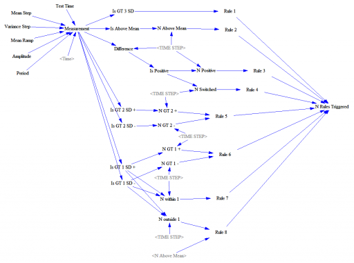
This feeds a test input (Normally distributed random values, with an optional signal superimposed) into a set of accounting variables that track metrics and compare with the rule thresholds. Some of these are complex.

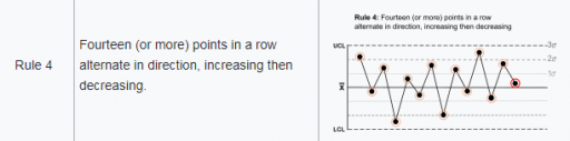
Rule 4, for example, looks for 14 points with alternating differences. That’s a little tricky to track in Vensim, where we’re normally more interested in continuous time. I tackle that with the following structure:

Difference = Measurement-SMOOTH(Measurement,TIME STEP)
**************************************************************
Is Positive=IF THEN ELSE(Difference>0,1,-1)
**************************************************************
N Switched=INTEG(IF THEN ELSE(Is Positive>0 :AND: N Switched<0
,(1-2*N Switched )/TIME STEP
,IF THEN ELSE(Is Positive<0 :AND: N Switched>0
 ,(-1-2*N Switched)/TIME STEP
 ,(Is Positive-N Switched)/TIME STEP)),0)
**************************************************************
Rule 4=IF THEN ELSE(ABS(N Switched)>14,1,0)
**************************************************************

There’s a trick here. To count alternating differences, we need to know (a) the previous count, and (b) whether the previous difference encountered was positive or negative. Above, N Switched stores both pieces of information in a single stock (INTEG). That’s possible because the count is discrete and positive, so we can overload the storage by giving it the sign of the previous difference encountered.

Thus, if the current difference is negative (Is Positive < 0) and the previous difference was positive (N Switched > 0), we (a) invert the sign of the count by subtracting 2*N Switched, and (b) augment the count, here by subtracting 1 to make it more negative.

Similar tricks are used elsewhere in the structure.

How does it perform? Surprisingly well. Here’s what happens when the measurement distribution shifts by one standard deviation halfway through the simulation:

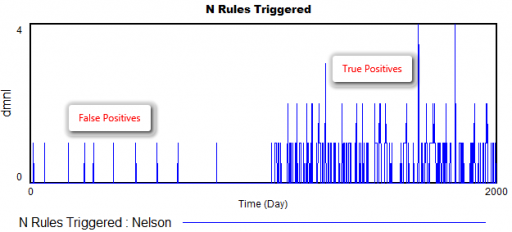
There are a few false positives in the first 1000 days, but after the shift, there are many more detections from multiple rules.

The rules are pretty good at detecting a variety of pathologies: increases or decreases in variance, shifts in the mean, trends, and oscillations. The rules also have different false positive rates, which might be OK, as long as they catch nonoverlapping problems, and don’t have big differences in sensitivity as well. (The original article may have more to say about this – I haven’t checked.)

However, I’m pretty sure that I could develop some pathological inputs that would sneak past these rules. By contrast, I’m pretty sure I’d have a hard time sneaking anything past the NIST or Diehard RNG test suites.

If I were designing this from scratch, I’d use machine learning tools more directly – there are lots of tests for distributions, changes, trend breaks, oscillation, etc. that can be used online with a consistent likelihood interpretation and optimal false positive/negative tradeoffs.

Here’s the model:

NelsonRules1.mdl

NelsonRules1.vpm

Reforesting Iceland

The NYT has an interesting article on the difficulties of reforesting Iceland.

This is an example of forest cover tipping points.

Iceland appears to be stuck in a state in which “no trees” is locally stable. So, the system pushes back when you try to reforest, at least until you can cross into another basin of attraction that’s forested.

Interestingly, in the Hirota et al. data above, a stable treeless state is a product of low precipitation. But Iceland is wet. So, deserts are a multidimensional thing.

Bernoulli and Poisson are in a bar …

Bernoulli asks, “how long have we been here?” Poisson replies, “I have no idea.”

Bad joke aside, memoryless behavior is a key component of a toy model of car rentals I made a while ago. I recently noticed that I was a bit lazy in my choice of RANDOM functions, so I’ve produced an update.

The difference is in the use of Poisson and Binomial distribution functions. In the original, I used the Poisson distribution everywhere to represent arrival processes. That’s reasonable in the limit, where a large number of candidate arrivals are realized with a small probability, such that the expected arrivals occur at some finite rate.

Think of a lemonade stand on a busy street – there’s a very large population of potential lemonade buyers, but only a small fraction actually stop for a drink. Normally, we don’t want to model the street and the traffic generation process, so it’s reasonable to assume independent arrivals from a large pool at some rate that we can measure, using the Poisson distribution. This is similar to using a cloud in SD to indicate a source or sink that we aren’t modeling. Continue reading “Bernoulli and Poisson are in a bar …”

Answer to A Bongard Problem

As a few people nearly guessed, the left side is “things a linear system can do” and the right side is “(additional) things a nonlinear system can do.”

On the left:

  • decaying oscillation
  • exponential decay
  • simple accumulation
  • equilibrium
  • exponential growth
  • 2nd order goal seeking with damped oscillation

On the right:

Bongard problems test visual pattern recognition, but there’s no reason to be strict about that. Here’s a slightly nontraditional Bongard problem:

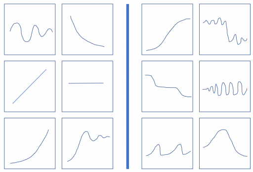
The six on the left conform to a pattern or rule, and your task is to discover it. As an aid, the six boxes on the right do not conform to the same pattern. They might conform to a different pattern, or simply reflect the negation of the rule on the left. It’s possible that more than one rule discriminates between the sets, but the one that I have in mind is not strictly visual (that’s a hint).

The original problem was here.