
I’ve been working on thyroid dynamics, tracking a friend’s data and seeking some understanding with models. With only one patient to go on, it’s impossible to generalize about thyroid behavior from one time series (though there are some interesting features I’ll report on later). On the other hand, our sample size of doctors is now around 10, and I’m starting to see some persistent misperceptions leading to potentially dangerous errors. One of the big issues is simple.
The principal indicator used for thyroid diagnosis is TSH (thyroid stimulating hormone). TSH regulates production of T4 and T3, T3 being the metabolically active hormone. T4 and T3 in turn downregulate TSH (via TRH), producing a negative feedback loop. The basis for the target range for TSH in thyroid treatment is basically the distribution of TSH in the general population without a thyroid diagnosis.
The challenge with TSH is that its response is logarithmic, so its distribution is lognormal. The usual target range is 0.4 to 4 mIU/L (or .45 to 4.5, or something else, depending on which source you prefer). Anyway, suppose you test at 2.2 – bingo! right in the middle! Well, not so fast. The geometric mean of .4 and 4.4 is actually 1.6, so you’re a little high.
How high? Well, no one will tell you without a fight. For some reason, most sources insist on throwing out much of the relevant information about the distribution of “normal”. In fact, when you look at the large survey papers reporting on population health, like NHANES, it’s hard to find the distribution. For example, Thyroid Profile of the Reference United States Population: Data from NHANES 2007-2012 (Jain 2015) doesn’t have a single visualization of the data – just a bunch of tables. When you do find the distribution, you’ll often get a subset (smokers) or a linear-scaled version that makes it hard to see the left tail. (For the record, TSH=2.2 is just above the 75th percentile in the NHANES THYROD_G dataset – so already quite far from the middle.)
There are also more subtle issues. In the first NHANES thyroid survey article, I found Fig. 1:
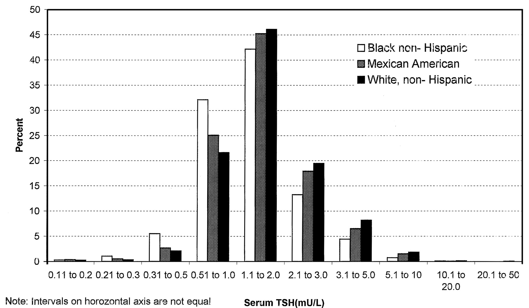
Here we have a log scale, but bins of convenience. The breakpoints 1, 2, 3, 5, 10… happen to be roughly equally spaced on a log scale. But when you space histogram bins at these intervals, the bin width is very rough indeed – varying by almost a factor of 2. That means the shape of the distribution is distorted. One of the bins expected to be small is the 2.1-3 range, and you can actually see here that those columns look anomalously low, compared to what you’d expect of a nice bell curve.
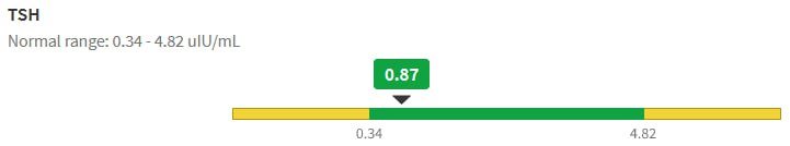
That was 20 years ago, but things are no better with modern analytics. If you get a blood test now, your results are likely to be reported to you, and your doc, though a system like MyChart. For TSH, this means you’ll get a range plot with a linear scale:
backed up by a time series with a linear scale:
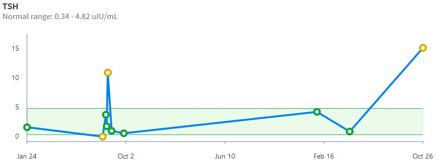
Notice that the “normal” range doesn’t match the ATA recommendation or any other source I’ve seen. Presumably it’s the lab’s +/- 2 standard deviation range or something like that. That’s bad, because the upper limit – 4.82 – is above every clinical association recommendation I’ve seen. The linear scale squashes all the variation around low values, and exaggerates the high ones.
Given that the information systems for the entire thyroid management enterprise offer biased, low-information displays of TSH stats, I think it’s not surprising that physicians have trouble overcoming the nonlinearity bias. They have hundreds of variables to think about, and can’t possibly be expected to maintain a table of log or Z transformations in their heads. Patients are probably even more baffled by the asymmetry.
It would be simple to remedy this by presenting the information in a way that minimizes the cognitive burden on the viewer. Reporting TSH on a log scale is trivial. Reporting percentiles as a complementary statistic would also be trivial, and percentiles are widely used, so you don’t have to explain them. Setting a target value rather than a target range would encourage driving without bouncing off the guardrails. I hope authors and providers can figure this out.