Sources of Uncertainty

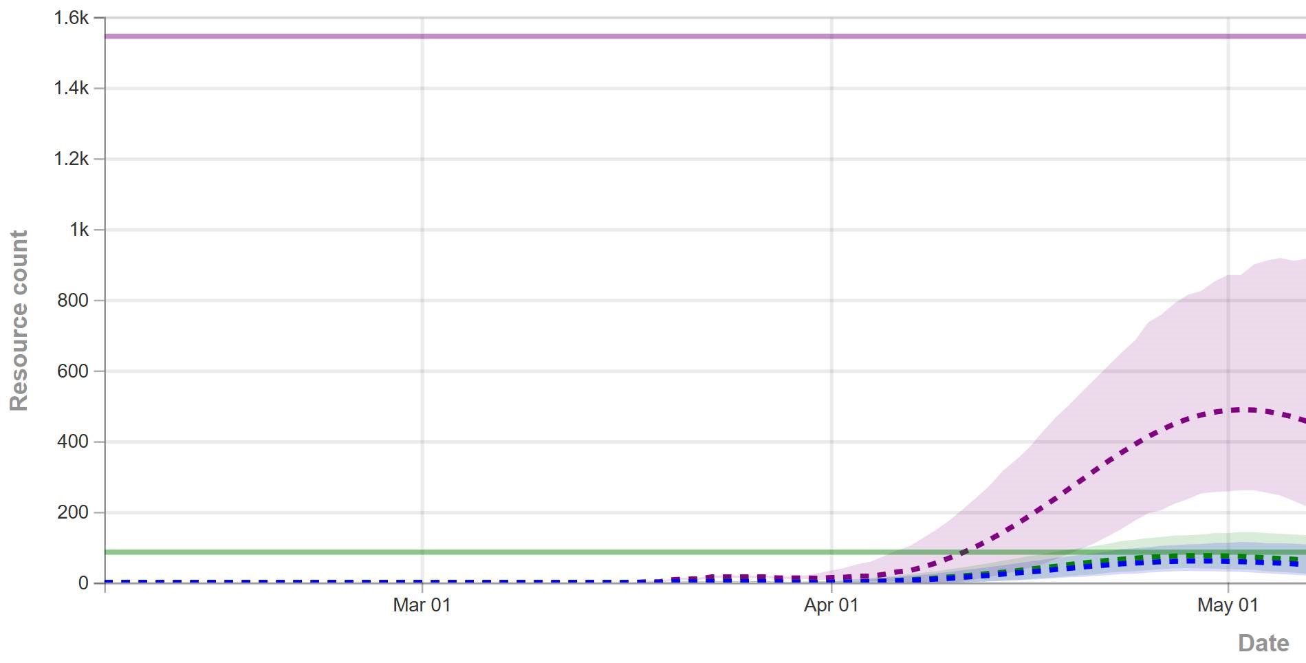
The confidence bounds I showed in my previous post have some interesting features. The following plots show three sources of the uncertainty in simulated surveillance for Chronic Wasting Disease in deer.

  • Parameter uncertainty
  • Sampling error in the measurement process
  • Driving noise from random interactions in the population

You could add external disturbances like weather to this list, though we don’t simulate it here.

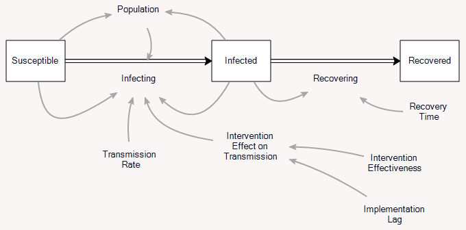
By way of background, this come from a fairly big model that combines the dynamics of the host (deer) with an SIR-like model of disease transmission and progression. There’s quite a bit of disaggregation (regions, ages, sexes). The model is driven by historic harvest and sample sizes, and generates deer population, vegetation, and disease dynamics endogenously. The parameters used here represent a Bayesian posterior, from MCMC with literature priors and a lot of data. The parameter sample from the posterior is a joint distribution that captures both individual parameter variation and covariation (though with only a few exceptions things seem to be relatively independent).

Here’s the effect of parameter uncertainty on the disease trajectory:

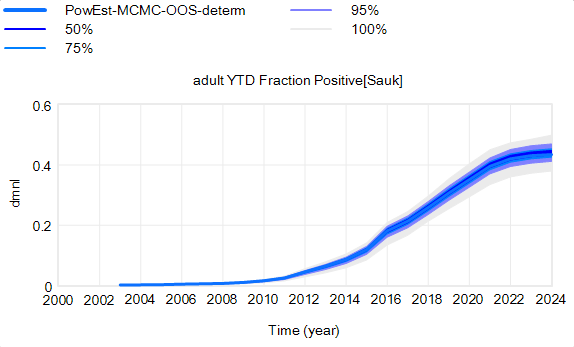
Each of the 10,000 runs making up this ensemble is deterministic. It’s surprisingly tight, because it is well-determined by the data.

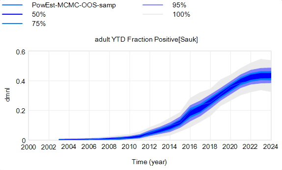
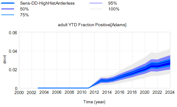
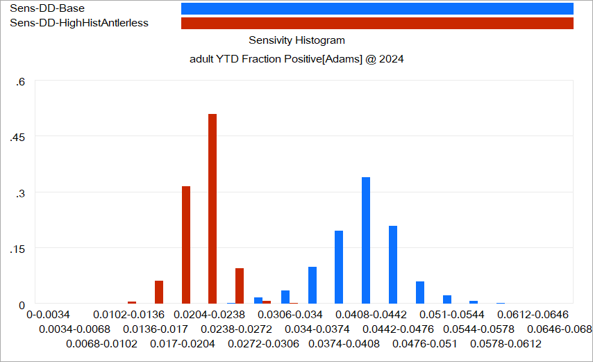
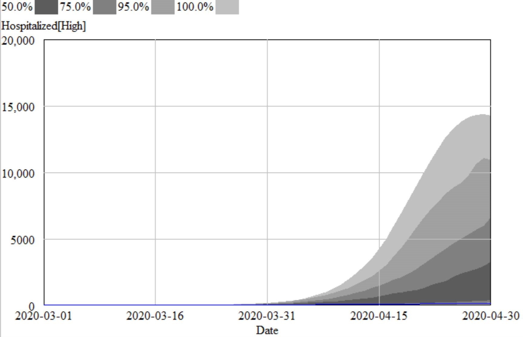
However, parameter uncertainty is not the only issue. Even if you know the actual state of the disease perfectly, there’s still uncertainty in the reported outcome due to sampling variation. You might stray from the “true” prevalence of the disease because of chance in the selection of which deer are actually tested. Making sampling stochastic broadens the bounds:

That’s still not the whole picture, because deer aren’t really deterministic. They come in integer quanta and they have random interactions. Thus a standard SD formulation like:

births = birth rate * doe population

becomes

births = Poisson( birth rate * doe population )

For stock outflows, like the transition from healthy to infected, the Binomial distribution may be the appropriate choice. This means there’s additional variance around the deterministic course, and the model can explore a wider set of trajectories.

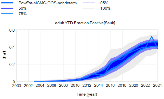
There’s one other interesting feature, particularly evident in this last graph: uncertainty around the mean (i.e. the geometric standard deviation) varies quite a bit. Initially, uncertainty increases with time – as Yogi Berra said, “It’s tough to make predictions, especially about the future.” In the early stages of the disese (2003-2008 say), numbers are small and random events affect the timing of takeoff of the disease, amplified by future positive feedback. A deterministic disease model with reproduction ratio R0>1 can only grow, but in a stochastic model luck can cause the disease to go extinct or bumble around 0 prevalence for a while before emerging into growth. Towards the end of this simulation, the confidence bounds narrow. There are two reasons for this: negative feedback is starting to dominate as the disease approaches saturation prevalence, and at the same time the normalized standard deviation of the sampling errors and randomness in deer dynamics is decreasing as the numbers become larger (essentially with 1/sqrt(n)).

This is not uncommon in real systems. For example, you may be unsure where a chaotic pendulum will be in it’s swing a minute from now. But you can be pretty sure that after an hour or a day it will be hanging idle at dead center. However, this might not remain true when you broaden the boundary of the system to include additional feedbacks or disturbances. In this CWD model, for example, there’s some additional feedback from human behavior (not in the statistical model, but in the full version) that conditions the eventual saturation point, perhaps preventing convergence of uncertainty.


Understanding Prediction

I posted my recent blogs on Forrester and forecasting uncertainty over at LinkedIn, and there’s been some good discussion. I want to highlight a few things.

First, a colleague pointed out that the way terms are understood is in the eye of the beholder. When you say “forecast” or “prediction” or “projection” the listener (client, stakeholder) may not hear what you mean. So regardless of whether your intention is correct when you say you’re going to “predict” something, you’d better be sure that your choice of language communicates to the end user with some fidelity.

Second, Samuel Allen asked a great question, which I haven’t answered to my satisfaction, “what are some good ways of preventing consumers of our conditional predictions from misunderstanding them?”

One piece of the puzzle is in Alan Graham’s comment:

an explanation that has communicated well starts from the distinction between behavior sensitivity (does the simulation change?) versus outcome or policy sensitivity (does the size or direction of the policy impact change?). Two different sets of experiments are needed to answer the two different questions, which are visually distinct:

This is basically a cleaner explanation of what’s going on in my post on Forecasting Uncertainty. I think what I did there is too complex (too many competing lines), so I’m going to break it down into simpler parts in a followup.

Another piece of the puzzle is visualization. Here’s a pair of scenarios from our CWD model. These are basically nowcasts showing uncertainty about historic conditions, subject to actual historic actions or a counterfactual “high harvest” scenario:

Note that I’m just grabbing raw stuff out of Vensim; for presentation these graphics could be cleaner. Also note the different scales.

On each of these charts, the spread indicates uncertainty from parameters and sampling error in disease surveillance. Comparing the two tells you how the behavior – including the uncertainty – is sensitive to the policy change.

In my experience, this works, but it’s cumbersome. There’s just too much information. You can put the two confidence bands on the same chart, using different colors, but then you have fuzzy things overlapping and it’s potentially hard to read.

Another option is to use histograms that slice the outcome (here, at the endpoint):

Again, this is just a quick capture that could be improved with minimal effort. The spread for each color shows the distribution of possibilities, given the uncertainty from parameters and sampling. The spread between the colors shows the policy impact. You can see that the counterfactual policy (red) both improves the mean outcome (shift left) and reduces the variance (narrower). I actually like this view of things. Unfortunately, I haven’t had much luck with such things in general audiences, who tend to wonder what the axes represent.

I think one answer may be that you simply have to go back to basics and explore the sensitivity of the policy to individual parameter changes, in paired trials per Alan Graham’s diagram above, in order to build understanding of how this works.

I think the challenge of this task – and time required to address it – should not be underestimated. I think there’s often a hope that an SD model can be used to extract an insight about some key leverage point or feedback loop that solves a problem. With the new understanding in hand, the model can be discarded. I can think of some examples where this worked, but they’re mostly simple systems and one-off decisions. In complex situations with a lot of uncertainty, I think it may be necessary to keep the model in the loop. Otherwise, a year down the road, arrival of confounding results is likely to drive people back to erroneous heuristics and unravel the solution.

I’d be interested to hear success stories about communicating model uncertainty.

Forecasting Uncertainty

Here’s an example that illustrates what I think Forrester was talking about.

This is a set of scenarios from a simple SIR epidemic model in Ventity.

There are two sources of uncertainty in this model: the aggressiveness of the disease (transmission rate) and the effectiveness of an NPI policy that reduces transmission.

Early in the epidemic, at time 40 where the decision to intervene is made, it’s hard to tell the difference between a high transmission rate and a lower transmission rate with a slightly larger initial infected population. This is especially true in the real world, because early in an epidemic the information-gathering infrastructure is weak.

However, you can still make decent momentum forecasts by extrapolating from the early returns for a few more days – to time 45 or 50 perhaps. But this is not useful, because that roughly corresponds with the implementation lag for the policy. So, over the period of skilled momentum forecasts, it’s not possible to have much influence.

Beyond time 50, there’s a LOT of uncertainty in the disease trajectory, both from the uncontrolled baseline (is R0 low or high?) and the policy effectiveness (do masks work?). The yellow curve (high R0, low effectiveness) illustrates a key feature of epidemics: a policy that falls short of lowering the reproduction ratio below 1 results in continued growth of infection. It’s still beneficial, but constituents are likely to perceive this as a failure and abandon the policy (returning to the baseline, which is worse).

Some of these features are easier to see by looking at the cumulative outcome. Notice that the point prediction for times after about 60 has extremely large variance. But not everything is uncertain. In the uncontrolled baseline runs (green and brownish), eventually almost everyone gets the disease, it’s a matter of when not if, so uncertainty actually decreases after time 90 or so. Also, even though the absolute outcome varies a lot, the policy always improves on the baseline (at least neglecting cost, as we are here). So, while the forecast for time 100 might be bad, the contingent prediction for the effect of the policy is qualitatively insensitive to the uncertainty.

Reading between the lines: Forrester on forecasting

I’d like to revisit Jay Forrester’s Next 50 Years article, with particular attention to a couple things I think about every day: forecasting and prediction. I previously tackled Forrester’s view on data.

Along with unwise simplification, we also see system dynamics being drawn into attempting what the client wants even when that is unwise or impossible. Of particular note are two kinds of effort—using system dynamics for forecasting, and placing emphasis on a model’s ability to exactly fit historical data.

With regard to forecasting specific future conditions, we face the same barrier that has long plagued econometrics.

Aside from what Forrester is about to discuss, I think there’s also a key difference, as of the time this was written. Econometric models typically employed lots of data and fast computation, but suffered from severe restrictions on functional form (linearity or log-linearity, Normality of distributions, etc.). SD models had essentially unrestricted functional form, particularly with respect to integration and arbitrary nonlinearity, but suffered from insufficient computational power to do everything we would have liked. To some extent, the fields are converging due to loosening of these constraints, in part because the computer under my desk today is now bigger than the fastest supercomputer in the world when I finished my dissertation years ago.

Econometrics has seldom done better in forecasting than would be achieved by naïve extrapolation of past trends. The reasons for that failure also afflict system dynamics. The reasons why forecasting future conditions fail are fundamental in the nature of systems. The following diagram may be somewhat exaggerated, but illustrates my point.

A system variable has a past path leading up to the current decision time. In the short term, the system has continuity and momentum that will keep it from deviating far from an extrapolation of the past. However, random events will cause an expanding future uncertainty range. An effective forecast for conditions at a future time can be made only as far as the forecast time horizon, during which past continuity still prevails. Beyond that horizon, uncertainty is increasingly dominant. However, the forecast is of little value in that short forecast time horizon because a responding decision will be defeated by the very continuity that made the forecast possible. The resulting decision will have its effect only out in the action region when it has had time to pressure the system away from its past trajectory. In other words, one can forecast future conditions in the region where action is not effective, and one can have influence in the region where forecasting is not reliable. You will recall a more complete discussion of this in Appendix K of Industrial Dynamics.

I think Forrester is basically right. However, I think there’s a key qualification. Some things – particularly physical systems – can be forecast quite well, not just because momentum permits extrapolation, but because there is a good understanding of the system. There’s a continuum of forecast skill, between “all models are wrong” and “some models are useful,” and you need to know where you are on that.

Fortunately, your model can tell you about the prospects for forecasting. You can characterize the uncertainty in the model parameters and environmental drivers, generate a distribution of outcomes, and use that to understand where forecasts will begin to fall apart. This is extremely valuable knowledge, and it may be key for implementation. Stakeholders want to know what your intervention is going to do to the system, and if you can’t tell them – with confidence bounds of some sort – they may have no reason to believe your subsequent attributions of success or failure.

In the hallways of SD, I sometimes hear people misconstrue Forrester, to say that “SD doesn’t predict.” This is balderdash. SD is all about prediction. We may not make point predictions of the future state of a system, but we absolutely make predictions about the effects of a policy change, contingent on uncertainties about parameters, structure and external disturbances. If we didn’t do that, what would be the point of the exercise? That’s precisely what JWF is getting at here:

The emphasis on forecasting future events diverts attention from the kind of forecast that system dynamics can reliably make, that is, the forecasting of the kind of continuing effect that an enduring policy change might cause in the behavior of the system. We should not be advising people on the decision they should now make, but rather on how to change policies that will guide future decisions. A properly designed system dynamics model is effective in forecasting how different decision-making policies lead to different kinds of system behavior.

Coronavirus Curve-fitting OverConfidence

This is a follow-on to The Normal distribution is a bad COVID19 model.

I understand that the IHME model is now more or less the official tool of the Federal Government. Normally I’m happy to see models guiding policy. It’s better than the alternative: would you fly in a plane designed by lawyers? (Apparently we have been.)

However, there’s nothing magic about a model. Using flawed methods, bad data, the wrong boundary, etc. can make the results GIGO. When a bad model blows up, the consequences can be just as harmful as any other bad reasoning. In addition, the metaphorical shrapnel hits the rest of us modelers. Currently, I’m hiding in my foxhole.

On top of the issues I mentioned previously, I think there are two more problems with the IHME model:

First, they fit the Normal distribution to cumulative cases, rather than incremental cases. Even in a parallel universe where the nonphysical curve fit was optimal, this would lead to understatement of the uncertainty in the projections.

Second, because the model has no operational mapping of real-world concepts to equation structure, you have no hooks to use to inject policy changes and the uncertainty associated with them. You have to construct some kind of arbitrary index and translate that to changes in the size and timing of the peak in an unprincipled way. This defeats the purpose of having a model.

For example, from the methods paper:

A covariate of days with expected exponential growth in the cumulative death rate was created using information on the number of days after the death rate exceeded 0.31 per million to the day when different social distancing measures were mandated by local and national government: school closures, non-essential business closures including bars and restaurants, stay-at-home recommendations, and travel restrictions including public transport closures. Days with 1 measure were counted as 0.67 equivalents, days with 2 measures as 0.334 equivalents and with 3 or 4 measures as 0.

This postulates a relationship that has only the most notional grounding. There’s no concept of compliance, nor any sense of the effect of stringency and exceptions.

In the real world, there’s also no linear relationship between “# policies implemented” and “days of exponential growth.” In fact, I would expect this to be extremely nonlinear, with a threshold effect. Either your policies reduce R0 below 1 and the epidemic peaks and shrinks, or they don’t, and it continues to grow at some positive rate until a large part of the population is infected. I don’t think this structure captures that reality at all.

That’s why, in the IHME figure above (retrieved yesterday), you don’t see any scenarios in which the epidemic fizzles, because we get lucky and warm weather slows the virus, or there are many more mild cases than we thought. You also don’t see any runaway scenarios in which measures fail to bring R0 below 1, resulting in sustained growth. Nor is there any possibility of ending measures too soon, resulting in an echo.

For comparison, I ran some sensitivity runs my model for North Dakota last night. I included uncertainty from fit to data (for example, R0 constrained to fit observations via MCMC) and some a priori uncertainty about effectiveness and duration of measures, and from the literature about fatality rates, seasonality, and unobserved asymptomatics.

I found that I couldn’t exclude the IHME projections from my confidence bounds, so they’re not completely crazy. However, they understate the uncertainty in the situation by a huge margin. They forecast the peak at a fairly definite time, plus or minus a factor of two. With my hybrid-SEIR model, the 95% bounds include variation by a factor of 10. The difference is that their bounds are derived only from curve fitting, and therefore omit a vast amount of structural uncertainty that is represented in my model.

Who is right? We could argue, but since the IHME model is statistically flawed and doesn’t include any direct effect of uncertainty in R0, prevalence of unobserved mild cases, temperature sensitivity of the virus, effectiveness of measures, compliance, travel, etc., I would not put any money on the future remaining within their confidence bounds.

The Normal distribution is a bad COVID19 model

Forecasting diffusion processes by fitting sigmoid curves has a long history of failure. Let’s not repeat those mistakes in the COVID19 epidemic.

I’ve seen several models explaining “flattening the curve” that use the Normal distribution as a model of the coronavirus epidemic. Now this model uses it to forecast peak hospital load:

We developed a curve-fitting tool to fit a nonlinear mixed effects model to the available admin 1 cumulative death data. The cumulative death rate for each location is assumed to follow a parametrized Gaussian error function … where the function is the Gaussian error function(written explicitly above), p controls the maximum death rate at each location, t is the time since death rate exceeded 1e-15, ß(beta)is a location-specific inflection point(time at which rate of increase of the death rate is maximum), and α(alpha)is a location-specific growth parameter. Other sigmoidal functional forms … were considered but did not fit the data as well. Data were fit to the log of the death rate in the available data, using an optimization framework described in the appendix.

One bell-shaped curve is as good as another, right? No!

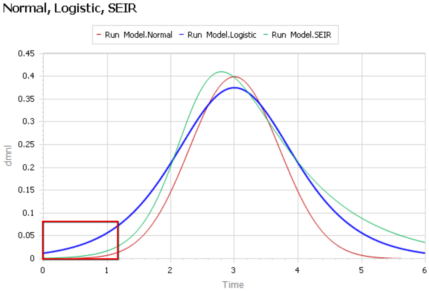
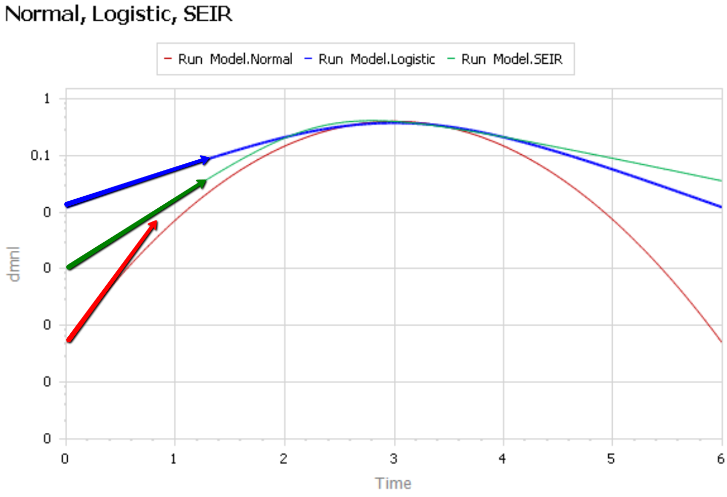
Like Young Frankenstein, epidemic curves are not Normal.

1. Fit to data is a weak test.

The graph below compares 3 possible models: the Normal distribution, the Logistic distribution (which has an equivalent differential equation interpretation), and the SEIR model. Consider what’s happening when you fit a sigmoid to the epidemic data so far (red box). The curves below are normalized to yield similar peaks, but imagine what would happen to the peaks if you fit all 3 to the same data series.

The problem is that this curve-fitting exercise expects data from a small portion of the behavior to tell you about the peak. But over that interval, there’s little behavior variation. Any exponential is going to fit reasonably well. Even worse, if there are any biases in the data, such as dramatic shifts in test coverage, the fit is likely to reflect those biases as much as it does the physics of the system. That’s largely why the history of fitting diffusion models to emerging trends in the forecasting literature is so dreadful.

After the peak, the right tail of the SEIR model is also quite different, because the time constant of recovery is different from the time constant for the growth phase. This asymmetry may also have implications for planning.

2. The properties of the Normal distribution don’t match the observed behavior of coronavirus.

It’s easier to see what’s going on if you plot the curves above on a log-y scale:

The logistic and SEIR models have a linear left tail. That is to say that they have a constant growth rate in the early epidemic, until controls are imposed or you run out of susceptible people.

The Normal distribution (red) is a parabola, which means that the growth rate is steadily decreasing, long before you get near the peak. Similarly, if you go backwards in time, the Normal distribution predicts that the growth rate would have been higher back in November, when patient 0 emerged.

There is some reason to think that epidemics start faster due to social network topology, but also some reasons for slower emergence. In any case, that’s not what is observed for COVID19 – uncontrolled growth rates are pretty constant:

https://aatishb.com/covidtrends/

3. With weak data, you MUST have other quality checks

Mining data to extract relationships works great in many settings. But when you have sparse data with lots of known measurement problems, it’s treacherous. In that case, you need a model of the physics of the system and the lags and biases in the data generating process. Then you test that model against all available information, including

  • conservation laws,
  • operational correspondence with physical processes,
  • opinions from subject matter experts and measurements from other levels of aggregation,
  • dimensional consistency,
  • robustness in extreme conditions, and finally
  • fit to data.

Fortunately, a good starting point has existed for almost a century: the SEIR model. It’s not without pitfalls, and needs some disaggregation and a complementary model of policies and the case reporting process, but if you want simple projections, it’s a good place to start.

Once you have triangulation from all of these sources, you have some hope of getting the peak right. But your confidence bounds should still be derived not only from the fit itself, but also priors on parameters that were not part of the estimation process.

Update: Coronavirus Curve-fitting OverConfidence

Coronavirus Roundup

I’ve been looking at early model-based projections for the coronavirus outbreak (SARS-CoV-2, COVID-19). The following post collects some things I’ve found informative. I’m eager to hear of new links in the comments.

This article has a nice summary, and some

Disease modelers gaze into their computers to see the future of Covid-19, and it isn’t good

The original SIR epidemic model, by Kermack and McKendrick. Very interesting to see how they thought about it in the pre-computer era, and how durable their analysis has been:

A data dashboard at Johns Hopkins:

A Lancet article that may give some hope for lower mortality:

The CDC’s flu forecasting activity:

Some literature, mostly “gray” preprints from MedRxiv, all open access:

A podcast with some background on transmission from Richard Larson, MIT (intestine alert – not for the squeamish!):

This blog post by Josh at Cassandra Capital collects quite a bit more interesting literature, and fits a simple SIR model to the data. I can’t vouch for the analysis because I haven’t looked into it in detail, but the links are definitely useful. One thing I note is that his fatality rate (12%) is much higher than in other sources I’ve seen (.5-3%) so hopefully things are less dire than shown here.

I had high hopes that social media might provide early links to breaking literature, but unfortunately the signal is swamped by rumors and conspiracy theories. The problem is made more difficult by naming – coronavirus, COVID19, SARS-CoV-2, etc. If you don’t include “mathematical model” or similar terms in your search, it’s really hopeless.

If your interested in exploring this yourself, the samples in the standard Ventity distribution include a family of infection models. I plan to update some of these and report back.

Assessing the predictability of nonlinear dynamics

An interesting exploration of the limits of data-driven predictions in nonlinear dynamic problems:

Assessing the predictability of nonlinear dynamics under smooth parameter changes
Simone Cenci, Lucas P. Medeiros, George Sugihara and Serguei Saavedra
https://doi.org/10.1098/rsif.2019.0627

Short-term forecasts of nonlinear dynamics are important for risk-assessment studies and to inform sustainable decision-making for physical, biological and financial problems, among others. Generally, the accuracy of short-term forecasts depends upon two main factors: the capacity of learning algorithms to generalize well on unseen data and the intrinsic predictability of the dynamics. While generalization skills of learning algorithms can be assessed with well-established methods, estimating the predictability of the underlying nonlinear generating process from empirical time series remains a big challenge. Here, we show that, in changing environments, the predictability of nonlinear dynamics can be associated with the time-varying stability of the system with respect to smooth changes in model parameters, i.e. its local structural stability. Using synthetic data, we demonstrate that forecasts from locally structurally unstable states in smoothly changing environments can produce significantly large prediction errors, and we provide a systematic methodology to identify these states from data. Finally, we illustrate the practical applicability of our results using an empirical dataset. Overall, this study provides a framework to associate an uncertainty level with short-term forecasts made in smoothly changing environments.

Challenges Sourcing Parameters for Dynamic Models

A colleague recently pointed me to this survey:

Estimating the price elasticity of fuel demand with stated preferences derived from a situational approach

It starts with a review of a variety of studies:

Table 1. Price elasticities of fuel demand reported in the literature, by average year of observation.

This is similar to other meta-analyses and surveys I’ve seen in the past. That means using it directly is potentially problematic. In a model, you’d typically plug the elasticity into something like the following:

Indicated fuel demand 
   = reference fuel demand * (price/reference price) ^ elasticity

You’d probably have the expression above embedded in a larger structure, with energy requirements embodied in the capital stock, and various market-clearing feedback loops (as below). The problem is that plugging the elasticities from the literature into a dynamic model involves several treacherous leaps.

First, do the parameter values even make sense? Notice in the results plotted above that 33% of the long term estimates have magnitude < .3, overlapping the top 25% of the short term estimates. That’s a big red flag. Do they have conflicting definitions of “short” and “long”? Are there systematic methods problems?

Second, are they robust as you plan to use them? Many of the short term estimates have magnitude <<.1, meaning that a modest supply shock would cause fuel expenditures to exceed GDP. This is primarily problem with the equation above (but that’s likely similar to what was estimated). A better formulation would consider non-constant elasticity, but most likely the data is not informative about the extremes. One of the long term estimates is even positive – I’d be interested to see the rationale for that. Perhaps fuel is a luxury good?

Third, are the parameters any good? My guess is that some of these estimates are simply violating good practice for estimating dynamic systems. The real long term response involves a lot of lags on varying time scales, from annual (perceptions of prices and behavior change) to decadal (fleet turnover, moving, mode-switching) to longer (infrastructure and urban development). Almost certainly some of this is ignored in the estimate, meaning that the true magnitude of the long term response is understated.

Stated preference estimates avoid some problems, but create others. In the short run, people have a good sense of their options and responses. But in the long term, likely not: you’re essentially asking them to mentally simulate a complex system, evaluating options that may not even exist at present. Expert judgments are subject to some of the same limitations.

I think this explains why it’s possible to build a model that’s backed up with a lot of expertise and literature at every equation, that fails to reproduce the aggregate behavior of the system. Until you spend time integrating components, reconciling conflicting definitions across domains, and revisiting open-loop estimates in a closed-loop context, you don’t have an internally consistent story. Getting to that is a big part of the value of dynamic modeling.

Not all models are wrong.

Box’s famous comment, that “all models are wrong,” gets repeated ad nauseum (even by me). I think it’s essential to be aware of this in the sloppy sciences, but it does a disservice to modeling and simulation in general.

As far as I’m concerned, a lot of models are basically right. I recently worked with some kids on an air track experiment in physics. We timed the acceleration of a sled released from various heights, and plotted the data. Then we used a quadratic fit, based on a simple dynamic model, to predict the next point. We were within a hundredth of a second, confirmed by video analysis.

Sure, we omitted lots of things, notably air resistance and relativity. But so what? There’s no useful sense in which the model was “wrong,” anywhere near the conditions of the experiment. (Not surprisingly, you can find a few cranks who contest Newton’s laws anyway.)

I think a lot of uncertain phenomena in social sciences operate on a backbone of the same kind of “physics.” The future behavior of the government is quite unpredictable, but there isn’t much uncertainty about accounting, e.g., that increasing the deficit increases the debt.

The domain of wrong but useful models remains large (within an even bigger sea of simple ignorance), but I think more and more things are falling into the category of models that are basically right. The trick is to be able to spot the difference. Some people clearly can’t:

A&G provide no formal method to distinguish between situations in which models yield useful or spurious forecasts. In an earlier paper, they claimed rather broadly,

‘To our knowledge, there is no empirical evidence to suggest that presenting opinions in mathematical terms rather than in words will contribute to forecast accuracy.’ (page 1002)

This statement may be true in some settings, but obviously not in general. There are many situations in which mathematical models have good predictive power and outperform informal judgments by a wide margin.

I wonder how well one could do with verbal predictions of a simple physical system? Score one for the models.