The Chartjunk Pandemic

So much junk, so little time.

The ‘net is awash with questionable coronavirus memes. The most egregiously flawed offender I’ve seen is this one from visualcapitalist:

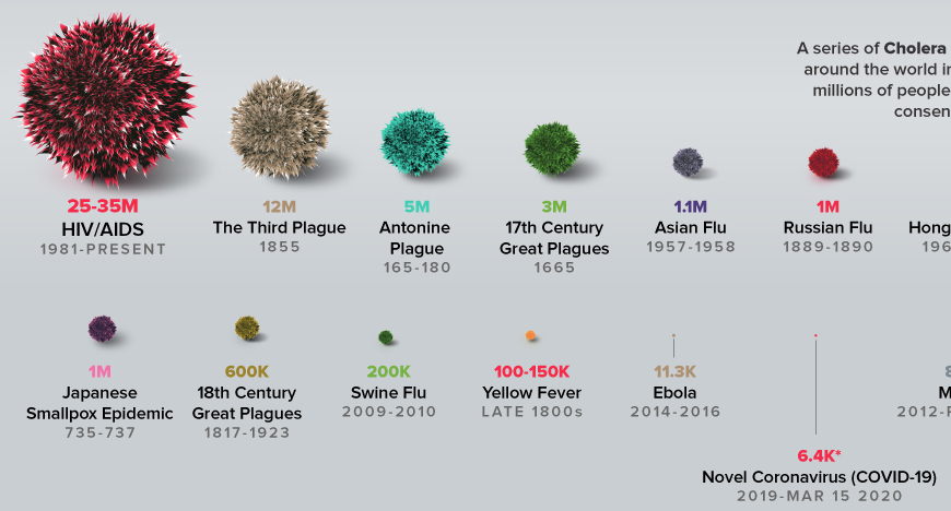
It’s interesting data, but the visualization really fails to put COVID19 in a proper perspective.


Exponential Growth

The biggest problem is obvious: the bottom of the curve is nothing like the peak for a quantity that grows exponentially.

Comparing the current death toll from COVID19, a few months old, to the final values from other epidemics over years to decades, is just spectacularly misleading. It beggars belief that anyone could produce such a comparison.

Perspective

Speaking of perspective, charts like this are rarely a good idea. This one gives the impression that 5M < 3M:

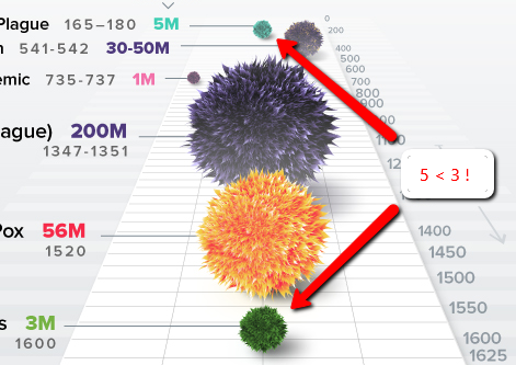
Reliance on our brains to map 2D to 3D is even more problematic when you consider the next problem.

2D or 3D?

Measuring the fur-blob sizes shows that the mapping of the data to the blobs is two-dimensional: the area of the blob on the page represents the magnitude. But the blobs are clearly rendered in 3D. That means the visual impression of the relationship between the Black Death (200M) and Japanese Smallpox (1M) is off by a factor of 15. The distortion is even more spectacular for COVID19.

You either have to go all the way with 3D, in which case COVID19 looks bigger, even with the other distortions unaddressed, or you need to make a less-sexy but more-informative flat 2D chart.

Stocks vs. Flows

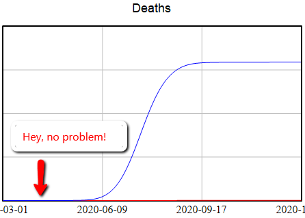
The fourth problem here is that the chart neglects time. The disruption from an epidemic is not simply a matter of its cumulative death toll. The time distribution also matters: a large impact concentrated in a brief time frame has much greater ripple effects, as we are now experiencing.

When sea level chartjunk attacks

SeaLevelAttack

This informationisbeautiful graphic is pretty, but I don’t find it informative. The y scale is nonlinear, and I don’t know if the x scale conveys anything. It’s hard to work out the timing of inundation, which is really the key. The focus on the low points of big cities in developed countries is misleading, because those will be defended for a long time. Ho Chi Minh city should be on there, as well as the US gulf coast. USA Today would love this.

Visualizing biological time

A new paper on arXiv shows an interesting approach to visualizing time in systems with circadian or other rhythms. I haven’t figured out if it’s useful for oscillatory dynamic systems more generally, but it makes some neat visuals:

scheme

The method makes it possible to see changes in behavior in time series with waaay to many oscillations to explore on a normal 2D time-value plot:

cardiac

Read more on arXiv.

Fun with Processing

Processing is a very clean, Java-based environment targeted at information visualization and art. I got curious about it, so I built a simple interactive game that demonstrates how dynamic complexity makes system control difficult. Click through to play:

dragdot

I think there’s a lot of potential for elegant presentation with Processing. There are several physics libraries and many simulations with a physical, chemical, or mathematical basis at OpenProcessing.org:

OpenProcessing

If you like code, it’s definitely worth a look.

Tableau + Vensim = ?

I’ve been testing a data mining and visualization tool called Tableau. It seems to be a hot topic in that world, and I can see why. It’s a very elegant way to access large database servers, slicing and dicing many different ways via a clean interface. It works equally well on small datasets in Excel. It’s very user-friendly, though it helps a lot to understand the relational or multidimensional data model you’re using. Plus it just looks good. I tried it out on some graphics I wanted to generate for a collaborative workshop on the Western Climate Initiative. Two examples:

Tableau state province emissions

Tableau map

A year or two back, I created a tool, based on VisAD, that uses the Vensim .dll to do multidimensional visualization of model output. It’s much cruder, but cooler in one way: it does interactive 3D. Anyway, I hoped that Tableau, used with Vensim, would be a good replacement for my unfinished tool.

After some experimentation, I think there’s a lot of potential, but it’s not going to be the match made in heaven that I hoped for. Cycle time is one obstacle: data can be exported from Vensim in .tab, .xls, or a relational table format (known as “data list” in the export dialog). If you go the text route (.tab), you have to pass through Excel to convert it to .csv, which Tableau reads. If you go the .xls route, you don’t need to pass through Excel, but may need to close/open the Tableau workspace to avoid file lock collisions. The relational format works, but yields a fundamentally different description of the data, which may be harder to work with.

I think where the pairing might really shine is with model output exported to a database server via Vensim’s ODBC features. I’m lukewarm on doing that with relational databases, because they just don’t get time series. A multidimensional database would be much better, but unfortunately I don’t have time to try at the moment.

Whether it works with models or not, Tableau is a nice tool, and I’d recommend a test drive.

http://www.ssec.wisc.edu/~billh/visad.html

ScapeToad

Nature had a nice article on a new tool that uses a diffusion algorithm to produce cartograms, maps rescaled in proportion to spatial variables. I know a bit about diffusion algorithms for image processing, and I can’t resist cool, free GIS software, so I downloaded a copy of the tool, ScapeToad, and tried it myself. First I grabbed a shapefile for US states from the Census’ TIGER/Line product. I clipped that to just the lower 48 states, using MapWindow. Also in MapWindow, I added a column to the shapefile’s attribute table to contain state emissions. In Excel, I used a lookup to insert state emissions from the Vulcan project into my emissions column in the attribute dbf. After a minute or two of chugging in ScapeToad (much more if you want higher resolution), I had this cartogram of state CO2 emissions:

State CO2 emissions cartogram

Visual Geology

A cool portal for worldwide geological map information has just been launched. OneGeology is a portal, into which regional geologic survey agencies can link their data through a map interface. Users can access map info through a web interface akin to Google Maps. Regional and global layers can be added easily, as in a GIS tool. Here’s a map of rock age for Afghanistan, overlayed on NASA Modis imagery, generated in just a minute or two:

Afghanistan rock ages

Exhibit A – the Social Cost of Carbon

I recently discovered a cool set of tools from MIT’s Simile project. My favorites are Timeline and Exhibit, which provide a fairly easy way to create web sites where visitors can interact with data. As a test, I built an Exhibit containing Richard Tol’s survey of assessments of the social cost of carbon (SCC):

Social Cost of Carbon Exhibit

Continue reading “Exhibit A – the Social Cost of Carbon”