Confusing the decision rule with the system

In the NYT:

To avoid quarantining students, a school district tries moving them around every 15 minutes.

Oh no.

To reduce the number of students sent home to quarantine after exposure to the coronavirus, the Billings Public Schools, the largest school district in Montana, came up with an idea that has public health experts shaking their heads: Reshuffling students in the classroom four times an hour.

The strategy is based on the definition of a “close contact” requiring quarantine — being within 6 feet of an infected person for 15 minutes or more. If the students are moved around within that time, the thinking goes, no one will have had “close contact” and be required to stay home if a classmate tests positive.

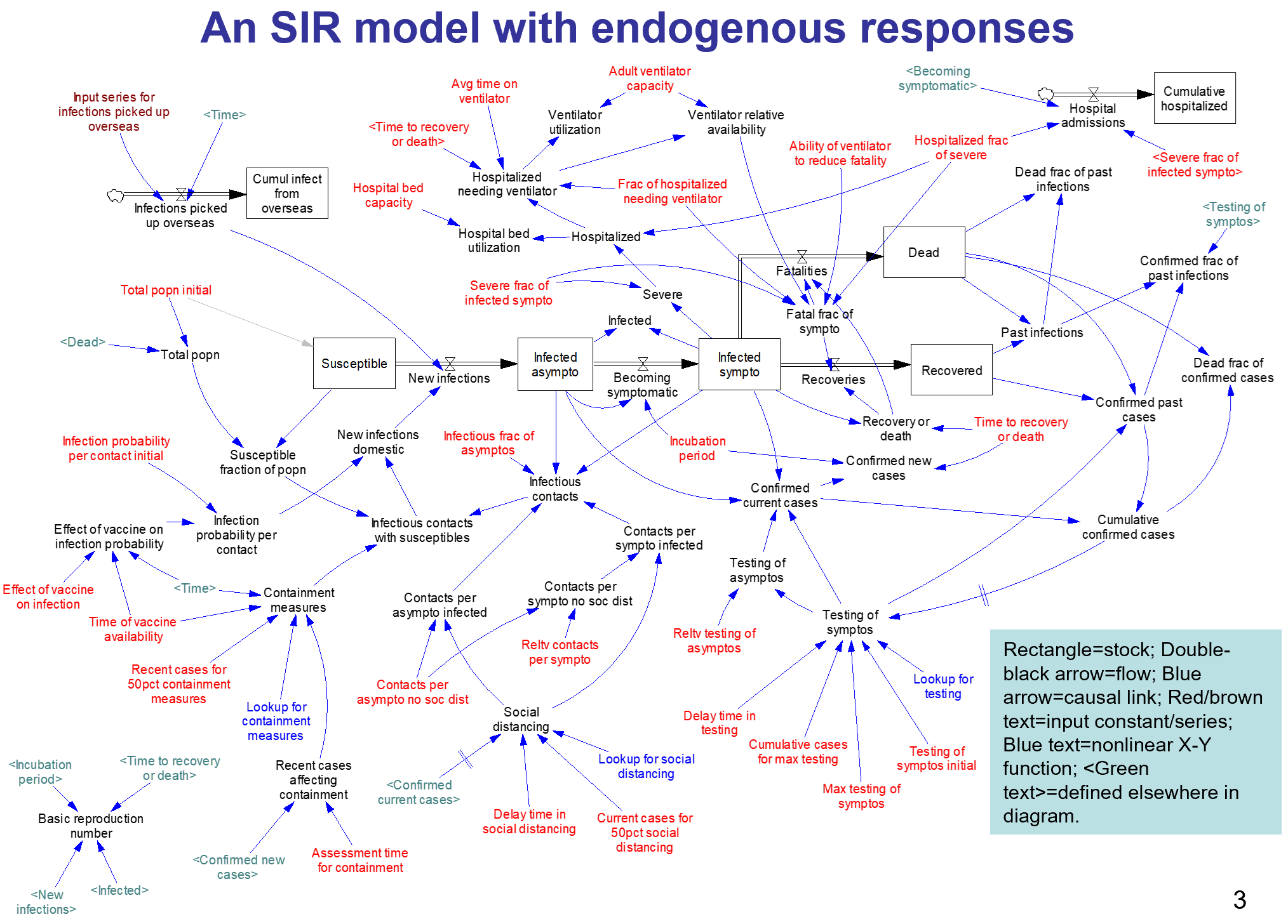
For this to work, there would have to be a nonlinearity in the dynamics of transmission. For example, if the expected number of infections from 2 students interacting with an infected person for 10 minutes each were less than the number from one student interacting with an infected person for 20 minutes, there might be some benefit. This would be similar to a threshold in a dose-response curve. Unfortunately, there’s no evidence for such an effect – if anything, increasing the number of contacts by fragmentation makes things worse.

Scientific reasoning has little to do with the real motivation:

Greg Upham, the superintendent of the 16,500-student school district, said in an interview that contact tracing had become a huge burden for the district, and administrators were looking for a way to ease the burden when they came up with the movement idea. It was not intended to “game the system,” he said, but rather to encourage the staff to be cognizant of the 15-minute window.

Regardless of the intent, this is absolutely an example of gaming the system. However, you game rules, but you can’t fool mother nature. The 15-minute window is a decision rule for prioritizing contact tracing, invented in the context of normal social mixing. Administrators have confused it with a physical phenomenon. Whether or not they intended to game the system, they’re likely to get what they want: less contact tracing. This makes the policy doubly disastrous: it increases transmission, and it diminishes the preventive effects of contact tracing and quarantine. In short order, that means more infections. A few doublings of cases will quickly overwhelm any reduction in contact tracing burden from shuffling students around.

I think the administrators who came up with this might want to consider adding systems thinking to the curriculum.


MSU Covid Evaluation

Well, my prediction of 10/9 covid cases at MSU, made on 10/6 using 10/2 data, was right on the money: I extrapolated 61 from cumulative cases, and the actual number was 60. (I must have made a typo or mental math error in reporting the expected cumulative cases, because 157+61 <> 207. The number I actually extrapolated was 157*e^.33 = 218 = 157 + 61.)

That’s pretty darn good, though I shouldn’t take too much credit, because my confidence bounds would have been wide, had I included them in the letter. Anyway, it was a fairly simpleminded exercise, far short of calibrating a real model.

Interestingly, the 10/16 release has 65 new cases, which is lower than the next simple extrapolation of 90 cases. However, Poisson noise in discrete events like this is large (the variance equals the mean, so this result is about two and a half standard deviations low), and we still don’t know how much testing is happening. I would still guess that case growth is positive, with R above 1, so it’s still an open question whether MSU will make it to finals with in-person classes.

Interestingly, the increased caseload in Gallatin County means that contact tracing and quarantine resources are now strained. This kicks off a positive feedback: increased caseload means that fewer contacts are traced and quarantined. That in turn means more transmission from infected people in the wild, further increasing caseload. MSU is relying on county resources for testing and tracing, so presumably the university is caught in this loop as well.


MSU Covid – what will tomorrow bring?

The following is a note I posted to a local listserv earlier in the week. It’s an example of back-of-the-envelope reasoning informed by experience with models, but without actually calibrating a model to verify the results. Often that turns out badly. I’m posting this to archive it for review and discussion later, after new data becomes available (as early as tomorrow, I expect).

I thought about responding to this thread two weeks ago, but at the time numbers were still very low, and data was scarce. However, as an MSU parent, I’ve been watching the reports closely. Now the picture is quite different.

If you haven’t discovered it, Gallatin County publishes MSU stats at the end of the weekly Surveillance Report, found here:

https://www.healthygallatin.org/about-us/press-releases/

For the weeks ending 9/10, 9/17, 9/24, and 10/2, MSU had 3, 7, 66, and 43 new cases. Reported active cases are slightly lower, which indicates that the active case duration is less than a week. That’s inconsistent with the two-week quarantine period normally recommended. It’s hard to see how this could happen, unless quarantine compliance is low or delays cause much of the infectious period to be missed (not good either way).

The huge jump two weeks ago is a concern. That’s growth of 32% per day, faster than the typical uncontrolled increase in the early days of the epidemic. That could happen from a superspreader event, but more likely reflects insufficient testing to detect a latent outbreak.

Unfortunately they still don’t publish the number of tests done at MSU, so it’s hard to interpret any of the data. We know the upper bound, which is the 2000 or so tests per week reported for all of Gallatin county. Even if all of those were dedicated to MSU, it still wouldn’t be enough to put a serious dent in infection through testing, tracing and isolation. Contrast this with Colby College, which tests everyone twice a week, which is a test density about 100x greater than Gallatin County+MSU.

In spite of the uncertainty, I think it’s wrong to pin Gallatin County’s increase in cases on MSU. First, COVID prevalence among incoming students was unlikely to be much higher than in the general population. Second, Gallatin County is much larger than MSU, and students interact largely among themselves, so it would be hard for them to infect the broad population. Third, the county has its own reasons for an increase, like reopening schools. Depending on when you start the clock, MSU cases are 18 to 28% of the county total, which is at worst 50% above per capita parity. Recently, there is one feature of concern – the age structure of cases (bottom of page 3 of the surveillance report). This shows that the current acceleration is driven by the 10-19 and 20-29 age groups.

As a wild guess, reported cases might understate the truth by a factor of 10. That would mean 420 active cases at MSU when you account for undetected asymptomatics and presymptomatic untested contacts. That’s out of a student/faculty population of 20,000, so it’s roughly 2% prevalence. A class of 10 would have a 1/5 chance of a positive student, and for 20 it would be 1/3. But those #s could easily be off by a factor of 2 or more.

Just extrapolating the growth rate (33%/week for cumulative cases), this Friday’s report would be for 61 new cases, 207 cumulative. If you keep going to finals, the cumulative would grow 10x – which basically means everyone gets it at some point, which won’t happen. I don’t know what quarantine capacity is, but suppose that MSU can handle a 300-case week (that’s where things fell apart at UNC). If so, the limit is reached in less than 5 weeks, just short of finals.

I’d say these numbers are discouraging. As a parent, I’m not yet concerned enough to pull my kids out, but they’re nonresidential so their exposure is low. Around classrooms on campus, compliance with masks, sanitizing and distancing is very good – certainly better than it is in town. My primary concern at present is that we don’t know what’s going on, because the published statistics are insufficient to make reliable judgments. Worse, I suspect that no one knows what’s going on, because there simply isn’t enough testing to tell. Tests are pretty cheap now, and the disruption from a surprise outbreak is enormous, so that seems penny wise and pound foolish. The next few weeks will reveal whether we are seeing random variation or the beginning of a large outbreak, but it would be far better to have enough surveillance and data transparency to know now.

Coronavirus Roundup II

Some things I’ve found interesting and useful lately:

R0

What I think is a pretty important article from LANL: High Contagiousness and Rapid Spread of Severe Acute Respiratory Syndrome Coronavirus 2. This tackles the questions I wondered about in my steady state growth post, i.e. that high observed growth rates imply high R0 if duration of infectiousness is long.

Earlier in the epidemic, this was already a known problem:

The time scale of asymptomatic transmission affects estimates of epidemic potential in the COVID-19 outbreak

The reproductive number of COVID-19 is higher compared to SARS coronavirus

Data

Epiforecasts’ time varying R0 estimates

CMMID’s time varying reporting coverage estimates

NECSI’s daily update for the US

The nifty database of US state policies from Raifman et al. at BU

A similar policy tracker for the world

The covidtracking database. Very useful, if you don’t mind a little mysterious turbulence in variable naming.

The Kinsa thermometer US health weather map

Miscellaneous

Nature’s Special report: The simulations driving the world’s response to COVID-19

Pandemics Depress the Economy, Public Health Interventions Do Not: Evidence from the 1918 Flu

Projecting the transmission dynamics of SARS-CoV-2 through the postpandemic period has some interesting dynamics, including seasonality.

Quantifying SARS-CoV-2 transmission suggests epidemic control with digital contact tracing looks at requirements for contact tracing and isolation

Models for Count Data With Overdispersion has important considerations for calibration

Variolation: hmm. Filed under “interesting but possibly crazy.”

Creative, and less obviously crazy: An alternating lock-down strategy for sustainable mitigation of COVID-19

How useful are antibody tests?

I just ran across this meta-analysis of antibody test performance on medrxiv:

Antibody tests in detecting SARS-CoV-2 infection: a meta-analysis

In total, we identified 38 eligible studies that include data from 7,848 individuals. The analyses showed that tests using the S antigen are more sensitive than N antigen-based tests. IgG tests perform better compared to IgM ones, andshow better sensitivity when the samples were taken longer after the onset of symptoms. Moreover, irrespective of the method, a combined IgG/IgM test seems to be a better choice in terms of sensitivity than measuring either antibody type alone. All methods yielded high specificity with some of them (ELISA and LFIA) reaching levels around 99%. ELISA-and CLIA-based methods performed better in terms of sensitivity (90-94%) followed by LFIA and FIA with sensitivities ranging from 80% to 86%.

The sensitivity results are interesting, but I’m more interested in timing:

Sample quality, low antibody concentrations and especially timing of the test -too soon after a person is infected when antibodies have not been developed yet or toolate when IgM antibodies have decreased or disappeared -could potentially explain the low ability of the antibody tests to identify people with COVID-19. According to kinetic measurements of some of the included studies 22, 49, 54 IgM peaks between days 5 and 12 and then drops slowly. IgGs reach peak concentrations after day 20 or so as IgM antibodies disappear. This meta-analysis showed, through meta-regression, that IgG tests did have better sensitivity when the samples were taken longer after the onset of symptoms. This is further corroborated by the lower specificity of IgM antibodies compared to IgG 15. Only few of the included studies provided data stratified by the time of onset of symptoms, so a separate stratified analysis was not feasible, but this should be a goal for future studies.

This is an important knowledge gap. Timing really matters, because tests that aren’t sensitive to early asymptomatic transmission have limited utility for preventing spread. Consider the distribution of serial infection times (Ferretti et al., Science):

Testing by itself doesn’t do anything to reduce the spread of infection. It’s an enabler: transmission goes down only if coronavirus-positive individuals identified through testing change their behavior. That implies a chain of delays:

  • Conduct the test and get the results
  • Inform the positive person
  • Get them into a situation where they won’t infect their coworkers, family, etc.
  • Trace their contacts, test them, and repeat

A test that only achieves peak sensitivity at >5 days may not leave much time for these delays to play out, limiting the effectiveness of contact tracing and isolation. A test that peaks at day 20 would be pretty useless (though interesting for surveillance and other purposes).

Consider Long et al., Antibody responses to SARS-CoV-2 in COVID-19 patients: the perspective application of serological tests in clinical practice:

Seroconversion rates of 30% at onset of symptoms seem problematic, given the significant pre-symptomatic transmission implied by the Ferretti, Liu & Nishiura results on serial infection times. I hope the US testing strategy relies on lots of fast tests, not just lots of tests.

See also:

Potential Rapid Diagnostics, Vaccine and Therapeutics for 2019 Novel Coronavirus (2019-nCoV): A Systematic Review.

Antibody surveys suggesting vast undercount of coronavirus infections may be unreliable in Science

h/t Yioryos Stamboulis

A coronavirus prediction you can bank on

How many cases will there be on June 1? Beats me. But there’s one thing I’m sure of.

My confidence bounds on future behavior of the epidemic are still pretty wide. While there’s good reason to be optimistic about a lot of locations, there are also big uncertainties looming. No matter how things shake out, I’m confident in this:

The antiscience crowd will be out in force. They’ll cherry-pick the early model projections of an uncontrolled epidemic, and use that to claim that modelers predicted a catastrophe that didn’t happen, and conclude that there was never a problem. This is the Cassandra’s curse of all successful modeling interventions. (See Nobody Ever Gets Credit for Fixing Problems that Never Happened for a similar situation.)

But it won’t stop there. A lot of people don’t really care what the modelers actually said. They’ll just make stuff up. Just today I saw a comment at the Bozeman Chronicle to the effect of, “if this was as bad as they said, we’d all be dead.” Of course that was never in the cards, or the models, but that doesn’t matter in Dunning Krugerland.

Modelers, be prepared for a lot more of this. I think we need to be thinking more about defensive measures, like forecast archiving and presentation of results only with confidence bounds attached. However, it’s hard to do that and to produce model results at a pace that keeps up with the evolution of the epidemic. That’s something we need more infrastructure for.

The Normal distribution is a bad COVID19 model

Forecasting diffusion processes by fitting sigmoid curves has a long history of failure. Let’s not repeat those mistakes in the COVID19 epidemic.

I’ve seen several models explaining “flattening the curve” that use the Normal distribution as a model of the coronavirus epidemic. Now this model uses it to forecast peak hospital load:

We developed a curve-fitting tool to fit a nonlinear mixed effects model to the available admin 1 cumulative death data. The cumulative death rate for each location is assumed to follow a parametrized Gaussian error function … where the function is the Gaussian error function(written explicitly above), p controls the maximum death rate at each location, t is the time since death rate exceeded 1e-15, ß(beta)is a location-specific inflection point(time at which rate of increase of the death rate is maximum), and α(alpha)is a location-specific growth parameter. Other sigmoidal functional forms … were considered but did not fit the data as well. Data were fit to the log of the death rate in the available data, using an optimization framework described in the appendix.

One bell-shaped curve is as good as another, right? No!

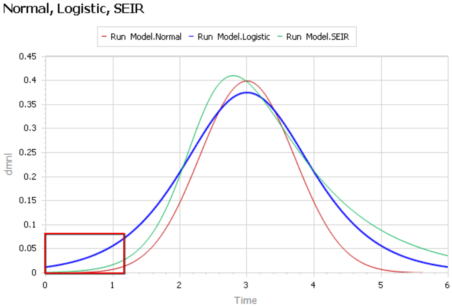
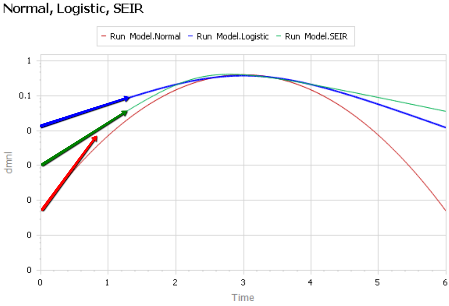
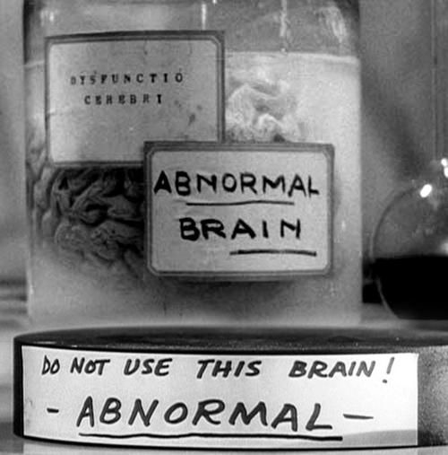
Like Young Frankenstein, epidemic curves are not Normal.

1. Fit to data is a weak test.

The graph below compares 3 possible models: the Normal distribution, the Logistic distribution (which has an equivalent differential equation interpretation), and the SEIR model. Consider what’s happening when you fit a sigmoid to the epidemic data so far (red box). The curves below are normalized to yield similar peaks, but imagine what would happen to the peaks if you fit all 3 to the same data series.

The problem is that this curve-fitting exercise expects data from a small portion of the behavior to tell you about the peak. But over that interval, there’s little behavior variation. Any exponential is going to fit reasonably well. Even worse, if there are any biases in the data, such as dramatic shifts in test coverage, the fit is likely to reflect those biases as much as it does the physics of the system. That’s largely why the history of fitting diffusion models to emerging trends in the forecasting literature is so dreadful.

After the peak, the right tail of the SEIR model is also quite different, because the time constant of recovery is different from the time constant for the growth phase. This asymmetry may also have implications for planning.

2. The properties of the Normal distribution don’t match the observed behavior of coronavirus.

It’s easier to see what’s going on if you plot the curves above on a log-y scale:

The logistic and SEIR models have a linear left tail. That is to say that they have a constant growth rate in the early epidemic, until controls are imposed or you run out of susceptible people.

The Normal distribution (red) is a parabola, which means that the growth rate is steadily decreasing, long before you get near the peak. Similarly, if you go backwards in time, the Normal distribution predicts that the growth rate would have been higher back in November, when patient 0 emerged.

There is some reason to think that epidemics start faster due to social network topology, but also some reasons for slower emergence. In any case, that’s not what is observed for COVID19 – uncontrolled growth rates are pretty constant:

https://aatishb.com/covidtrends/

3. With weak data, you MUST have other quality checks

Mining data to extract relationships works great in many settings. But when you have sparse data with lots of known measurement problems, it’s treacherous. In that case, you need a model of the physics of the system and the lags and biases in the data generating process. Then you test that model against all available information, including

  • conservation laws,
  • operational correspondence with physical processes,
  • opinions from subject matter experts and measurements from other levels of aggregation,
  • dimensional consistency,
  • robustness in extreme conditions, and finally
  • fit to data.

Fortunately, a good starting point has existed for almost a century: the SEIR model. It’s not without pitfalls, and needs some disaggregation and a complementary model of policies and the case reporting process, but if you want simple projections, it’s a good place to start.

Once you have triangulation from all of these sources, you have some hope of getting the peak right. But your confidence bounds should still be derived not only from the fit itself, but also priors on parameters that were not part of the estimation process.

Update: Coronavirus Curve-fitting OverConfidence

Steady State Growth in SIR & SEIR Models

Beware of the interpretation of R0, and models that plug an R0 estimated in one context into a delay structure from another.

This started out as a techy post about infection models for SD practitioners interested in epidemiology. However, it has turned into something more important for coronavirus policy.

It began with a puzzle: I re-implemented my conceptual coronavirus model for multiple regions, tuning it for Italy and Switzerland. The goal was to use it to explore border closure policies. But calibration revealed a problem: using mainstream parameters for the incubation time, recovery time, and R0 yielded lukewarm growth in infections. Retuning to fit the data yields R0=5, which is outside the range of most estimates. It also makes control extremely difficult, because you have to reduce transmission by 1-1/R0 = 80% to stop the spread.

To understand why, I decided to solve the model analytically for the steady-state growth rate in the early infection period, when there are plenty of susceptible people, so the infection rate is unconstrained by availability of victims. That analysis is reproduced in the subsequent sections. It’s of general interest as a way of thinking about growth in SD models, not only for epidemics, but also in marketing (the Bass Diffusion model is essentially an epidemic model) and in growing economies and supply chains.

First, though, I’ll skip to the punch line.

The puzzle exists because R0 is not a complete description of the structure of an epidemic. It tells you some important things about how it will unfold, like how much you have to reduce transmission to stop it, but critically, not how fast it will go. That’s because the growth rate is entangled with the incubation and recovery times, or more generally the distribution of the generation time (the time between primary and secondary infections).

This means that an R0 value estimated with one set of assumptions about generation times (e.g., using the R package R0) can’t be plugged into an SEIR model with different delay structure assumptions, without changing the trajectory of the epidemic. Specifically, the growth rate is likely to be different. The growth rate is, unfortunately, pretty important, because it influences the time at which critical thresholds like ventilator capacity will be breached.

The mathematics of this are laid out clearly by Wallinga & Lipsitch. They approach the problem from generating functions, which give up simple closed-form solutions a little more readily than my steady-state growth calculations below. For example, for the SEIR model,

R0 = (1 + r/b1)(1 + r/b2)           (Eqn. 3.2)

Where r is the growth rate, b1 is the inverse of the incubation time, and b2 is the inverse of the recovery time. If you plug in r = 0.3/day, b1 = 1/(5 days), b2 = 1/(10 days), R0 = 10, which is not plausible for COVID-19. Similarly, if you plug in the frequently-seen R0=2.4 with the time constants above, you get growth at 8%/day, not the observed 30%/day.

There are actually more ways to get into trouble by using R0 as a shorthand for rich assumptions in models. Stochastic dynamics and network topology matter, for example. In The Failure of R0, Li Blakely & Smith write,

However, in almost every aspect that matters, R 0 is flawed. Diseases can persist with R 0 < 1, while diseases with R 0 > 1 can die out. We show that the same model of malaria gives many different values of R 0, depending on the method used, with the sole common property that they have a threshold at 1. We also survey estimated values of R 0 for a variety of diseases, and examine some of the alternatives that have been proposed. If R 0 is to be used, it must be accompanied by caveats about the method of calculation, underlying model assumptions and evidence that it is actually a threshold. Otherwise, the concept is meaningless.

Is this merely a theoretical problem? I don’t think so. Here’s how things stand in some online SEIR-type simulators:

Model R0 (dmnl) Incubation (days) Infectious (days) Growth Rate (%/day)
My original 3.3  5  7  17
Homer US 3.5  5.4  11  18
covidsim.eu 4  4 & 1  10  17
Epidemic Calculator 2.2  5.2  2.9  30*
Imperial College 2.4 5.1 ~3** 20***

*Observed in simulator; doesn’t match steady state calculation, so some feature is unknown.

**Est. from 6.5 day mean generation time, distributed around incubation time.

***Not reported; doubling time appears to be about 6 days.

I think this is certainly a Tower of Babel situation. It seems likely that the low-order age structure in the SEIR model is problematic for accurate representation of the dynamics. But it also seems like piecemeal parameter selection understates the true uncertainty in these values. We need to know the joint distribution of R0 and the generation time distribution in order to properly represent what is going on.

Steady State Growth – SIR

Continue reading “Steady State Growth in SIR & SEIR Models”

A model of COVID-19 in the US with endogenous testing, containment measures, and social distancing

Here’s another COVID-19 model. This one’s from Jack Homer of Homer Consulting. Jack is a very creative modeler, the author of some SD classics like the worker burnout model, an SD blogger, and plays a central role in important projects like Rethink Health.

The core of the model is an SEIR chain, similar to my model. This adds some nice features, including endogenous testing and a feedback decision rule for control measures. It’s parameterized for the US.

I haven’t spent significant time with the model yet, so I can’t really comment. An alarming feature of this disease is that doublings occur on the same time scale as thinking through an iteration of a model, especially if coronavirus is not your day job. I hope to add some further thoughts when I’ve thinned my backlog a bit.

From the slide deck:

Conclusions

  • The results here come from a model with several key numerical assumptions, especially around behavioral responses. As the 4 runs illustrate, if the assumptions are modified, the overall results change over some range of possibility.
  • My assumptions about the behavioral responses were informed by what we been seeing recently in the US: a good response, even in regions not yet hard-hit. The message is out, and it is having an effect.
  • Because of the responses, and despite the absence of a vaccine, I conclude this epidemic will not infect a third or half of the population as some have predicted. Rather, we are likely to see 6m-28m cases in the US in total, resulting in 100k-500k deaths. This projection assumes a vaccine available by next April.
  • I also conclude that our hospital system overall has enough bed capacity to handle the peak load late April/early May; and enough ventilator capacity except during those 3 weeks in the more pessimistic Slowboth scenario. We would need 180k ventilators (rather than the assumed 120k) to avoid this shortage in the pessimistic scenario.
  • I have not addressed here the impact of containment measures and social distancing on the economy, including the supply of food and other necessities. This supply is important, affecting our ability to maintain strong containment and distancing.

This archive contains the Vensim model in mdl and vpmx format, a custom graph set (already loaded in the model), and some runs:

homerCOVID19v2.zip

A nice slide deck documenting the results:

Covid19US model jh v2.pdf

This uses data via GET XLS so it won’t work with PLE; the Model Reader will work.

Update, 3/24/2020: This version refines the model. I’ve added a copy with the data variables deleted, that should work with PLE.

Covid19US-model-jh-v2c.zip

Update, 4/27/2020:

homer v8.zip