I often run across interesting time series that make good reference mode diagrams. Reference modes, in System Dynamics jargon, are plots that “neatly summarize the real-world problem behavior that motivated a model” (VanderWerf, 1981). There’s a lot of variation in practice, but drawing reference modes is often a nice way to get started on model conceptualization, particularly in a group model building session.
My typical practice is to get participants to identify some key variables that they think are of interest in their system, and then generate some time series plots of history, what they think will happen in the future, bounded by what they hope or fear may happen. VanderWerf has a nice example:
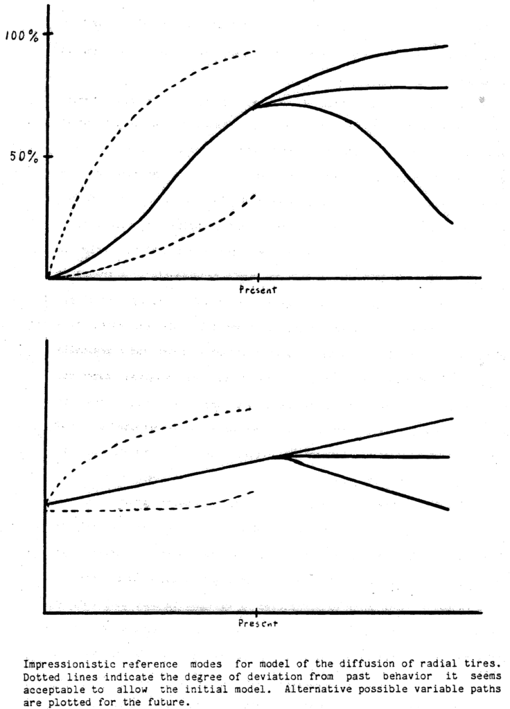
I have one quibble with this: the axes should be labeled with a real time horizon, variable name, and units of measure. This last point is critical for establishing good habits early.
There’s often real data as a starting point, but capturing participants’ “impressionistic” reference modes is often revealing. When you collect the data that ought to underlie those, you might learn (a) that participants’ impressions are wrong (revealing something about their mental models), or (b) that the data are wrong in some sense, either due to measurement and interpretation problems, or because the chosen variables aren’t really the key drivers of a problem. Either way, this is valuable information.
If you have the data to hand, you can still use it effectively for conceptualization. Here’s an example:
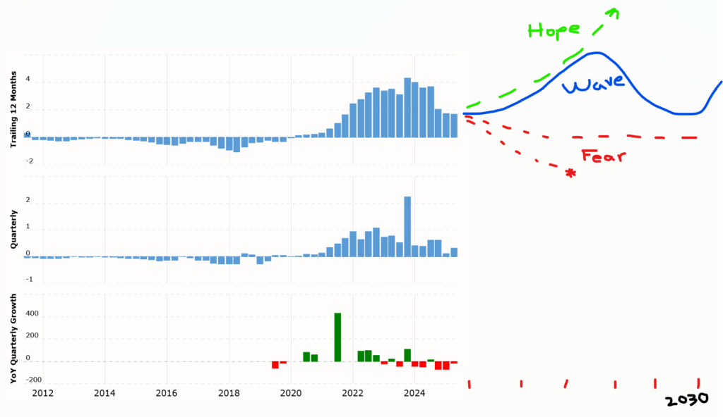
This is TSLA earnings per share in $/share (or YOY growth at bottom), with my markup on the first plot. Looking at this abstractly, it’s tempting to view it as some kind of logistic growth or overshoot-and-collapse dynamic, in which case one might fear (red) the extrapolation to negative earnings and bankruptcy, or at least something like mild decline or persistence of the status quo (which is roughly what yesterday’s earnings did). However, the stock market clearly hopes (green) for something else: the PE ratio in the hundreds indicates an expectation of resumed exponential growth to well above 10x recent earnings. One might also notice some cyclical peaks and troughs and hypothesize future oscillations (blue).
I’m not putting a stake in the ground as to which of these will happen, but I think this is a nice illustration of the first point of Khalid Saeed’s policy space concept: if your model can’t capture both the hope and the fear scenarios, “The problem definition might be linked too intimately to a preferred rather than a competing set of manifestations, hence the model it creates has no way to transform behavior to an alternative manifestation.” You won’t be able to use the model to discriminate among competing predictions, or to talk to people with different beliefs about the future or response to intervention.