Loopy

I just gave Loopy a try, after seeing Gene Bellinger’s post about it.

It’s cool for diagramming, and fun. There are some clever features, like drawing a circle to create a node (though I was too dumb to figure that out right away). Its shareability and remixing are certainly useful.

However, I think one must be very cautious about simulating causal loop diagrams directly. A causal loop diagram is fundamentally underspecified, which is why no method of automated conversion of CLDs to models has been successful.

In this tool, behavior is animated by initially perturbing the system (e.g, increase the number of rabbits in a predator-prey system). Then you can follow the story around a loop via animated arrow polarity changes – more rabbits causes more foxes, more foxes causes less rabbits. This is essentially the storytelling method of determining loop polarity, which I’ve used many times to good effect.

However, as soon as the system has multiple loops, you’re in trouble. Link polarity tells you the direction of change, but not the gain or nonlinearity. So, when multiple loops interact, there’s no way to determine which is dominant. Also, in a real system it matters which nodes are stocks; it’s not sufficient to assume that there must be at least one integration somewhere around a loop.

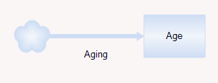
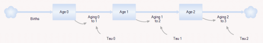
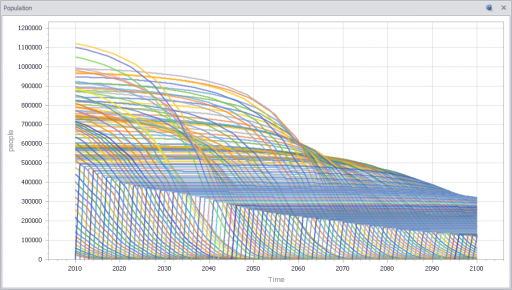
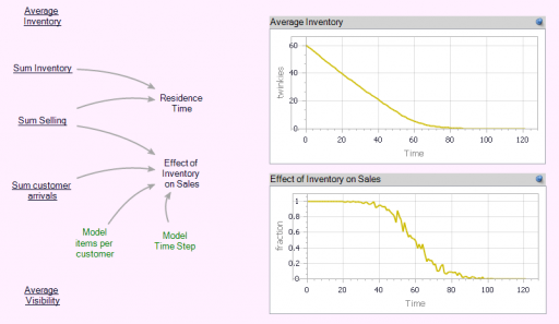
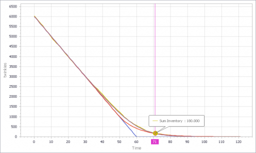
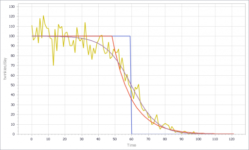
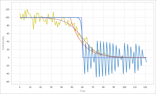
You can test this for yourself by starting with the predator-prey example on the home page. The initial model is a discrete oscillator (more rabbits -> more foxes -> fewer rabbits). But the real system is nonlinear, with oscillation and other possible behaviors, depending on parameters. In Loopy, if you start adding explicit births and deaths, which should get you closer to the real system, simulations quickly result in a sea of arrows in conflicting directions, with no way to know which tendency wins. So, the loop polarity simulation could be somewhere between incomprehensible and dead wrong.

Similarly, if you consider an SIR infection model, there are three loops of interest: spread of infection by contact, saturation from running out of susceptibles, and recovery of infected people. Depending on the loop gains, it can exhibit different behaviors. If recovery is stronger than spread, the infection dies out. If spread is initially stronger than recovery, the infection shifts from exponential growth to goal seeking behavior as dominance shifts nonlinearly from the spread loop to the saturation loop.

I think it would be better if the tool restricted itself to telling the story of one loop at a time, without making the leap to system simulations that are bound to be incorrect in many multiloop cases. With that simplification, I’d consider this a useful item in the toolkit. As is, I think it could be used judiciously for explanations, but for conceptualization it seems likely to prove dangerous.

My mind goes back to Barry Richmond’s approach to systems here. Causal loop diagrams promote thinking about feedback, but they aren’t very good at providing an operational description of how things work. When you’re trying to figure out something that you don’t understand a priori, you need the bottom-up approach to synthesize the parts you understand into the whole you’re grasping for, so you can test whether your understanding of processes explains observed behavior. That requires stocks and flows, explicit goals and actual states, and all the other things system dynamics is about. If we could get to that as elegantly as Loopy gets to CLDs, that would be something.

Aging is unnatural

Larry Yeager and I submitted a paper to the SD conference, proposing dynamic cohorts as a new way to model aging populations, vehicle fleets, and other quantities. Cohorts aren’t new*, of course, but Ventity makes it practical to allocate them on demand, so you don’t waste computation and attention on a lot of inactive zeroes.

The traditional alternative has been aging chains. Setting aside technical issues like dispersion, I think there’s a basic conceptual problem with aging chains: they aren’t a natural, intuitive operational representation of what’s happening in a system. Here’s why.

Consider a model of an individual. You’d probably model age like this:

Here, age is a state of the individual that increases with aging. Simple. Equivalently, you could calculate it from the individual’s birth date:

Ideally, a model of a population would preserve the simplicity of the model of the individual. But that’s not what the aging chain does:

This says that, as individuals age, they flow from one stock to another. But there’s no equivalent physical process for that. People don’t flow anywhere on their birthday. Age is continuous, but the separate stocks here represent an arbitrary discretization of age.

Even worse, if there’s mortality, the transition time from age x to age x+1 (the taus on the diagram above) is not precisely one year.

You can contrast this with most categorical attributes of an individual or population:

When cars change (geographic) state, the flow represents an actual, physical movement across a boundary, which seems a lot more intuitive.

As we’ll show in the forthcoming paper, dynamic cohorts provide a more natural link between models of individuals and groups, and make it easy to see the lifecycle of a set of related entities. Here are the population sizes of annual cohorts for Japan:

I’ll link the paper here when it’s available.


* This was one of the applications we proposed in the original Ventity white paper, and others have arrived at the same idea, minus the dynamic allocation of the cohorts. Demographers have been doing it this way for ages, though usually in statistical approaches with no visual representation of the system.

Dynamics of the last Twinkie

When Hostess went bankrupt in 2012, there was lots of speculation about the fate of the last Twinkie, perhaps languishing on the dusty shelves of a gas station convenience store somewhere in New Mexico. Would that take ten days, ten weeks, ten years?

So, what does this have to do with system dynamics? It calls to mind the problem of modeling the inventory stockout constraint on sales. This problem dates back to Industrial Dynamics (see the variable NIR driving SSR and the discussion around figs. 15-5 and 15-7).

If there’s just one product in one inventory (i.e. one store), and visibility doesn’t matter, the constraint is pretty simple. As long as there’s one item left, sales or shipments can proceed. The constraint then is:

(1) selling = MIN(desired selling, inventory/time step)

In other words, the most that can be sold in one time step is the amount of inventory that’s actually on hand. Generically, the constraint looks like this:

Here, tau is a time constant, that could be equal to time step (DT), as above, or could be generalized to some longer interval reflecting handling and other lags.

This can be further generalized to some kind of continuous function, like:

(2) selling = desired selling * f( inventory )

where f() is often a lookup table. This can be a bit tricky, because you have to ensure that f() goes to zero fast enough to obey the inventory/DT constraint above.

But what if you have lots of products and/or lots of inventory points, perhaps with different normal turnover rates? How does this aggregate? I built the following toy model to find out. You could easily do this in Vensim with arrays, but I found that it was ideally suited to Ventity.

Here’s the setup:

First, there’s a collection of Store entities, each with an inventory. Initial inventory is random, with a Poisson distribution, which ensures integer twinkies. Customer arrivals also have a Poisson distribution, and (optionally), the mean arrival rate varies by store. Selling is constrained to stock on hand via inventory/DT, and is also subject to a visibility effect – shelf stock influences the probability that a customer will buy a twinkie (realized with a Binomial distribution). The visibility effect saturates, so that there are diminishing returns to adding stock, as occurs when new stock goes to the back rows of the shelf, for example.

In addition, there’s an Aggregate entitytype, which is very similar to the Store, but deterministic and continuous.

The Aggregate’s initial inventory and sales rates are set to the expected values for individual stores. Two different kinds of constraints on the inventory outflow are available: inventory/tau, and f(inventory). The sales rate simplifies to:

(3) selling = min(desired sales rate*f(inventory),Inventory/Min time to sell)

(4) min time to sell >= time step

In the Store and the Aggregate, the nonlinear effect of inventory on sales (called visibility in the store) is given by

(5) f(inventory) = 1-Exp(-Inventory/Threshold)

However, the aggregate threshold might be different from the individual store threshold (and there’s no compelling reason for the aggregate f() to match the individual f(); it was just a simple way to start).

In the Store[] collection, I calculate aggregates of the individual stores, which look quite continuous, even though the population is only 100. (There are over 100,000 gas stations in the US.)

Notice that the time series behavior of the effect of inventory on sales is sigmoid.

Now we can compare individual and aggregate behavior:

Inventory

Selling

The noisy yellow line is the sum of the individual Stores. The blue line arises from imposing a hard cutoff, equation (1) above. This is like assuming that all stores are equal, and inventory doesn’t affect sales, until it’s gone. Clearly it’s not a great fit, though it might be an adequate shortcut where inventory dynamics are not really the focus of a model.

The red line also imposes an inventory/tau constraint, but the time constant (tau) is much longer than the time step, at 8 days (time step = 1 day). Finally, the purple sigmoid line arises from imposing the nonlinear f(inventory) constraint. It’s quite a good fit, but the threshold for the aggregate must be about twice as big as for the individual Stores.

However, if you parameterize f() poorly, and omit the inventory/tau constraint, you get what appear to be chaotic oscillations – cool, but obviously unphysical:

If, in addition, you add diversity in Store’s customer arrival rates, you get a longer tail on inventory. That last Twinkie is likely to be in a low-traffic outlet. This makes it a little tougher to fit all parts of the curve:

I think there are some interesting questions here, that would make a great paper for the SD conference:

  • (Under what conditions) can you derive the functional form of the aggregate constraint from the properties of the individual Stores?
  • When do the deficiencies of shortcut approaches, that may lack smooth derivatives, matter in aggregate models like Industrial dynamics?
  • What are the practical implications for marketing models?
  • What can you infer about inventory levels from aggregate data alone?
  • Is that really chaos?

Have at it!

The Ventity model: LastTwinkie1.zip

Data science meets the bottom line

A view from simulation & System Dynamics


I come to data science from simulation and System Dynamics, which originated in control engineering, rather than from the statistics and database world. For much of my career, I’ve been working on problems in strategy and public policy, where we have some access to mental models and other a priori information, but little formal data. The attribution of success is tough, due to the ambiguity, long time horizons and diverse stakeholders.

I’ve always looked over the fence into the big data pasture with a bit of envy, because it seemed that most projects were more tactical, and establishing value based on immediate operational improvements would be fairly simple. So, I was surprised to see data scientists’ angst over establishing business value for their work:

One part of solving the business value problem comes naturally when you approach things from the engineering point of view. It’s second nature to include an objective function in our models, whether it’s the cash flow NPV for a firm, a project’s duration, or delta-V for a rocket. When you start with an abstract statistical model, you have to be a little more deliberate about representing the goal after the model is estimated (a simulation model may be the delivery vehicle that’s needed).

You can solve a problem whether you start with the model or start with the data, but I think your preferred approach does shape your world view. Here’s my vision of the simulation-centric universe:

The more your aspirations cross organizational silos, the more you need the engineering mindset, because you’ll have data gaps at the boundaries – variations in source, frequency, aggregation and interpretation. You can backfill those gaps with structural knowledge, so that the model-data combination yields good indirect measurements of system state. A machine learning algorithm doesn’t know about dimensional consistency, conservation of people, or accounting identities unless the data reveals such structure, but you probably do. On the other hand, when your problem is local, data is plentiful and your prior knowledge is weak, an algorithm can explore more possibilities than you can dream up in a given amount of time. (Combining the two approaches, by using prior knowledge of structure as “free data” constraints for automated model construction, is an area of active research here at Ventana.)

I think all approaches have a lot in common. We’re all trying to improve performance with systems science, we all have to deal with messy data that’s expensive to process, and we all face challenges formulating problems and staying connected to decision makers. Simulations need better connectivity to data and users, and purely data driven approaches aren’t going to solve our biggest problems without some strategic context, so maybe the big data and simulation worlds should be working with each other more.

Cross-posted from LinkedIn