The static reserve life index rears its ugly head in the State of the Union

The President said, in the State of the Union Address,

We have a supply of natural gas that can last America nearly one hundred years, and my Administration will take every possible action to safely develop this energy.

The 100 year figure presumably comes straight from EIA:

According to the EIA Annual Energy Outlook 2011, the United States possesses 2,543 trillion cubic feet (Tcf) of potential natural gas resources. Natural gas from shale resources, considered uneconomical just a few years ago, accounts for 862 Tcf of this resource estimate. At the 2010 rate of U.S. consumption (about 24.1 Tcf per year), 2,543 Tcf of natural gas is enough to supply over 100 years of use.

100 years is the static reserve life index (SRLI). It’s well known that the SRLI is a misleading metric (this figured prominently in Limits to Growth, for example). Exponential growth in consumption violates the basic assumption of the SRLI, which is that consumption remains constant. Even a small amount of growth greatly erodes the actual lifetime of a resource:
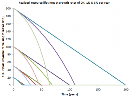
Growth at 3% per year reduces the SRLI of gas from 100 years to a realized lifetime of 45 years, which is not nearly so comfortable. This ought to be intuitive even if you can’t integrate exponentials in your head, because gas consumption would have to roughly double to replace coal (and that doubling would have to happen quickly to meet job claims), so clearly “100 years at current rates” isn’t going to happen.

Update: EIA just lowered shale gas resource estimates by nearly half, taking another big bite out of the SRLI:

In the AEO2012 Reference case, the estimated unproved technically recoverable resource (TRR) of shale gas for the United States is 482 trillion cubic feet, substantially below the estimate of 827 trillion cubic feet in AEO2011.
Disinfographics

I cringed when I saw the awful infographics in a recent GreenBiz report, highlighted in a Climate Progress post. A site that (rightly) criticizes the scientific illiteracy of the GOP field shouldn’t be gushing over chartjunk that would make USA Today blush. Climate Progress dumped my mildly critical comment into eternal moderation queue purgatory, so I have to rant about this a bit.

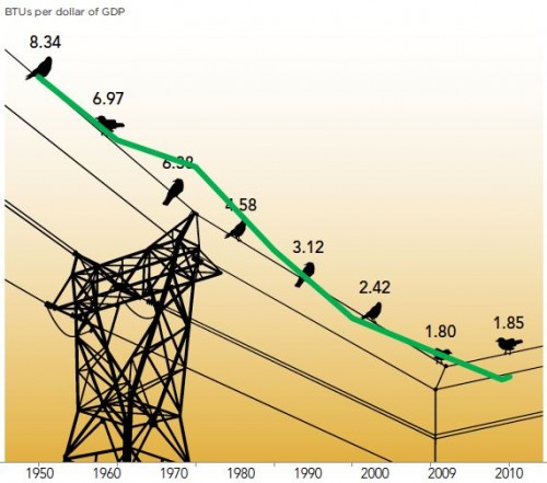
Here’s one of the graphics, with my overlay of the data plotted correctly (in green):

“What We Found: The energy consumed per dollar of gross domestic product grew slightly in 2010, the first increase after steady declines for more than half a century.”

Notice that:

  • No, there really wasn’t a great cosmic coincidence that caused energy intensity to progress at a uniform rate from 1950-1970 and 1980-2009, despite the impression given by the arrangements of points on the wire.
  • The baseline of the original was apparently some arbitrary nonzero value.
  • The original graphic vastly overstates the importance of the last two data points by using a nonuniform time axis.

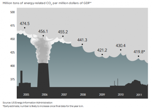
The issues are not merely aesthetic; the bad graphics contribute to distorted interpretations of reality, as the caption above indicates. From another graphic (note the short horizon and nonzero baseline), CP extracts the headline, “US carbon intensity is flat lining.”

From any reasonably long sample of the data it should be clear that the 2009-2011 “flat lining” is just a blip, having little to do with the long term emission trends we need to modify to achieve deep emissions reductions.

The other graphics in the article are each equally horrific in their own special way.

My advice to analysts is simple. If you want to communicate information, find someone numerate who’s read Tufte to make your plots. If you must have a pretty picture for eye candy, use it as a light background to an accurate plot. If you want pretty pictures to persuade people without informing them, skip the data and use a picture of a puppy. Here, you can even use my puppy:

Why learn calculus?

A young friend asked, why bother learning calculus, other than to get into college?

The answer is that calculus holds the keys to the secrets of the universe. If you don’t at least have an intuition for calculus, you’ll have a harder time building things that work (be they machines or organizations), and you’ll be prey to all kinds of crank theories. Of course, there are lots of other ways to go wrong in life too. Be grumpy. Don’t brush your teeth. Hang out in casinos. Wear white shoes after Labor Day. So, all is not lost if you don’t learn calculus. However, the world is less mystifying if you do.

The amazing thing is, calculus works. A couple of years ago, I found my kids busily engaged in a challenge, using a sheet of tinfoil of some fixed size to make a boat that would float as many marbles as possible. They’d managed to get 20 or 30 afloat so far. I surreptitiously went off and wrote down the equation for the volume of a rectangular prism, subject to the constraint that its area not exceed the size of the foil, and used calculus to maximize. They were flabbergasted when I managed to float over a hundred marbles on my first try.

The secrets of the universe come in two flavors. Mathematically, those are integration and differentiation, which are inverses of one another.

Continue reading “Why learn calculus?”

Sandpiles & Systems

Sand piles are sometimes used as a counterpoint to systems, where a system is a bunch of interconnected components that interact in some interesting way, while a sand pile is just a bunch of boring stuff. Ironically, sand piles are actually pretty interesting – they self organize. Avalanches regulate the angle of repose of the pile. In aggregate, one can think of this as a negative feedback process – when the pile is too steep, it avalanches, building up the base and lowering the top. There’s more to the picture when you look at it from a disaggregate perspective; the resulting state is an example of self-organized criticality, and if you keep adding to the pile, you get avalanches at all scales (i.e. a power law distribution).

Overnight, nature left me a nice example of a snow pile system on our front stair railing. At some point, the accumulated snow on the handrail partially avalanched, leaving bare wood on its lower half. Evidently the railing is at just the right angle for the ongoing snowfall, fine grains due to the cold, to make a kind of cellular automaton, resulting in this surprisingly regular pattern, reminiscent of a Sierpinski triangle or one of Wolfram’s elementary systems.