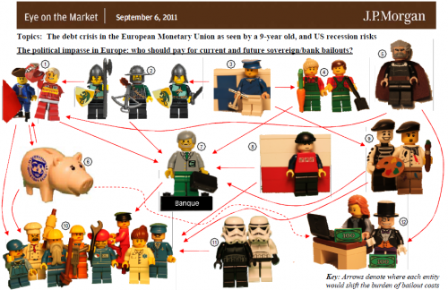
A clever visualization from a 9-year-old:

Click through to the original .pdf for the numbered legend.
This is isn’t quite a causal loop diagram; arrows indicate “where each entity would shift the burden of bailout costs,” but the network of relationships implies a lot of interesting dynamics.
