I cringed when I saw the awful infographics in a recent GreenBiz report, highlighted in a Climate Progress post. A site that (rightly) criticizes the scientific illiteracy of the GOP field shouldn’t be gushing over chartjunk that would make USA Today blush. Climate Progress dumped my mildly critical comment into eternal moderation queue purgatory, so I have to rant about this a bit.
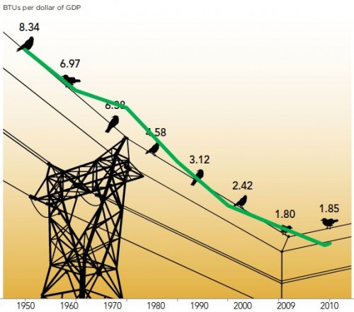
Here’s one of the graphics, with my overlay of the data plotted correctly (in green):
“What We Found: The energy consumed per dollar of gross domestic product grew slightly in 2010, the first increase after steady declines for more than half a century.”
Notice that:
- No, there really wasn’t a great cosmic coincidence that caused energy intensity to progress at a uniform rate from 1950-1970 and 1980-2009, despite the impression given by the arrangements of points on the wire.
- The baseline of the original was apparently some arbitrary nonzero value.
- The original graphic vastly overstates the importance of the last two data points by using a nonuniform time axis.
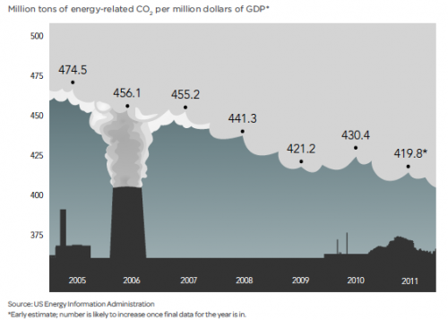
The issues are not merely aesthetic; the bad graphics contribute to distorted interpretations of reality, as the caption above indicates. From another graphic (note the short horizon and nonzero baseline), CP extracts the headline, “US carbon intensity is flat lining.”

From any reasonably long sample of the data it should be clear that the 2009-2011 “flat lining” is just a blip, having little to do with the long term emission trends we need to modify to achieve deep emissions reductions.
The other graphics in the article are each equally horrific in their own special way.
My advice to analysts is simple. If you want to communicate information, find someone numerate who’s read Tufte to make your plots. If you must have a pretty picture for eye candy, use it as a light background to an accurate plot. If you want pretty pictures to persuade people without informing them, skip the data and use a picture of a puppy. Here, you can even use my puppy:


