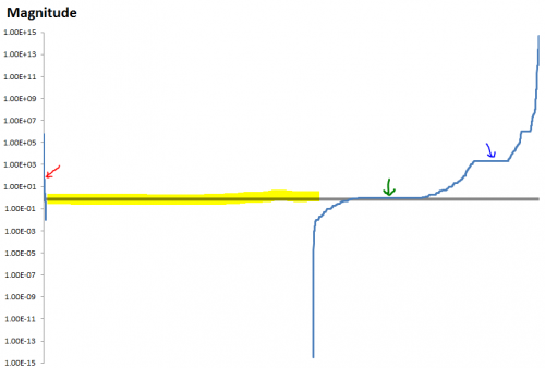
Answering my own question, here’s the distribution of all 12,000 constants from a dozen models, harvested from my hard drive. About half are from Ventana, and there are a few classics, like World3. All are policy models – no physics, biology, etc.
 The vertical scale is magnitude, ABS(x). Values are sorted on the horizontal axis, so that negative values appear on the left. Incredibly, there were only about 60 negative values in the set. Clearly, unlike linear models where signs fall where they may, there’s a strong user preference for parameters with a positive sense.
Next comes a big block of 0s, which don’t show on the log scale. Most of the 0s are not really interesting parameters; they’re things like switches in subscript mapping, though doubtless some are real.
At the right are the positive values, ranging from about 10^-15 to 10^+15. The extremes are units converters and physical parameters (area of the earth). There are a couple of flat spots in the distribution – 1s (green arrow), probably corresponding with the 0s, though some are surely “interesting”, and years (i.e. things with a value of about 2000, blue arrow).
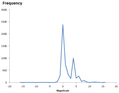
If you look at just the positive parameters, here’s the density histogram, in log10 magnitude bins:
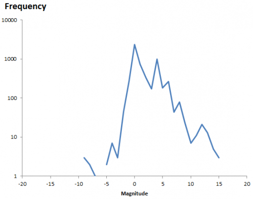
 Again, the two big peaks are the 1s and the 2000s. The 0s would be off the scale by a factor of 2. There’s clearly some asymmetry – more numbers greater than 1 (magnitude 0) than less.
 One thing that seems clear here is that log-uniform (which would be a flat line on the last two graphs) is a bad guess.

1 thought on “Parameter Distributions”