Baseline Scenario has a nice account of the role of Excel in the London Whale (aka Voldemort) blowup.
… To summarize: JPMorgan’s Chief Investment Office needed a new value-at-risk (VaR) model for the synthetic credit portfolio (the one that blew up) and assigned a quantitative whiz (“a London-based quantitative expert, mathematician and model developer” who previously worked at a company that built analytical models) to create it. The new model “operated through a series of Excel spreadsheets, which had to be completed manually, by a process of copying and pasting data from one spreadsheet to another.” The internal Model Review Group identified this problem as well as a few others, but approved the model, while saying that it should be automated and another significant flaw should be fixed. After the London Whale trade blew up, the Model Review Group discovered that the model had not been automated and found several other errors. Most spectacularly,
“After subtracting the old rate from the new rate, the spreadsheet divided by their sum instead of their average, as the modeler had intended. This error likely had the effect of muting volatility by a factor of two and of lowering the VaR . . .”
Microsoft Excel is one of the greatest, most powerful, most important software applications of all time. …
As a consequence, Excel is everywhere you look in the business world—especially in areas where people are adding up numbers a lot, like marketing, business development, sales, and, yes, finance. …
But while Excel the program is reasonably robust, the spreadsheets that people create with Excel are incredibly fragile. There is no way to trace where your data come from, there’s no audit trail (so you can overtype numbers and not know it), and there’s no easy way to test spreadsheets, for starters. The biggest problem is that anyone can create Excel spreadsheets—badly. Because it’s so easy to use, the creation of even important spreadsheets is not restricted to people who understand programming and do it in a methodical, well-documented way.
This is why the JPMorgan VaR model is the rule, not the exception: manual data entry, manual copy-and-paste, and formula errors. This is another important reason why you should pause whenever you hear that banks’ quantitative experts are smarter than Einstein, or that sophisticated risk management technology can protect banks from blowing up. …
System Dynamics has a strong tradition of model quality control, dating all the way back to its origins in Industrial Dynamics. Some of it is embodied in software, while other bits are merely habits and traditions. If the London Whale model had been an SD model, would the crucial VaR error have occurred? Since the model might not have employed much feedback, one might also ask, had it been built with SD software, like Vensim, would the error have occurred?
There are multiple lines of defense against model errors:
- Seeing the numbers. This is Excel’s strong suit. It apparently didn’t help in this case though.
- Separation of model and data. A model is a structure that one can populate with different sets of parameters and data. In Excel, the structure and the data are intermingled, so it’s tough to avoid accidental replacement of structure (an equation) by data (a number), and tough to compare versions of models or model runs to recover differences. Vensim is pretty good at that. But it’s not clear that such comparisons would have revealed the VaR structure error.
- Checking units of measure. When I was a TA for the MIT SD course, I graded a LOT of student models. I think units checking would have caught about a third of conceptual errors. In this case though, the sum and average of a variable have the same units, so it wouldn’t have helped.
- Fit to data. Generally, people rely far too much on R^2, and too little on other quality checks, but the VaR error is exactly the kind of problem that might be revealed by comparison to history. However, if the trade was novel, there might not be any relevant data to use. In any case, there’s no real obstacle to evaluating fit in Excel, though the general difficulties of building time series models are an issue where time is relevant.
- Conservation laws. SD practitioners are generally encouraged to observe conservation of people, money, material, etc. Software supports this with the graphical stock-flow convention, though it ought to be possible to do more. Excel doesn’t provide any help in this department, though it’s not clear whether it would have mattered to the Whale trade model.
- Extreme conditions tests. “Kicking the tires” of models has been a good idea since the beginning. This is an ingrained SD habit, and Vensim provides Reality Check™ to automate it. It’s not clear that this would have revealed the VaR sum vs. average error, because that’s a matter of numerical sensitivity that might not reveal itself as a noticeable change in behavior. But I bet it would reveal lots of other problems with the model boundary and limitations to validity of relationships.
- Abstraction. System Dynamics focuses on variables as containers for time series, and distinguishes stocks (state variables) from flows and other auxiliary conversions. Most SD languages also include some kind of array facility, like subscripts in Vensim, for declarative processing of detail complexity. Excel basically lacks such conventions, except for named ranges that are infrequently used. Time and other dimensions exist spatially as row-column layout. This means that an Excel model is full of a lot of extraneous material for handling dynamics, is stuck in discrete time, can’t be checked for DT stability, and requires a lot of manual row-column fill operations to express temporal phenomena that are trivial in SD and many other languages. With less busywork needed, it might have been much easier for auditors to discover the VaR error.
- Readable equations. It’s not uncommon to encounter =E1*EXP($D$3)*SUM(B32:K32)^2/(1+COUNT(A32:K32)) in Excel. While it’s possible to create such gobbledygook in Vensim, it’s rare to actually encounter it, because SD software and habits encourage meaningful variable names and “chunking” equations into comprehensible components. Again, this might have made it much easier for auditors to discover the VaR error.
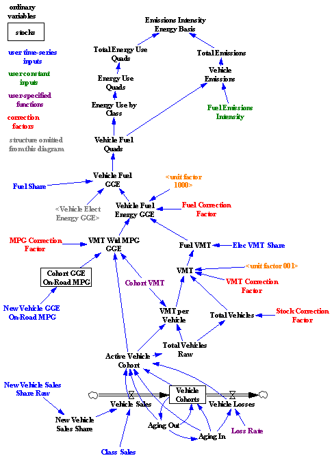
- Graphical representation of structure. JPMorgan should get some credit for having a model audit process at all, even though it failed to prevent the error. Auditors’ work is much easier when they can see what the heck is going on in the model. SD software provides useful graphical conventions for revealing model structure. Excel has no graphics. There’s an audit tool, but it’s hampered by the lack of a variable concept, and it’s slower to use than Vensim’s Causal Tracing™.
I think the score’s Forrester 8, Gates 1. Excel is great for light data processing and presentation, but it’s way down my list of tools to choose for serious modeling. The secret to its success, cell-level processing that’s easy to learn and adaptable to many problems, is also its Achilles heel. Add in some agency problems and confirmation bias, and it’s a deadly combination:
There’s another factor at work here. What if the error had gone the wrong way, and the model had incorrectly doubled its estimate of volatility? Then VaR would have been higher, the CIO wouldn’t have been allowed to place such large bets, and the quants would have inspected the model to see what was going on. That kind of error would have been caught. Errors that lower VaR, allowing traders to increase their bets, are the ones that slip through the cracks. That one-sided incentive structure means that we should expect VaR to be systematically underestimated—but since we don’t know the frequency or the size of the errors, we have no idea of how much.
Sadly, the loss on this single trade would probably just about pay for all the commercial SD that’s ever been done.
Related:

