There’s an interesting discussion about a CNN poll of public perceptions of the federal budget over at Statistical Modeling. Don’t bias yourself – check it out and test yourself before you peek at my contribution below the fold.
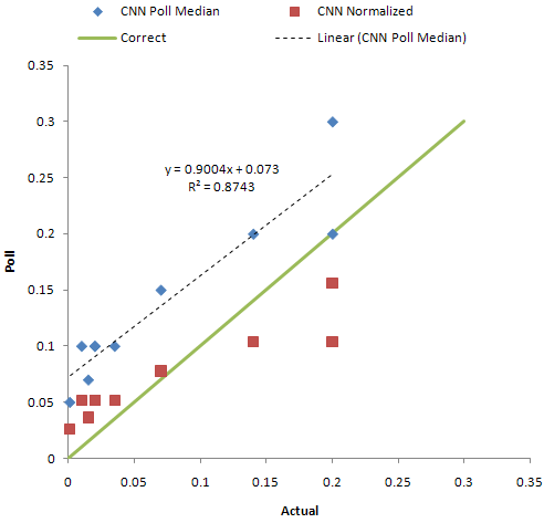
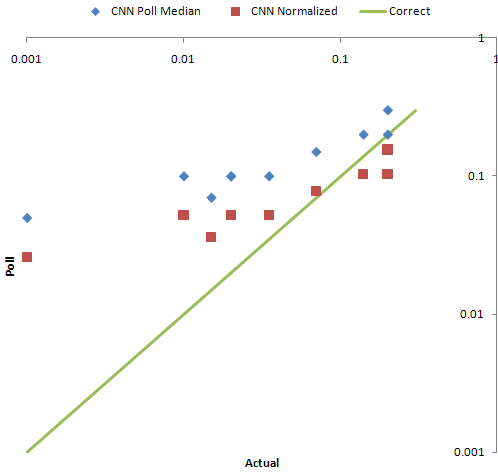
My small addition is just quick and dirty plots of the results on linear and log-log scales:

Blue dots are poll median answers vs. actual budget shares. If people correctly perceive budget shares, their answers should lie on the green line. Red indicates poll results, after normalizing to adjust for the fact that responses sum to much more than 100% (I don’t think this is necessarily a legitimate thing to do; I was just curious).

It appears that people have very biased perceptions of the budget share of small programs. When you look at the raw data there are some real oddities – can 7% of respondents really believe that public broadcasting accounts for over half the federal budget (when in reality it’s ~0.1%)?
