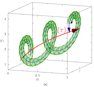
A new paper on arXiv shows an interesting approach to visualizing time in systems with circadian or other rhythms. I haven’t figured out if it’s useful for oscillatory dynamic systems more generally, but it makes some neat visuals:

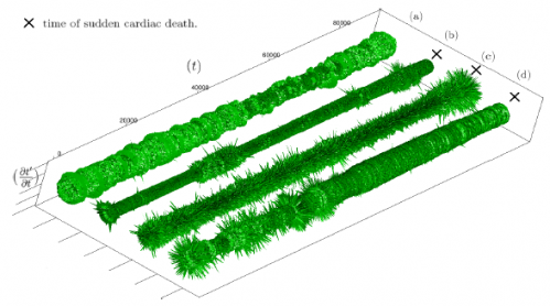
The method makes it possible to see changes in behavior in time series with waaay to many oscillations to explore on a normal 2D time-value plot:


I don’t pretend to understand the math but the visuals make perfect sense. Anyone who has ever done a year-round biological survey ( I have done some bird surveys) will identify with those pulses and loops. Thanks Tom!
Hi, Tom. See slide 20 of http://facilitatedsystems.com/weblog/sdforcheapskates.beamer.pdf. The 3D aspect is not central to this discussion, but what I called a trajectory plot seems related. If you do it in Gnuplot, you can spin the graph; one graph can then show you the flow vs. time, the stock vs. time, the phase plane diagram, or the trajectory plot.
The stereogram enables you to see all of those in real 3D.
You can also see a non-stereo example in http://facilitatedsystems.com/mcsimqrc.pdf.