
I posted my recent blogs on Forrester and forecasting uncertainty over at LinkedIn, and there’s been some good discussion. I want to highlight a few things.
First, a colleague pointed out that the way terms are understood is in the eye of the beholder. When you say “forecast” or “prediction” or “projection” the listener (client, stakeholder) may not hear what you mean. So regardless of whether your intention is correct when you say you’re going to “predict” something, you’d better be sure that your choice of language communicates to the end user with some fidelity.
Second, Samuel Allen asked a great question, which I haven’t answered to my satisfaction, “what are some good ways of preventing consumers of our conditional predictions from misunderstanding them?”
One piece of the puzzle is in Alan Graham’s comment:
an explanation that has communicated well starts from the distinction between behavior sensitivity (does the simulation change?) versus outcome or policy sensitivity (does the size or direction of the policy impact change?). Two different sets of experiments are needed to answer the two different questions, which are visually distinct:
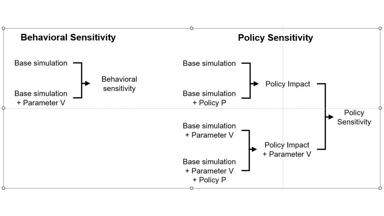
This is basically a cleaner explanation of what’s going on in my post on Forecasting Uncertainty. I think what I did there is too complex (too many competing lines), so I’m going to break it down into simpler parts in a followup.
Another piece of the puzzle is visualization. Here’s a pair of scenarios from our CWD model. These are basically nowcasts showing uncertainty about historic conditions, subject to actual historic actions or a counterfactual “high harvest” scenario:

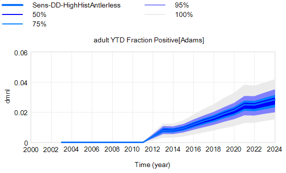 Note that I’m just grabbing raw stuff out of Vensim; for presentation these graphics could be cleaner. Also note the different scales.
On each of these charts, the spread indicates uncertainty from parameters and sampling error in disease surveillance. Comparing the two tells you how the behavior – including the uncertainty – is sensitive to the policy change.
In my experience, this works, but it’s cumbersome. There’s just too much information. You can put the two confidence bands on the same chart, using different colors, but then you have fuzzy things overlapping and it’s potentially hard to read.
Another option is to use histograms that slice the outcome (here, at the endpoint):
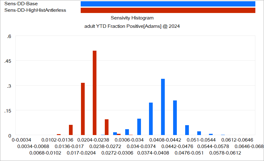 Again, this is just a quick capture that could be improved with minimal effort. The spread for each color shows the distribution of possibilities, given the uncertainty from parameters and sampling. The spread between the colors shows the policy impact. You can see that the counterfactual policy (red) both improves the mean outcome (shift left) and reduces the variance (narrower). I actually like this view of things. Unfortunately, I haven’t had much luck with such things in general audiences, who tend to wonder what the axes represent.
I think one answer may be that you simply have to go back to basics and explore the sensitivity of the policy to individual parameter changes, in paired trials per Alan Graham’s diagram above, in order to build understanding of how this works.
I think the challenge of this task – and time required to address it – should not be underestimated. I think there’s often a hope that an SD model can be used to extract an insight about some key leverage point or feedback loop that solves a problem. With the new understanding in hand, the model can be discarded. I can think of some examples where this worked, but they’re mostly simple systems and one-off decisions. In complex situations with a lot of uncertainty, I think it may be necessary to keep the model in the loop. Otherwise, a year down the road, arrival of confounding results is likely to drive people back to erroneous heuristics and unravel the solution.
I’d be interested to hear success stories about communicating model uncertainty.