Food-nutrition-health-exercise-energy interactions are an amazing nest of positive feedbacks, with many win-win opportunities, but more on that another time.
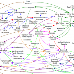
Instead, I’m hoisting an interesting influence diagram about obesity from the comments. At first glance, it’s just another plate of spaghetti.
But when you follow the link (do it now), there’s an interesting innovation: the diagram is interactive. You can zoom, scroll, and highlight particular sectors and dynamics. There’s some narrative here and here. (Update: the interactive link seems to be down, but the diagram is still here: https://assets.publishing.service.gov.uk/government/uploads/system/uploads/attachment_data/file/295153/07-1177-obesity-system-atlas.pdf)
It took me a while to decide whether I’d call this a causal loop diagram or not. I think the primary distinction between a CLD and other kinds of mindmaps or process diagrams is the use of variables. On a CLD, each label represents a quantity that can vary, with a definite direction – TV Watching, Stress, Use of Medicines. Items on other kinds of diagrams might represent events or fuzzier constellations of concepts. This diagram doesn’t have link polarities (too bad) or loop polarities (which would be pretty incomprehensible anyway), but many other CLDs also avoid such labels for simplicity.
I think there’s a lot of potential for further exploration of this idea. There’s a lot you could do to relate structure to behavior, or at least to explain the rationale for structure (both shortcomings of the diagram). Each link, for example, could have its tale revealed when clicked, and key loops could be animated individually, with stories told. Drill-down could be extended to provide links between top-level subsystem relationships and more microscopic views.
I think huge diagrams like the one above are always going to be overwhelming to a layperson. Also, it’s hard to make even a small CLD good, so making a big one really accurate is tough. Therefore, I’d rather see advanced CLD presentations used to improve the communication of simpler stories, with a few loops. However, big or small, there might be many common technological benefits from dedicated diagramming software.

Hey. I wanted to see the map and interact with it but it is not available any more…
Too bad. Not sure where to find it.
Actually there’s a hires pdf here at least … https://www.gov.uk/government/publications/reducing-obesity-obesity-system-map
Tom – Could you point me to any reference criticizing “spaghetti”, especially why CLD is not the ideal data type for building programmatic theory. I admit CLD can be an vehicle for unit theory.
Just for the context of its use: https://github.com/Data4DM/BayesSD/discussions/269.