Bret Victor’s video of a slick iPad app for interactive visualization of the Lotka-Voltera equations has been making the rounds:
Coincidentally, this came to my notice around the same time that I got interested in the debate over wolf reintroduction here in Montana. Even simple models say interesting things about wolf-elk dynamics, which I’ll write about some other time (I need to get vaccinated for rabies first).
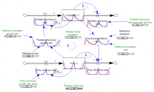
To ponder the implications of the video and predator-prey dynamics, I built a version of the Lotka-Voltera model in Vensim.
After a second look at the video, I still think it’s excellent. Victor’s two design principles, ubiquitous visualization and in-context manipulation, are powerful for communicating a model. Some aspects of what’s shown have been in Vensim since the introduction of SyntheSim a few years ago, though with less Tufte/iPad sexiness. But other features, like Causal Tracing, are not so easily discovered – they’re effective for pros, but not new users. The way controls appear at one’s fingertips in the iPad app is very elegant. The “sweep” mode is also clever, so I implemented a similar approach (randomized initial conditions across an array dimension) in my version of the model. My favorite trick, though, is the 2D control of initial conditions via the phase diagram, which makes discovery of the system’s equilibrium easy.
The slickness of the video has led some to wonder whether existing SD tools are dinosaurs. From a design standpoint, I’d agree in some respects, but I think SD has also developed many practices – only partially embodied in tools – that address learning gaps that aren’t directly tackled by the app in the video:
- The good ol’ stock and flow diagram beats equations and time series graphs for conveying structure by a country mile, especially with models that are bigger than second order. Yes, it’s true that most people don’t understand them, but I think that the solution for that is education, not avoidance. The mapping between ODEs and a stock-flow diagram is pretty fundamental, so I’d argue that eschewing diagrams almost requires dumbing down your structure presentation. Maybe we can improve on existing visual conventions, but I don’t think we can do without something like the stock-flow diagram.
- More generally, SD has a number of habits for conveying operational descriptions, in plain language, that help the user to understand what is in the model and how the world works. It would be nice to formalize and automate these.
- It’s nice for a user to explore a model as an artifact, like a slinky or a skateboard, but it’s equally important to assist the user in exploring the limitations of the model (like the atto-fox problem in the Lotka-Volterra equations), by identifying suspect behavior as it occurs and providing cues for experiments that reveal pathologies. Vensim’s Reality Check is one way to do this, though it’s under-utilized (even by its creators).
There’s also a lot of territory that no tool I’m aware of covers particularly well:
- It’s nice to have explorable equations, but they need some support – comprehensible variable names (as in the app) and documentation and units (as presented in Vensim when a user hovers over a variable) help, but there’s still likely to be a gulf between the user’s mental model of how a process works, and the implementation in equation structure. This is particularly acute where there’s aggregation from discrete events to continuous flows. There ought to be some way to help convey the rationale for the choice of y = ax + b vs. y = x/(1+ax) vs. …
- It’s easy to rationalize behavior that emerges from a model, especially when one is unfamiliar with it. It would be nice if there were some automated way to capture prior expectations and compare them with model output, so that the user could learn from failed mental simulation attempts. Over longer time scales, a similar approach could facilitate tracking and evaluating predictions from the model.
- Time series output is not the only model output to explore:
- In most cases, some runs represent better outcomes than others. Mapping the payoff surface for such outcomes makes it possible to quickly choose desirable and undesirable policies.
- Uncertainty matters, so it would be helpful to have elegant ways of capturing subjective probability distributions and visualizing their impact on model behavior.
- Like phase diagrams, neither of these concepts is familiar to many people, so a mix of education and intuitive presentation will be required.
- There’s a lot of room for improvement in browsing of complex models.
- It’s nice to see behavior and structure, but understanding how behavior emerges from structure is much more useful. Formally, this means eigenvalue/eigenvector analysis and similar methods, as here, here, and here. Currently the fraction of potential model consumers who can interpret an eigenvalue is pretty tiny, so a lot will have to happen to make such metrics intuitive.
This is a long way of saying that we’re just beginning to scratch the surface of the possibilities for beautiful, functional and intuitive use of models.


Tom,
I got this from your mother-in-law, our great friend/tenant Eve. I really enjoy it. I have a question. Have you ever considered – or are you aware of anyone creating a game for kids/adults on climate change. I’m thinking of “Civilization”. Our son Will loves it. At first Erik and I were not keen on on-line games, but a friend of ours Sarah Corbet wrote an article on this for the New York Times – the spin on games where kids really get charged up and learn a lot. This certainly is the case with Civilization….what if kids could play a game to “save the planet” by making choices…on drinking water, sanitary waste, food, transportation..- what if kids could design a city where sewage was diverted from oceans to smaller septic fields? or if they drop pH in oceans – they grow tons of seaweed to take up carbon and nutrients…etc what happens if they use poop as fuel…how much methane do their residents make, the pets, how much carbon is released with a cup of coffee? You could call the game it carbon sink. I don’t know just a thought…maybe it’s already there…if so I’d like it for my 9 year old!
Cheers,
Tamara
I’m not aware of any games that are easy to play in a family or school setting, though I hope there are some.
A spinoff of the C-ROADS work I’ve been involved in with Climate Interactive is the World Climate exercise, http://climateinteractive.org/simulations/world-climate
It’s pretty cool, because the game is actually fairly simple, but people bring so much richness to the discussion.
I’ll have to sniff around for other options.
Tom, nice visualization, and nice ideas on graphics that describe dynamic systems.
Still, part of me says not to forget text. I’ve used literate programming approaches to present models and results to a client, and I’ve even used plain text to explain a model to a musician (http://makingsense.facilitatedsystems.com/2007/03/making-musical-sense-by-email-table-of.html). In fairness, he liked the more graphical form better, but another musician I know found the text form just fine.
I currently seem to use a mix of communications methods, partially aimed at meeting a particular person’s or group’s needs and partially mixing it up to see (and show) problems from different sides.
I agree. I think there’s even a matching event-behavior-structure hierarchy for stories we tell about systems. Just as we need formal mathematical ways to connect behavior to structure, text (or storytelling) needs ways to be compelling about events or patterns while ultimately connecting them to the structure that caused them.
More practically, some people don’t respond to graphs, especially things like phase plots in 2+ dimensions.