
Let’s count:
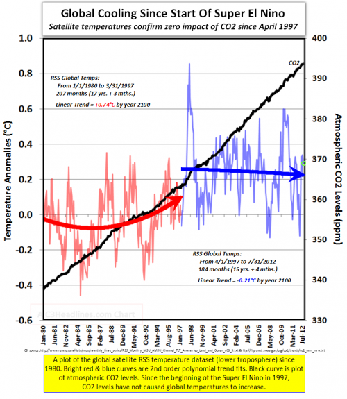 Truncate records that start ca. 1850 at an arbitrary starting point.
- Calculate trends around a breakpoint cherry-picked to most favor your argument.
- Abuse polynomial fits generally. (See this series.)
- Report misleading linear trends by simply dropping the quadratic term.
- Fail to notice the obvious: that temperature in the second period is, on average, higher than in the first.
- Choose a loaded color scheme that emphasizes #5.
- Fail to understand that temperature integrates CO2.
- Fallacy of the single cause (only CO2 affects temperature – in good company with Burt Rutan).
