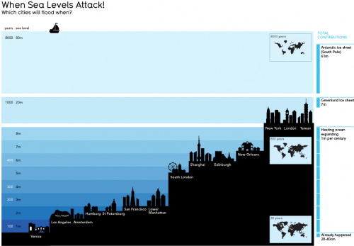
This informationisbeautiful graphic is pretty, but I don’t find it informative. The y scale is nonlinear, and I don’t know if the x scale conveys anything. It’s hard to work out the timing of inundation, which is really the key. The focus on the low points of big cities in developed countries is misleading, because those will be defended for a long time. Ho Chi Minh city should be on there, as well as the US gulf coast. USA Today would love this.
Skip to content

