Two quick visualizations of the scenario data behind the war game:
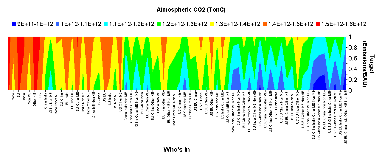
First, a map of what happens to the concentration of atmospheric CO2 as a function of an emissions target to which participating regions adhere (y axis) and the regions participating (enumerated on the x axis). This is basically an elaboration of everyone plays. The color scheme on the surface shows atmospheric CO2 concentration in 2100 in slightly cryptic units (TonC). The important thing to know is that the bluest end of the scale (all in, aggressive targets) succeeds in staying under 466ppm, the reddest end (no action) is a disaster at up to 750ppm, and the green and turquoise bands are near 2x CO2. Click the graphic for a larger version.
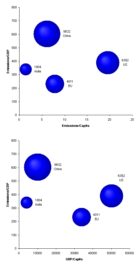
Second, a visual version of some of the data in the reduction illusion. Bubble size is proportional to regional CO2 emissions in 2015.