I’m trying to adapt to the new tabbed interface in Office 2007. So far, all those pretty buttons seem like a hindrance. Vensim, on the other hand, is a bit too austere. I’ve just installed version 5.9 (check it out, and while you’re at it see the new Ventana site); my setup follows. Note that this only applies to advanced versions of Vensim.
First, I allow the equation editor to “accept enter” – I like to be able to add line breaks to equations (and hate accidentally dismissing the editor with an <enter>). You can do this anyway with <ctl><enter>, but I prefer it this way.

Next, change the equation editor to a monospaced font (Courier New 9pt), so I don’t go blind or crazy trying to insert the cursor between a pair of l’s or the !] in a subscript summation. You can also make sketches and graphs look nice with alternate defaults.
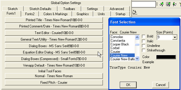
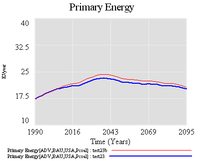
Next, make the default graph background a little more Tufteish:
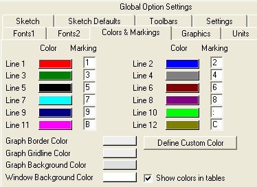
Allow multiple models to be open at once. As a rule, it’s better to edit only one model at a time (otherwise dataset loading and other things can become confusing), but I often like to have several others open for reference or copy/pasting.

Normally I’d also set up compiled simulation, but I don’t yet have a compiler on my new computer.
Finally, colorize the toolbars (by right-clicking each button). You’ll notice that I’ve added some extra arrow instances to the sketch (top) toolbar, and extra charts and other goodies to the analysis (left) toolbar; you can modify the toolsets under the Tools menu.
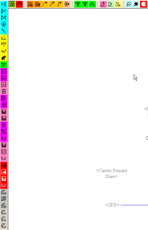
Others (recently departed Ventana modeler Dan Goldner) have a nicer aesthetic sense, but if you can stand my garish coloring, you can have these toolsets:
Update: new versions, with milder colors (less paracetamol needed) and a few other refinements:
Thanks for these nice usability tips. I have an additional suggestion:
Instead of using the default font for diagram sketching, I set the color of the font to dark red. This makes distinguishing variable names from the black colored sketch elements easier.
Also I decrease the font size to 9 to make more variables visible in one screen.
Mert – Nice idea. Maybe I’ll finally get around to customizing my diagram defaults (after 15 years).
Others might like to make the font size bigger to force putting fewer variables on the screen. 🙂
One other thing I should mention: except for the toolbars, these settings reside in vensim.ini (which sits in your windows system directory on winXP). Once in a great while I make a backup (a copy of the file named vensim.ini.bak) in case I forget and overwrite it when installing a new version of Vensim or something like that.
You can have extra copies of vensim.ini and launch Vensim by dragging the .ini onto the executable (.exe) to switch default settings. This is nice if you want to try someone else’s settings, or use the default to help someone or have a non-busy toolbar for a presentation.
You can copy and share the .ini, and include it in .vpm files for compatibility. The latter is important if your analysis toolset contains custom colors, or graphs or tables with custom names that are used in I/O objects on model views, and you want the model to work for someone else.