I like maps, but I love time series.
ScienceInsider has a nice roundup of radiation maps. I visited a few, and found current readings, but got curious about the dynamics, which were not evident.
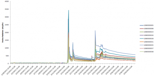
So, I grabbed Marian Steinbach’s scraped data and filtered it to a manageable size. Here’s what I got for the 9 radiation measurement stations in Ibaraki prefecture, where the Fukushima-Daiichi reactors are located:
The time series above (click it to enlarge) shows about 10 days of background readings, pre-quake, followed by some intense spikes of radiation, with periods of what looks like classic exponential decay behavior. “Intense” is relative, because fortunately those numbers are in nanoGrays, which are small.
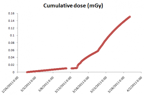
The cumulative dose at these sites is not yet high, but climbing:
The Fukushima contribution to cumulative dose is about .15 milliGrays – according to this chart, roughly a chest x-ray. Of course, if you extrapolate to long exposure from living there, that’s not good, but fortunately the decay process is also underway.
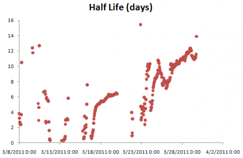
The interesting thing about the decay process is that it shows signs of having multiple time constants. That’s exactly what you’d expect, given that there’s a mix of isotopes with different half lives and a mix of processes (radioactive decay and physical transport of deposited material through the environment).
The linear increases in the time constant during the long, smooth periods of decay presumably arise as fast processes play themselves out, leaving the longer time constants to dominate. For example, if you have a patch of soil with cesium and iodine in it, the iodine – half life 8 days – will be 95% gone in a little over a month, leaving the cesium – half life 30 years – to dominate the local radiation, with a vastly slower rate of decay.
Since the longer-lived isotopes will dominate the future around the plant, the key question then is what the environmental transport processes do with the stuff.
Update: Here’s the Steinbach data, aggregated to hourly (from 10min) frequency, with -888 and -888 entries removed, and trimmed in latitude range. Station_data Query hourly (.zip)


Nice. I wonder if it would be possible to estimate iodine/cesium ratio from the trends in the half-life plot (assuming zero loss from circulation). Also it seems that the curve at 28/3 is a continuation of the trend at 18/3. Does that mean that the iodine was all produced at an earlier event?
Yeah – I thought that trend continuation was provocative, and was tempted to make a mini model and fit it, but unfortunately I have some more pressing things to do.
I’ll add the preprocessed data to the post, in case anyone else wants to take a stab at it.