A Grizzly-Pine-Nutcracker CLD Rework

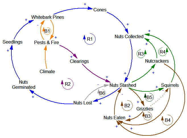
I spent a little time working out what Clark’s Causal Calamity might look like as a well-formed causal loop diagram. Here’s an attempt, based on little more than spending a lot of time wandering around the Greater Yellowstone ecosystem:

The basic challenge is that there isn’t a single cycle that encompasses the whole system. Grizzlies, for example, are not involved in the central loop of pine-cone-seedling dispersal and growth (R1). They are to some extent free riders on the system – they raid squirrel middens and eat a lot of nuts, which can’t be good for the squirrels (dashed line, loop B5).

There are also a lot of “nuisance” loops  that are essential for robustness of the real system, but aren’t really central to the basic point about ecosystem interconnectedness. B6 is one example – you get such a negative loop every time you have an outflow from a stock (more stuff in the stock -> faster outflow -> less stuff in the stock). R2 is another – the development of clearings from pines via fire and pests is offset by the destruction of pines via the same process.

I suspect that this CLD is still dramatically underspecified and erroneous, compared to the simplest stock-flow model that could encompass these concepts. It would also make a lousy poster for grocery store consumption.

Thinking about stuff

A while back I decided to never buy another garden plant unless I’d first dug the hole for it. In a single stroke, this simple rule eliminated impulse shopping at the nursery, improved the survival rate of new plants, and increased overall garden productivity.

This got me thinking about the insidious dynamics of stuff, by which tools come to rule their masters. I’ve distilled most of my thinking into this picture:
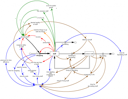

Click to enlarge.

This is mainly a visual post, but here’s a quick guide to some of the loops:

Black: stuff is the accumulation of shopping, less outflows from discarding and liquidation.

Red: Shopping adjusts the stock of stuff to a goal. The goal is set by income (a positive feedback, to the extent that stuff makes you more productive, so you can afford more stuff) and by the utility of stuff at the margin, which falls as you have less and less time to use each item of stuff, or acquire increasingly useless items.

So far, Economics 101 would tell a nice story of smooth adjustment of the shopping process to an equilibrium at the optimal stuff level. That’s defeated by the complexity of all of the other dynamics, which create a variety of possible vicious cycles and misperceptions of feedback that result in suboptimal stuffing.

Orange: You need stuff to go with the stuff. The iPad needs a dock, etc. Even if the stuff is truly simple, you need somewhere to put it.

Green: Society reinforces the need for stuff, via keep-up-with-the-Joneses and neglect of shared stuff. When you have too much stuff, C.H.A.O.S. ensues – “can’t have anyone over syndrome” – which reinforces the desire for stuff to hide the chaos or facilitate fun without social contact.

Blue: Stuff takes time, in a variety of ways. The more stuff  you have, the less time you actually have for using stuff for fun. This can actually increase your desire for stuff, due to the desire to have fun more efficiently in the limited time available.

Brown: Pressure for time and more stuff triggers a bunch of loops involving quality of stuff. One response is to buy low-quality stuff, which soon increases the stock of broken stuff lying about, worsening time pressure. One response is the descent into disposability, which saves the time, at the expense of a high throughput (shopping->discarding) relative to the stock of stuff. Once you’re fully stocked with low-quality stuff, why bother fixing it when it breaks? Fixing one thing often results in collateral damage to another (computers are notorious for this).

I’m far from a successful minimalist yet, but here’s what’s working for me to various degrees:

  • The old advice, “Use it up, wear it out, make it do or do without” works.
  • Don’t buy stuff when you can rent it. Unfortunately rental markets aren’t very liquid so this can be tough.
  • Allocate time to liquidating stuff. This eats up free time in the short run, but it’s a worse-before-better dynamic, so there’s a payoff in the long run. Fortunately liquidating stuff has a learning curve – it gets easier.
  • Make underutilized and broken stuff salient, by keeping lists and eliminating concealing storage.
  • Change your shopping policy to forbid acquisition of new stuff until existing stuff has been dealt with.
  • Buy higher quality than you think you’ll need.
  • Learn low-stuff skills.
  • Require steady state stuff: no shopping for new things until something old goes to make way for it.
  • Do things, even when you don’t have the perfect gear.
  • Explicitly prioritize stuff acquisition.
  • Tax yourself, or at least mentally double the price of any proposed acquisition, to account for all the side effects that you’ll discover later.
  • Get relatives to give $ to your favorite nonprofit rather than giving you something you won’t use.

There are also some policies that address the social dimensions of stuff:

  • Underdress and underequip. Occasionally this results in your own discomfort, but reverses the social arms race.
  • Don’t reward other peoples’ shopping by drooling over their stuff. Pity them.
  • Use and promote shared stuff, like parks.

This system has a lot of positive feedback, so once you get the loops running the right way, improvement really takes off.
Return of the Afghan spaghetti

The Afghanistan counterinsurgency causal loop diagram makes another appearance in this TED talk, in which Eric Berlow shows the hypnotized chickens the light:
https://www.ted.com/talks/eric_berlow_simplifying_complexity/transcript?language=en

I’m of two minds about this talk. I love that it embraces complexity rather than reacting with the knee-jerk “eeewww … gross” espoused by so many NYT commenters. The network view of the system highlights some interesting relationships, particularly when colored by the flavor of each sphere (military, ethnic, religious … ). Also, the generic categorization of variables that are actionable (unlike terrain) is useful. The insights from ecosystem simplification are potentially quite interesting, though we really only get a tantalizing hint at what might lie beneath.

However, I think the fundamental analogy between the system CLD and a food web or other network may only partially hold. That means that the insight, that influence typically lies within a few degrees of connectivity of the concept of interest, may not be generalizable. Generically, a dynamic model is a network of gains among state variables, and there are perhaps some reasons to think that, due to signal attenuation and so forth, that most influences are local. However, there are some important differences between the Afghan CLD and typical network diagrams.

In a food web, the nodes are all similar agents (species) which have a few generic relationships (eat or be eaten) with associated flows of information or resources. In a CLD, the nodes are a varied mix of agents, concepts, and resources. As a result, their interactions may differ wildly: the interaction between “relative popularity of insurgents” and “funding for insurgents” (from the diagram) is qualitatively different from that between “targeted strikes” and “perceived damages.” I suspect that in many models, the important behavior modes are driven by dynamics that span most of the diagram or model. That may be deliberate, because we’d like to construct models that describe a dynamic hypothesis, without a lot of extraneous material.

Probably the best way to confirm or deny my hypothesis would be to look at eigenvalue analysis of existing models. I don’t have time to dig into this, but Kampmann & Oliva’s analysis of Mass’ economic model is an interesting case study. In that model, the dominant structures responsible for oscillatory modes in the economy are a real mixed bag, with important contributions from both short and longish loops.

This bears further thought … please share yours, especially if you have a chance to look at Berlow’s PNAS article on food webs.

Interactive diagrams – obesity dynamics

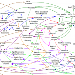
Food-nutrition-health-exercise-energy interactions are an amazing nest of positive feedbacks, with many win-win opportunities, but more on that another time.

Instead, I’m hoisting an interesting influence diagram about obesity from the comments. At first glance, it’s just another plate of spaghetti.

ForesightObesity

But when you follow the link (do it now), there’s an interesting innovation: the diagram is interactive. You can zoom, scroll, and highlight particular sectors and dynamics. There’s some narrative here and here. (Update: the interactive link seems to be down, but the diagram is still here: https://assets.publishing.service.gov.uk/government/uploads/system/uploads/attachment_data/file/295153/07-1177-obesity-system-atlas.pdf)

It took me a while to decide whether I’d call this a causal loop diagram or not. I think the primary distinction between a CLD and other kinds of mindmaps or process diagrams is the use of variables. On a CLD, each label represents a quantity that can vary, with a definite direction – TV Watching, Stress, Use of Medicines. Items on other kinds of diagrams might represent events or fuzzier constellations of concepts. This diagram doesn’t have link polarities (too bad) or loop polarities (which would be pretty incomprehensible anyway), but many other CLDs also avoid such labels for simplicity.

I think there’s a lot of potential for further exploration of this idea. There’s a lot you could do to relate structure to behavior, or at least to explain the rationale for structure (both shortcomings of the diagram). Each link, for example, could have its tale revealed when clicked, and key loops could be animated individually, with stories told. Drill-down could be extended to provide links between top-level subsystem relationships and more microscopic views.

I think huge diagrams like the one above are always going to be overwhelming to a layperson. Also, it’s hard to make even a small CLD good, so making a big one really accurate is tough. Therefore, I’d rather see advanced CLD presentations used to improve the communication of simpler stories, with a few loops. However, big or small, there might be many common technological benefits from dedicated diagramming software.

Diagrams vs. Models

Following Bill Harris’ comment on Are causal loop diagrams useful? I went looking for Coyle’s hybrid influence diagrams. I didn’t find them, but instead ran across this interesting conversation in the SDR:

The tradition, one might call it the orthodoxy, in system dynamics is that a problem can only be analysed, and policy guidance given, through the aegis of a fully quantified model. In the last 15 years, however, a number of purely qualitative models have been described, and have been criticised, in the literature. This article briefly reviews that debate and then discusses some of the problems and risks sometimes involved in quantification. Those problems are exemplified by an analysis of a particular model, which turns out to bear little relation to the real problem it purported to analyse. Some qualitative models are then reviewed to show that they can, indeed, lead to policy insights and five roles for qualitative models are identified. Finally, a research agenda is proposed to determine the wise balance between qualitative and quantitative models.

… In none of this work was it stated or implied that dynamic behaviour can reliably be inferred from a complex diagram; it has simply been argued that describing a system is, in itself, a useful thing to do and may lead to better understanding of the problem in question. It has, on the other hand, been implied that, in some cases, quantification might be fraught with so many uncertainties that the model’s outputs could be so misleading that the policy inferences drawn from them might be illusory. The research issue is whether or not there are circumstances in which the uncertainties of simulation may be so large that the results are seriously misleading to the analyst and the client. … This stream of work has attracted some adverse comment. Lane has gone so far as to assert that system dynamics without quantified simulation is an oxymoron and has called it ‘system dynamics lite (sic)’. …

Coyle (2000) Qualitative and quantitative modelling in system dynamics: some research questions

Jack Homer and Rogelio Oliva aren’t buying it:

Geoff Coyle has recently posed the question as to whether or not there may be situations in which computer simulation adds no value beyond that gained from qualitative causal-loop mapping. We argue that simulation nearly always adds value, even in the face of significant uncertainties about data and the formulation of soft variables. This value derives from the fact that simulation models are formally testable, making it possible to draw behavioral and policy inferences reliably through simulation in a way that is rarely possible with maps alone. Even in those cases in which the uncertainties are too great to reach firm conclusions from a model, simulation can provide value by indicating which pieces of information would be required in order to make firm conclusions possible. Though qualitative mapping is useful for describing a problem situation and its possible causes and solutions, the added value of simulation modeling suggests that it should be used for dynamic analysis whenever the stakes are significant and time and budget permit.

Homer & Oliva (2001) Maps and models in system dynamics: a response to Coyle

Coyle rejoins:

This rejoinder clarifies that there is significant agreement between my position and that of Homer and Oliva as elaborated in their response. Where we differ is largely to the extent that quantification offers worthwhile benefit over and above analysis from qualitative analysis (diagrams and discourse) alone. Quantification may indeed offer potential value in many cases, though even here it may not actually represent ‘‘value for money’’. However, even more concerning is that in other cases the risks associated with attempting to quantify multiple and poorly understood soft relationships are likely to outweigh whatever potential benefit there might be. To support these propositions I add further citations to published work that recount effective qualitative-only based studies, and I offer a further real-world example where any attempts to quantify ‘‘multiple softness’’ could have lead to confusion rather than enlightenment. My proposition remains that this is an issue that deserves real research to test the positions of Homer and Oliva, myself, and no doubt others, which are at this stage largely based on personal experiences and anecdotal evidence.

Coyle (2001) Rejoinder to Homer and Oliva

My take: I agree with Coyle that qualitative models can often lead to insight. However, I don’t buy the argument that the risks of quantification of poorly understood soft variables exceeds the benefits. First, if the variables in question are really too squishy to get a grip on, that part of the modeling effort will fail. Even so, the modeler will have some other working pieces that are more physical or certain, providing insight into the context in which the soft variables operate. Second, as long as the modeler is doing things right, which means spending ample effort on validation and sensitivity analysis, the danger of dodgy quantification will reveal itself as large uncertainties in behavior subject to the assumptions in question. Third, the mere attempt  to quantify the qualitative is likely to yield some insight into the uncertain variables, which exceeds that derived from the purely qualitative approach. In fact, I would argue that the greater danger lies in the qualitative approach, because it is quite likely that plausible-looking constructs on a diagram will go unchallenged, yet harbor deep conceptual problems that would be revealed by modeling.

I see this as a cost-benefit question. With infinite resources, a model always beats a diagram. The trouble is that in many cases time, money and the will of participants are in short supply, or can’t be justified given the small scale of a problem. Often in those cases a qualitative approach is justified, and diagramming or other elicitation of structure is likely to yield a better outcome than pure talk. Also, where resources are limited, an overzealous modeling attempt could lead to narrow focus, overemphasis on easily quantifiable concepts, and implementation failure due to too much model and not enough process. If there’s a risk to modeling, that’s it – but that’s a risk of bad modeling, and there are many of those.

Are causal loop diagrams useful?

Reflecting on the Afghanistan counterinsurgency diagram in the NYTimes, Scott Johnson asked me whether I found causal loop diagrams (CLDs) to be useful. Some system dynamics hardliners don’t like them, and others use them routinely.

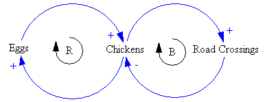
Here’s a CLD:

Chicken CLD

And here’s it’s stock-flow sibling:

Chicken Stock Flow

My bottom line is:

  • CLDs are very useful, if developed and presented with a little care.
  • It’s often clearer to use a hybrid diagram that includes stock-flow “main chains”. However, that also involves a higher burden of explanation of the visual language.
  • You can get into a lot of trouble if you try to mentally simulate the dynamics of a complex CLD, because they’re so underspecified (but you might be better off than talking, or making lists).
  • You’re more likely to know what you’re talking about if you go through the process of building a model.
  • A big, messy picture of a whole problem space can be a nice complement to a focused, high quality model.

Here’s why:

Continue reading “Are causal loop diagrams useful?”

Hypnotizing chickens, Afghan insurgents, and spaghetti

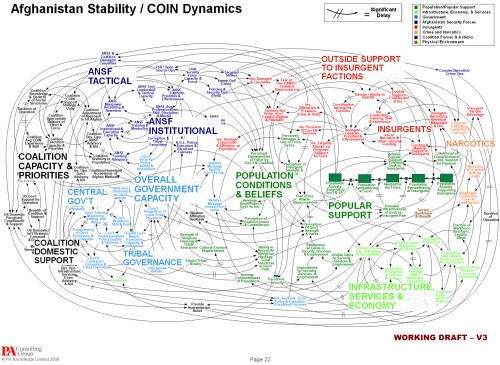
The NYT is about 4 months behind the times picking up on a spaghetti diagram of Afghanistan situation, which it uses to lead off a critique of Powerpoint use in the military. The reporter is evidently cheesed off at being treated like a chicken:

Senior officers say the program does come in handy when the goal is not imparting information, as in briefings for reporters.

The news media sessions often last 25 minutes, with 5 minutes left at the end for questions from anyone still awake. Those types of PowerPoint presentations, Dr. Hammes said, are known as “hypnotizing chickens.”

Afghanistan Stability: COIN (Counterinsurgency) Model
Click to enlarge

The Times reporter seems unaware of the irony of her own article. Early on, she quotes a general, “Some problems in the world are not bullet-izable.” But isn’t the spaghetti diagram an explicit attempt to get away from bullets, and present a rich, holistic picture of a complicated problem? The underlying point – that presentations are frequently awful and waste time – is well taken, but hardly news. If there’s a problem here, it’s not the fault of Powerpoint, and we’d do well to identify the real issue.

For those unfamiliar with the lingo, the spaghetti is actually a Causal Loop Diagram (CLD), a type of influence diagram. It’s actually a hybrid, because the Popular Support sector also has a stock-flow chain. Between practitioners, a good CLD can be an incredibly efficient communication device – much more so than the “five-pager” cited in the article. CLDs occupy a niche between formal mathematical models and informal communication (prose or ppt bullets). They’re extremely useful for brainstorming (which is what seems to have been going on here) and for communicating selected feedback insights from a formal model. They also tend to leave a lot to the imagination – if you try to implement a CLD in equations, you’ll discover many unstated assumptions and inconsistencies along the way. Still, the CLD is likely to be far more revealing of the tangle of assumptions that lie in someone’s head than a text document or conversation.

Evidently the Times has no prescription for improvement, but here’s mine:

  • If the presenters were serious about communicating with this diagram, they should have spent time introducing the CLD lingo and walking through the relationships. That could take a long time, i.e. a whole presentation could be devoted to the one slide. Also, the diagram should have been built up in digestible chunks, without overlapping links, and key feedback loops that lead to success or disaster should be identified.
  • If the audience were serious about understanding what’s going on, they shouldn’t shut off their brains and snicker when unconventional presentations appear. If reporters stick their fingers in their ears and mumble “not listening … not listening … not listening …” at the first sign of complexity, it’s no wonder DoD treats them like chickens.