
NPR takes a harder look at the much-circulated xkcd temperature reconstruction cartoon.
The criticism:
Epic Climate Cartoon Goes Viral, But It Has One Key Problem
[…]
As you scroll up and down the graphic, it looks like the temperature of Earth’s surface has stayed remarkably stable for 10,000 years. It sort of hovers around the same temperature for some 10,000 years … until — bam! The industrial revolution begins. We start producing large amounts of carbon dioxide. And things heat up way more quickly.
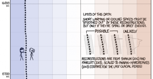
Now look a bit closer at the bottom of the graphic. See how all of a sudden, around 150 years ago, the dotted line depicting average Earth temperature changes to a solid line. Munroe makes this change because the data used to create the lines come from two very different sources.
The solid line comes from real data — from scientists actually measuring the average temperature of Earth’s surface. These measurements allow us to see temperature fluctuations that occur over a very short timescale — say, a few decades or so.
But the dotted line comes from computer models — from scientists reconstructing Earth’s surface temperature. This gives us very, very coarse information. It averages Earth’s temperature over hundreds of years. So we can see temperature fluctuations that occur only over longer periods of time, like a thousand years or so. Any upticks, spikes or dips that occur in shorter time frames get smoothed out.
So in a way the graphic is really comparing apples and oranges: measurements of the recent past versus reconstructions of more ancient times.
Here’s the bit in question:
The fundamental point is well taken, that fruit are mixed here. The cartoon even warns of that:
I can’t fault the technical critique, but I take issue with a couple aspects of the tone of the piece. It gives the impression that “real data” is somehow exalted and models are inferior, thereby missing the real issues. And it lends credence to the “sh!t happens” theory of climate, specifically that the paleoclimate record could be full of temperature “hockey sticks” like the one we’re in now.
There’s no such thing as pure, assumption free “real data.” Measurement processes involve – gasp! – models. Even the lowly thermometer requires a model to be read, with the position of a mercury bubble converted to temperature via a calibrated scale, making various assumptions about physics of thermal expansion, linearity, etc.
There are no infallible “scientists actually measuring the average temperature of Earth’s surface.” Earth is a really big place, measurements are sparse, and instruments and people make mistakes. Reducing station observations to a single temperature involves reconstruction, just as it does for longer term proxy records. (If you doubt this, check the methodology for the Berkeley Earth Surface Temperature.)
Data combined with a model gives a better measurement than the raw data alone. That’s why a GPS unit combines measurements from satellites with a model of the device’s motion and noise processes to estimate position with greater accuracy than any single data point can provide.
In fact, there are three sources here:
- recent global temperature, reconstructed from land and sea measurements with high resolution in time and space (the solid line)
- long term temperature, reconstructed from low resolution proxies (the top dotted line)
- projections from models that translate future emissions scenarios into temperature
If you take the recent, instrumental global temperature record as the gold standard, there are then two consistency questions of interest. Does the smoothing in the long term paleo record hide previous hockey sticks? Are the models accurate prognosticators of the future?
On the first point, the median temporal resolution of the records contributing to the Marcott 11,300 year reconstruction used is 120 years. So, a century-scale temperature spike would be attenuated by a factor of 2. There is then some reason to think that missing high frequency variation makes the paleo record look different. But there are also good reasons to think that this is not terribly important. Marcott et al. address this:
Our results indicate that global mean temperature for the decade 2000 – 2009 ( 34 ) has not yet exceeded the warmest temperatures of the early Holocene (5000 to 10,000 yr B.P.). These temperatures are, however, warmer than 82% of the Holocene distribution as represented by the Standard 5×5 stack, or 72% after making plausible corrections for inherent smoothing of the high frequencies in the stack. In contrast, the decadal mean global temperature of the early 20th century (1900 – 1909) was cooler than >95% of the Holocene distribution under both the Standard 5×5 and high-frequency corrected scenarios. Global temperature, therefore, has risen from near the coldest to the warmest levels of the Holocene within the past century, reversing the long-term cooling trend that began ~5000 yr B.P.
Even if there were hockey sticks in the past, that’s not evidence for a natural origin for today’s warming. We know little about paleo forcings, so it would be hard to discern the origin of those variations. One might ask, if they are happening now, why can’t we observe them? Similarly, evidence for higher natural variability is evidence for less damping of the climate system, which favors higher climate sensitivity.
Finally, the question of the validity of model projections is too big to tackle, but I should point out that the distinction between a model that generates future projections and a model that assimilates historic measurements is not as great as one might think. Obviously the future hasn’t happened yet, so future projections are subject to an additional source of uncertainty, which is that we don’t know all the inputs (future solar output, volcanic eruptions, etc.), whereas in the past those have been realized, even if we didn’t measure them. Also, models the project may have somewhat different challenges (like getting atmospheric physics right) than data-driven models (which might focus more on statistical methods). But future-models and observational data-models also have one thing in common: there’s no way to be sure that the model structure is right. In one case, it’s because the future hasn’t happened yet, and in the other because there’s no oracle to reveal the truth about what did happen.
So, does the “one key problem” with the cartoon invalidate the point, that something abrupt and unprecedented in the historical record is underway or about to happen? Not likely.