Reflecting on the Afghanistan counterinsurgency diagram in the NYTimes, Scott Johnson asked me whether I found causal loop diagrams (CLDs) to be useful. Some system dynamics hardliners don’t like them, and others use them routinely.
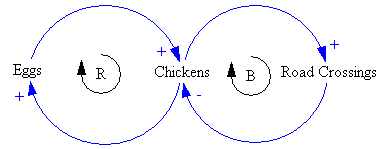
Here’s a CLD:
And here’s it’s stock-flow sibling:

My bottom line is:
- CLDs are very useful, if developed and presented with a little care.
- It’s often clearer to use a hybrid diagram that includes stock-flow “main chains”. However, that also involves a higher burden of explanation of the visual language.
- You can get into a lot of trouble if you try to mentally simulate the dynamics of a complex CLD, because they’re so underspecified (but you might be better off than talking, or making lists).
- You’re more likely to know what you’re talking about if you go through the process of building a model.
- A big, messy picture of a whole problem space can be a nice complement to a focused, high quality model.
Here’s why:
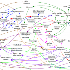
There are well documented conceptual problems with CLD notation. More importantly, it’s easy to make very bad CLDs. Just use lots of crossing lines (spaghetti), variable names with no sense of direction, neglect to label loop and link polarity, and mix in some clip art for good measure. (There’s some good advice on CLD notation here, but replace the S and O arrow polarity notation with + and -). As a practical matter, it’s been my experience that most causal loop diagrams leave a lot to the imagination, which you can easily discover by attempting to formalize one as a model. You’ll discover unstated parameters, aggregation questions, and other leaps of logic.
The Afghanistan diagram shares many of those problems. It has the dreaded spaghetti topology. It doesn’t indicate loop polarities. Some variables are really concept areas of interest, rather than quantities that can vary. There’s no way to translate it directly to equations (however, the rumor mill has it that there is an underlying model).
Still, the Afghanistan diagram and other messy mind maps like it aren’t useless, as many NYT commenters asserted. First, it might be a good way to summarize the output of a brainstorming session. In that case, the goal is to surface as many relationships as possible up front. Detailed critique of each link or loop along the way tends to bog down such generative processes. If you don’t later drill into the details of the spaghetti to sort out the dynamics, you might remain as muddled as you were when you started, but that doesn’t make the spaghetti intrinsically useless.
Similarly, a spaghetti diagram can be a useful overview of the complicated territory covered by a model. With most audiences, you’d be crazy to start with the full diagram – you’ll just turn people off. Instead, the presentation should build up the big picture from smaller pieces, reflecting on the contribution of each link or loop to the overall dynamics. (Apparently this is how the Afghanistan diagram was actually presented). Of course, that only works if you have an underlying model; otherwise the incomplete formalization of a CLD makes it really easy to draw spurious conclusions. Without a model, all you really have is a dynamic hypothesis – which still might be a lot more than you had before you drew the diagram.
In my own work, I don’t use CLDs very much. I prefer stock-flow diagrams, and I can hardly get out of bed without a real model. Still, thinking back, I can think of two CLDs that have been very successful.
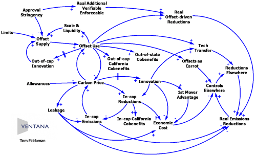
The first (below, click to enlarge) is a work product from the first day of a collaborative workshop on emissions offsets, which Ron Suiter and I ran in California. With support of WSPA, we assembled industry, regulators, NGOs, and offset providers to talk about the pros and cons of including offsets in AB32 regulations (particularly the cap & trade system). Immediately two worldviews emerged: offsets are essential, and offsets are a scam. This diagram explains both worldviews as competing perceptions about the relative strength of various feedback loops in the diagram.
Like most CLDs, this one’s not completely explicit about the “physics” of the system. Still, it communicated very well. I walked through it at the start of the second day of the workshop, and their were lots of positive comments and subsequent references to the framework. It’s important to note that I didn’t present this as a monolith – I built it up piece by piece (as you can see in the report), with color coding and references to the elements of the first day conversation that backed up each link or loop. I probably could translate this to a stock-flow diagram, but there’s no way I could have created and described it within the time available.
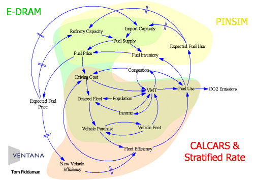
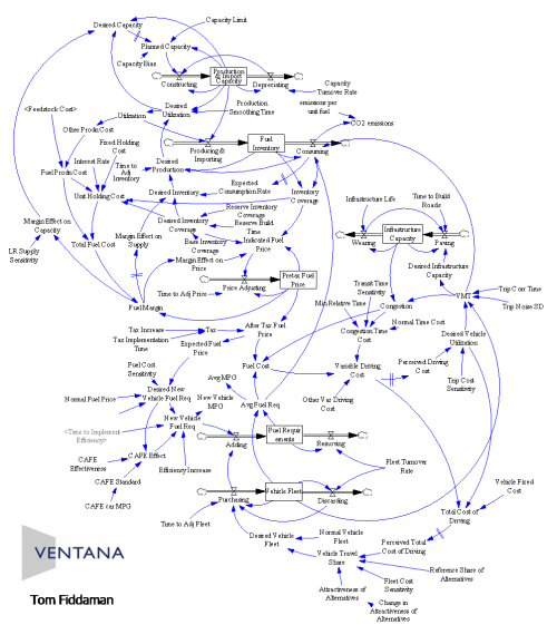
The second is a map of the transport fuels policy space, developed to support conversations with the Energy Commission and others in California:
The colored regions represent three models that were in use at the CEC and CalTrans at the time (around 2005, following AB2076 study). The key insight is not so much the about the specifics of the structure, but that the existing models don’t span the space. The supply and demand side (yellow & red) are covered by separate models, and the only integration is provided by a general equilibrium model (green) with incompatible aggregation and units of measure. I do present this diagram all at once, but only to subject matter experts who can quickly recognize the content.
This model does have a working model counterpart that maps more or less one to one to the CLD concepts:
I find that the stock-flow version (even with a few hidden parameters, as above) does freak people out on first contact, at least if they aren’t familiar with stock-flow diagrams. However, when presented in digestible chunks, it does make sense to them.
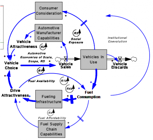
It’s interesting to contrast my diagrams with a hybrid stock-flow representation of the transport space, from Jeroen Struben and John Sterman’s work on the alt fuel/vehicle transition:
There’s more than one way to skin a cat.
Tom – great overview and examples. Thanks!
Tom, great discussion you’ve started.
I’ve vacillated on CLDs. I was initially predisposed to use them back when I first encountered SD (years ago), but then I found that many (most?) published CLDs were less concrete and less understandable than the related S+F, so I gave up on them almost totally.
Then I discovered Geoff Coyle’s and Eric Wolstenholme’s approach to influence diagrams (IDs) a few years ago and find that quite nice: they do show loop structure more clearly than S+Fs do, and, if drawn stylistically as Geoff does, they hint nicely at the location of the stocks. As Geoff points out in one of his books, you can pretty much tell what is a stock, anyway, from the topology of the graph.
Based on that level of specificity in IDs, I’ve done some amount of operationalizing IDs directly. When I use MCSim, that’s easy (although I admit that Vensim is about the easiest way I’ve found to draw an ID). When I use Vensim, I do sometimes convert the ID to a simulation model. That troubles some people, so I try not to do that around S+F users. 🙂
The real benefit I’ve found is that I now can build an ID in a group setting, which is often easier for newcomers, I can make it as concrete as an S+F, I can analyze the loop structure, and I can directly simulate it, if I wish.
Looking at Coyle’s book, second chapter, he seems to equate CLD to influence diagrams?
I think the terms are often used interchangeably.
The problem with that is that ‘influence diagram’ is already used by Decision Analysts and so this is just creating confusing. Plus, there are more Decision Analysts using it that way than SDists using it; the latter are a small minority even within SD.
I see no benefit in using anything other than ‘CLD’.
the diagrams are awesome and you have said what you do not like but you never said what is the advantage to the loops and the disadvantages of creating such loop that you have worked on for a long time.
I tend to think that there’s little downside to thinking, and if you’re not thinking about feedback, you’re not thinking about much.
Good article and several of your points resonated with me. In short:
1. Use CLD and SFM according to the nature of the problem for investigation (e.g. CLD can be an effective way to “prep” for a SFM)
2. Keep it simple – butterflies on the other side of the globe may play a some role in your problem, but probably not a significant one 😉
3. Don’t get executives involved – they generally don’t have the time/interest to understand and just want “the answer”
4. Remember Dr. Box’s observation about models being wrong but that they can be useful (if used appropriately)
Thanks.
I think #3 is often true. But it’s often the root of problems in the first place. If a problem is below an exec’s pay grade, great – just solve it. But if it’s a top-level strategic issue, they need to understand the dynamics. Otherwise, they may torpedo implementation with lukewarm support, take conflicting action, or similar. This is an ongoing struggle.
Also remember that Box’s observation applies equally to informal mental models.
David Lane’s article, Can we have confidence in generic structures? https://www.researchgate.net/publication/44843543_Can_we_have_confidence_in_generic_structures
Nice post.
Looking at the chicken-egg example, I note that for some reason, CLDs seem to always (?) omit self-loops. In your explicit interpretation, we see that there is a minor feedback loop (eggs → hatching → eggs), which (by necessity) introduces a self-loop when the variable “hatching” is removed from an aggregate representation of the SFD. Is this observation false, e.g., are there self-loops in CLDs and I am just missing them? (The omission matters imho)
While omitting polarity information from CLDs is lamentable, it is not as clear cut as books make as believe, it is? Is there a better definition for polarity (in information flows) around than the one given by Sterman (2000, p. 139), i.e., focussing on the sign of the partial derivative? That rule to me does not explain why a delay time constant has negative polarity or how to label a simple product x1 * x2? I miss that polarity is only valid as a static concept around an initial value or a certain point in time (maybe I overlooked this?). It seems that there is some implicit limitation on positive values somewhere.
Addendum.
We should also see that there is in fact a delay involved in the reinforcing feedback loop (Chickens → Eggs → Chickens). Aggregating the diagram to have just one variable “Chickens” further would show a positive self-loop with a delay and a negative self-loop without a delay, which may tell us that chickens might die faster than they can reproduce?
Self-loops matter …
Interesting observation. I think in this case, the CLD basically portrays the system as first order, so it shows the self-loop of the outflow from road crossing mortality, but not the self-loop of the hatching outflow from eggs. This means it essentially mingles the concepts of laying, eggs, and hatching, neglecting the incubation delay involved.
I think this is a good example of why CLDs don’t provide enough of an operational description of a system to yield reliable simulations of how things work. On the other hand, there are lots of first-order population models for wildlife population and harvest dynamics that still yield interesting insights, so not every problem requires full detail.