Marginal Abatement Cost (MAC) curves are a handy way of describing the potential for and cost of reducing energy consumption or GHG emissions. McKinsey has recently made them famous, but they’ve been around, and been debated, for a long time.
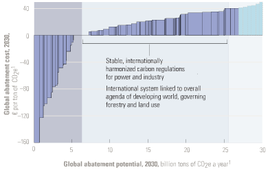
One version of the McKinsey MAC curve
Five criticisms are common:
1. Negative cost abatement options don’t really exist, or will be undertaken anyway without policy support. This criticism generally arises from the question begged by the Sweeney et al. MAC curve below: if the leftmost bar (diesel anti-idling) has a large negative cost (i.e. profit opportunity) and is price sensitive, why hasn’t anyone done it? Where are those $20 bills on the sidewalk? There is some wisdom to this, but you have to drink pretty deeply of the neoclassical economic kool aid to believe that there really are no misperceptions, institutional barriers, or non-climate externalities that could create negative cost opportunities.
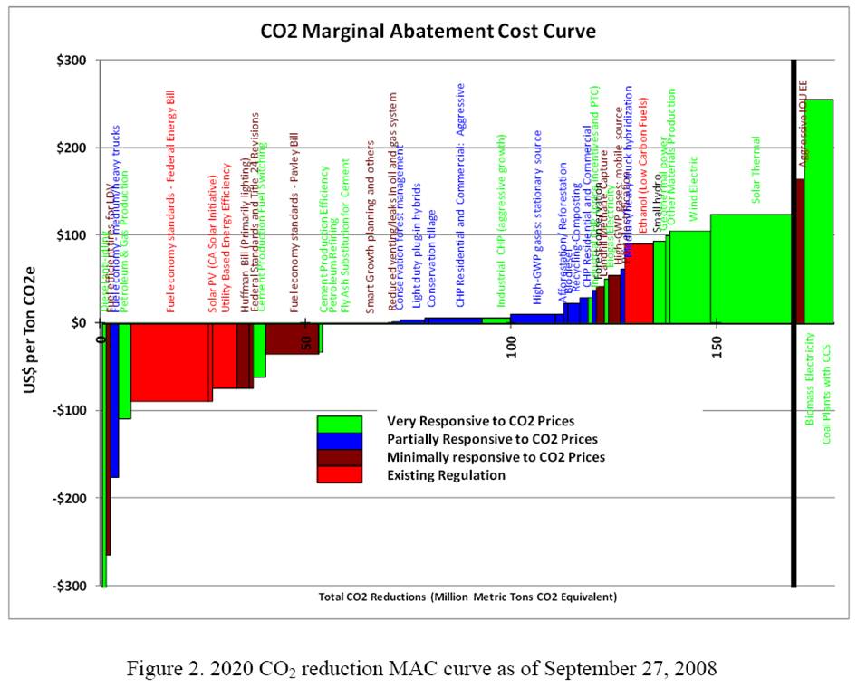
Sweeney, Weyant et al. Analysis of Measures to Meet the Requirements of California’s Assembly Bill 32
The neoclassical perspective is evident in AR4, which reports results primarily of top-down, equilibrium models. As a result, mitigation costs are (with one exception) positive:
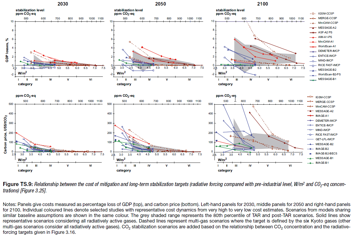
AR4 WG3 TS fig. TS-9
Note that these are top-down implicit MAC curves, derived by exercising aggregate models, rather than bottom-up curves constructed from detailed menus of technical options.
2. The curves employ static assumptions, that might not come true. For example, I’ve heard that the McKinsey curves assume $60/bbl oil. This criticism is true, but could be generalized to more or less any formal result that’s presented as a figure rather than an interactive model. I regard it as a caveat rather than a flaw.
3. The curves themselves are static, while reality evolves. I think the key issue here is that technology evolves endogenously, so that to some extent the shape of the curve in the future will depend on where we choose to operate on the curve today. There are also 2nd-order, market-mediated effects (related to #2 as well): a) exploiting the curve reduces energy demand, and thus prices, which changes the shape of the curve, and b) changes in GHG prices or other policies used to drive exploitation of the curve influence prices of capital and other factors, again changing the shape of the curve.
4. The notion of “supply” is misleading or incomplete. Options depicted on a MAC curve typically involve installing some kind of capital to reduce energy or GHG use. But that installation depends on capital turnover, and therefore is available only incrementally. The rate of exploitation is more difficult to pin down than the maximum potential under idealized conditions.
5. A lot of mitigation falls through the cracks. There are two prongs to this criticism: bottom-up, and top-down. Bottom-up models, because they employ a menu of known technologies, inevitably overlook some existing or potential options that might materialize in reality (with the incentive of GHG prices, for example). That error is, to some extent, offset by over-optimism about other technologies that won’t materialize. More importantly, a menu of supply and end use technology choices is an incomplete specification of the economy; there’s also a lot of potential for changes in lifestyle and substitution of activity among economic sectors. Today’s bottom-up MAC curve is essentially a snapshot of how to do what we do now, with fewer GHGs. If we’re serious about deep emissions cuts, the economy may not resemble what we’re doing now very much in 40 years. Top down models capture the substitution potential among sectors, but still take lifestyle as a given and (mostly) start from a first-best equilibrium world, devoid of mitigation options arising from the frailty of human, institutional, and market failures.
To get the greenhouse gas MAC curve right, you need a model that captures bottom-up and top-down aspects of the economy, with realistic dynamics and agent behavior, endogenous technology, and non-climate externalities all included. As I see it, mainstream integrated assessment models are headed down some of those paths (endogenous technology), but remain wedded to the equilibrium/optimization perspective. Others (including us at Ventana) are exploring other avenues, but it’s a hard road to hoe.
In the meantime, we’re stuck with a multitude of perspectives on mitigation costs. Here are a few from the WCI, compiled by Wei and Rose from partner jurisdictions’ Climate Action Team reports and other similar documents:
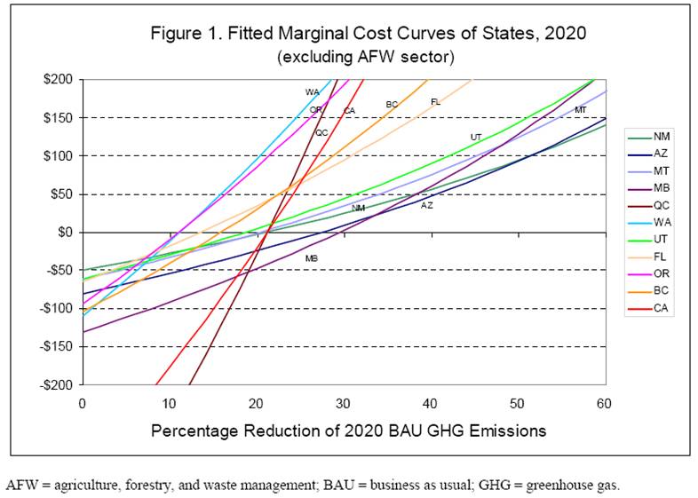
Wei & Rose, Preliminary Cap & Trade Simulation of Florida Joining WCI
The methods used to develop the various partner options differ, so these curves reflect diverse beliefs rather than a consistent comparison. What’s striking to me is that the biggest opportunities (are perceived to) exist in California, which already has (roughly) the lowest GHG intensity and most stringent energy policies among the partners. Economics 101 would suggest that California might already have exploited the low-hanging fruit, and that greater opportunity would exist, say, here in Montana, where energy policy means low taxes and GHG intensity is extremely high.
For now, we have to live with the uncertainty. However, it seems obvious that an adaptive strategy for discovering the true potential for mitigation is easy. No matter who you beleive, the cost of the initial increment of emissions reductions is either small (<<1% of GDP) or negative, so just put a price on GHGs and see what happens.