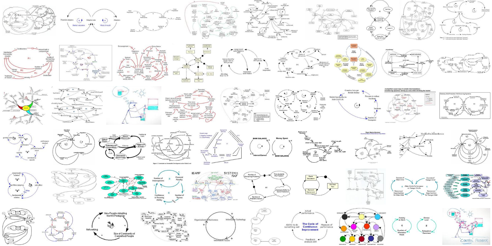
Coincidence?

The equinox brought a strange confluence of two recent posts: Brian Eno on intuitive design, via TOP.

The trouble begins with a design philosophy that equates “more options” with “greater freedom.” Designers struggle endlessly with a problem that is almost nonexistent for users: “How do we pack the maximum number of options into the minimum space and price?” In my experience, the instruments and tools that endure (because they are loved by their users) have limited options.

Although designers continue to dream of “transparency” – technologies that just do their job without making their presence felt – both creators and audiences actually like technologies with “personality.” A personality is something with which you can have a relationship. Which is why people return to pencils, violins, and the same three guitar chords.

Brian Eno, meet Stafford Beer

Brian Eno reflects on feedback and self-organization in musical composition, influenced by the organization of complex systems in Stafford Beer’s The Brain of the Firm.

Stafford Beer was a member of the cybernetics thread of systems thought (if that sounds baffling, read George Richardson’s excellent book on the evolution of thinking about systems).

The BC carbon tax – good idea, bad implementation

Via PEF:

BC’s carbon tax was supposed to be “revenue neutral”, meaning all carbon tax revenue would be “recycled” to British Columbians through personal income tax cuts, corporate income tax cuts and a low-income credit. When the 2008 budget launched the carbon tax, we were provided with a forecast that had revenues precisely match recycling through tax cuts and credits, with about one-third of revenues going to each of PIT cuts, CIT cuts and the low-income credit.

But recent budgets have shown a carbon tax deficit: tax cuts have completely swamped carbon tax revenues. While some were concerned that the carbon tax would be a “tax grab”, instead we are a carbon tax is that is revenue negative not revenue neutral.

Corporate tax cuts are now absorbing the lion’s share of carbon tax revenues. In 2010/11, they will be equivalent to 57% of carbon tax revenues, compared to one-third in 2008/09. Cutting corporate taxes is the worst possible way of using carbon tax revenues. This is because of the intense concentration of ownership of capital at the top of the income distribution (when you hear corporate tax cuts think upper-income tax cuts), and also because shareholders outside BC, who pay no carbon tax, benefit from corporate tax cuts.

Superstitious learning about the stimulus

Stimulus regret seems to be pretty widespread now. The undercurrent seems to be that, because unemployment is still 10% etc., the stimulus didn’t work or at least wasn’t cost effective. This conclusion is based on pattern matching thinking. Pattern matching assumes simple A->B correlation: Stimulus->Unemployment. Working backwards from that assumption, one concludes from ongoing high unemployment and the fact that stimulus did occur that the correlation between stimulus and unemployment is low.

There are two problems with this logic. First, there are many confounding factors in the A->B relationship that could be responsible for ongoing problems. Second, there’s feedback between A and B, which also means that there are (possibly large) intervening stocks (integrations, accumulations). Stocks decouple the temporal relationship between A and B, so that pattern matching doesn’t work .

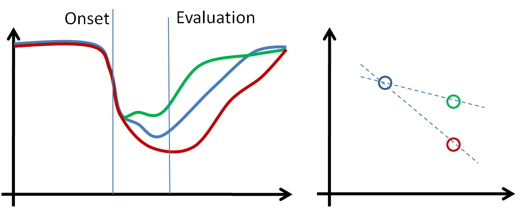
Consider three possible worlds, schematically below. The blue scenario is the economy’s trajectory with no intervention. In the green scenario, stimulus spending is used, and it works, making recovery faster. In the red scenario, stimulus is counterproductive. If one evaluates the stimulus early, without accounting for delays and accumulation, one can’t help but conclude that the stimulus has failed, because things got worse. Pattern matching doesn’t account for the fact that things might have gotten worse more slowly.
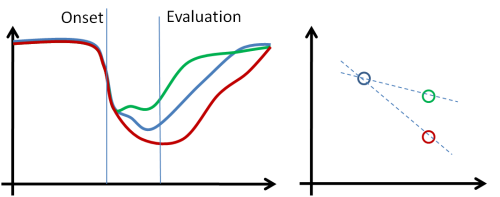
Stimulus Superstition

For a politician evaluated by people who ignore system structure, this is a no-win situation. As long as things get worse, blame follows, regardless of what policy is chosen.

I’m not arguing that stimulus works, just that the public debate about it is vacuous. There’s little talk about delays, feedback, let alone model-driven discussion of the outcome, i.e. the only perspective through which one can understand the problem is largely confined to a small circle of wonks.
Interactive diagrams – obesity dynamics

Food-nutrition-health-exercise-energy interactions are an amazing nest of positive feedbacks, with many win-win opportunities, but more on that another time.

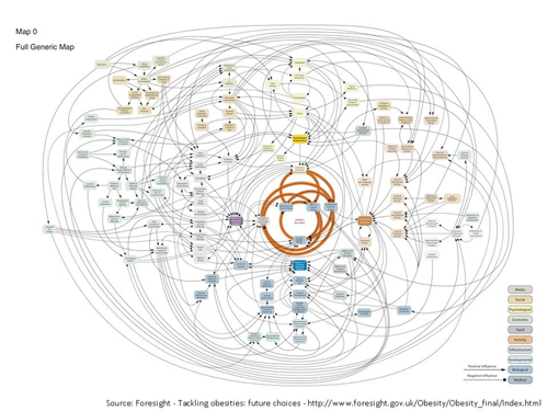
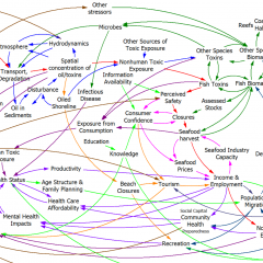
Instead, I’m hoisting an interesting influence diagram about obesity from the comments. At first glance, it’s just another plate of spaghetti.

ForesightObesity

But when you follow the link (do it now), there’s an interesting innovation: the diagram is interactive. You can zoom, scroll, and highlight particular sectors and dynamics. There’s some narrative here and here. (Update: the interactive link seems to be down, but the diagram is still here: https://assets.publishing.service.gov.uk/government/uploads/system/uploads/attachment_data/file/295153/07-1177-obesity-system-atlas.pdf)

It took me a while to decide whether I’d call this a causal loop diagram or not. I think the primary distinction between a CLD and other kinds of mindmaps or process diagrams is the use of variables. On a CLD, each label represents a quantity that can vary, with a definite direction – TV Watching, Stress, Use of Medicines. Items on other kinds of diagrams might represent events or fuzzier constellations of concepts. This diagram doesn’t have link polarities (too bad) or loop polarities (which would be pretty incomprehensible anyway), but many other CLDs also avoid such labels for simplicity.

I think there’s a lot of potential for further exploration of this idea. There’s a lot you could do to relate structure to behavior, or at least to explain the rationale for structure (both shortcomings of the diagram). Each link, for example, could have its tale revealed when clicked, and key loops could be animated individually, with stories told. Drill-down could be extended to provide links between top-level subsystem relationships and more microscopic views.

I think huge diagrams like the one above are always going to be overwhelming to a layperson. Also, it’s hard to make even a small CLD good, so making a big one really accurate is tough. Therefore, I’d rather see advanced CLD presentations used to improve the communication of simpler stories, with a few loops. However, big or small, there might be many common technological benefits from dedicated diagramming software.

Dry Lake Mead

The systems story on Lake Mead deepens (unlike the lake itself). I heard about some more interesting dynamics in a side conversation at the Balaton Group meeting in Iceland.

First, it’s not just Mead that’s impacted; upstream Lake Powell is also low. One consequence of this is that hydro generation is down, because the head is lower. Since both lakes are half full, it might make sense to drain Powell into Mead. That would raise the head at Mead, making up for the loss of generation at Powell. Water losses would also decrease. One possible obstacle to this strategy is that stakeholders in Powell fear that it could never be refilled, because endangered species would reinhabit the empty canyons.

Second, as the lakes get lower, bad things happen. Evidently the deep waters are stratified, and there are plumes of nasty saline gunk near the bottom. If lake levels continue to drop, there’s a possibility of serious water quality problems to go with the quantity issues.

One thing that’s striking about the media coverage of data and projections by agencies is that there’s little discussion of the nature or magnitude of variability. The implicit assumption behind current behavior is that droughts are cyclical or just noise. The hope seems to be that, since we’re in a low period for basin rainfall, the magic of reversion to the mean will soon bring forth the waters again. I don’t think there’s any good reason to act as if that will really happen, especially if climate makes the distribution nonstationary. Modelers seem to think that the Southwest will move to a drought regime as the earth warms, but what if they’re wrong, and the hydrologic cycle accelerates? Glen Canyon Dam was nearly lost in 1983, so a healthy increase in rainfall wouldn’t necessarily be a blessing either.

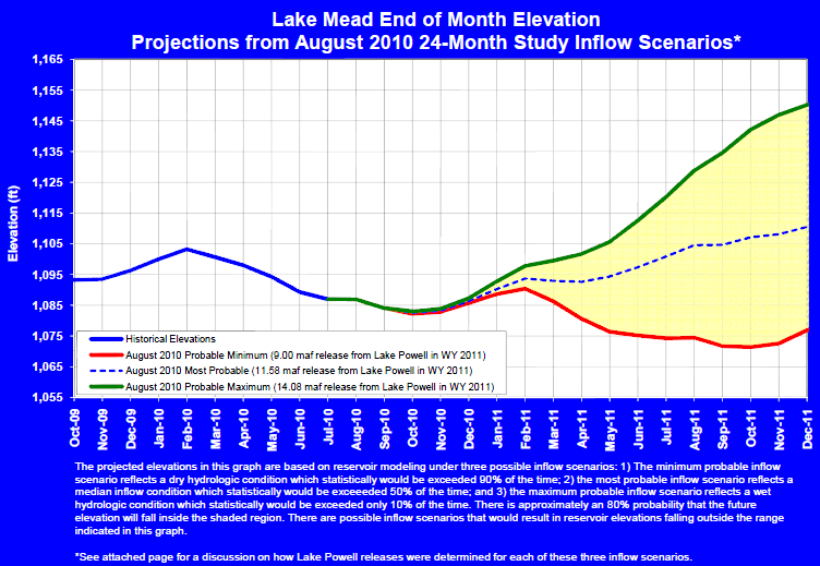
LakeMeadProjection2010Current Bureau of Reclamation projections for Lake Mead elevation. Documentation is pretty opaque, but it looks like the projections are based on quantiles of historic inflows, i.e. they neglect autocorrelation or changes in the distribution of supply.

Edward Abbey must be smiling at least a little at this mess.

Why is the arctic brown?

I’m blogging from a 757, somewhere over the North pole, returning from a sustainability meeting in Iceland. The world below is a wilderness of sea ice and clouds. I’d expect brilliant white, but there’s actually a brown haze over the landscape. It’s stratified, much like the odd sight of half-white, half-brown clouds one occasionally sees when flying into a polluted city. Where does it come from? Chinese coal fumes? Russian fires? American SUV tailpipes? Icelandic airplane exhaust?

You are what you eat

I’m on my way home from the 29th meeting of the Balaton Group, held in Iceland. Iceland seems to be rising gracefully from it’s financial crisis, with introspection into the values that led to it and a renewed interest in sustainability. Author Andri Magnason visited us at dinner, and talked a bit about Iceland and his wonderful book, Dreamland – A Self-help Manual for a Frightened Nation. I picked up a copy in the airport (can’t get it at amazon yet) and got halfway through on the plane – I highly recommend it.

Another Magnason project is a book of Bonus Poetry, named for and spoofing the Icelandic Walmart.

You are what you eat
My grandfather was 70% water
He was 70% the stream
that trickled past his farm
he was the 30%
the sheep that grazed on his mountain
he was the fish swimming in his lake
he was the cow eating
in his field
he was the stream, he was the grass,
the mountain and the lake
I am not 70% water
perhaps 15% mineral water
the rest is beer and coca cola
I am italian pasta, swiss cheese
danish pork and chinese rice
american ketchup
runs through my veins
you are what you eat
I am a miniature of the world
no
I am a miniature of Bonus

Fuel economy makeover

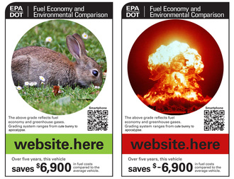
The EPA is working on new fuel economy window stickers for cars (you can vote on alternatives). I like this one:

New Fuel Econ Sticker
hoisted from the comments at jalopnik

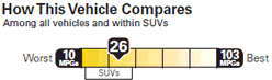
There are some things to like about the possible new version. For example, it indicates fuel economy on an absolute scale, so that there’s no implicit allocation of pollution rights to bigger vehicles (unlike Energy Star and the CAFE standard):

New Fuel Econ ScaleSince the new stickers will indicate fueling costs, emissions taxes on fuels will be a nice complementary policy, as they’ll be more evident on the dealer lot.