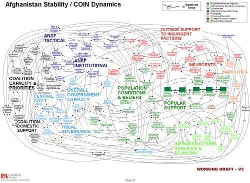
The NYT is about 4 months behind the times picking up on a spaghetti diagram of Afghanistan situation, which it uses to lead off a critique of Powerpoint use in the military. The reporter is evidently cheesed off at being treated like a chicken:
Senior officers say the program does come in handy when the goal is not imparting information, as in briefings for reporters.
The news media sessions often last 25 minutes, with 5 minutes left at the end for questions from anyone still awake. Those types of PowerPoint presentations, Dr. Hammes said, are known as “hypnotizing chickens.”
The Times reporter seems unaware of the irony of her own article. Early on, she quotes a general, “Some problems in the world are not bullet-izable.” But isn’t the spaghetti diagram an explicit attempt to get away from bullets, and present a rich, holistic picture of a complicated problem? The underlying point – that presentations are frequently awful and waste time – is well taken, but hardly news. If there’s a problem here, it’s not the fault of Powerpoint, and we’d do well to identify the real issue.
For those unfamiliar with the lingo, the spaghetti is actually a Causal Loop Diagram (CLD), a type of influence diagram. It’s actually a hybrid, because the Popular Support sector also has a stock-flow chain. Between practitioners, a good CLD can be an incredibly efficient communication device – much more so than the “five-pager” cited in the article. CLDs occupy a niche between formal mathematical models and informal communication (prose or ppt bullets). They’re extremely useful for brainstorming (which is what seems to have been going on here) and for communicating selected feedback insights from a formal model. They also tend to leave a lot to the imagination – if you try to implement a CLD in equations, you’ll discover many unstated assumptions and inconsistencies along the way. Still, the CLD is likely to be far more revealing of the tangle of assumptions that lie in someone’s head than a text document or conversation.
Evidently the Times has no prescription for improvement, but here’s mine:
- If the presenters were serious about communicating with this diagram, they should have spent time introducing the CLD lingo and walking through the relationships. That could take a long time, i.e. a whole presentation could be devoted to the one slide. Also, the diagram should have been built up in digestible chunks, without overlapping links, and key feedback loops that lead to success or disaster should be identified.
- If the audience were serious about understanding what’s going on, they shouldn’t shut off their brains and snicker when unconventional presentations appear. If reporters stick their fingers in their ears and mumble “not listening … not listening … not listening …” at the first sign of complexity, it’s no wonder DoD treats them like chickens.


My sister is finishing her undergrad in journalism. Maybe it’s the kind of study and information they’re used to; she is perfectly comfortable with reading through endless pages, but when you try to summarize it into a few charts and equations, it’s the “not listening, not listening, la la la” you mention.
This is also relevant to communicating complex scientific information (yes, I am talking Climate Change here…), where I sometimes find reporters only go for the headline, ignoring the caveats. That makes them much more prone to be used by “denialists”, and to pounce on things like ClimateGate, trying to uncover some supposed blame and not the underlying reasons related to incomplete knowledge of complex reality.
Absolutely.
I think a root cause is that many people simply don’t have tools for talking thinking about complex systems. My guess is that most practitioners in systems disciplines – SD, economics, ecology, etc. – would agree. Part of the solution is meeting people where they are, by translating complex insights into stories that people respond to. Unless you’re very careful, that approach favors laundry-list thinking, unidirectional causality, and event-driven explanations of structural problems. Therefore part of the solution also needs to involve raising the general level of understanding, so that we can have better conversations.
I completely agree Tom. I’ve been spending a lot of time lately thinking about and helping others to have “Systems Smart” conversations. It would be great to share my notes with you sometime.
Would love to hear your thoughts.
Our choir knows that the process, and not just the diagram, was a part of the learning. Again, some people have an addiction to instant solutions that can be presented in bulleted lists or sound bites or half-columns in a newspaper. I can just hear brains screaming, “This is too hard to comprehend!” Unfortunately we can’t ignore them, we have to keep singing.
I have not ever had spaghetti that was so well organized and useful. The pattern recognition skills of these pundits is very poor. In fact the vast majority of PowerPoint presentations use all sorts of shapes and arrows willy-nilly without any methodological or standard definition. This CLD on a PowerPoint is a refreshing and useful change.
It’s surprising how many people in the NYT comments picked up on what this diagram represents. Clearly the world isn’t totally clueless. It would be interesting to know what fraction of readers can interpret this as an influence diagram, whether they know what a CLD specifically is or not. It’s something I tend to take for granted (at my own risk).
Although typical Powerpoint usage is worth flogging, the NY Times picked a poor example. Edward Tufte did the definitive job with his dissection of NASA’s Columbia disaster. An SD-CLD diagram like this needs to be progressively disclosed, which based on versions of this presentation I’ve seen was likely the case.
The question shouldn’t be about the particular diagram and it’s usefulness, only the question about the abilities of the reporter to accurately report the news at the detail of the audience. The diagram is no doubt genius and spagetti at the same time depending on the context in which you want to use it.
We discuss this diagram, but do not discuss the broader background of the NYT reader base.
This would be appropriate for a technical magazine, not for general consumption. The reporter should be flogged, not the author of the diagram.