
I just ran across Twist and Shout: Images and Graphs in Skeptical Climate Media, a compendium of cherry picking and other chartjunk abuses.
I think it misses a large class of (often willful) errors: ignoring the climate bathtub. Such charts typically plot CO2 emissions or concentration against temperature, with the implication that any lack of correlation indicates a problem with the science. But this engages in a combination of a pattern matching fallacy and fallacy of the single cause. Sometimes these things make it into the literature, but most live on swampy skeptic sites.
An example, reportedly from John Christy, who should know better:
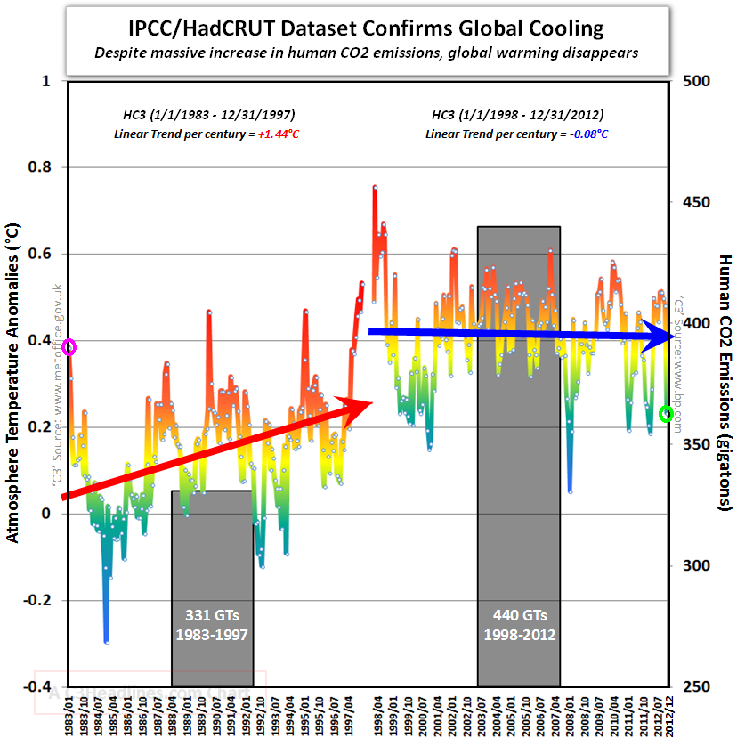
Notice how we’re supposed to make a visual correlation between emissions and temperature (even though two integrations separate them, and multiple forcings and noise influence temperature). Also notice how the nonzero minimum axis crossing for CO2 exaggerates the effect. That’s in addition to the usual tricks of inserting an artificial trend break at the 1998 El Nino and truncating the rest of history.