
PNAS has a new article on climate catastrophe mechanisms, focused on the social side, not natural tipping points. The article includes a causal loop diagram capturing some of the key feedbacks:
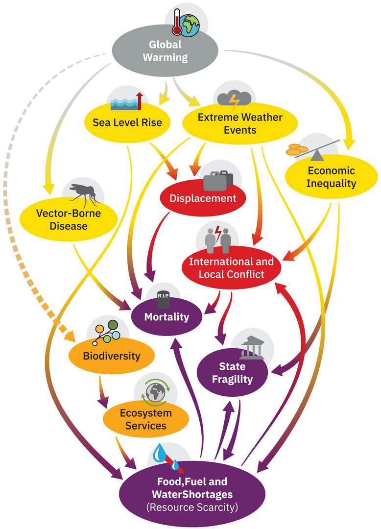 The diagram makes an unconventional choice: link polarity is denoted by dashed lines, rather than the usual + and – designations at arrowheads. Per the caption,
This is a causal loop diagram, in which a complete line represents a positive polarity (e.g., amplifying feedback; not necessarily positive in a normative sense) and a dotted line denotes a negative polarity (meaning a dampening feedback).
Does this new convention work? I don’t think so. It’s not less visually cluttered, and it makes negative links look tentative, though in fact there’s no reason for a negative link to have any less influence than a positive one. I think it makes it harder to assess loop polarity by following reversals from – links. There’s at least one goof: increasing ecosystem services should decrease food and water shortages, so that link should have negative polarity.
The caption also confuses link and loop polarity: “a complete line represents a positive polarity (e.g., amplifying feedback”. A single line is a causal link, not a loop, and therefore doesn’t represent feedback at all. (The rare exception might be a variable with a link back to itself, sometimes used to indicate self-reinforcement without elaborating on the mechanism.)
Nevertheless, I think this is a useful start toward a map of the territory. For me, it was generative, i.e. it immediately suggested a lot of related effects. I’ve elaborated on the original here:
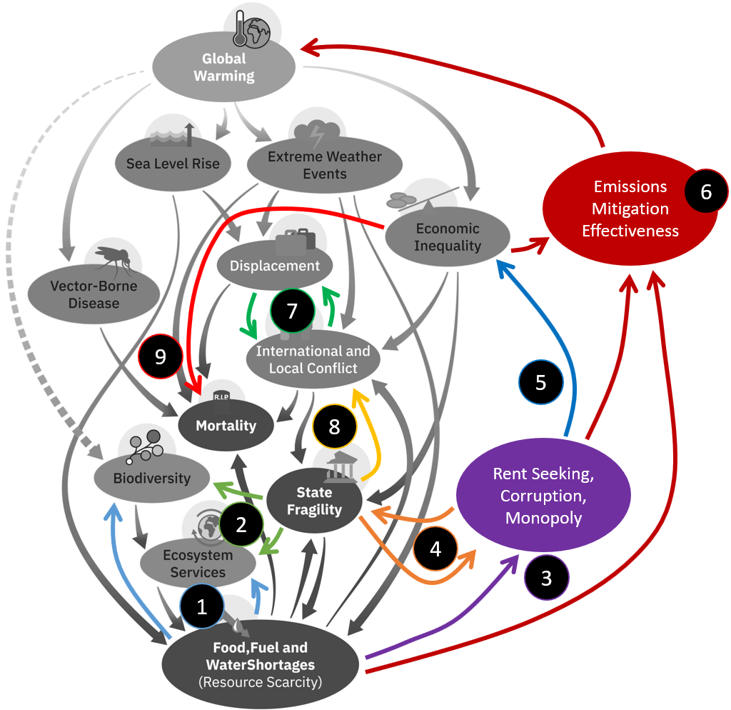
- Food, fuel and water shortages increase pressure to consume more natural resources (biofuels, ag land, fishing for example) and therefore degrade biodiversity and ecosystem services. (These are negative links, but I’m not following the dash convention – I’m leaving polarity unlabeled for simplicity.) This is perverse, because it creates reinforcing loops worsening the resource situation.
- State fragility weakens protections that would otherwise protect natural resources against degradation.
- Fear of scarcity induces the wealthy to protect their remaining resources through rent seeking, corruption and monopoly.
- Corruption increases state fragility, and fragile states are less able to defend against further corruption.
- More rent seeking, corruption and monopoly increases economic inequality.
- Inequality, rent seeking, corruption, and scarcity all make emissions mitigation harder, eventually worsening warming.
- Displacement breeds conflict, and conflict displaces people.
- State fragility breeds conflict, as demagogues blame “the other” for problems and nonviolent conflict resolution methods are less available.
- Economic inequality increases mortality, because mortality is an extreme outcome, and inequality puts more people in the vulnerable tail of the distribution.
#6 is key, because it makes it clear that warming is endogenous. Without it, the other variables represent a climate-induced cascade of effects. In reality, I think we’re already seeing many of the tipping effects (resource and corruption effects on state fragility, for example) and the resulting governance problems are a primary cause of the failure to reduce emissions.
I’m sure I’ve missed a bunch of links, but this is already a case of John Muir‘s idea, “When we try to pick out anything by itself, we find it hitched to everything else in the Universe.”
Unfortunately, most of the hitches here create reinforcing loops, which can amplify our predicament and cause catastrophic tipping events. I prefer to see this as an opportunity: we can run these vicious cycles in reverse, making them virtuous. Fighting corruption makes states less fragile, making mitigation more successful, reducing future warming and the cascade of side effects that would otherwise reinforce state fragility in the future. Corruption is just one of many places to start, and any progress is amplified. It’s just up to us to cross enough virtuous tipping points to get the whole system moving in a good direction.
Thanks for insightful comments on diagram representation, Tom. May I ask your opinion on three other representations?
1. using the solid arrow for the same level or integration and dotted arrow for differentiation relation of variables. Examples of dotted arrow (in stock management model) are from supplyline to supply rate and supplyline to supplyline adjustment rate.
2. coloring variables according to semantic and/or unit:
– semantic: green for estimated parameter (as opposed to assumed parameter)
– unit: red for time (month) , green for level (#), blue for rate (#/month), skyblue for ratio (dmnl).
Complexity of this idea makes it less realistic but I’ve seen at least three scholars using colors (unfortunately without much consistency between scholars and even within one scholar) so the need for color might get some consensus.
3. (most unrealistic) use straight arrow for the same unit and curved for different units. Downside is aesthetics; overlapping arrows and less dynamic-feel as flows are usually associated with curve images (for good reasons). I find 3 useful but perhaps 2 above can be a partial solution.
1. I think this is an interesting idea. However, for CLDs, I tend to minimize the information encoded, because the point is to communicate with people who don’t know the lingo. If I have to start explaining anything more than basic influence, I feel like there’s a risk of losing the audience.
2. In CLDs, I generally color by discussion topic or to identify key loops. In models, I often color code for variable types or topics, but I don’t have a consistent style. We’ve been thinking about adding some semantic tags to variables, which could be used by a style sheet to automate this (Vensim & Ventity).
3. I think the aesthetic downside overrides any benefit here.
As an alternative: what if the diagram coloring could be varied on the fly – a menu command to color by units, tags, variable type, etc.?
Tom, is the difficulty with the conventions or the mode of the presentation itself?
* https://systemswiki.substack.com/p/storytelling
Good point. The mode works for me, but I wouldn’t want to inflict it on an unsuspecting audience in one big chunk.
Hi Tom, sometimes I can’t remember all the thoughts I should have on my mind at one time. Here’s essentially part 2 of the previous musing.
* https://systemswiki.substack.com/p/storytelling-revisited