Hypnotizing chickens, Afghan insurgents, and spaghetti

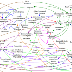
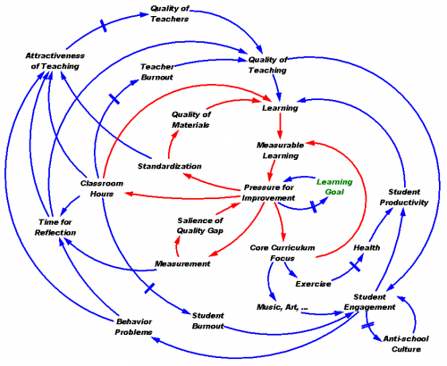
The NYT is about 4 months behind the times picking up on a spaghetti diagram of Afghanistan situation, which it uses to lead off a critique of Powerpoint use in the military. The reporter is evidently cheesed off at being treated like a chicken:

Senior officers say the program does come in handy when the goal is not imparting information, as in briefings for reporters.

The news media sessions often last 25 minutes, with 5 minutes left at the end for questions from anyone still awake. Those types of PowerPoint presentations, Dr. Hammes said, are known as “hypnotizing chickens.”

Afghanistan Stability: COIN (Counterinsurgency) Model
Click to enlarge

The Times reporter seems unaware of the irony of her own article. Early on, she quotes a general, “Some problems in the world are not bullet-izable.” But isn’t the spaghetti diagram an explicit attempt to get away from bullets, and present a rich, holistic picture of a complicated problem? The underlying point – that presentations are frequently awful and waste time – is well taken, but hardly news. If there’s a problem here, it’s not the fault of Powerpoint, and we’d do well to identify the real issue.

For those unfamiliar with the lingo, the spaghetti is actually a Causal Loop Diagram (CLD), a type of influence diagram. It’s actually a hybrid, because the Popular Support sector also has a stock-flow chain. Between practitioners, a good CLD can be an incredibly efficient communication device – much more so than the “five-pager” cited in the article. CLDs occupy a niche between formal mathematical models and informal communication (prose or ppt bullets). They’re extremely useful for brainstorming (which is what seems to have been going on here) and for communicating selected feedback insights from a formal model. They also tend to leave a lot to the imagination – if you try to implement a CLD in equations, you’ll discover many unstated assumptions and inconsistencies along the way. Still, the CLD is likely to be far more revealing of the tangle of assumptions that lie in someone’s head than a text document or conversation.

Evidently the Times has no prescription for improvement, but here’s mine:

  • If the presenters were serious about communicating with this diagram, they should have spent time introducing the CLD lingo and walking through the relationships. That could take a long time, i.e. a whole presentation could be devoted to the one slide. Also, the diagram should have been built up in digestible chunks, without overlapping links, and key feedback loops that lead to success or disaster should be identified.
  • If the audience were serious about understanding what’s going on, they shouldn’t shut off their brains and snicker when unconventional presentations appear. If reporters stick their fingers in their ears and mumble “not listening … not listening … not listening …” at the first sign of complexity, it’s no wonder DoD treats them like chickens.

Writing a good system dynamics paper II

It’s SD conference paper review time again. Last year I took notes while reviewing, in an attempt to capture the attributes of a good paper. A few additional thoughts:

  • No model is perfect, but it pays to ask yourself, will your model stand up to critique?
  • Model-data comparison is extremely valuable and too seldom done, but trivial tests are not interesting. Fit to data is a weak test of model validity; it’s often necessary, but never sufficient as a measure of quality. I’d much rather see the response of a model to a step input or an extreme conditions test than a model-data comparison. It’s too easy to match the model to the data with exogenous inputs, so unless I see a discussion of a multi-faceted approach to validation, I get suspicious. You might consider how your model meets the following criteria:
    • Do decision rules use information actually available to real agents in the system?
    • Would real decision makers agree with the decision rules attributed to them?
    • Does the model conserve energy, mass, people, money, and other physical quantities?
    • What happens to the behavior in extreme conditions?
    • Do physical quantities always have nonnegative values?
    • Do units balance?
  • If you have time series output, show it with graphs – it takes a lot of work to “see” the behavior in tables. On the other hand, tables can be great for other comparisons of outcomes.
  • If all of your graphs show constant values, linear increases (ramps), or exponentials, my eyes glaze over, unless you can make a compelling case that your model world is really that simple, or that people fail to appreciate the implications of those behaviors.
  • Relate behavior to structure. I don’t care what happens in scenarios unless I know why it happens. One effective way to do this is to run tests with and without certain feedback loops or sectors of the model active.
  • Discuss what lies beyond the boundary of your model. What did you leave out and why? How does this limit the applicability of the results?
  • If you explore a variety of scenarios with your model (as you should), introduce the discussion with some motivation, i.e. why are the particular scenarios tested important, realistic, etc.?
  • Take some time to clean up your model diagrams. Eliminate arrows that cross unnecessarily. Hide unimportant parameters. Use clear variable names.
  • It’s easiest to understand behavior in deterministic experiments, so I like to see those. But the real world is noisy and uncertain, so it’s also nice to see experiments with stochastic variation or Monte Carlo exploration of the parameter space. For example, there are typically many papers on water policy in the ENV thread. Water availability is contingent on precipitation, which is variable on many time scales. A system’s response to variation or extremes of precipitation is at least as important as its mean behavior.
  • Modeling aids understanding, which is intrinsically valuable, but usually the real endpoint of a modeling exercise is a decision or policy change. Sometimes, it’s enough to use the model to characterize a problem, after which the solution is obvious. More often, though, the model should be used to develop and test decision rules that solve the problem you set out to conquer. Show me some alternative strategies, discuss their limitations and advantages, and describe how they might be implemented in the real world.
  • If you say that an SD model can’t predict or forecast, be very careful. SD practitioners recognized early on that forecasting was often a fool’s errand, and that insight into behavior modes for design of robust policies was a worthier goal. However, SD is generally about building good dynamic models with appropriate representations of behavior and so forth, and good models are a prerequisite to good predictions. An SD model that’s well calibrated can forecast as well as any other method, and will likely perform better out of sample than pure statistical approaches. More importantly, experimentation with the model will reveal the limits of prediction.
  • It never hurts to look at your paper the way a reviewer will look at it.

NUMMI – an innovation killed by its host's immune system?

This American Life had a great show on the NUMMI car plant, a remarkable joint venture between Toyota and GM. It sheds light on many of the reasons for the decline of GM and the American labor movement. More generally, it’s a story of a successful innovation that failed to spread, due to policy resistance, inability to confront worse-before-better behavior and other dynamics.

I noticed elements of a lot of system dynamics work in manufacturing. Here’s a brief reading list:

The Trouble with Spreadsheets

As a prelude to my next look at alternative fuels models, some thoughts on spreadsheets.

Everyone loves to hate spreadsheets, and it’s especially easy to hate Excel 2007 for rearranging the interface: a productivity-killer with no discernible benefit. At the same time, everyone uses them. Magne Myrtveit wonders, Why is the spreadsheet so popular when it is so bad?

Spreadsheets are convenient modeling tools, particularly where substantial data is involved, because numerical inputs and outputs are immediately visible and relationships can be created flexibly. However, flexibility and visibility quickly become problematic when more complex models are involved, because:

  • Structure is invisible and equations, using row-column addresses rather than variable names, are sometimes incomprehensible.
  • Dynamics are difficult to represent; only Euler integration is practical, and propagating dynamic equations over rows and columns is tedious and error-prone.
  • Without matrix subscripting, array operations are hard to identify, because they are implemented through the geography of a worksheet.
  • Arrays with more than two or three dimensions are difficult to work with (row, column, sheet, then what?).
  • Data and model are mixed, so that it is easy to inadvertently modify a parameter and save changes, and then later be unable to easily recover the differences between versions. It’s also easy to break the chain of causality by accidentally replacing an equation with a number.
  • Implementation of scenario and sensitivity analysis requires proliferation of spreadsheets or cumbersome macros and add-in tools.
  • Execution is slow for large models.
  • Adherence to good modeling practices like dimensional consistency is impossible to formally verify

For some of the reasons above, auditing the equations of even a modestly complex spreadsheet is an arduous task. That means spreadsheets hardly ever get audited, which contributes to many of them being lousy. (An add-in tool called Exposé can get you out of that pickle to some extent.)

There are, of course, some benefits: spreadsheets are ubiquitous and many people know how to use them. They have pretty formatting and support a wide variety of data input and output. They support many analysis tools, especially with add-ins.

For my own purposes, I generally restrict spreadsheets to data pre- and post-processing. I do almost everything else in Vensim or a programming language. Even seemingly trivial models are better in Vensim, mainly because it’s easier to avoid unit errors, and more fun to do sensitivity analysis with Synthesim.

How to critique a model (and build a model that withstands critique)

Long ago, in the MIT SD PhD seminar, a group of us replicated and critiqued a number of classic models. Some of those formed the basis for my model library. Around that time, Liz Keating wrote a nice summary of “How to Critique a Model.” That used to be on my web site in the mid-90s, but I lost track of it. I haven’t seen an adequate alternative, so I recently tracked down a copy. Here it is: SD Model Critique (thanks, Liz). I highly recommend a look, especially with the SD conference paper submission deadline looming.

The Health Care Death Spiral

Paul Krugman documents an ongoing health care death spiral in California:

Here’s the story: About 800,000 people in California who buy insurance on the individual market — as opposed to getting it through their employers — are covered by Anthem Blue Cross, a WellPoint subsidiary. These are the people who were recently told to expect dramatic rate increases, in some cases as high as 39 percent.

Why the huge increase? It’s not profiteering, says WellPoint, which claims instead (without using the term) that it’s facing a classic insurance death spiral.

Bear in mind that private health insurance only works if insurers can sell policies to both sick and healthy customers. If too many healthy people decide that they’d rather take their chances and remain uninsured, the risk pool deteriorates, forcing insurers to raise premiums. This, in turn, leads more healthy people to drop coverage, worsening the risk pool even further, and so on.

A death spiral arises when a positive feedback loop runs as a vicious cycle. Another example is Andy Ford’s utility death spiral. The existence of the positive feedback leads to counter-intuitive policy prescriptions: Continue reading “The Health Care Death Spiral”

The Dynamics of Science

First, check out SEED’s recent article, which asks, When it comes to scientific publishing and fame, the rich get richer and the poor get poorer. How can we break this feedback loop?

For to all those who have, more will be given, and they will have an abundance; but from those who have nothing, even what they have will be taken away.
—Matthew 25:29

Author John Wilbanks proposes to use richer metrics to evaluate scientists, going beyond publications to consider data, code, etc. That’s a good idea per se, but it’s a static solution to a dynamic problem. It seems to me that it spreads around the effects of the positive feedback from publications->resources->publications a little more broadly, but doesn’t necessarily change the gain of the loop. A better solution, if meritocracy is the goal, might be greater use of blind evaluation and changes to allocation mechanisms themselves.

Lamarckat35

The reason we care about this is that we’d like science to progress as quickly as possible. That involves crafting a reward system with some positive feedback, but not so much that it easily locks in to suboptimal paths. That’s partly a matter of the individual researcher, but there’s a larger question: how to ensure that good theories out-compete bad ones?

170px-Darwin_ape

Now check out the work of John Sterman and Jason Wittenberg on Kuhnian scientific revolutions.

Update: also check out filter bubbles.

(Dry) Lake Mead

I’m just back from two weeks camping in the desert. Ironically, we had a lot of rain. Apart from the annoyance of cooking in the rain, water in the desert is a wonderful sight.

We spent one night in transit at Las Vegas Bay campground on Lake Mead. We were surprised to discover that it’s not a bay anymore – it’s a wash. The lake has been declining for a decade and is now 100 feet below its maximum.

Lake Mead water level

It turned out that this is not unprecedented – it happened in 1965, for example. After that relatively brief drought, it took a decade to claw back to “normal” levels.

The recent decline looks different to me, though – it’s not a surprising, abrupt decline, it’s a long, slow ramp, suggesting a persistent supply-demand imbalance. Bizarrely, it’s easy to get lake level data, but hard to find a coherent set of basin flow measurements. Would you invest in a company with a dwindling balance sheet, if they couldn’t provide you with an income statement?

It appears to me that the Colorado River system is simply overallocated, and their hasn’t been any feedback between reality (actual water availability) and policy (water use, governed by the Law of the River). It also appears that the problem is not with the inflow to Lake Mead. Here’s discharge past the Lees Ferry guage, which accounts for the bulk of the lake’s supply:

Lees Ferry flow

Notice that the post-2000 flows are low (probably reflecting mainly the statutory required discharge from Glenn Canyon dam upstream), but hardly unprecedented. My hypothesis is that the de facto policy for managing water levels is to wait for good years to restore the excess withdrawals of bad years, and that demand management measures in the interim are toothless. That worked back when river flows were not fully subscribed. The trouble is, supply isn’t stationary, and there’s no reason to assume that it will return to levels that prevailed in the early years of river compacts. At the same time, demand isn’t stationary either, as population growth in the west drives it up. To avoid Lake Mead drying up, the system is going to have to get a spine, i.e. there’s going to have to be some feedback between water availability and demand.

I’m sure there’s a much deeper understanding of water dynamics among various managers of the Colorado basin than I’ve presented here. But if there is, they’re certainly not sharing it very effectively, because it’s hard for an informed tinkerer like me to get the big picture. Colorado basin managers should heed Krys Stave’s advice:

Water managers increasingly are faced with the challenge of building public or stakeholder support for resource management strategies. Building support requires raising stakeholder awareness of resource problems and understanding about the consequences of different policy options.

Hadley cells for lunch

quinoa convection

At lunch today we were amazed by these near-perfect convection cells that formed in a pot of quinoa. You can DIY at NOAA. I think this is an instance of Benard-Marangoni convection, because the surface is free, though the thinness assumptions are likely violated, and quinoa is not quite an ideal liquid. Anyway, it’s an interesting phenomenon because the dynamics involve a surface tension gradient, not just heat transfer. See this and this.

Fun with Processing

Processing is a very clean, Java-based environment targeted at information visualization and art. I got curious about it, so I built a simple interactive game that demonstrates how dynamic complexity makes system control difficult. Click through to play:

dragdot

I think there’s a lot of potential for elegant presentation with Processing. There are several physics libraries and many simulations with a physical, chemical, or mathematical basis at OpenProcessing.org:

OpenProcessing

If you like code, it’s definitely worth a look.