Don't just do something, stand there! Reflections on the counterintuitive behavior of complex systems, seen through the eyes of System Dynamics, Systems Thinking and simulation.
This model is the product of my Major Qualifying Project (MQP) for my Bachelors degree in the field of system dynamics at Worcester Polytechnic Institute. There were two goals to this project:
1) To develop a model that reasonably simulates the historic attacks by the al-Qaida terrorist network against the United States.
2) To evaluate the usefulness of the model for developing public understanding of the terrorism problem.
The full model and report are available on my website.
Reference Mode
The reference mode for this model was the escalation of attacks linked to al-Qaida against the U.S., as shown below. The data for this chart is available through this Google Document.
Causal View of the Model
Below is the causal diagram of the primary feedback loops in the model.
Online Story Model
There is an online story version that explains the primary model structure as well as complete iThink and Vensim models on my MQP page.
Peer reviewed: Yes (probably when submitted for publication?)
Units balance: Yes
Format: Vensim
Target audience: People interested in the concept of payments for environmental services as a means of improving land use and conservation of natural resources.
Questions answered: How might land users’ environmental ethic be influenced by, and influence, payments for environmental services.
Processing is a very clean, Java-based environment targeted at information visualization and art. I got curious about it, so I built a simple interactive game that demonstrates how dynamic complexity makes system control difficult. Click through to play:
I think there’s a lot of potential for elegant presentation with Processing. There are several physics libraries and many simulations with a physical, chemical, or mathematical basis at OpenProcessing.org:
There are lots of good reasons for building models without data. However, if you want to measure something (i.e. estimate model parameters), produce results that are closely calibrated to history, or drive your model with historical inputs, you need data. Most statistical modeling you’ll see involves static or dynamically simple models and well-behaved datasets: nice flat files with uniform time steps, units matching (or, alarmingly, ignored), and no missing points. Things are generally much messier with a system dynamics model, which typically has broad scope and (one would hope) lots of dynamics. The diversity of data needed to accompany a model presents several challenges:
disagreement among sources
missing data points
non-uniform time intervals
variable quality of measurements
diverse source formats (spreadsheets, text files, databases)
The mathematics for handling the technical estimation problems were developed by Fred Schweppe and others at MIT decades ago. David Peterson’s thesis lays out the details for SD-type models, and most of the functionality described is built into Vensim. It’s also possible, of course, to go a simpler route; even hand calibration is often effective and reasonably quick when coupled with Synthesim.
Either way, you have to get your data corralled first. For a simple model, I’ll build the data right into the dynamic model. But for complicated models, I usually don’t want the main model bogged down with units conversions and links to a zillion files. In that case, I first build a separate datamodel, which does all the integration and passes cleaned-up series to the main model as a fast binary file (an ordinary Vensim .vdf). In creating the data infrastructure, I try to maximize three things:
Replicability. Minimize the number of manual steps in the process by making the data model do everything. Connect the datamodel directly to primary sources, in formats as close as possible to the original. Automate multiple steps with command scripts. Never use hand calculations scribbled on a piece of paper, unless you’re scrupulous about lab notebooks, or note the details in equations’ documentation field.
Transparency. Often this means “don’t do complex calculations in spreadsheets.” Spreadsheets are very good at some things, like serving as a data container that gives good visibility. However, spreadsheet calculations are error-prone and hard to audit. So, I try to do everything, from units conversions to interpolation, in Vensim.
Quality.#1 and #2 already go a long way toward ensuring quality. However, it’s possible to go further. First, actually look at the data. Take time to build a panel of on-screen graphs so that problems are instantly visible. Use a statistics or visualization package to explore it. Lately, I’ve been going a step farther, by writing Reality Checks to automatically test for discontinuities and other undesirable properties of spliced time series. This works well when the data is simply to voluminous to check manually.
This can be quite a bit of work up front, but the payoff is large: less model rework later, easy updates, and higher quality. It’s also easier generate graphics or statistics that help others to gain confidence in the model, though it’s sometimes important to help them recognize that goodness of fit is a weak test of quality.
It’s good to build the data infrastructure before you start modeling, because that way your drivers and quality control checks are in place as you build structure, so you avoid the pitfalls of an end-of-pipe inspection process. A frequent finding in our corporate work has been that cherished data is in fact rubbish, or means something quite different that what users have historically assumed. Ventana colleague Bill Arthur argues that modern IT practices are making the situation worse, not better, because firms aren’t retaining data as long (perhaps a misplaced side effect of a mania for freshness).
We report experiments assessing people’s intuitive understanding of climate change. We presented highly educated graduate students with descriptions of greenhouse warming drawn from the IPCC’s nontechnical reports. Subjects were then asked to identify the likely response to various scenarios for CO2 emissions or concentrations. The tasks require no mathematics, only an understanding of stocks and flows and basic facts about climate change. Overall performance was poor. Subjects often select trajectories that violate conservation of matter. Many believe temperature responds immediately to changes in CO2 emissions or concentrations. Still more believe that stabilizing emissions near current rates would stabilize the climate, when in fact emissions would continue to exceed removal, increasing GHG concentrations and radiative forcing. Such beliefs support wait and see policies, but violate basic laws of physics.
The climate bathtubs are really a chain of stock processes: accumulation of CO2 in the atmosphere, accumulation of heat in the global system, and accumulation of meltwater in the oceans. How we respond to those, i.e. our emissions trajectory, is conditioned by some additional bathtubs: population, capital, and technology. This post is a quick look at the first.
I’ve grabbed the population sector from the World3 model. Regardless of what you think of World3’s economics, there’s not much to complain about in the population sector. It looks like this:
World3 population sector
People are categorized into young, reproductive age, working age, and older groups. This 4th order structure doesn’t really capture the low dispersion of the true calendar aging process, but it’s more than enough for understanding the momentum of a population. If you think of the population in aggregate (the sum of the four boxes), it’s a bathtub that fills as long as births exceed deaths. Roughly tuned to history and projections, the bathtub fills until the end of the century, but at a diminishing rate as the gap between births and deaths closes:
Notice that the young (blue) peak in 2030 or so, long before the older groups come into near-equilibrium. An aging chain like this has a lot of momentum. A simple experiment makes that momentum visible. Suppose that, as of 2010, fertility suddenly falls to slightly below replacement levels, about 2.1 children per couple. (This is implemented by changing the total fertility lookup). That requires a dramatic shift in birth rates:
However, that doesn’t translate to an immediate equilibrium in population. Instead,population still grows to the end of the century, but reaching a lower level. Growth continues because the aging chain is internally out of equilibrium (there’s also a small contribution from ongoing extension of life expectancy, but it’s not important here). Because growth has been ongoing, the demographic pyramid is skewed toward the young. So, while fertility is constant per person of child-bearing age, the population of prospective parents grows for a while as the young grow up, and thus births continue to increase. Also, at the time of the experiment, the elderly population has not reached equilibrium given rising life expectancy and growth down the chain.
Achieving immediate equilibrium in population would require a much more radical fall in fertility, in order to bring births immediately in line with deaths. Implementing such a change would require shifting yet another bathtub – culture – in a way that seems unlikely to happen quickly. It would also have economic side effects. Often, you hear calls for more population growth, so that there will be more kids to pay social security and care for the elderly. However, that’s not the first effect of accelerated declines in fertility. If you look at the dependency ratio (the ratio of the very young and old to everyone else), the first effect of declining fertility is actually a net benefit (except to the extent that young children are intrinsically valued, or working in sweatshops making fake Gucci wallets):
The bottom line of all this is that, like other bathtubs, it’s hard to change population quickly, partly because of the physics of accumulation of people, and partly because it’s hard to even talk about the culture of fertility (and the economic factors that influence it). Population isn’t likely to contribute much to meeting 2020 emissions targets, but it’s part of the long game. If you want to win the long game, you have to anticipate long delays, which means getting started now.
System dynamics models handle data in various ways. Traditionally, time series inputs were embedded in so-called lookups or table functions (DYNAMO users will remember TABHL for example). Lookups are really best suited for graphically describing a functional relationship. They’re really cool in Vensim’s Synthesim mode, where you can change the shape of a relationship and watch the behavioral consequence in real time.
Time series data can be thought of as f(time), so lookups are often used as data containers. This works decently when you have a limited amount of data, but isn’t really suitable for industrial strength modeling. Those familiar with advanced versions of Vensim may be aware of data variables – a special class of equation designed for working with time series data rather than endogenous structure.
There are many advantages to working with data variables:
You can tell where there are data points, visually on graphs or in equations by testing for a special :NA: value indicating missing data.
You can easily determine the endpoints of a series and vary the interpolation method.
Data variables execute outside the main sequence of the model, so they don’t bog down optimization or Synthesim.
It’s easier to use diverse sources for data (Excel, text files, ODBC, and other model runs) with data variables.
You can see the data directly, without creating extra variables to manipulate it.
In calibration optimization, data variables contribute to the payoff only when it makes sense (i.e., when there’s real data).
I think there are just two reasons to use lookups as containers for data:
You want compatibility with Vensim PLE (e.g., for students)
You want to expose the data stream to quick manipulation in a user interface
Otherwise, go for data variables. Occasionally, there are technical limitations that make it impossible to accomplish something with a data equation, but in those cases the solution is generally a separate data model rather than use of lookups. More on that soon.
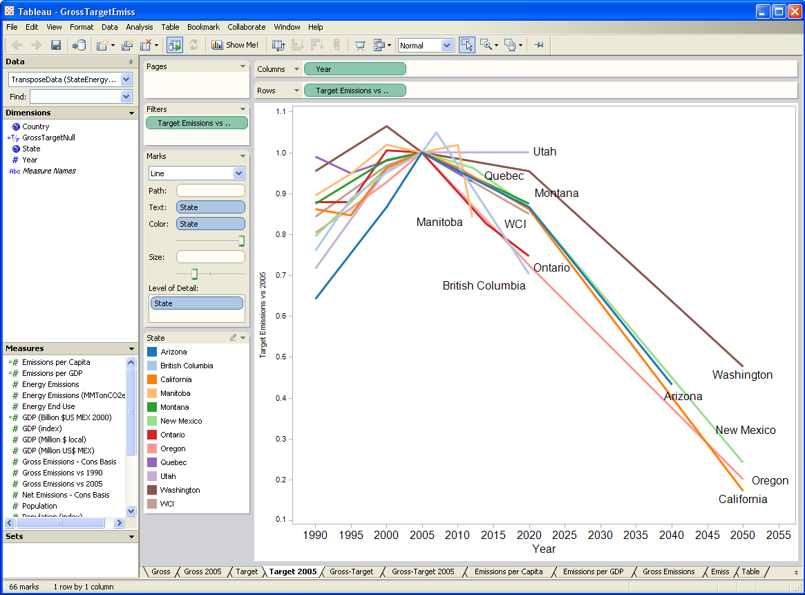
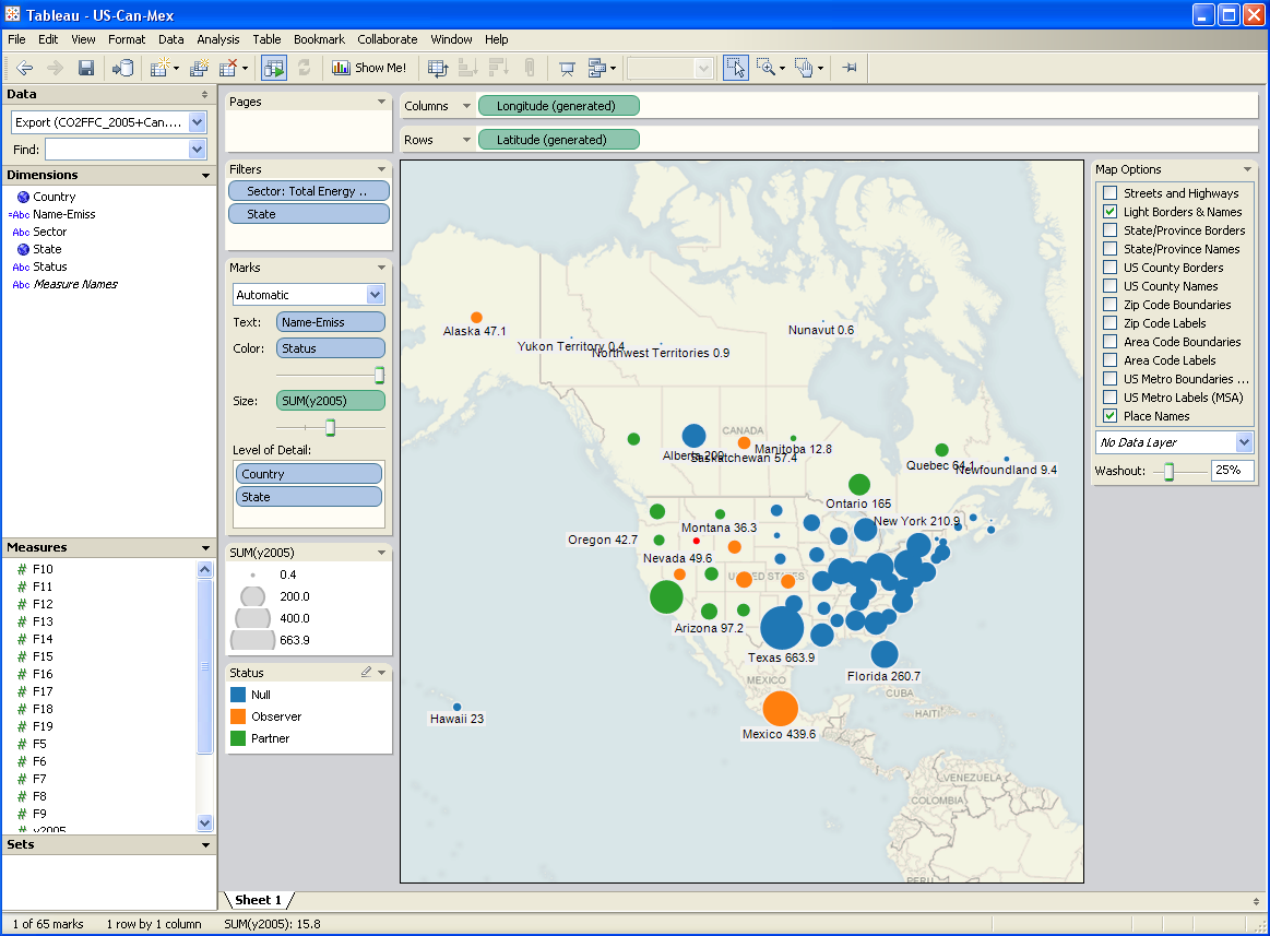
I’ve been testing a data mining and visualization tool called Tableau. It seems to be a hot topic in that world, and I can see why. It’s a very elegant way to access large database servers, slicing and dicing many different ways via a clean interface. It works equally well on small datasets in Excel. It’s very user-friendly, though it helps a lot to understand the relational or multidimensional data model you’re using. Plus it just looks good. I tried it out on some graphics I wanted to generate for a collaborative workshop on the Western Climate Initiative. Two examples:
A year or two back, I created a tool, based on VisAD, that uses the Vensim .dll to do multidimensional visualization of model output. It’s much cruder, but cooler in one way: it does interactive 3D. Anyway, I hoped that Tableau, used with Vensim, would be a good replacement for my unfinished tool.
After some experimentation, I think there’s a lot of potential, but it’s not going to be the match made in heaven that I hoped for. Cycle time is one obstacle: data can be exported from Vensim in .tab, .xls, or a relational table format (known as “data list” in the export dialog). If you go the text route (.tab), you have to pass through Excel to convert it to .csv, which Tableau reads. If you go the .xls route, you don’t need to pass through Excel, but may need to close/open the Tableau workspace to avoid file lock collisions. The relational format works, but yields a fundamentally different description of the data, which may be harder to work with.
I think where the pairing might really shine is with model output exported to a database server via Vensim’s ODBC features. I’m lukewarm on doing that with relational databases, because they just don’t get time series. A multidimensional database would be much better, but unfortunately I don’t have time to try at the moment.
Whether it works with models or not, Tableau is a nice tool, and I’d recommend a test drive.
In an effort to get a handle on Waxman Markey, I’ve been digging through the EPA’s analysis. Here’s a visualization of covered vs. uncovered emissions in 2016 (click through for the interactive version).
The orange bits above are uncovered emissions – mostly the usual suspects: methane from cow burps, landfills, and coal mines; N2O from agriculture; and other small process or fugitive emissions. This broad scope is one of W-M’s strong points.