Big data and the power of personal feedback

In a recent conversation about data requirements for future Vensim, a colleague observed that the availability of ready access to ‘big data’ in corporations has had curious side effects. One might have hoped for a flowering of model-driven conversations about the firm. Instead, ubiquitous access to data has led managers to spend less time contemplating what data might actually be important. Crucial data for model calibration are often harder to get than they were in the bad old days, because:

  • The perceived time scale of relevance is shorter than ever; there are no enduring generic structures, only transient details, so old data gets tossed or ignored.
  • Prevalent databases are still lousy at constructing aggregate time series.
  • Zombie managerial instincts for hoarding data still walk the earth.
  • Users are riveted by slick graphics which conceal quality issues in the underlying data.

Perhaps this is a consequence of the fact that data collection has become incredibly cheap. In the short run, business is about execution of essentially fixed strategies, and raw data is pretty darn useful for that. The problem is that the long run challenge of formulating strategies requires an investment of time to turn data into models (mental or formal), but modeling hasn’t experienced the same productivity revolution. This could leave companies more strategically blind than ever, and therefore accelerate the process of inadvertently walking off a cliff.

Around the same time, I ran into this Wired article about the power of feedback to change behavior. It details a variety of interesting innovations, from radar speed signs to brainwave headbands. I’ve experimented with similar stuff, like Daytum (found here, clever, but soon abandoned) and the Kill-a-watt (still used occasionally).

In the past two or three years, the plunging price of sensors has begun to foster a feedback-loop revolution. …

And today, their promise couldn’t be greater. The intransigence of human behavior has emerged as the root of most of the world’s biggest challenges. Witness the rise in obesity, the persistence of smoking, the soaring number of people who have one or more chronic diseases. Consider our problems with carbon emissions, where managing personal energy consumption could be the difference between a climate under control and one beyond help. And feedback loops aren’t just about solving problems. They could create opportunities. Feedback loops can improve how companies motivate and empower their employees, allowing workers to monitor their own productivity and set their own schedules. They could lead to lower consumption of precious resources and more productive use of what we do consume. They could allow people to set and achieve better-defined, more ambitious goals and curb destructive behaviors, replacing them with positive actions. Used in organizations or communities, they can help groups work together to take on more daunting challenges. In short, the feedback loop is an age-old strategy revitalized by state-of-the-art technology. As such, it is perhaps the most promising tool for behavioral change to have come along in decades.

But the applications don’t quite live up to these big ambitions:

… The GreenGoose concept starts with a sheet of stickers, each containing an accelerometer labeled with a cartoon icon of a familiar household object—a refrigerator handle, a water bottle, a toothbrush, a yard rake. But the secret to GreenGoose isn’t the accelerometer; that’s a less-than-a-dollar commodity. The key is the algorithm that Krejcarek’s team has coded into the chip next to the accelerometer that recognizes a particular pattern of movement. For a toothbrush, it’s a rapid back-and-forth that indicates somebody is brushing their teeth. … In essence, GreenGoose uses sensors to spray feedback loops like atomized perfume throughout our daily life—in our homes, our vehicles, our backyards. “Sensors are these little eyes and ears on whatever we do and how we do it,” Krejcarek says. “If a behavior has a pattern, if we can calculate a desired duration and intensity, we can create a system that rewards that behavior and encourages more of it.” Thus the first component of a feedback loop: data gathering.

Then comes the second step: relevance. GreenGoose converts the data into points, with a certain amount of action translating into a certain number of points, say 30 seconds of teeth brushing for two points. And here Krejcarek gets noticeably excited. “The points can be used in games on our website,” he says. “Think FarmVille but with live data.” Krejcarek plans to open the platform to game developers, who he hopes will create games that are simple, easy, and sticky. A few hours of raking leaves might build up points that can be used in a gardening game. And the games induce people to earn more points, which means repeating good behaviors. The idea, Krejcarek says, is to “create a bridge between the real world and the virtual world. This has all got to be fun.”

This strikes me as a rehash of the corporate experience: use cheap data to solve execution problems, but leave the big strategic questions unaddressed. The torrent of the measurable might even push the crucial intangibles – love, justice, happiness, wisdom – further toward the unmanaged margins of our existence.

My guess is that these technologies can help us solve our universal personal problems, particularly in areas like health and fitness where rewards are proximate in time and space. There might even be beneficial spillovers from healthier, happier personal lifestyles to reduced resource demand and

But I don’t see them doing much to solve global environmental problems, or even large-scale universal problems like urban decay and poverty. Those problems exist, not for lack of data, but for lack of feedback that is compelling to the same degree as the pressures of markets and other financial and social systems, which aren’t all about fun. In the US, we’re not even willing to entertain the idea of creating climate feedback loops. I suspect that the solutions to our biggest problems awaits some other technology that makes us much more productive at devising good strategies based on shared mental models.
The rise of systems sciences

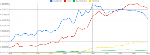
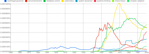
The Google books ngram viewer nicely documents the rise of various systems science disciplines, from about the time of Maxwell’s landmark 1868 paper, On Governors:

Click to enlarge.

We still have a long way to go though:

Further reading:

Elk, wolves and dynamic system visualization

Bret Victor’s video of a slick iPad app for interactive visualization of the Lotka-Voltera equations has been making the rounds:

Coincidentally, this came to my notice around the same time that I got interested in the debate over wolf reintroduction here in Montana. Even simple models say interesting things about wolf-elk dynamics, which I’ll write about some other time (I need to get vaccinated for rabies first).

To ponder the implications of the video and predator-prey dynamics, I built a version of the Lotka-Voltera model in Vensim.

After a second look at the video, I still think it’s excellent. Victor’s two design principles, ubiquitous visualization and in-context manipulation, are powerful for communicating a model. Some aspects of what’s shown have been in Vensim since the introduction of SyntheSim a few years ago, though with less Tufte/iPad sexiness. But other features, like Causal Tracing, are not so easily discovered – they’re effective for pros, but not new users. The way controls appear at one’s fingertips in the iPad app is very elegant. The “sweep” mode is also clever, so I implemented a similar approach (randomized initial conditions across an array dimension) in my version of the model. My favorite trick, though, is the 2D control of initial conditions via the phase diagram, which makes discovery of the system’s equilibrium easy.

The slickness of the video has led some to wonder whether existing SD tools are dinosaurs. From a design standpoint, I’d agree in some respects, but I think SD has also developed many practices – only partially embodied in tools – that address learning gaps that aren’t directly tackled by the app in the video: Continue reading “Elk, wolves and dynamic system visualization”

Another tangible user interface: the sandtable

This looks fun to play with: it’s a sandbox combined with digital sensing and projection tools. You shape your sand, and it maps the surface:

Digital Sandtable by Redfish Group @ Santa Fe Complex from stephen guerin on Vimeo.

Once your sandscape is constructed, you can simulate a forest fire on it, using a cigarette lighter as the ignition source, just like a real arsonist:

Lighting a fire on the Digital Sandtable from stephen guerin on Vimeo.

This isn’t quite as exciting to me as Jim Hines’ tangible user interface, because you can essentially change the initial conditions of your sandsystem, but not the structure of the model. However, it sure would be fun to play with, and could be pretty good at giving people insights about physical systems. It’s gone commercial as simtable.

I predict that this will soon go meta, with an ipad app that simulates the sandtable, allowing the user to push simsand around on the surface, flicking a lighter with a finger tap, creating the first virtual virtual forest fire environment.

Return of the Afghan spaghetti

The Afghanistan counterinsurgency causal loop diagram makes another appearance in this TED talk, in which Eric Berlow shows the hypnotized chickens the light:
https://www.ted.com/talks/eric_berlow_simplifying_complexity/transcript?language=en

I’m of two minds about this talk. I love that it embraces complexity rather than reacting with the knee-jerk “eeewww … gross” espoused by so many NYT commenters. The network view of the system highlights some interesting relationships, particularly when colored by the flavor of each sphere (military, ethnic, religious … ). Also, the generic categorization of variables that are actionable (unlike terrain) is useful. The insights from ecosystem simplification are potentially quite interesting, though we really only get a tantalizing hint at what might lie beneath.

However, I think the fundamental analogy between the system CLD and a food web or other network may only partially hold. That means that the insight, that influence typically lies within a few degrees of connectivity of the concept of interest, may not be generalizable. Generically, a dynamic model is a network of gains among state variables, and there are perhaps some reasons to think that, due to signal attenuation and so forth, that most influences are local. However, there are some important differences between the Afghan CLD and typical network diagrams.

In a food web, the nodes are all similar agents (species) which have a few generic relationships (eat or be eaten) with associated flows of information or resources. In a CLD, the nodes are a varied mix of agents, concepts, and resources. As a result, their interactions may differ wildly: the interaction between “relative popularity of insurgents” and “funding for insurgents” (from the diagram) is qualitatively different from that between “targeted strikes” and “perceived damages.” I suspect that in many models, the important behavior modes are driven by dynamics that span most of the diagram or model. That may be deliberate, because we’d like to construct models that describe a dynamic hypothesis, without a lot of extraneous material.

Probably the best way to confirm or deny my hypothesis would be to look at eigenvalue analysis of existing models. I don’t have time to dig into this, but Kampmann & Oliva’s analysis of Mass’ economic model is an interesting case study. In that model, the dominant structures responsible for oscillatory modes in the economy are a real mixed bag, with important contributions from both short and longish loops.

This bears further thought … please share yours, especially if you have a chance to look at Berlow’s PNAS article on food webs.

Interactive diagrams – obesity dynamics

Food-nutrition-health-exercise-energy interactions are an amazing nest of positive feedbacks, with many win-win opportunities, but more on that another time.

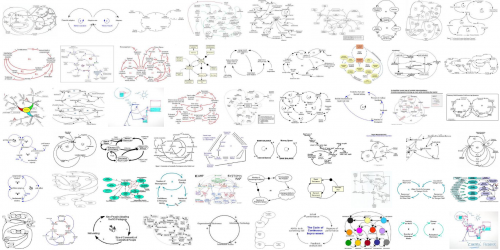
Instead, I’m hoisting an interesting influence diagram about obesity from the comments. At first glance, it’s just another plate of spaghetti.

ForesightObesity

But when you follow the link (do it now), there’s an interesting innovation: the diagram is interactive. You can zoom, scroll, and highlight particular sectors and dynamics. There’s some narrative here and here. (Update: the interactive link seems to be down, but the diagram is still here: https://assets.publishing.service.gov.uk/government/uploads/system/uploads/attachment_data/file/295153/07-1177-obesity-system-atlas.pdf)

It took me a while to decide whether I’d call this a causal loop diagram or not. I think the primary distinction between a CLD and other kinds of mindmaps or process diagrams is the use of variables. On a CLD, each label represents a quantity that can vary, with a definite direction – TV Watching, Stress, Use of Medicines. Items on other kinds of diagrams might represent events or fuzzier constellations of concepts. This diagram doesn’t have link polarities (too bad) or loop polarities (which would be pretty incomprehensible anyway), but many other CLDs also avoid such labels for simplicity.

I think there’s a lot of potential for further exploration of this idea. There’s a lot you could do to relate structure to behavior, or at least to explain the rationale for structure (both shortcomings of the diagram). Each link, for example, could have its tale revealed when clicked, and key loops could be animated individually, with stories told. Drill-down could be extended to provide links between top-level subsystem relationships and more microscopic views.

I think huge diagrams like the one above are always going to be overwhelming to a layperson. Also, it’s hard to make even a small CLD good, so making a big one really accurate is tough. Therefore, I’d rather see advanced CLD presentations used to improve the communication of simpler stories, with a few loops. However, big or small, there might be many common technological benefits from dedicated diagramming software.

When sea level chartjunk attacks

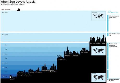
SeaLevelAttack

This informationisbeautiful graphic is pretty, but I don’t find it informative. The y scale is nonlinear, and I don’t know if the x scale conveys anything. It’s hard to work out the timing of inundation, which is really the key. The focus on the low points of big cities in developed countries is misleading, because those will be defended for a long time. Ho Chi Minh city should be on there, as well as the US gulf coast. USA Today would love this.

Dynamics on the iPhone

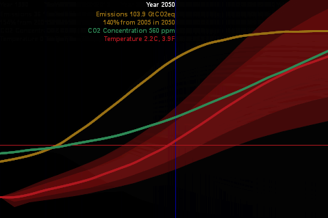
Scott Johnson asks about C-LITE, an ultra-simple version of C-ROADS, built in Processing – a cool visually-oriented language.

C-LITE

(Click the image to try it).

With this experiment, I was striving for a couple things:

  • A reduced-form version of the climate model, with “good enough” accuracy and interactive speed, as in Vensim’s Synthesim mode (no client-server latency).
  • Tufte-like simplicity of the UI (no grids or axis labels to waste electrons). Moving the mouse around changes the emissions trajectory, and sweeps an indicator line that gives the scale of input and outputs.
  • Pervasive representation of uncertainty (indicated by shading on temperature as a start).

This is just a prototype, but it’s already more fun than models with traditional interfaces.

I wanted to run it on the iPhone, but was stymied by problems translating the model to Processing.js (javascript) and had to set it aside. Recently Travis Franck stepped in and did a manual translation, proving the concept, so I took another look at the problem. In the meantime, a neat export tool has made it easy. It turns out that my code problem was as simple as replacing “float []” with “float[]” so now I have a javascript version here. It runs well in Firefox, but there are a few glitches on Safari and iPhones – text doesn’t render properly, and I don’t quite understand the event model. Still, it’s cool that modest dynamic models can run realtime on the iPhone. [Update: forgot to mention that I sued Michael Schieben’s touchmove function modification to processing.js.]

The learning curve for all of this is remarkably short. If you’re familiar with Java, it’s very easy to pick up Processing (it’s probably easy coming from other languages as well). I spent just a few days fooling around before I had the hang of building this app. The core model is just standard Euler ODE code:

initialize parameters
initialize levels
do while time < final time
compute rates & auxiliaries
compute levels

The only hassle is that equations have to be ordered manually. I built a Vensim prototype of the model halfway through, in order to stay clear on the structure as I flew seat-of-the pants.

With the latest Processing.js tools, it’s very easy to port to javascript, which runs on nearly everything. Getting it running on the iPhone (almost) was just a matter of discovering viewport meta tags and a line of CSS to set zero margins. The total codebase for my most complicated version so far is only 500 lines. I think there’s a lot of potential for sharing model insights through simple, appealing browser tools and handheld platforms.

As an aside, I always wondered why javascript didn’t seem to have much to do with Java. The answer is in this funny programming timeline. It’s basically false advertising.

Diagrams vs. Models

Following Bill Harris’ comment on Are causal loop diagrams useful? I went looking for Coyle’s hybrid influence diagrams. I didn’t find them, but instead ran across this interesting conversation in the SDR:

The tradition, one might call it the orthodoxy, in system dynamics is that a problem can only be analysed, and policy guidance given, through the aegis of a fully quantified model. In the last 15 years, however, a number of purely qualitative models have been described, and have been criticised, in the literature. This article briefly reviews that debate and then discusses some of the problems and risks sometimes involved in quantification. Those problems are exemplified by an analysis of a particular model, which turns out to bear little relation to the real problem it purported to analyse. Some qualitative models are then reviewed to show that they can, indeed, lead to policy insights and five roles for qualitative models are identified. Finally, a research agenda is proposed to determine the wise balance between qualitative and quantitative models.

… In none of this work was it stated or implied that dynamic behaviour can reliably be inferred from a complex diagram; it has simply been argued that describing a system is, in itself, a useful thing to do and may lead to better understanding of the problem in question. It has, on the other hand, been implied that, in some cases, quantification might be fraught with so many uncertainties that the model’s outputs could be so misleading that the policy inferences drawn from them might be illusory. The research issue is whether or not there are circumstances in which the uncertainties of simulation may be so large that the results are seriously misleading to the analyst and the client. … This stream of work has attracted some adverse comment. Lane has gone so far as to assert that system dynamics without quantified simulation is an oxymoron and has called it ‘system dynamics lite (sic)’. …

Coyle (2000) Qualitative and quantitative modelling in system dynamics: some research questions

Jack Homer and Rogelio Oliva aren’t buying it:

Geoff Coyle has recently posed the question as to whether or not there may be situations in which computer simulation adds no value beyond that gained from qualitative causal-loop mapping. We argue that simulation nearly always adds value, even in the face of significant uncertainties about data and the formulation of soft variables. This value derives from the fact that simulation models are formally testable, making it possible to draw behavioral and policy inferences reliably through simulation in a way that is rarely possible with maps alone. Even in those cases in which the uncertainties are too great to reach firm conclusions from a model, simulation can provide value by indicating which pieces of information would be required in order to make firm conclusions possible. Though qualitative mapping is useful for describing a problem situation and its possible causes and solutions, the added value of simulation modeling suggests that it should be used for dynamic analysis whenever the stakes are significant and time and budget permit.

Homer & Oliva (2001) Maps and models in system dynamics: a response to Coyle

Coyle rejoins:

This rejoinder clarifies that there is significant agreement between my position and that of Homer and Oliva as elaborated in their response. Where we differ is largely to the extent that quantification offers worthwhile benefit over and above analysis from qualitative analysis (diagrams and discourse) alone. Quantification may indeed offer potential value in many cases, though even here it may not actually represent ‘‘value for money’’. However, even more concerning is that in other cases the risks associated with attempting to quantify multiple and poorly understood soft relationships are likely to outweigh whatever potential benefit there might be. To support these propositions I add further citations to published work that recount effective qualitative-only based studies, and I offer a further real-world example where any attempts to quantify ‘‘multiple softness’’ could have lead to confusion rather than enlightenment. My proposition remains that this is an issue that deserves real research to test the positions of Homer and Oliva, myself, and no doubt others, which are at this stage largely based on personal experiences and anecdotal evidence.

Coyle (2001) Rejoinder to Homer and Oliva

My take: I agree with Coyle that qualitative models can often lead to insight. However, I don’t buy the argument that the risks of quantification of poorly understood soft variables exceeds the benefits. First, if the variables in question are really too squishy to get a grip on, that part of the modeling effort will fail. Even so, the modeler will have some other working pieces that are more physical or certain, providing insight into the context in which the soft variables operate. Second, as long as the modeler is doing things right, which means spending ample effort on validation and sensitivity analysis, the danger of dodgy quantification will reveal itself as large uncertainties in behavior subject to the assumptions in question. Third, the mere attempt  to quantify the qualitative is likely to yield some insight into the uncertain variables, which exceeds that derived from the purely qualitative approach. In fact, I would argue that the greater danger lies in the qualitative approach, because it is quite likely that plausible-looking constructs on a diagram will go unchallenged, yet harbor deep conceptual problems that would be revealed by modeling.

I see this as a cost-benefit question. With infinite resources, a model always beats a diagram. The trouble is that in many cases time, money and the will of participants are in short supply, or can’t be justified given the small scale of a problem. Often in those cases a qualitative approach is justified, and diagramming or other elicitation of structure is likely to yield a better outcome than pure talk. Also, where resources are limited, an overzealous modeling attempt could lead to narrow focus, overemphasis on easily quantifiable concepts, and implementation failure due to too much model and not enough process. If there’s a risk to modeling, that’s it – but that’s a risk of bad modeling, and there are many of those.