Are causal loop diagrams useful?

Reflecting on the Afghanistan counterinsurgency diagram in the NYTimes, Scott Johnson asked me whether I found causal loop diagrams (CLDs) to be useful. Some system dynamics hardliners don’t like them, and others use them routinely.

Here’s a CLD:

Chicken CLD

And here’s it’s stock-flow sibling:

Chicken Stock Flow

My bottom line is:

  • CLDs are very useful, if developed and presented with a little care.
  • It’s often clearer to use a hybrid diagram that includes stock-flow “main chains”. However, that also involves a higher burden of explanation of the visual language.
  • You can get into a lot of trouble if you try to mentally simulate the dynamics of a complex CLD, because they’re so underspecified (but you might be better off than talking, or making lists).
  • You’re more likely to know what you’re talking about if you go through the process of building a model.
  • A big, messy picture of a whole problem space can be a nice complement to a focused, high quality model.

Here’s why:

Continue reading “Are causal loop diagrams useful?”

Visualizing biological time

A new paper on arXiv shows an interesting approach to visualizing time in systems with circadian or other rhythms. I haven’t figured out if it’s useful for oscillatory dynamic systems more generally, but it makes some neat visuals:

scheme

The method makes it possible to see changes in behavior in time series with waaay to many oscillations to explore on a normal 2D time-value plot:

cardiac

Read more on arXiv.

Fun with Processing

Processing is a very clean, Java-based environment targeted at information visualization and art. I got curious about it, so I built a simple interactive game that demonstrates how dynamic complexity makes system control difficult. Click through to play:

dragdot

I think there’s a lot of potential for elegant presentation with Processing. There are several physics libraries and many simulations with a physical, chemical, or mathematical basis at OpenProcessing.org:

OpenProcessing

If you like code, it’s definitely worth a look.

Tableau + Vensim = ?

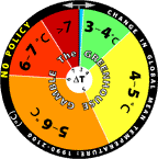
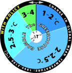
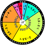
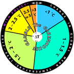
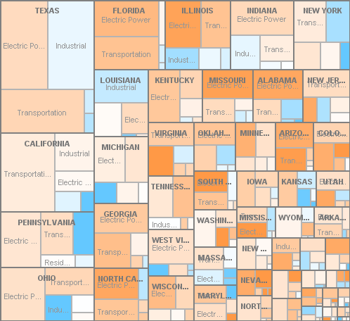
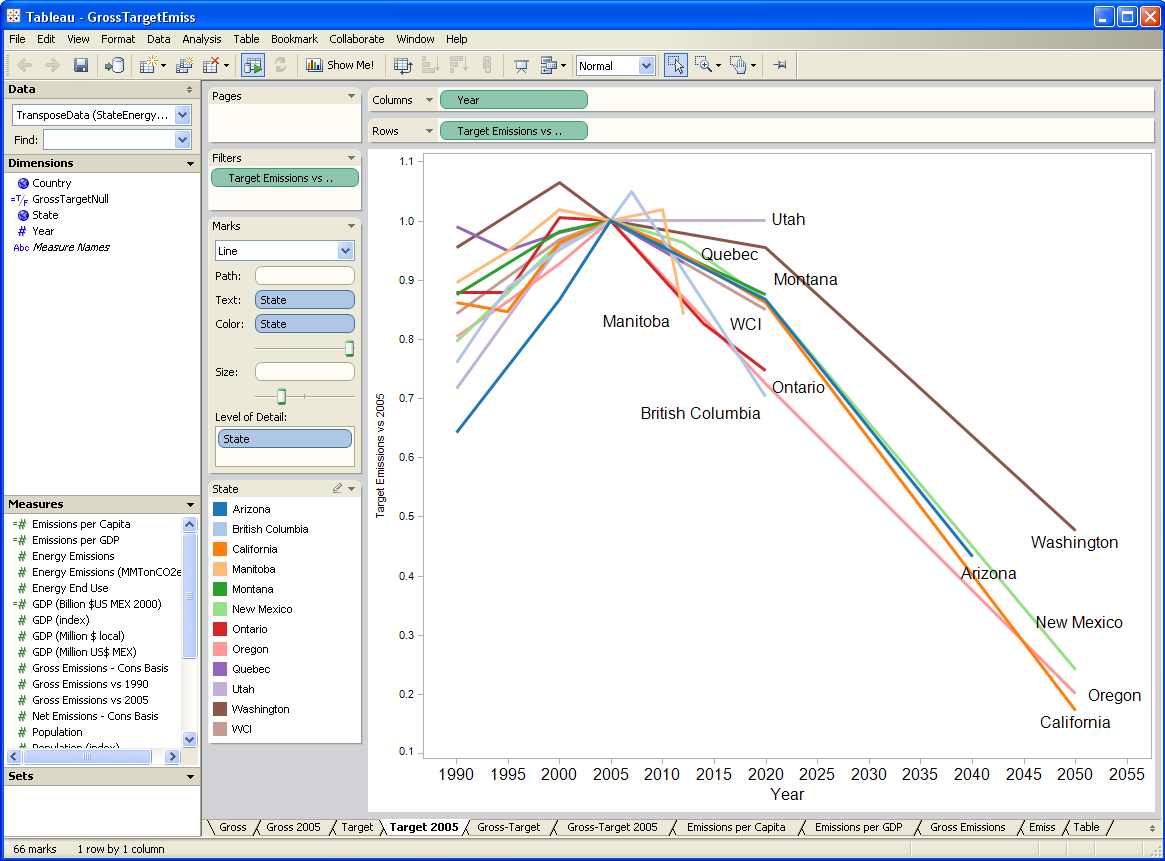
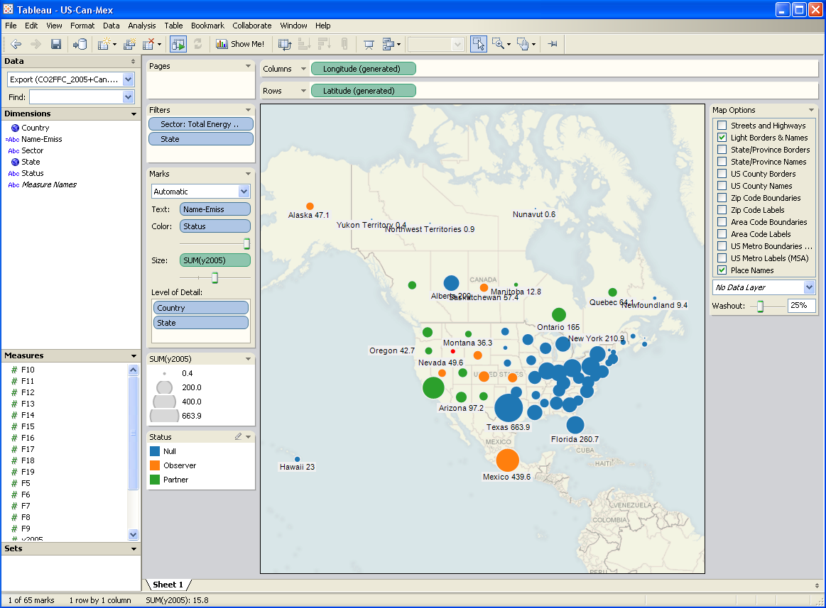
I’ve been testing a data mining and visualization tool called Tableau. It seems to be a hot topic in that world, and I can see why. It’s a very elegant way to access large database servers, slicing and dicing many different ways via a clean interface. It works equally well on small datasets in Excel. It’s very user-friendly, though it helps a lot to understand the relational or multidimensional data model you’re using. Plus it just looks good. I tried it out on some graphics I wanted to generate for a collaborative workshop on the Western Climate Initiative. Two examples:

Tableau state province emissions

Tableau map

A year or two back, I created a tool, based on VisAD, that uses the Vensim .dll to do multidimensional visualization of model output. It’s much cruder, but cooler in one way: it does interactive 3D. Anyway, I hoped that Tableau, used with Vensim, would be a good replacement for my unfinished tool.

After some experimentation, I think there’s a lot of potential, but it’s not going to be the match made in heaven that I hoped for. Cycle time is one obstacle: data can be exported from Vensim in .tab, .xls, or a relational table format (known as “data list” in the export dialog). If you go the text route (.tab), you have to pass through Excel to convert it to .csv, which Tableau reads. If you go the .xls route, you don’t need to pass through Excel, but may need to close/open the Tableau workspace to avoid file lock collisions. The relational format works, but yields a fundamentally different description of the data, which may be harder to work with.

I think where the pairing might really shine is with model output exported to a database server via Vensim’s ODBC features. I’m lukewarm on doing that with relational databases, because they just don’t get time series. A multidimensional database would be much better, but unfortunately I don’t have time to try at the moment.

Whether it works with models or not, Tableau is a nice tool, and I’d recommend a test drive.

http://www.ssec.wisc.edu/~billh/visad.html

Waxman-Markey emissions coverage

In an effort to get a handle on Waxman Markey, I’ve been digging through the EPA’s analysis. Here’s a visualization of covered vs. uncovered emissions in 2016 (click through for the interactive version).

0b50f88e-65c3-11de-b8e7-000255111976 Blog_this_caption

The orange bits above are uncovered emissions – mostly the usual suspects: methane from cow burps, landfills, and coal mines; N2O from agriculture; and other small process or fugitive emissions. This broad scope is one of W-M’s strong points.

MIT Updates Greenhouse Gamble

For some time, the MIT Joint Program has been using roulette wheels to communicate climate uncertainty. They’ve recently updated the wheels, based on new model projections:

No Policy Policy
New No policy Policy
Old Old no policy Old policy

The changes are rather dramatic, as you can see. The no-policy wheel looks like the old joke about playing Russian Roulette with an automatic. A tiny part of the difference is a baseline change, but most is not, as the report on the underlying modeling explains:

The new projections are considerably warmer than the 2003 projections, e.g., the median surface warming in 2091 to 2100 is 5.1°C compared to 2.4°C in the earlier study. Many changes contribute to the stronger warming; among the more important ones are taking into account the cooling in the second half of the 20th century due to volcanic eruptions for input parameter estimation and a more sophisticated method for projecting GDP growth which eliminated many low emission scenarios. However, if recently published data, suggesting stronger 20th century ocean warming, are used to determine the input climate parameters, the median projected warning at the end of the 21st century is only 4.1°C. Nevertheless all our simulations have a very small probability of warming less than 2.4°C, the lower bound of the IPCC AR4 projected likely range for the A1FI scenario, which has forcing very similar to our median projection.

I think the wheels are a cool idea, but I’d be curious to know how users respond to it. Do they cheat, and spin to get the outcome they hope for? Perhaps MIT should spice things up a bit, by programming an online version that gives users’ computers the BSOD if they roll a >7C world.

Hat tip to Travis Franck for pointing this out.

Random Excellence – Bailouts, Biases, Boxplots

(A good title, stolen from TOP, and repurposed a bit).

1. A nice graphical depiction of the stimulus package, at the Washington post

2. An interesting JDM article on the independence of cognitive ability and biases, via Marginal Revolution. Abstract:

In 7 different studies, the authors observed that a large number of thinking biases are uncorrelated with cognitive ability. These thinking biases include some of the most classic and well-studied biases in the heuristics and biases literature, including the conjunction effect, framing effects, anchoring effects, outcome bias, base-rate neglect, ‘less is more’ effects, affect biases, omission bias, myside bias, sunk-cost effect, and certainty effects that violate the axioms of expected utility theory. In a further experiment, the authors nonetheless showed that cognitive ability does correlate with the tendency to avoid some rational thinking biases, specifically the tendency to display denominator neglect, probability matching rather than maximizing, belief bias, and matching bias on the 4-card selection task. The authors present a framework for predicting when cognitive ability will and will not correlate with a rational thinking tendency.

The framework alluded to in that last sentence is worth a look. Basically, the explanation hinges on whether subjects have “mindware” available, time resources, and reflexes to trigger an (unbiased) analytical solution when a (biased) heuristic response is unwarranted. This seems to be applicable to dynamic decision making tasks as well: people use heuristics (like pattern matching), because they don’t have the requisite mindware (understanding of dynamics) or triggers (recognition that dynamics matter).

3. A nice monograph on the construction of statistical graphics, via Statisitical Modeling, Causal Inference, and Social Science Update: Bill Harris likes this one too.

We're All Going to Die

Well, at least me and a few fellow Montanans. There’s an earthquake swarm in Yellowstone right now. The supervolcano is sure to blow us all to Kingdom Come. This elk my wife met seems unconcerned though:

Elk pthpt

A guy at Wolfram made a nice visualization example out of the data, though it’s not exactly a gripping movie.