
I’ve seen several models explaining “flattening the curve” that use the Normal distribution as a model of the coronavirus epidemic. Now this model uses it to forecast peak hospital load:
We developed a curve-fitting tool to fit a nonlinear mixed effects model to the available admin 1 cumulative death data. The cumulative death rate for each location is assumed to follow a parametrized Gaussian error function … where the function is the Gaussian error function(written explicitly above), p controls the maximum death rate at each location, t is the time since death rate exceeded 1e-15, ß(beta)is a location-specific inflection point(time at which rate of increase of the death rate is maximum), and α(alpha)is a location-specific growth parameter. Other sigmoidal functional forms … were considered but did not fit the data as well. Data were fit to the log of the death rate in the available data, using an optimization framework described in the appendix.
One bell-shaped curve is as good as another, right? No!
 Like Young Frankenstein, epidemic curves are not Normal.
1. Fit to data is a weak test.
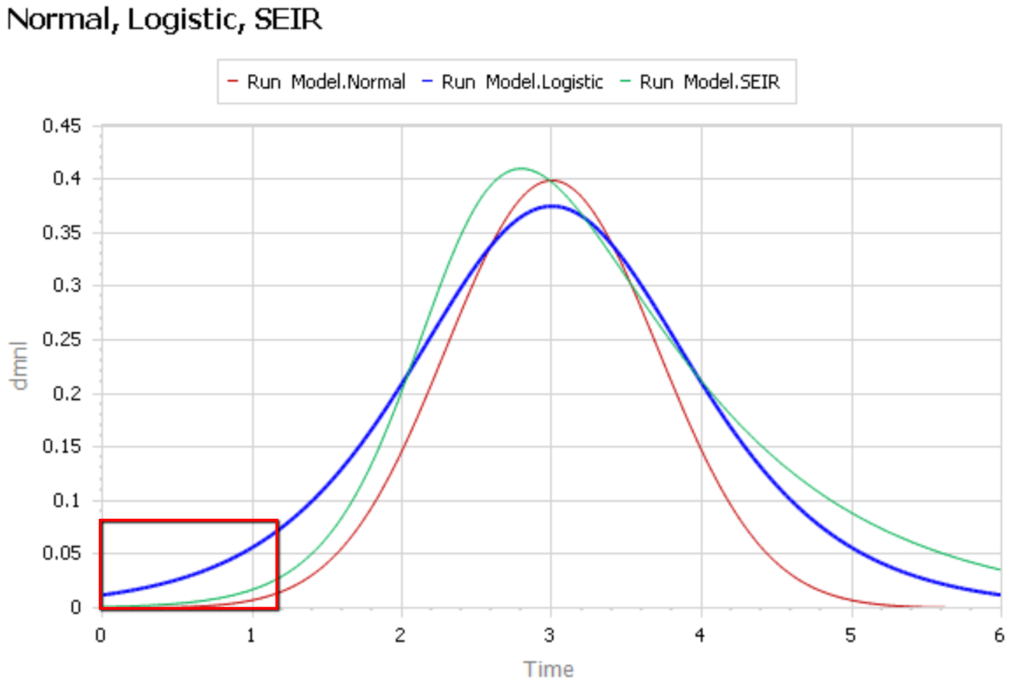
The graph below compares 3 possible models: the Normal distribution, the Logistic distribution (which has an equivalent differential equation interpretation), and the SEIR model. Consider what’s happening when you fit a sigmoid to the epidemic data so far (red box). The curves below are normalized to yield similar peaks, but imagine what would happen to the peaks if you fit all 3 to the same data series.
The problem is that this curve-fitting exercise expects data from a small portion of the behavior to tell you about the peak. But over that interval, there’s little behavior variation. Any exponential is going to fit reasonably well. Even worse, if there are any biases in the data, such as dramatic shifts in test coverage, the fit is likely to reflect those biases as much as it does the physics of the system. That’s largely why the history of fitting diffusion models to emerging trends in the forecasting literature is so dreadful.
After the peak, the right tail of the SEIR model is also quite different, because the time constant of recovery is different from the time constant for the growth phase. This asymmetry may also have implications for planning.
2. The properties of the Normal distribution don’t match the observed behavior of coronavirus.
It’s easier to see what’s going on if you plot the curves above on a log-y scale:
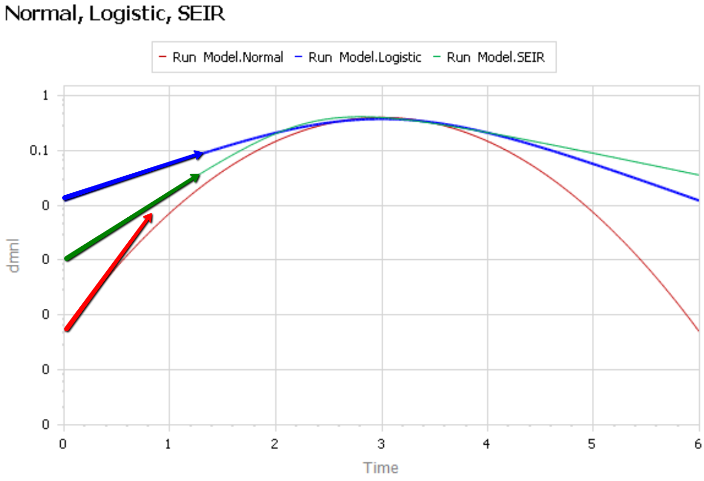
The logistic and SEIR models have a linear left tail. That is to say that they have a constant growth rate in the early epidemic, until controls are imposed or you run out of susceptible people.
The Normal distribution (red) is a parabola, which means that the growth rate is steadily decreasing, long before you get near the peak. Similarly, if you go backwards in time, the Normal distribution predicts that the growth rate would have been higher back in November, when patient 0 emerged.
There is some reason to think that epidemics start faster due to social network topology, but also some reasons for slower emergence. In any case, that’s not what is observed for COVID19 – uncontrolled growth rates are pretty constant:
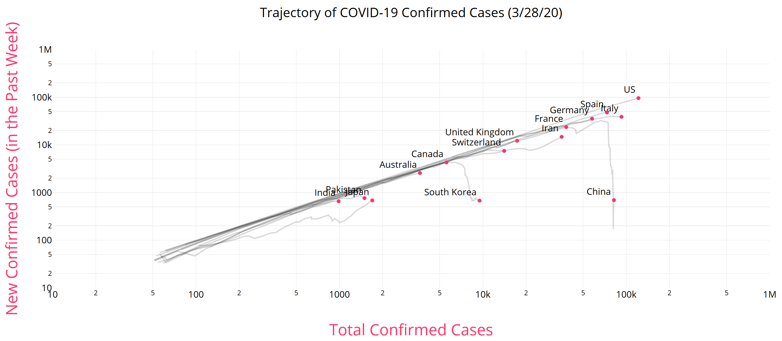
https://aatishb.com/covidtrends/
3. With weak data, you MUST have other quality checks
Mining data to extract relationships works great in many settings. But when you have sparse data with lots of known measurement problems, it’s treacherous. In that case, you need a model of the physics of the system and the lags and biases in the data generating process. Then you test that model against all available information, including
- conservation laws,
- operational correspondence with physical processes,
- opinions from subject matter experts and measurements from other levels of aggregation,
- dimensional consistency,
- robustness in extreme conditions, and finally
- fit to data.
Fortunately, a good starting point has existed for almost a century: the SEIR model. It’s not without pitfalls, and needs some disaggregation and a complementary model of policies and the case reporting process, but if you want simple projections, it’s a good place to start.
Once you have triangulation from all of these sources, you have some hope of getting the peak right. But your confidence bounds should still be derived not only from the fit itself, but also priors on parameters that were not part of the estimation process.
I just happened to find this site today because a friend posted it on facebook. I looked at the projection for New York and find that, On March 30, it projected a need for over 6500 ICU beds. Gov Cuomo claims they have around 3000. I’m pretty sure he would have said something if they had already bypassed the number of beds already.
Interesting. The gap is even bigger now, after less than a day. I think their hospitalization projections aren’t calibrated to actual admissions data.
This seems to be true all over the country. It’s certainly true in Colorado. Seems irresponsible to be publicizing hospitalization modeling results that are not at all matching reality. Interestingly, the death projections seem accurate. It may be that we’re experiencing a higher death rate and lower incidence than they’ve modeled, but they should share that! And calibrate their model.
On the difficulties of fitting a curve “when you have sparse data with lots of known measurement problems”. This report https://www.rki.de/DE/Content/InfAZ/N/Neuartiges_Coronavirus/Situationsberichte/2020-03-30-de.pdf?__blob=publicationFile shows in figure 4 the reported cases by date of receipt at the national register (with a clear weekly workday pattern) whereas in figure 3 the date is adjusted backward to the date of infection once the full case report is received. The shape of the curves is quite different as the peak days in the reports are 10 days apart – which is interesting as Germany is doubling cases every five days.
Unrelated data point re stress and hospital system: 60% of the ICU capacity has been freed in anticipation of the surge in covid-19 cases
Hi Tom, just found your model today and find it to be one of the more detailed with great explanations. I hope to share your video explaining the model in a medical student course I am teaching in a couple weeks (with credit). Not related to your post today: but I am just wondering about a possible missing link in the model. Many of us suspect that additional hospital strain (decreased access to PPE in particular as cases go up and supplies go down) leads to increased healthcare worker exposure and infection, then additional exposure of susceptible/non-infected patients by healthcare workers. This link doesn’t change the pool of susceptible individuals but could accelerate the transmission rate in a very scary way. Or perhaps it just feeds back into the number infected? I do think there is something “special” about an infected healthcare worker who can subsequently take out other healthcare workers and vulnerable patients but am not sure how you would quantify that.
This is definitely an important effect.
To do it right, there should be a parallel population for health care workers, with cross exposure in both directions. There’s definitely something special about an infected worker, but also an infected patient is presumably a lot more dangerous than your average broken leg.
The other loop this triggers is a decrease in hospital capacity, which makes outcomes worse, and might also increase duration of stays, further exacerbating the problem.
Tom, this is amazingly good stuff. It’s really important, and needs to get out more widely. Like most folks, I had no idea that the IHME model was just a statistical curve fit, not really a causal model at all. And then, even worse, they chose to fit a Gaussian curve, apparently because that’s the only thing they know that goes up and then down. Your graphic beautifully illustrates the huge problems with that ‘model’.
You would have thought that the central model being used to make US policy did not have to make the forced assumption that the rise and fall of the disease must be symmetric, but there you go.
Did you happen to see Dr. Fauci on Fox News Apr 10? He said many times that he didn’t believe in modeling. This helps to explain why.