
I just ran across a funny instance of TSH nonlinearity. Check out the axis on this chart:
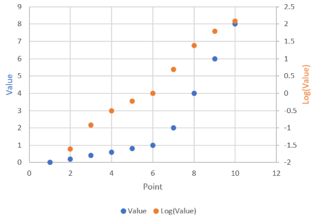
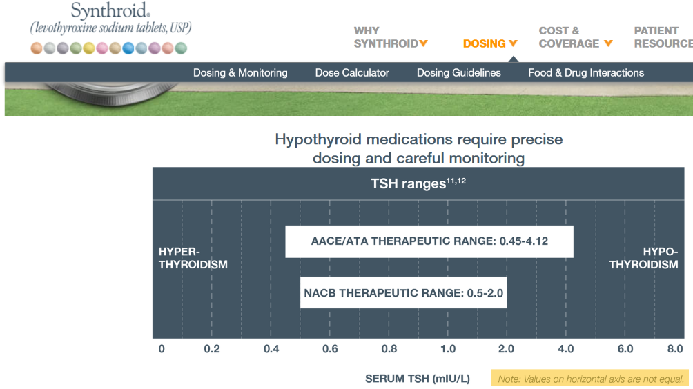 It’s actually not as bad as you’d think: the irregular axis is actually a decent approximation of a log-linear scale:
 My main gripe is that the perceptual midpoint of the ATA range bar on the chart is roughly 0.9, whereas the true logarithmic midpoint is more like 1.6. The NACB bar is similarly distorted.