Both Stella and Vensim draw conveyors incorrectly, in different ways.
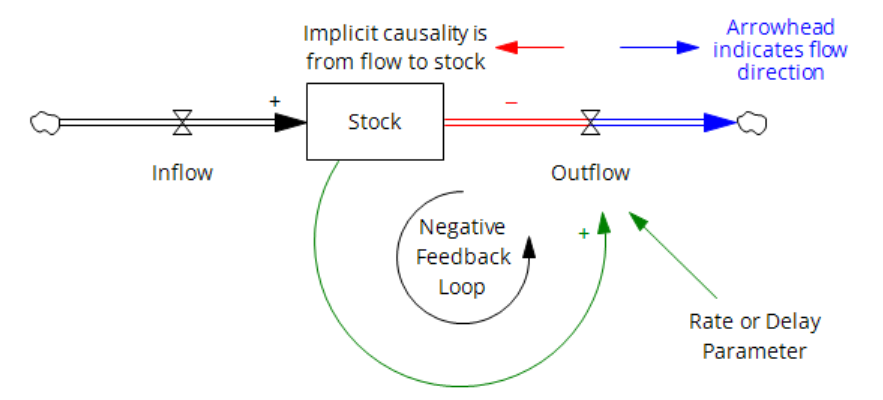
In part, the challenges arise from the standard SD convention for stock-flow diagramming. Consider the stock-flow structure above and its CLD equivalent below.
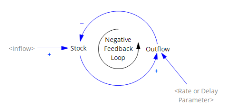
The CLD version has its own problems, but the stock-flow version is potentially baffling to novices because the arrowhead convention for flow pipes differs from an information arrow in its representation of causality. The arrowhead indicates the direction of material flow, which is the opposite of the direction of causality or information. In Stella, there may be a “shadow” arrowhead in the negative-flow direction, but this doesn’t really help – the concept of flow direction (bidirectional vs. unidirectional) is still confounded with causality (always flow->stock).
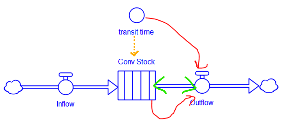
When the stock is a conveyor, the problems deepen.
In Stella, the conveyor has a distinct icon, which is good. It indicates that the stock is divided into internal compartments (which are essentially slats of TIME STEP aka DT duration, rendering the object higher-order than a normal stock). However, the transit time is a property setting in the stock dialog, implying the orange arrow, which can’t properly be drawn because stocks don’t normally have dynamic information arrow inputs, and transit time could potentially change during the simulation. The segment of flow pipe between the stock and outflow is now further overloaded, because it represents both the “expiration” of stock contents due to exceedance of transit time (i.e. reaching the end of the conveyor) and the old causal interpretation, that the outflow reduces the stock (green arrowheads). While the code is correct, the diagram fails to indicate that the outflow is a consequence of the stock contents and transit time. I think the user would be much better served by the conventional diagram approach (red arrows).
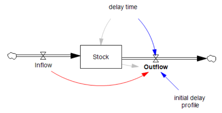
In Vensim, the conveyor is not really a distinct object in the language, which makes things better in one respect but worse in several others. The conveyor really lives in a function, DELAY CONVEYOR, which is used in the outflow. This means that the connection between the delay time parameter is properly both dynamic (for determining the outflow) and static (for initialization of the stock). However, the initial delay profile parameter is connected to the flow, not the stock, which is weird – this is because the stock is actually an accounting variable that is needed to keep track of the conveyor contents, rather than an actual dynamic participant in the structure, hence the lack of an arrow from stock to flow, except for initialization (gray). This convention also requires the oddity of a flow-to-flow connection (red) which is normally a no-no.
Similar problems exist for leakage flows, but I won’t detail those.
My conclusion is that both approaches are flawed. They both work mathematically, but neither portrays what’s really going on for the diagram viewer. We’ll get it right in a forthcoming version of Ventity, and maybe improve Vensim at some point.