Fun with 1D vector fields

Phase plots are the key to understanding life, the universe and the dynamics of everything.

Well, maybe that’s a bit of an overstatement. But they do nicely explain tipping points and bifurcations, which explain a heck of a lot (as I’ll eventually get to).

Fortunately, phase plots for simple systems are easy to work with. Consider a one-dimensional (first-order) system, like the stock and flow in my bathtub posts.

stock & flow

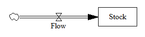
In Vensim lingo, you’d write this out as,

Stock = INTEG( Flow, Initial Stock )
Flow = ... {some function of the Stock and maybe other stuff}

In typical mathematical notation, you might write it as a differential equation, like

x' = f(x)

where x is the stock and x’ (dx/dt) is the flow.

This system (or vector field) has a one dimensional phase space – i.e. a line – because you can completely characterize the state of the system by the value of its single stock.

Fortunately, paper is two dimensional, so we can use the second dimension to juxtapose the flow with the stock (x’ with x), producing a phase plot that helps us get some intuition into the behavior of this stock-flow system. Here’s an example:

Pure accumulation

In this case, the flow is always above the x-axis, i.e. always positive, so the stock can only go up. The flow is constant, irrespective of the stock level, so there’s no feedback and the stock’s slope is constant.

Left: flow vs. stock. Right: resulting behavior of the stock over time.

Exponential growth

Adding feedback makes things more interesting.

In this simplest-possible first order positive feedback loop, the flow is proportional to the stock, so the stock-flow relationship is a rising line (left frame). There’s a trivial equilibrium (or fixed point) at stock = flow = 0, but it’s unstable, so it’s indicated with a hollow circle. An arrowhead indicates the direction of motion in the phase plot.

The resulting behavior is exponential growth (right frame). The bigger the stock gets, the steeper its slope gets.

Exponential decay

Negative feedback just inverts this case. The flow is below 0 when the stock is positive, and the system moves toward the origin instead of away from it.

The equilibrium at 0 is now stable, so it has a solid circle.

Linear systems like those above can have only one equilibrium. Geometrically, this is because the line of stock-flow proportionality can only cross 0 (the x axis) once. Mathematically, it’s because a system with a single state can have only one eigenvalue/eigenvector pair. Things get more interesting when the system is nonlinear.

S-shaped (logistic) growth

Here, the flow crosses zero twice, so there are two fixed points. The one at 0 is unstable, so as long as the stock is initially >0, it will rise to the stable equilibrium at 1.

(Note that there’s no reason to constrain the axes to the 0-1 unit line; it’s just a graphical convenience here.)

Tipping point

A phase diagram for a nonlinear model can have as many zero-crossings as you like. My forest cover toy model has five. A system can then have multiple equilibria. A pair of stable equilibria bracketing an unstable equilibrium creates a tipping point.

In this arrangement, the stable fixed points at 0 and 1 constitute basins of attraction that draw in any trajectories of the stock that lie in their half of the unit line. The unstable point at 0.5 is the fence between the basins, i.e. the tipping point. Any trajectory starting with the stock near 0.5 is drawn to one of the extremes. While stock=0.5 is theoretically possible permanently, real systems always have noise that will trigger the runaway.

If the stock starts out near 1, it will stay there fairly robustly, because feedback will restore that state from any excursion. But if some intervention or noise pushes the stock below 0.5, feedback will then draw it toward 0. Once there, it will be fairly robustly stuck again. This behavior can be surprising and disturbing if 1=good and 0=bad.

This is the very thing that happens in project fire fighting, for example. The 64 trillion dollar question is whether tipping point dynamics create perilous boundaries in the earth system, e.g., climate.

Not all systems are quite this simple. In particular, a stock is often associated with multiple flows. But it’s often helpful to look at first order subsystems of complex models in this way. For example, Jeroen Struben and John Sterman make good use of the phase plot to explore the dynamics of willingness (W) to purchase alternative fuel vehicles. They decompose the net flow of W (red) into multiple components that create a tipping point:

You can look at higher-order systems in the same way, though the pictures get messier (but prettier). You still preserve the attractive feature of this approach: by just looking at the topology of fixed points (or similar higher-dimensional sets), you can learn a lot about system behavior without doing any calculations.

Kansas legislators fleece their grandchildren

File under “this would be funny if it weren’t frightening.”

HOUSE BILL No. 2366

By Committee on Energy and Environment

(a) No public funds may be used, either directly or indirectly, to promote, support, mandate, require, order, incentivize, advocate, plan for, participate in or implement sustainable development.

(2) “sustainable development” means a mode of human development in which resource use aims to meet human needs while preserving the environment so that these needs can be met not only in the present, but also for generations to come, but not to include the idea, principle or practice of conservation or conservationism.

Surely it’s not the “resource use aims to meet human needs” part that the authors find objectionable, so it must be the “preserving the environment so that these needs can be met … for generations to come” that they reject. The courts are going to have a ball developing a legal test separating that from conservation. I guess they’ll have to draw a line that distinguishes “present” from “generations to come” and declares that conservation is for something other than the future. Presumably this means that Kansas must immediately abandon all environment and resource projects with a payback time of more than a year or so.

But why stop with environment and resource projects? Kansas could simply set its discount rate for public projects to 100%, thereby terminating all but the most “present” of its investments in infrastructure, education, R&D and other power grabs by generations to come.

Another amusing contradiction:

(b) Nothing in this section shall be construed to prohibit the use of public funds outside the context of sustainable development: (1) For planning the use, development or extension of public services or resources; (2) to support, promote, advocate for, plan for, enforce, use, teach, participate in or implement the ideas, principles or practices of planning, conservation, conservationism, fiscal responsibility, free market capitalism, limited government, federalism, national and state sovereignty, individual freedom and liberty, individual responsibility or the protection of personal property rights;

So, what happens if Kansas decides to pursue conservation the libertarian way, by allocating resource property rights to create markets that are now missing? Is that sustainable development, or promotion of free market capitalism? More fun for the courts.

Perhaps this is all just a misguided attempt to make the Montana legislature look sane by comparison.

h/t Bloomberg via George Richardson

What the heck is a bifurcation?

A while back, Bruce Skarin asked for an explanation of the bifurcations in a nuclear core model. I can’t explain that model well enough to be meaningful, but I thought it might be useful to explain the concept of bifurcations more generally.

A bifurcation is a change in the structure of a model that brings about a qualitative change in behavior. Qualitative doesn’t just mean big; it means different. So, a change in interest rates that bankrupts a country in a week instead of a century is not a bifurcation, because the behavior is exponential growth either way. A qualitative change in behavior is what we often talk about in system dynamics as a change in behavior mode, e.g. a change from exponential decay to oscillation.

This is closely related to differences in topology. In topology, the earth and a marble are qualitatively the same, because they’re both spheres. Scale doesn’t matter. A rugby ball and a basketball are also topologically the same, because you can deform one into the other without tearing.

On the other hand, you can’t deform a ball into a donut, because there’s no way to get the hole. So, a bifurcation on a ball is akin to pinching it until the sides meet, tearing out the middle, and stitching together the resulting edges. That’s qualitative.

Just as we can distinguish a ball from a donut from a pretzel by the arrangement of holes, we can recognize bifurcations by their effect on the arrangement of fixed points or other invariant sets in the state space of a system. Fixed points are just locations in state space at which the behavior of a system maps a point to itself – that is, they’re equilbria. More generally, an invariant set might be a an orbit (a limit cycle in two dimensions) or a chaotic attractor (in three).

A lot of parameter changes in a system will just move the fixed points around a bit, or deform them, without changing their number, type or relationship to each other. This changes the quantitative outcome, possibly by a lot, but it doesn’t change the qualitative behavior mode.

In a bifurcation, the population of fixed points and invariant sets actually changes. Fixed points can split into multiple points, change in stability, collide and annihilate one another, spawn orbits, and so on. Of course, for many of these things to exist or coexist, the system has to be nonlinear.

My favorite example is the supercritical pitchfork bifurcation. As a bifurcation parameter varies, a single stable fixed point (the handle of the pitchfork) abruptly splits into three (the tines): a pair of stable points, with an unstable point in the middle. This creates a tipping point: around the unstable fixed point, small changes in initial conditions cause the system to shoot off to one or the other stable fixed points.

Similarly, a Hopf bifurcation emerges when a fixed point changes in stability and a periodic orbit emerges around it. Periodic orbits often experience period doubling, in which the system takes two orbits to return to its initial state, and repeated period doubling is a route to chaos.

I’ve posted some model illustrating these and others here.

A bifurcation typically arises from a parameter change. You’ll often see diagrams that illustrate behavior or the location of fixed points with respect to some bifurcation parameter, which is just a model constant that’s varied over some range to reveal the qualitative changes. Some bifurcations need multiple coordinated changes to occur.

Of course, a constant parameter in one conception of a model might be an endogenous state in another – on a longer time horizon, for example. You can also think of a structure change (adding a feedback loop) as a parameter change, where the parameter is 0 (loop is off) or 1 (loop is on).

Bifurcations provide one intuitive explanation for the old SD contention that structure is more important than parameters. The structure of a system will often have a more significant effect on the kinds of fixed points or sets that can exist than the details of the parameters. (Of course, this is tricky, because it’s true, except when it’s not.  Sensitive parameters may exist, and in nonlinear systems, hard-to-find sensitive combinations may exist. Also, sensitivity may exist for reasons other than bifurcation.)

Why does this matter? For decision makers, it’s important because it’s easy to get comfortable with stable operation of a system in one regime, and then to be surprised when the rules suddenly change in response to some unnoticed or unmanaged change of state or parameters. For the nuclear reactor operator, stability is paramount, and it would be more than a little disturbing for limit cycles to emerge following a Hopf bifurcation induced by some change in operating parameters.

More on this later.

A project power law experiment

Taking my own advice, I grabbed a simple project model and did a Monte Carlo experiment to see if project performance had a heavy tailed distribution in response to normal and uniform inputs.

The model is the project tipping point model from Taylor, T. and Ford, D.N. Managing Tipping Point Dynamics in Complex Construction Projects ASCE Journal of Construction Engineering and Management. Vol. 134, No. 6, pp. 421-431. June, 2008, kindly supplied by David.

I made a few minor modifications to the model, to eliminate test inputs, and constructed a sensitivity input on a few parameters, similar to that described here. I used project completion time (the time at which 99% of work is done) as a performance metric. In this model, that’s perfectly correlated with cost, because the workforce is constant.

The core structure is the flow of tasks through the rework cycle to completion:

The initial results were baffling. The distribution of completion times was bimodal:

Worse, the bimodality didn’t appear to be correlated with any particular input:

Excerpt from a Weka scatterplot matrix of sensitivity inputs vs. log completion time.

Trying to understand these results with a purely black-box statistical approach is a hard road. The sensible thing is to actually look at the model to develop some insight into how the structure determines the behavior. So, I fired it up in Synthesim and did some exploration.

It turns out that there are (at least) two positive loops that cause projects to explode in this model. One is the rework cycle: work that is done wrong the first time has to be reworked – and it might be done wrong the second time, too. This is a positive loop with gain < 1, so the damage is bounded, but large if the error rate is high. A second, related loop is “ripple effects” – the collateral damage of rework.

My Monte Carlo experiment was, in some cases, pushing the model into a region with ripple+rework effects approaching 1, so that every task done creates an additional task. That causes the project to spiral into the right sub-distribution, where it is difficult or impossible to complete.

This is interesting, but more pathological than what I was interested in exploring. I moderated my parameter choices and eliminated a few test inputs in the model, and repeated the experiment.

Voila:

Normal+uniformly-distributed uncertainty in project estimation, productivity and ripple/rework effects generates a lognormal-ish left tail (parabolic on the log-log axes above) and a heavy Power Law right tail.*

The interesting thing about this is that conventional project estimation methods will completely miss it. There are no positive loops in the standard CPM/PERT/Gantt view of a project. This means that a team analyzing project uncertainty with Normal errors in will get Normal errors out, completely missing the potential for catastrophic Black Swans.

Continue reading “A project power law experiment”

Randomness in System Dynamics

A discrete event simulation guru asked Ventana colleague David Peterson about the representation of randomness in System Dynamics models. In the discrete event world, granular randomness is the whole game, and it often doesn’t make sense to look at something without doing a lot of Monte Carlo experiments, because any single run could be misleading. The reply:

  • Randomness 1:  System Dynamics models often incorporate random components, in two ways:
    • Internal:  the system itself is stochastic (e.g. parts failures, random variations in sales, Poisson arrivals, etc.
    • External:  All the usual Monte-Carlo explorations of uncertainty from either internal randomness or via replacing constant-but-unknown parameters with probability distributions as a form of sensitivity analysis.
  • Randomness 2:  There is also a kind of probabilistic flavor to the deterministic simulations in System Dynamics.  If one has a stochastic linear differential equation with deterministic coefficients and Gaussian exogenous inputs, it is easy to prove that all the state variables have time-varying Gaussian densities.  Further, the time-trajectories of the means of those Gaussian process can be computed immediately by the deterministic linear differential equation which is just the original stochastic equations, with all random inputs replaced by their mean trajectories.  In System Dynamics, this concept, rigorous in the linear case, is extended informally to the nonlinear case as an approximation.  That is, the deterministic solution of a System Dynamics model is often taken as an approximation of what would be concluded about the mean of a Monte-Carlo exploration.  Of course it is only an approximate notion, and it gives no information at all about the variances of the stochastic variables.
  • Randomness 3:  A third kind of randomness in System Dynamics models is also a bit informal:  delays, which might be naturally modeled as stochastic, are modeled as deterministic but distributed.  For example, if procurement orders are received on average 6 months later, with randomness of an unspecified nature, a typical System Dynamics model would represent the procurement delay as a deterministic subsystem, usually a first- or third-order exponential delay.  That is the output of the delay, in response to a pulse input, is a first- or third-order Erlang shape.  These exponential delays often do a good job of matching data taken from high-volume stochastic processes.
  • Randomness 4:  The Vensim software includes extended Kalman filtering to jointly process a model and data, to estimate the most likely time trajectories of the mean and variance/covariance of the state variables of the model. Vensim also includes the Schweppe algorithm for using such extended filters to compute maximum-likelihood estimates of parameters and their variances and covariances.  The system itself might be completely deterministic, but the state and/or parameters are uncertain trajectories or constants, with the uncertainty coming from a stochastic system, or unspecified model approximations, or measurement errors, or all three.

“Vanilla” SD starts with #2 and #3. That seems weird to people used to the pervasive randomness of discrete event simulation, but has a huge advantage of making it easy to understand what’s going on in the model, because there is no obscuring noise. As soon as things are nonlinear or non-Gaussian enough, or variance matters, you’re into the explicit representation of stochastic processes. But even then, I find it easier to build and debug  a model deterministically, and then turn on randomness. We explicitly reserve time for this in most projects, but interestingly, in top-down strategic environments, it’s the demand that lags. Clients are used to point predictions and take a while to get into the Monte Carlo mindset (forget about stochastic processes within simulations). The financial crisis seems to have increased interest in exploring uncertainty though.

Project Power Laws

An interesting paper finds a heavy-tailed (power law) distribution in IT project performance.

IT projects fall in to a similar category. Calculating the risk associated with an IT project using the average cost overrun is like creating building standards using the average size of earthquakes. Both are bound to be inadequate.

These dangers have yet to be fully appreciated, warn Flyvbjerg and Budzier. “IT projects are now so big, and they touch so many aspects of an organization, that they pose a singular new risk….They have sunk whole corporations. Even cities and nations are in peril.”

They point to the IT problems with Hong Kong’s new airport in the late 1990s, which reportedly cost the local economy some $600 million.

They conclude that it’s only a matter of time before something much more dramatic occurs. “It will be no surprise if a large, established company fails in the coming years because of an out-of-control IT project. In fact, the data suggest that one or more will,” predict Flyvbjerg and Budzier.

In a related paper, they identify the distribution of project outcomes:

We argue that these results show that project performance up to the first tipping point is politically motivated and project performance above the second tipping point indicates that project managers and decision – makers are fooled by random outliers, …

I’m not sure I buy the detailed interpretation of the political (yellow) and performance (green) regions, but it’s really the right tail (orange) that’s of interest. The probability of becoming a black swan is 17%, with mean 197% cost increase, 68% schedule increase, and some outcomes much worse.

The paper discusses some generating mechanisms for power law distributions (highly optimized tolerance, preferential attachment, …). A simple recipe for power laws is to start with some benign variation or heterogeneity, and add positive feedback. Voila – power laws on one or both tails.

What I think is missing in the discussion is some model of how a project actually works. This of course has been a staple of SD for a long time. And SD shows that projects and project portfolios are chock full of positive feedback: the rework cycle, Brooks’ Law, congestion, dilution, burnout, despair.

It would be an interesting experiment to take an SD project or project portfolio model and run some sensitivity experiments to see what kind of tail you get in response to light-tailed inputs (normal or uniform).

Circling the Drain

“It’s Time to Retire ‘Crap Circles’,” argues Gardiner Morse in the HBR. I wholeheartedly agree. He’s assembled a lovely collection of examples. Some violate causality amusingly:

“Through some trick of causality, termination leads to deployment.”

Morse ridicules one diagram that actually shows an important process,

The friendly-looking sunburst that follows, captured from the website of a solar energy advocacy group, shows how to create an unlimited market for your product. Here, as the supply of solar energy increases, so does the demand — in an apparently endless cycle. If these folks are right, we’re all in the wrong business.

This is not a particularly well-executed diagram, but the positive feedback process (reinforcing loop) of increasing demand driving economies of scale, lowering costs and further increasing demand, is real. Obviously there are other negative loops that restrain this one from delivering infinite solar, but not every diagram needs to show every loop in a system.

Unfortunately, Morse’s prescription, “We could all benefit from a little more linear thinking,” is nearly as alarming as the illness. The vacuous linear processes are right there next to the cycles in PowerPoint’s Smart Art:

Linear thinking isn’t a get-out-of-chartjunk-free card. It’s an invitation to event-driven unidirectional causal thinking, laundry lists, and George Richardson’s Dead Buffalo Syndrome. What we really need is more understanding of causality and feedback, and more operational thinking, so that people draw meaningful graphics, employing cycles where they appropriately describe causality.

h/t John Sterman for pointing this out.

Thorium Dreams

The NY Times nails it in In Search of Energy Miracles:

Yet not even the speedy Chinese are likely to get a sizable reactor built before the 2020s, and that is true for the other nuclear projects as well. So even if these technologies prove to work, it would not be surprising to see the timeline for widespread deployment slip to the 2030s or the 2040s. The scientists studying climate change tell us it would be folly to wait that long to start tackling the emissions problem.

Two approaches to the issue — spending money on the technologies we have now, or investing in future breakthroughs — are sometimes portrayed as conflicting with one another. In reality, that is a false dichotomy. The smartest experts say we have to pursue both tracks at once, and much more aggressively than we have been doing.

An ambitious national climate policy, anchored by a stiff price on carbon dioxide emissions, would serve both goals at once. In the short run, it would hasten a trend of supplanting coal-burning power plants with natural gas plants, which emit less carbon dioxide. It would drive some investment into low-carbon technologies like wind and solar power that, while not efficient enough, are steadily improving.

And it would also raise the economic rewards for developing new technologies that could disrupt and displace the ones of today. These might be new-age nuclear reactors, vastly improved solar cells, or something entirely unforeseen.

In effect, our national policy now is to sit on our hands hoping for energy miracles, without doing much to call them forth.

Yep.

h/t Travis Franck

Defense Against the Black Box

Baseline Scenario has a nice account of the role of Excel in the London Whale (aka Voldemort) blowup.

… To summarize: JPMorgan’s Chief Investment Office needed a new value-at-risk (VaR) model for the synthetic credit portfolio (the one that blew up) and assigned a quantitative whiz (“a London-based quantitative expert, mathematician and model developer” who previously worked at a company that built analytical models) to create it. The new model “operated through a series of Excel spreadsheets, which had to be completed manually, by a process of copying and pasting data from one spreadsheet to another.” The internal Model Review Group identified this problem as well as a few others, but approved the model, while saying that it should be automated and another significant flaw should be fixed. After the London Whale trade blew up, the Model Review Group discovered that the model had not been automated and found several other errors. Most spectacularly,

“After subtracting the old rate from the new rate, the spreadsheet divided by their sum instead of their average, as the modeler had intended. This error likely had the effect of muting volatility by a factor of two and of lowering the VaR . . .”

Microsoft Excel is one of the greatest, most powerful, most important software applications of all time. …

As a consequence, Excel is everywhere you look in the business world—especially in areas where people are adding up numbers a lot, like marketing, business development, sales, and, yes, finance. …

But while Excel the program is reasonably robust, the spreadsheets that people create with Excel are incredibly fragile. There is no way to trace where your data come from, there’s no audit trail (so you can overtype numbers and not know it), and there’s no easy way to test spreadsheets, for starters. The biggest problem is that anyone can create Excel spreadsheets—badly. Because it’s so easy to use, the creation of even important spreadsheets is not restricted to people who understand programming and do it in a methodical, well-documented way.

This is why the JPMorgan VaR model is the rule, not the exception: manual data entry, manual copy-and-paste, and formula errors. This is another important reason why you should pause whenever you hear that banks’ quantitative experts are smarter than Einstein, or that sophisticated risk management technology can protect banks from blowing up. …

System Dynamics has a strong tradition of model quality control, dating all the way back to its origins in Industrial Dynamics. Some of it is embodied in software, while other bits are merely habits and traditions. If the London Whale model had been an SD model, would the crucial VaR error have occurred? Since the model might not have employed much feedback, one might also ask, had it been built with SD software, like Vensim, would the error have occurred?

There are multiple lines of defense against model errors:

  • Seeing the numbers. This is Excel’s strong suit. It apparently didn’t help in this case though.
  • Separation of model and data. A model is a structure that one can populate with different sets of parameters and data. In Excel, the structure and the data are intermingled, so it’s tough to avoid accidental replacement of structure (an equation) by data (a number), and tough to compare versions of models or model runs to recover differences. Vensim is pretty good at that. But it’s not clear that such comparisons would have revealed the VaR structure error.
  • Checking units of measure. When I was a TA for the MIT SD course, I graded a LOT of student models. I think units checking would have caught about a third of conceptual errors. In this case though, the sum and average of a variable have the same units, so it wouldn’t have helped.
  • Fit to data. Generally, people rely far too much on R^2, and too little on other quality checks, but the VaR error is exactly the kind of problem that might be revealed by comparison to history. However, if the trade was novel, there might not be any relevant data to use. In any case, there’s no real obstacle to evaluating fit in Excel, though the general difficulties of building time series models are an issue where time is relevant.
  • Conservation laws. SD practitioners are generally encouraged to observe conservation of people, money, material, etc. Software supports this with the graphical stock-flow convention, though it ought to be possible to do more. Excel doesn’t provide any help in this department, though it’s not clear whether it would have mattered to the Whale trade model.
  • Extreme conditions tests. “Kicking the tires” of models has been a good idea since the beginning. This is an ingrained SD habit, and Vensim provides Reality Check™ to automate it. It’s not clear that this would have revealed the VaR sum vs. average error, because that’s a matter of numerical sensitivity that might not reveal itself as a noticeable change in behavior. But I bet it would reveal lots of other problems with the model boundary and limitations to validity of relationships.
  • Abstraction. System Dynamics focuses on variables as containers for time series, and distinguishes stocks (state variables) from flows and other auxiliary conversions. Most SD languages also include some kind of array facility, like subscripts in Vensim, for declarative processing of detail complexity. Excel basically lacks such conventions, except for named ranges that are infrequently used. Time and other dimensions exist spatially as row-column layout. This means that an Excel model is full of a lot of extraneous material for handling dynamics, is stuck in discrete time, can’t be checked for DT stability, and requires a lot of manual row-column fill operations to express temporal phenomena that are trivial in SD and many other languages. With less busywork needed, it might have been much easier for auditors to discover the VaR error.
  • Readable equations. It’s not uncommon to encounter =E1*EXP($D$3)*SUM(B32:K32)^2/(1+COUNT(A32:K32)) in Excel. While it’s possible to create such gobbledygook in Vensim, it’s rare to actually encounter it, because SD software and habits encourage meaningful variable names and “chunking” equations into comprehensible components. Again, this might have made it much easier for auditors to discover the VaR error.
  • Graphical representation of structure. JPMorgan should get some credit for having a model audit process at all, even though it failed to prevent the error. Auditors’ work is much easier when they can see what the heck is going on in the model. SD software provides useful graphical conventions for revealing model structure. Excel has no graphics. There’s an audit tool, but it’s hampered by the lack of a variable concept, and it’s slower to use than Vensim’s Causal Tracing™.

I think the score’s Forrester 8, Gates 1. Excel is great for light data processing and presentation, but it’s way down my list of tools to choose for serious modeling. The secret to its success, cell-level processing that’s easy to learn and adaptable to many problems, is also its Achilles heel. Add in some agency problems and confirmation bias, and it’s a deadly combination:

There’s another factor at work here. What if the error had gone the wrong way, and the model had incorrectly doubled its estimate of volatility? Then VaR would have been higher, the CIO wouldn’t have been allowed to place such large bets, and the quants would have inspected the model to see what was going on. That kind of error would have been caught. Errors that lower VaR, allowing traders to increase their bets, are the ones that slip through the cracks. That one-sided incentive structure means that we should expect VaR to be systematically underestimated—but since we don’t know the frequency or the size of the errors, we have no idea of how much.

Sadly, the loss on this single trade would probably just about pay for all the commercial SD that’s ever been done.

Related:

The Trouble with Spreadsheets

Fuzzy VISION

Zombies in Great Falls and the SRLI

The undead are rising from their graves to attack the living in Montana, and people are still using the Static Reserve Life Index.

http://youtu.be/c7pNAhENBV4

The SRLI calculates the expected lifetime of reserves based on constant usage rate, as life=reserves/production. For optimistic gas reserves and resources of about 2200 Tcf (double the USGS estimate), and consumption of 24 Tcf/year (gross production is a bit more than that), the SRLI is about 90 years – hence claims of 100 years of gas.

How much natural gas does the United States have and how long will it last?

EIA estimates that there are 2,203 trillion cubic feet (Tcf) of natural gas that is technically recoverable in the United States. At the rate of U.S. natural gas consumption in 2011 of about 24 Tcf per year, 2,203 Tcf of natural gas is enough to last about 92 years.

Notice the conflation of SRLI as indicator with a prediction of the actual resource trajectory. The problem is that constant usage is a stupid assumption. Whenever you see someone citing a long SRLI, you can be sure that a pitch to increase consumption is not far behind. Use gas to substitute for oil in transportation or coal in electricity generation!

Substitution is fine, but increasing use means that the actual dynamic trajectory of the resource will show greatly accelerated depletion. For logistic growth in exploitation of the resource remaining, and a 10-year depletion trajectory for fields, the future must hold something like the following:

That’s production below today’s levels in less than 50 years. Naturally, faster growth now means less production later. Even with a hypothetical further doubling of resources (4400 Tcf, SRLI = 180 years), production growth would exhaust resources in well under 100 years. My guess is that “peak gas” is already on the horizon within the lifetime of long-lived capital like power plants.

Limits to Growth actually devoted a whole section to the silliness of the SRLI, but that was widely misinterpreted as a prediction of resource exhaustion by the turn of the century. So, the SRLI lives on, feasting on the brains of the unwary.