Vital lessons

SEED asked eleven researchers to share the single most vital lesson from their life’s work. Every answer is about systems. Two samples:

“You can make sense of anything that changes smoothly in space or time, no matter how wild and complicated it may appear, by reimagining it as an infinite series of infinitesimal changes, each proceeding at a constant (and hence much simpler) rate, and then adding all those simple little changes back together to reconstitute the original whole.”
—Steven Strogatz is a mathematician at Cornell University.

“Many social and natural phenomena—societies, economies, ecosystems, climate systems—are complex evolving webs of interdependent parts whose collective behavior cannot be reduced to a sum of parts; small, gradual changes in any component can trigger catastrophic and potentially irreversible changes in the entire system that can propagate, in domino fashion, even across traditional disciplinary boundaries.”
—George Sugihara is a theoretical biologist at the Scripps Institution of Oceanography.

The rest @ SEED.

Modeling the Ryan proposal

Thanks Pete for pointing out that there is modeling behind the Ryan proposal after all. Macroeconomic Advisers has the kind of in-depth scrutiny of the model results that I love, in The Economic Effects of the Ryan Plan: Assuming the Answer?.

You really should read it, but here are some of the juicier excerpts:

Peek-a-boo

There were actually two sets of results. The first showed real GDP immediately rising by $33.7 billion in 2012 (or 0.2%) relative to the baseline, with total employment rising 831 thousand (or 0.6%) and the civilian unemployment rate falling a stunning 2 percentage points, a decline that persisted for a decade. (This path for the unemployment rate is labeled “First Result” in the table.) The decline in the unemployment rate was greeted — quite correctly, in our view — with widespread incredulity. Shortly thereafter, the initial results were withdrawn and replaced with a second set of results that made no mention of the unemployment rate, but not before we printed a hardcopy! (This is labeled “Second Result” in the table.)

Multiplier Mischief

The simulation shows real federal non-defense purchases down by $37.4 billion in 2012, but real GDP up by $33.7 billion, so the short-run “fiscal multiplier” is negative.[11] As noted above, that analysis was prepared using the GI model of the US economy. We are not intimately familiar with this model but have the impression it is a structural macro model in which near-term movements in GDP are governed by aggregate demand while long-term trends in output are determined by the labor force, the capital stock, and total factor productivity. Obviously we can’t object to this paradigm, since we rely on it, too.

However, precisely because we are so familiar with the characteristics of such systems, we doubt that the GI model, used as intended, shows a negative short-run fiscal multiplier. Indeed, GI’s own discussion of its model makes clear the system does, in fact, have a positive short-run fiscal multiplier.[12] This made us wonder how and on what grounds analysts at Heritage manipulated the system to produce the results reported.

Crowding Out Credibility

So, as we parsed the simulation results, we couldn’t see what was stimulating aggregate demand at unchanged interest rates and in the face of large cuts in government consumption and transfer payments…until we read this:

“Economic studies repeatedly find that government debt crowds out private investment, although the degree to which it does so can be debated. The structure of the model does not allow for this direct feedback between government spending and private investment variables. Therefore, the add factors on private investment variables were also adjusted to reflect percentage changes in publicly held debt (MA italics).”

In sum, we have never seen an investment equation specified this way and, in our judgment, adjusting up investment demand in this manner is tantamount to assuming the answer. If Heritage wanted to show more crowding in, it should have argued for a bigger drop in interest rates or more interest-sensitive investment, responses over which there is legitimate empirical debate. These kinds of adjustments would not have reversed the sign of the short-run fiscal multiplier in the manner that simply adjusting up investment spending did.

Hilarious Housing?

In the simulation, the component of GDP that initially increases most, both in absolute and in percentage terms, is residential investment. This is really hard to fathom. There’s no change in pre-tax interest rates to speak of, hence the after-tax mortgage rate presumably rises with the decline in marginal tax rates even as the proposed tax reform curtails some or all of the mortgage interest deduction. …

The list of problems goes on and on, and there are others. MacroAdviser’s bottom line:

In our opinion, however, the macroeconomic analysis released in conjunction with the House Budget Resolution is not relevant to the coming discussion. We believe that the main result — that aggressive deficit reduction immediately raises GDP at unchanged interest rates — was generated by manipulating a model that would not otherwise produce this result, and that the basis for this manipulation is not supported either theoretically or empirically. Other features of the results — while perhaps unintended — seem highly problematic to us and seriously undermine the credibility of the overall conclusions.

This is really unfortunate, both for the policy debate and the modeling profession. Using models as arguments from authority, while manipulating them to produce propagandistic output, poisons the well for all rational inputs to policy debates. Unfortunately, there’s a long history of such practice, particularly in economic forecasting:

Not surprisingly, the forecasts produced by econometric models often don’t square with the modeler’s intuition. When they feel the model output is wrong, many modelers, including those at the “big three” econometric forecasting firms—Chase Econometrics, Wharton Econometric Forecasting Associates, and Data Resources – simply adjust their forecasts. This fudging, or add factoring as they call it, is routine and extensive. The late Otto Eckstein of Data Resources admitted that their forecasts were 60 percent model and 40 percent judgment (“Forecasters Overhaul Models of Economy in Wake of 1982 Errors,” Wall Street Journal, 17 February 1983). Business Week (“Where Big Econometric Models Go Wrong,” 30 March 1981) quotes an economist who points out that there is no way of knowing where the Wharton model ends and the model’s developer, Larry Klein, takes over. Of course, the adjustments made by add factoring are strongly colored by the personalities and political philosophies of the modelers. In the article cited above, the Wall Street Journal quotes Otto Eckstein as conceding that his forecasts sometimes reflect an optimistic view: “Data Resources is the most influential forecasting firm in the country… If it were in the hands of a doom-and- gloomer, it would be bad for the country.” John Sterman, A Skeptic’s Guide to Computer Models

As a historical note, GI – Global Insight, maker of the model used by Heritage CDA for the Ryan analysis – is the product of a Wharton/DRI merger, though it appears that the use of the GI model may have been outside their purview in this case.

What’s the cure? I’m not sure there is one as long as people are cherry-picking plausible sounding arguments to back up their preconceived notions or narrow self-interest. But assuming that some people do want intelligent discourse, it’s fairly easy to get it by having high standards for model transparency and quality. This means more than peer review, which often entails only weak checks of face validity of output. It means actual interaction with models, supported by software that makes it easy to identify causal relationships and perform tests in extreme conditions. It also means archiving of models and results for long-term replication and quality improvement. It requires that modelers invest more in testing the limits of their own insights, communicating their learnings and tools, and fostering understanding of principles that help raise the average level of debate.

The delusional revenue side of the Ryan budget proposal

I think the many chapters of health care changes in the Ryan proposal are actually a distraction from the primary change. It’s this:

  • Provides individual income tax payers a choice of how to pay their taxes – through existing law, or through a highly simplified code …
  • Simplifies tax rates to 10 percent on income up to $100,000 for joint filers, and $50,000 for single filers; and 25 percent on taxable income above these amounts. … [A minor quibble: it’s stupid to have a stepwise tax rate, especially with a huge jump from 10 to 25%. Why can’t congress get a grip on simple ideas like piecewise linearity?]
  • Eliminates the alternative minimum tax [AMT].
  • Promotes saving by eliminating taxes on interest, capital gains, and dividends; also eliminates the death tax.
  • Replaces the corporate income tax – currently the second highest in the industrialized world – with a border-adjustable business consumption tax of 8.5 percent. …

This ostensibly results in a revenue trajectory that rises to a little less than 19% of GDP, roughly the postwar average. The CBO didn’t analyze this; it used a trajectory from Ryan’s staff. The numbers appear to me to be delusional.

For sub-$50k returns in the new 10% bracket, this does not appear to be a break. Of those returns, currently over 2/3 pay less than a 5% average tax rate. It’s not clear what the distribution of income is within this bracket, but an individual would only have to make about $25k to be worse off than the median earner, it appears. The same appears to be true in the $100k-200k bracket. A $150k return with a $39k exemption for a family of four would pay 18.5% on average, while the current median is 10-15%. This is certainly not a benefit to wage earners, though the net effect is ambiguous (to me at least) because of the change in treatment of asset income.

The elimination of tax on interest, dividends and capital gains is really the big story here. For returns over $200k, wages are less than 42% of AGI. Interest, dividends and gains are over 35%. The termination of asset taxes means that taxes fall by about a third on high income returns (the elimination of the mortgage interest deduction does little to change that). The flat 25% marginal rate can’t possibly make up for this, because it’s not different enough from the ~20% median effective tax rate in that bracket. For the top 400 returns in the US, exemption of asset income would reduce the income basis by 70%, and reduce the marginal tax rate from the ballpark of 35% to 25%.

It seems utterly delusional to imagine that this somehow returns to something resembling the postwar average tax burden, unless setting taxes on assets to zero is accompanied by a net increase in other taxes (i.e. wages, which constitute about 70% of total income). That in turn implies a tax increase for the lower brackets, a substantial cut on returns over $200k, and a ginormous cut for the very highest earners.

This is all exacerbated by the simultaneous elimination of corporate taxes, which are already historically low and presumably have roughly the same incidence as individual asset income, making the cut another gift to the top decile. With rates falling from 35% at the margin to 8.5% on “consumption” (a misnomer – the title calls it a “business consumption tax” but the language actually taxes “gross profits”, which is in turn a misnomer because investment is treated as a current year expense). The repeal of the estate tax, of which 80% is currently collected on estates over $5 million (essentially 0% below $2 million) has a similar distributional effect.

I think it’s reasonable to discuss cutting corporate taxes, which do appear to be cross sectionally high. But if you’re going to do that, you need to somehow maintain the distributional characteristics of the tax system, or come up with a rational reason not to, in the face of increasing inequity of wealth.

I can’t help wondering whether there’s any analysis behind these numbers, or if they were just pulled from a hat by lawyers and lobbyists. This simply isn’t a serious proposal, except for people who are serious about top-bracket tax cuts and drowning the government in a bathtub.

Given that the IRS knows the distribution of individual income in exquisite detail, and that much of the aggregate data needed to analyze proposals like those above is readily available on the web, it’s hard to fathom why anyone would even entertain the idea of discussing a complex revenue proposal like Ryan’s without some serious analytic support and visualization. This isn’t rocket science, or even bathtub dynamics. It’s just basic accounting – perfect stuff for a spreadsheet. So why are we reviewing this proposal with 19th century tools – an overwhelming legal text surrounded by a stew of bogus rhetoric?

The Ryan health care proposal

The Ryan budget proposal achieves the bulk of its savings by cutting health care outlays, particularly Medicare and Medicaid. The mechanism sounds a lot like a firm’s transition from a defined benefits pension plan to a defined contribution scheme. Medicaid becomes a system of block grants to states, and Medicare becomes a system of flat-rate vouchers. Along the way, it has some useful aspirations: to separate health insurance from employment and eliminate health’s favored tax status.

Reading some of the finer print, though, I don’t think it really fixes the fundamental flaws of the current system. It’s billed as “universal access” but that’s a misnomer. It guarantees universal access to a tax credit or voucher that can be used to purchase coverage, but not universal access to coverage. That’s because it doesn’t solve the adverse selection problem. As a result, any provider that doesn’t play the usual game of excluding anyone who’s really sick from coverage (using preexisting conditions and rotating plan changes) will suffer a variant of the utility death spiral: increasing costs drive the healthy out of the plan, leaving it to serve a diminishing set of members who had the misfortune to get sick, at an escalating cost.

Universal access to coverage is left to the states, who can create assigned risk pools or other methods to cover the uncoverable. Leaving things to the states strikes me as a reasonable strategy, because the health system is so complex that evolutionary learning is likely to beat the kind of deliberate design we’ll get out of congress. But it’s not clear to me that the proposal creates any real authority to raise money to support these assigned risk pools; without money, the state mechanisms will be rather perfunctory.

The real challenge seems to me to be to address three features of health:

  • Prevention beats cure by a long shot, in terms of both cost and quality of life. In the current system, patient churn through providers eliminates most of the provider-side incentive to address this. Patients have contributed by abdicating responsibility for their own health, and insurance exacerbates the problem by obscuring the costs of the quadruple bypass that follows from a life of Big Macs.
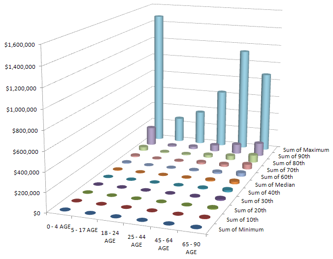
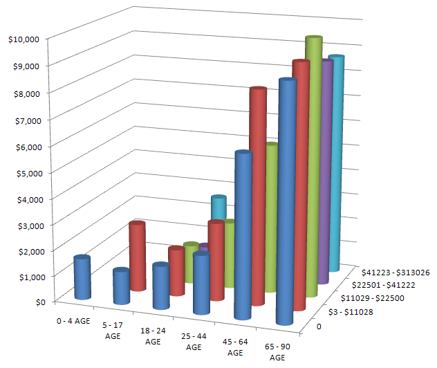
  • Health care expenditures are extremely skewed over one’s lifetime and within age cohorts. Good behavior can’t mitigate all risk, particularly the risk of getting old. (See below for a peek at the data.)
  • In some circumstances, the health care system is capable of expending an extremely large amount of resources on a person – sometimes for a miraculous outcome, and sometimes for rather marginal end-of-life extension.

What’s needed is a distributed way to share risk (which is why it’s called insurance), while preserving incentives for good behavior and matching total expenditures to resources. That’s a tall order. It’s not clear to me that the Ryan proposal tackles it in any serious way; it just extends the flaws of the current system to Medicare patients.

healthExpendAgeIncomeMEPSPer capita annual medical expenditures from the MEPS panel, by age and income. There’s surprisingly little variation by income, but a lot by age. The bill terminates the agency that collects this data.

healthExpendAgeDecileMEPSHealth expenditures by age and decile of cohort, showing the extreme concentration of expenditures at all ages.

The really fine print, the text of the bill itself, is daunting – 629 pages. This strikes me as simply unmanageable (like the deceased cap and trade legislation). There are simply too many opportunities for unintended consequences, and hidden agendas, in such a multifaceted approach, especially with the opaque analytic support available. Surely this could be tackled in a series of smaller bites – health, revenue, other expenditures. It calls to mind the criticism of the FAA’s repeated failure to redesign the air traffic control system, “you can’t design a system that evolved.” Well, maybe you can, but not with the kind of tools and discourse that now prevail.

A walk through the Ryan budget proposal

Since the budget deal was announced, I’ve been wondering what was in it. It’s hard to imagine that it really works like this:

“This is an agreement to invest in our country’s future while making the largest annual spending cut in our history,” Obama said.

However, it seems that there isn’t really much substance to the deal yet, so I thought I’d better look instead at one target: the Ryan budget roadmap. The CBO recently analyzed it, and put the $ conveniently in a spreadsheet.

Like most spreadsheets, this is very good at presenting the numbers, and lousy at revealing causality. The projections are basically open-loop, but they run to 2084. There’s actually some justification for open-loop budget projections, because many policies are open loop. The big health and social security programs, for example, are driven by demographics, cutoff ages and inflation adjustment formulae. The demographics and cutoff ages are predictable. It’s harder to fathom the possible divergence between inflation adjustments and broad inflation (which affects the health sector share) and future GDP growth. So, over long horizons, it’s a bit bonkers to look at the system without considering feedback, or at least uncertainty in the future trajectory of some key drivers.

There’s also a confounding annoyance in the presentation, with budgets and debt as percentages of GDP. Here’s revenue and “other” expenditures (everything but social security, health and interest):
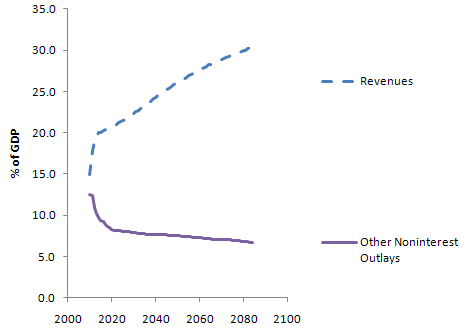
RevenueOtherTransientThere’s a huge transient in each, due to the current financial mess. (Actually this behavior is to some extent deliberately Keynesian – the loss of revenue in a recession is amplified over the contraction of GDP, because people fall into lower tax brackets and profits are more volatile than gross activity. Increased borrowing automatically takes up the slack, maintaining more stable spending.) The transient makes it tough to sort out what’s real change, and what is merely the shifting sands of the GDP denominator. This graph also points out another irritation: there’s no history. Is this plausible, or unprecedented behavior?

The Ryan team actually points out some of the same problems with budgets and their analyses:

One reason the Federal Government’s major entitlement programs are difficult to control is that they are designed that way. A second is that current congressional budgeting provides no means of identifying the long-term effects of near-term program expansions. A third is that these programs are not subject to regular review, as annually appropriated discretionary programs are; and as a result, Congress rarely evaluates the costs and effectiveness of entitlements except when it is proposing to enlarge them. Nothing can substitute for sound and prudent policy choices. But an improved budget process, with enforceable limits on total spending, would surely be a step forward. This proposal calls for such a reform.

Unfortunately the proposed reforms don’t seem to change anything about the process for analyzing the budget or designing programs. We need transparent models with at least a little bit of feedback in them, and programs that are robust because they’re designed with that little bit of feedback in mind.

Setting aside these gripes, here’s what I can glean from the spreadsheet.

The Ryan proposal basically flatlines revenue at 19% of GDP, then squashes programs to fit. By contrast, the CBO Extended Baseline scenario expands programs per current rules and then raises revenue to match (very roughly – the Ryan proposal actually winds up with slightly more public debt 20 years from now).
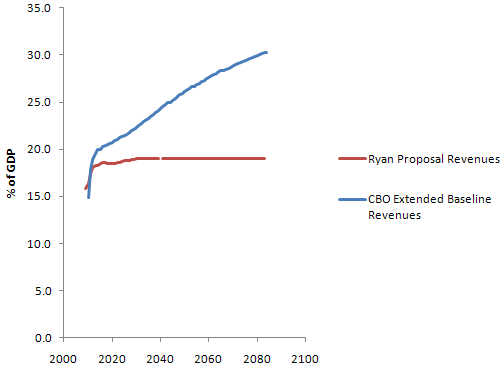
RevenueIt’s not clear how the 19% revenue level arises; the CBO used a trajectory from Ryan’s staff, not its own analysis. Ryan’s proposal says:

  • Provides individual income tax payers a choice of how to pay their taxes – through existing law, or through a highly simplified code that fits on a postcard with just two rates and virtually no special tax deductions, credits, or exclusions (except the health care tax credit).
  • Simplifies tax rates to 10 percent on income up to $100,000 for joint filers, and $50,000 for single filers; and 25 percent on taxable income above these amounts. Also includes a generous standard deduction and personal exemption (totaling $39,000 for a family of four).
  • Eliminates the alternative minimum tax [AMT].
  • Promotes saving by eliminating taxes on interest, capital gains, and dividends; also eliminates the death tax.
  • Replaces the corporate income tax – currently the second highest in the industrialized world – with a border-adjustable business consumption tax of 8.5 percent. This new rate is roughly half that of the rest of the industrialized world.

It’s not clear that there’s any analysis to back up the effects of this proposal. Certainly it’s an extremely regressive shift. Real estate fans will flip when they find out that the mortgage interest deduction is gone (actually a good idea, I think).

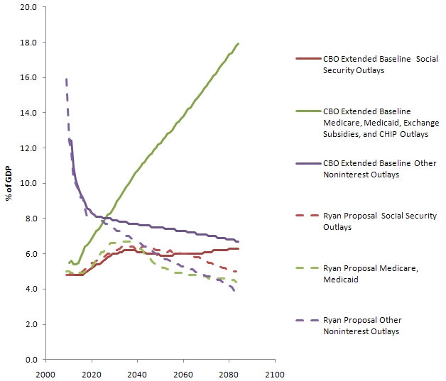
On the outlay side, here’s the picture (CBO in solid lines; Ryan proposal with dashes):
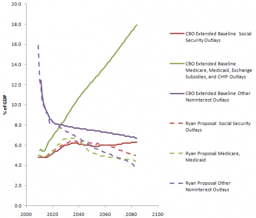
OutlaysYou can see several things here:

  • Social security is untouched until some time after 2050. CBO says that the proposal doesn’t change the program; Ryan’s web site partially privatizes it after about a decade and “eventually” raises the retirement age. There seems to be some disconnect here.
  • Health care outlays are drastically lower; this is clearly where the bulk of the savings originate. Even so, there’s not much change in the trend until at least 2025 (the initial absolute difference is definitional – inclusion of programs other than Medicare/Medicaid in the CBO version).
  • Other noninterest outlays also fall substantially – presumably this means that all other expenditures would have to fit into a box not much bigger than today’s defense budget, which seems like a heroic assumption even if you get rid of unemployment, SSI, food stamps, Section 8, and all similar support programs.

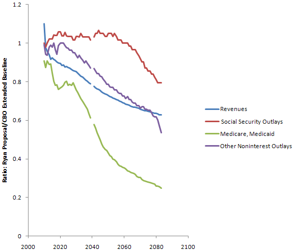
You can also look at the ratio of outlays under Ryan vs. CBO’s Extended Baseline:
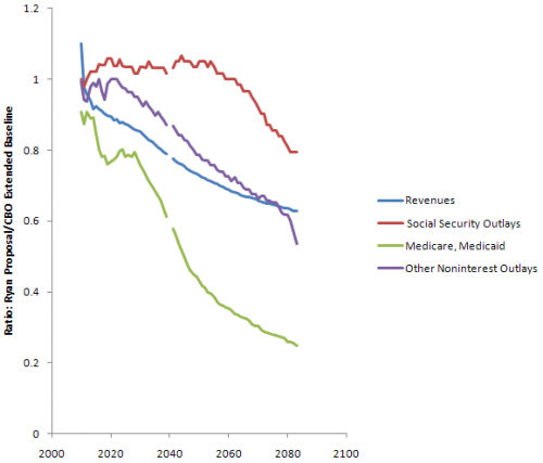
OutlayRatios

Since health care carries the flag for savings, the question is, will the proposal work? I’ll take a look at that next.
We the Landowners

Montana Senate Bill 379 gives a few landowners veto power over zoning. I used GIS data to do a quick calculation of how that would play out in some Gallatin County zoning districts:

Zoning District Distinct owners Owners of 40% of Land Share of owners required to protest zoning acts
Bear Canyon District 84 5 6.0%
Bridger Canyon 885 10 1.1%
Middle Cottonwood 242 81 33.5%
River Rock 938 41 4.4%
Springhill 200 27 13.5%
Sypes Canyon #1 24 7 29.2%
Trail Creek District 339 10 2.9%

In remaining Gallatin County, 263 out of 42,576 distinct owners (less than 1%) could block zoning, but my calculations are incorrect because of missing data and the presence of Bozeman in the middle, but the truth is probably not too different from the calculations above.

In fact, the table above understates how dramatically this legislation moves toward a principle of “one acre, one vote.” First, represented “owners” in each district aren’t necessarily people; corporations and trusts get a vote in zoning protests too. Second, non-landowners are completely disenfranchised, even though as residents and citizens they still have an interest in land use policy.

Since MT legislators have already tried to override federal powers in a number of bills this session, perhaps next session they can introduce a MT-specific preamble to the US Constitution,

We the People Landowners of the United States, in Order to form a more perfect Union Subdivision, establish Justice, insure domestic Tranquility Profitability, provide for the common aristocracy’s defence, promote the general Welfare Subservience, and secure the Blessings of Liberty Property to ourselves and our Posterity, do ordain and establish this Constitution for the United States of America, LLC.

I hope that there is in fact some valid underlying intent to SB379. My guess is that it’s fear of a fairness issue: that the rabble will acquire their small lots, then seek to use zoning to lock up all land remaining in large undeveloped parcels, to preserve views and resources. So far, this is a strictly theoretical problem. County commissions, and a lot of MT voters, are a conservative lot, which militates against such developments, and agriculture and forestry are protected from zoning anyway. If there’s any real need for policy here, surely there is a means to achieve it that doesn’t do such violence to democracy.

If the real goal is to create a de facto zoning ban, by making it impossible to create districts or amend regulations, then the legislature should simply de-authorize zoning. But, following the wingwalker’s rule (don’t let go of one thing until you’ve got hold of another), they should first come up with an incentive  system that achieves the purposes of zoning more flexibly.

Crazy orbital dynamics

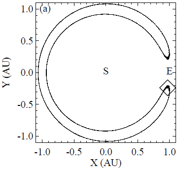
An asteroid has been discovered sharing earth’s orbit, with a horseshoe-shaped orbit (from an earthbound reference frame).

asteroid

The arXiv blog has a nice summary:

Near-Earth asteroids are common but SO16 is in a category of its own. First and foremost, it has an exotic horseshoe-shaped orbit (see diagram above) which astronomers believe to be very rare.

Its worth taking a few moments to think about horseshoe orbits. Two points are worth bearing in mind. First, objects further from the Sun than Earth, orbit more slowly. Second, objects that are closer to the Sun orbit more quickly than Earth.

So imagine an asteroid with an orbit around the Sun that is just a little bit smaller than Earth’s. Because it is orbiting more quickly, this asteroid will gradually catch up with Earth.

When it approaches Earth, the larger planet’s gravity will tend to pull the asteroid towards it and away from the Sun. This makes the asteroid orbit more slowly and if the asteroid ends up in a orbit that is slightly bigger than Earth’s, it will orbit the Sun more slowly than Earth and fall behind.

After that, the Earth will catch up with the slower asteroid in the bigger orbit, pulling it back into the small faster orbit and process begins again.

So from the point of view of the Earth, the asteroid has a horseshoe-shaped orbit, constantly moving towards and away from the Earth without ever passing it. (However, from the asteroid’s point of view, it orbits the Sun continuously in the same direction, sometimes more quickly in smaller orbits and sometimes more slowly in bigger orbits.)

For SO16, the period of this effect is about 350 years.

Even simple systems like the three-body problem can yield analytically intractable and surprising solutions, but this is the weirdest I’ve yet seen (and the competition is stiff this week). It even inspires poetry in the comments.

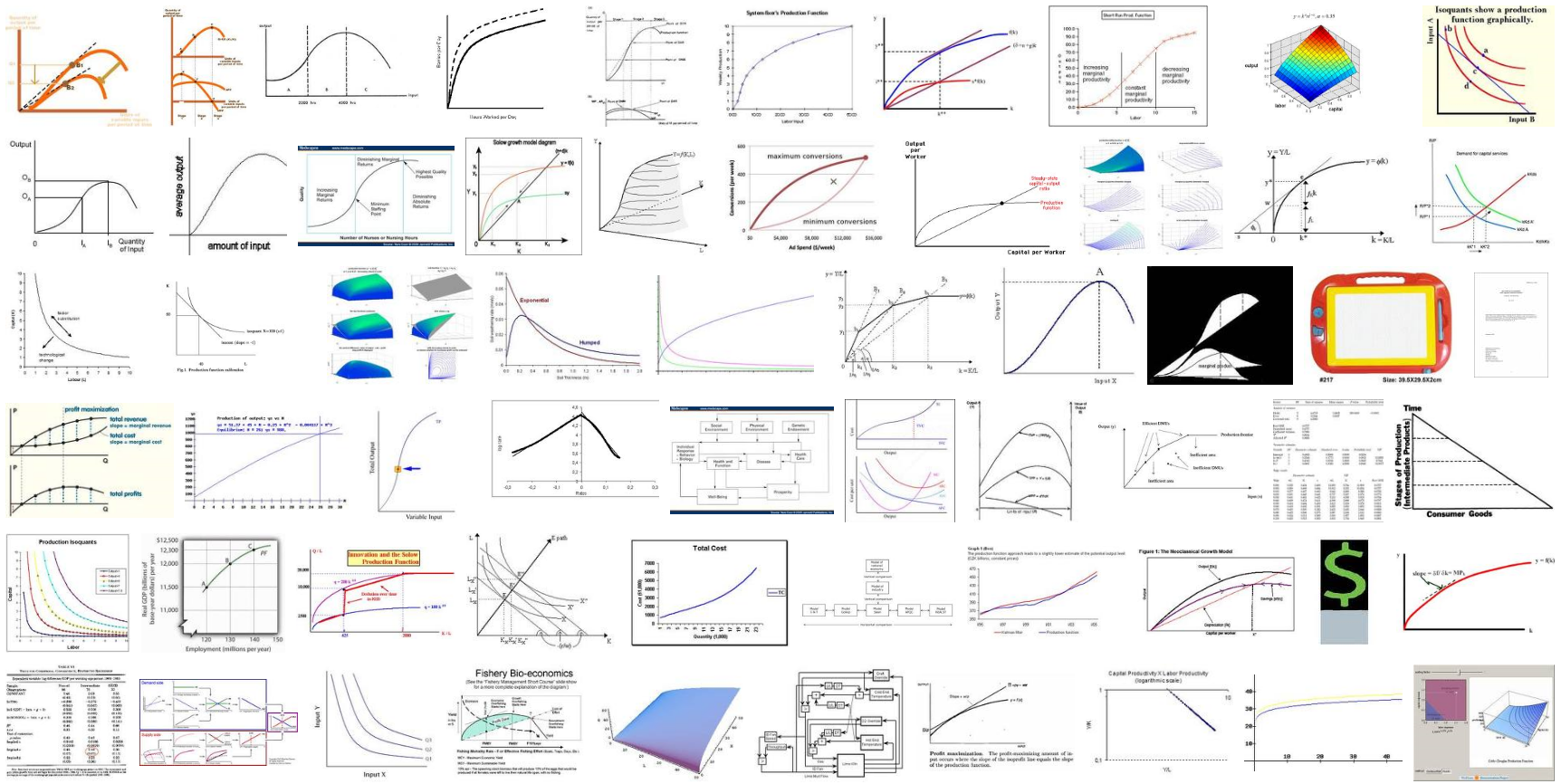
Production functions – so pretty, so unphysical

I’m rediscovering my old frustrations with aggregate production functions like the CES. They’re handy, but I have a nagging suspicion, never quite formalized, that they just don’t capture the engineering/thermodynamic realities of substitution. Anyone know any papers on that? I’m aware of critiques of KLEM applications, but not interfuel aggregation.

prodFimages

Click to enlarge. From a google images search for production function.

Candy Causality Confusion

Candy Professor is confused:

Contagious Cavities

One of the favorite themes of the candy alarmists is dental decay: candy causes cavities! How many times have you heard that one? But it just ain’t so.

From no less an authority than the New York Times, this week’s Science section:

While candy and sugar get all the blame, cavities are caused primarily by bacteria that cling to teeth and feast on particles of food from your last meal.

Your last meal. Did you hear that? Not candy, not at all. It’s food, just plain old food, that those cavity-causing bacteria crave.

This is just what we’d all like to hear – cavities are a random act of bacterial promiscuity, so we can gorge on candy as much as we want without dental repercussions!

Unfortunately, this is highly misleading.

The NYT article mentions that streptococcus mutans is one of the common cavity precursor bacteria. A quick trip to wikipedia and microbe wiki reveals all. Here’s a rough picture of the process:

candy

click to enlarge

At top left, food (including candy) goes in. The output of this system that we’re interested in is healthy tooth enamel – i.e. the opposite of cavities. There are many causal pathways between candy and cavities. The simplest (in red) starts when candy (i.e. sugars) goes into the mouth. There, in the presence of bacteria, it’s metabolized to acid, which is neutralized by eroding enamel. That’s bad.

Things get worse if the candy contains sucrose. Sucrose is enzymatically degraded to fructose and glucose (green path), directly fueling the acid process. More importantly, S. mutans preferentially hijacks sucrose, consuming the fructose for energy and using the glucose to make a sticky polysacharide scaffolding for its colonies, which we come to know as plaque. That plaque becomes a home for other less hardy bacteria (orange path). The existence of food and housing allows bacterial populations of all sorts to flourish (blue paths). All of this increases enamel-eroding acid metabolism.

Admittedly, none of this would happen without bacteria around to metabolize sugars. But that’s a feedback loop – sugar intake fuels the growth of the bacterial populations. The idea that “It’s food, just plain old food, that those cavity-causing bacteria crave” is surely nonsense, because there’s a metabolic penalty and a delay in converting complex carbohydrates into cavity-causing sugars. That delay means that the shorter time constant, of chewing and swallowing your food, dominates, so that the primary fuel for bacteria must be simpler (or stickier) carbohydrates.

The existence of at least half a dozen causal pathways from candy intake to loss of tooth enamel gives the lie to the notion that it’s “Not candy, not at all.” You can blame the bacteria if you like, but that’s a victim’s approach to policy. Absent an S. mutans vaccine or similar innovations, there’s not much we can do about our resident bacteria. We can, however, choose not to feed them substances that are uniquely suited to fueling their populations and the destructive processes that result.