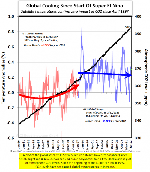
How many things can you get wrong on one chart?

Let’s count:

  1. stupidGraphTruncate records that start ca. 1850 at an arbitrary starting point.
  2. Calculate trends around a breakpoint cherry-picked to most favor your argument.
  3. Abuse polynomial fits generally. (See this series.)
  4. Report misleading linear trends by simply dropping the quadratic term.
  5. Fail to notice the obvious: that temperature in the second period is, on average, higher than in the first.
  6. Choose a loaded color scheme that emphasizes #5.
  7. Fail to understand that temperature integrates CO2.
  8. Fallacy of the single cause (only CO2 affects temperature – in good company with Burt Rutan).

Those crazy Marxists are at it again

“Normally, conservatives extol the magic of markets and the adaptability of the private sector, which is supposedly able to transcend with ease any constraints posed by, say, limited supplies of natural resources. But as soon as anyone proposes adding a few limits to reflect environmental issues — such as a cap on carbon emissions — those all-capable corporations supposedly lose any ability to cope with change.” Krugman – NYT

Geoengineering justice & governance

From Clive Hamilton via Technology Review,

If humans were sufficiently omniscient and omnipotent, would we, like God, use climate engineering methods benevolently? Earth system science cannot answer this question, but it hardly needs to, for we know the answer already. Given that humans are proposing to engineer the climate because of a cascade of institutional failings and self-interested behaviours, any suggestions that deployment of a solar shield would be done in a way that fulfilled the strongest principles of justice and compassion would lack credibility, to say the least.

Geoengineering seems sure to make a mess, even if the tech works.

How I learned to stop worrying and love methane

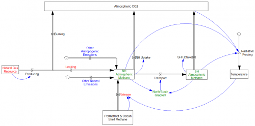
RealClimate has a nice summary of recent atmospheric methane findings. Here’s the structure:

methane2The bad news (red) has been that methane release from permafrost and clathrates on the continental shelf appears to be significant. At the same time, methane release from natural gas seems to be larger than previously thought, and (partly for the same reason – fracking) gas resources appear to be larger. Both put upward pressure on atmospheric methane.

However, there are some constraints as well. The methane budget must be consistent with observations of atmospheric concentrations and gradients (green). Therefore, if one source is thought to be bigger, it must be the case historically that other natural or anthropogenic sources are smaller (or perhaps uptake is faster) by an offsetting amount (blue).

This bad-news-good-news story does not rule out positive feedbacks from temperature or atmospheric chemistry, but at least we’re not cooked yet.

Golf is the answer

Lots of golf.

I couldn’t resist a ClimateDesk article mocking carbon-sucking golf balls, so I took a look at the patent.

I immediately started wondering about the golf ball’s mass balance. There are rules about these things. But the clever Nike engineers thought of everything,

Generally, a salt may be formed as a result of the reaction between the carbon dioxide absorbent and the atmospheric carbon dioxide. The presence of this salt may cause the golf ball to increase in weight. This increase in weight may be largely negligible, or the increase in weight may be sufficient to be measurable and affect the play characteristics of the golf ball. The United States Golf Association (USGA) official Rules of Golf require that a regulation golf ball weigh no more than 45.93 grams. Therefore, a golf ball in accordance with this disclosure may be manufactured to weigh some amount less than 45.93, so that the golf ball may increase in weight as atmospheric carbon dioxide is absorbed. For example, a finished golf ball manufactured in accordance with this disclosure may weigh 45.5 grams before absorbing any significant amount of atmospheric carbon dioxide.

Let’s pretend that 0.43 grams of CO2 is “significant” and do the math here. World energy CO2 emissions were about 32.6 MMT in 2011. That’s 32.6 gigatons or petagrams, so you’d need about 76 petaballs per year to absorb it. That’s 76,000,000,000,000,000 balls per year.

It doesn’t sound so bad if you think of it as 11 million balls per capita per year. Think of the fun you could have with 11 million golf balls! Plus, you’d have 22 million next year, except for the ones you whacked into a water trap.

Because the conversion efficiency is so low (less than half a gram CO2 uptake per 45 gram ball, i.e about 1%), you need 100 grams of ball per gram of carbon. This means that the mass flow of golf balls would have to exceed the total mass flow of food, fuels, minerals and construction materials on the planet, by a factor of 50.

76 petaballs take up about 4850 cubic kilometers, so we’d soon have to decide where to put them. I think Scotland would be appropriate. We’d only have to add a 60-meter layer of balls to the country each year.

A train bringing 10,000 tons of coal to a power plant (three days of fuel for 500MW) would have to make a lot more trips to carry away the 1,000,000 tons of balls needed to offset its emissions. That’s a lot of rail traffic, so it might make sense to equip plants with an array of 820 rotary cannon retrofitted to fire balls into the surrounding countryside. That’s only 90,000 balls per second, after all. Perhaps that’s what analysts mean when they say that there are no silver bullets, only silver buckshot. In any case, the meaning of “climate impacts” would suddenly be very palpable.

Dealing with this enormous mass flow would be tough, but there would be some silver linings. For starters, the earth’s entire fossil fuel output would be diverted to making plastics, so emissions would plummet, and the whole scale of the problem would shrink to manageable proportions. Golf balls are pretty tough, so those avoided emissions could be sequestered for decades. In addition, golf balls float, and they’re white, so we could release them in the arctic to replace melting sea ice.

Who knows what other creative uses of petaballs the free market will invent?

Update, courtesy of Jonathan Altman:

animal house marbles

Summary for Suckers

The NIPCC critique is, ironically, a compelling argument in favor of the IPCC assessment. Why? Well, science is about evaluation of competing hypotheses. The NIPCC report collects a bunch of alternatives to mainstream climate science in one place, where it’s easy to see how pathetic they are. If this is the best climate skeptics can muster, their science must be exceedingly weak.

The NIPCC (Nongovernmental International Panel on Climate Change, a.k.a. Not IPCC) is the Heartland Institute’s rebuttal of the IPCC assessments. Apparently the latest NIPCC report has been mailed to zillions of teachers. As a homeschooling dad, I’m disappointed that I didn’t get mine. Well, not really.

It would probably take more pages to debunk the NIPCC report than it occupies, but others are chipping away at it. Some aspects, like temperature cherry-picking, are like shooting fish in a barrel.

The SPM, and presumably the entire report that it summarizes, seems to labor under the misapprehension that the IPCC is itself a body that conducts science. In fact, the IPCC assessments are basically a giant literature review. So, when the Heartland panel writes,

In contradiction of the scientific method, the IPCC assumes its implicit hypothesis is correct and that its only duty is to collect evidence and make plausible arguments in the hypothesis’s favor.

we must remember that “the IPCC” is shorthand for a vast conspiracy of scientists, coordinated by an invisible hand.

The report organizes the IPPC argument into 3 categories: “Global Climate Model (GCM) projections,” “postulates,” and “circumstantial evidence.” This is a fairly ridiculous caricature of the actual body of work. Most of what is dismissed as postulates could better be described as, “things we’re too lazy to explore properly,” for example. But my eye strays straight to the report’s misconceptions about modeling.

First, the NIPCC seems to have missed the fact that GCMs are not the only models in use. There are EMICS (models of intermediate complexity) and low-order energy balance models as well.

The NIPCC has taken George Box’s “all models are wrong, some are useful” and run with it:

… Global climate models produce meaningful results only if we assume we already know perfectly how the global climate works, and most climate scientists say we do not (Bray and von Storch, 2010).

How are we to read this … all models are useless, unless they’re perfect? Of course, no models are perfect, therefore all models are useless. Now that’s science!

NIPCC trots out a von Neumann quote that’s almost as tired as Box:

with four parameters I can fit an elephant, and with five I can make him wiggle his trunk

In models with lots of reality checks available (i.e. laws of physics), it just isn’t that easy. And the earth is a very big elephant, which means that there’s a rather vast array of data to be fit.

The NIPCC seems to be aware of only a few temperature series, but the AR5 report devotes 200 pages (Chapter 9) to model evaluation, with results against a wide variety of spatial and temporal distributions of physical quantities. Models are obviously far from perfect, but a lot of the results look good, in ways that exceed the wildest dreams of social system modelers.

NIPCC doesn’t seem to understand how this whole “fit” thing works.

Model calibration is faulty as it assumes all temperature rise since the start of the industrial revolution has resulted from human CO2 emissions.

This is blatantly false, not only because it contradicts the actual practice of attribution, but because there is no such parameter as “fraction of temp rise due to anthro CO2.” One can’t assume the answer to the attribution question without passing through a lot of intermediate checks, like conforming to physics and data other than global temperature. In complex models, where the contribution of any individual parameter to the outcome is likely to be unknown to the modeler, and the model is too big to calibrate by brute force, the vast majority of parameters must be established bottom up, from physics or submodels, which makes it extremely difficult for the modeler to impose preconceptions on the complete model.

Similarly,

IPCC models stress the importance of positive feedback from increasing water vapor and thereby project warming of ~3-6°C, whereas empirical data indicate an order of magnitude less warming of ~0.3-1.0°C.

Data by itself doesn’t “indicate” anything. Data only speaks insofar as it refutes (or fails to refute) a model. So where is the NIPCC model that fits available data and yields very low climate sensitivity?

The bottom line is that, if it were really true that models have little predictive power and admit many alternative calibrations (a la the elephant), it should be easy for skeptics to show model runs that fit the data as well as mainstream results, with assumptions that are consistent with low climate sensitivity. They wouldn’t necessarily need a GCM and a supercomputer; modest EBMs or EMICs should suffice. This they have utterly failed to demonstrate.
 

Pindyck on Integrated Assessment Models

Economist Robert Pindyck takes a dim view of the state of integrated assessment modeling:

Climate Change Policy: What Do the Models Tell Us?

Robert S. Pindyck

NBER Working Paper No. 19244

Issued in July 2013

Very little. A plethora of integrated assessment models (IAMs) have been constructed and used to estimate the social cost of carbon (SCC) and evaluate alternative abatement policies. These models have crucial flaws that make them close to useless as tools for policy analysis: certain inputs (e.g. the discount rate) are arbitrary, but have huge effects on the SCC estimates the models produce; the models’ descriptions of the impact of climate change are completely ad hoc, with no theoretical or empirical foundation; and the models can tell us nothing about the most important driver of the SCC, the possibility of a catastrophic climate outcome. IAM-based analyses of climate policy create a perception of knowledge and precision, but that perception is illusory and misleading.

Freepers seem to think that this means the whole SCC enterprise is GIGO. But this is not a case where uncertainty is your friend. Bear in mind that the deficiencies Pindyck discusses, discounting welfare and ignoring extreme outcomes, create a one-sided bias toward a SCC that is too low. Zero (the de facto internalized SCC in most places) is one number that’s virtually certain to be wrong.

The IAMs that ate the poor

Discounting has long been controversial in climate integrated assessment models (IAMs), with prevailing assumptions less than favorable to future generations.

The evidence in favor of aggressive discounting has generally been macro in nature – observed returns appear to be consistent with discounting of welfare, so that’s what we should do. To swallow this, you have to believe that markets faithfully reveal preferences and that only on-market returns count. Even then, there’s still the problem of confounding of time preference with inequality aversion. Given that this perspective is contradicted by micro behavior, i.e. actually asking people what they want, it’s hard to see a reason other than convenience for its upper hand in decision making. Ultimately, the situation is neatly self-fulfilling. We observe inflated returns consistent with myopia, so we set myopic hurdles for social decisions, yielding inflated short-term returns.

It gets worse.

Back in 1997, I attended a talk on an early version of the RICE model, a regional version of DICE. In an optimization model with uniform utility functions, there’s an immediate drive to level incomes across all the regions. That’s obviously contrary to the observed global income distribution. A “solution” is to use Negishi weights, which apply weights to each region’s welfare in proportion to the inverse of the marginal utility of consumption there. That prevents income leveling, by explicitly assuming that the rich are rich because they deserve it.

This is a reasonable practical choice if you don’t think you can do anything about income distribution, and you’re not worried that it confounds equity with human capital differences. But when you use the same weights to identify an optimal emissions trajectory, you’re baking the inequity of the current market order into climate policy. In other words, people in developed countries are worth 10x more than people in developing countries.

Way back when, I didn’t have the words at hand to gracefully ask why it was a good idea to model things this way, but I sure wish I’d had the courage to forge ahead anyway.

The silly thing is that there’s no need to make such inequitable assumptions to model this problem. Elizabeth Stanton analyzes Negishi weighting and suggests alternatives. Richard Tol explored alternative frameworks some time before. And there are still more options, I think.

In the intertemporal optimization framework, one could treat the situation as a game between self-interested regions (with Negishi weights) and an equitable regulator (with equal weights to welfare). In that setting, mitigation by the rich might look like a form of foreign aid that couldn’t be squandered by the elites of poor regions, and thus I would expect deep emissions cuts.

Better still, dump notions of equilibrium and explore the problem with behavioral models, reserving optimization for policy analysis with fair objectives.

Thanks to Ramon Bueno for passing along the Stanton article.

Emissions trading goes live in China

Shenzhen kicks off China’s pilot emissions trading scheme today, with 635 companies trading, covering about 40% of emissions. It’ll be interesting to see how much the market really benefits from learning from the European experience.

Interestingly, China’s emissions trading plans are proceeding in spite of immaturity and stability concerns, but a national carbon tax is on hold, even though it’s small and economically benign.