Oscillation from a purely positive loop

Replicated by Mohammad Mojtahedzadeh from Alan Graham’s thesis, or created anew with the same inspiration. He created these models in the course of his thesis work on structural analysis through pathway participation matrices.

Alan Graham, 1977. Principles on the Relationship Between Structure and Behavior of Dynamic Systems. MIT Thesis. Page 76+

These models are pure positive feedback loops that don’t exhibit exponential growth (under the right initial conditions). See my blog post for a discussion of the details.
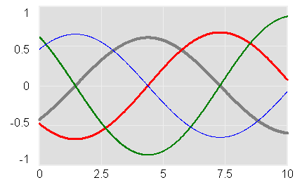
These are generic models, and therefore don’t have units. All should run with Vensim PLE, except the generic gain matrix version which uses arrays and therefore requires an advanced version or the Model Reader.

The original 4th order model, replicated from Alan’s thesis: PurePosOscill4.vpm – note that this includes a .cin file with an alternate stable initialization.

My slightly modified version, permitting initialization with different gains at each level: PurePosOscill4alt.vpm

Loops of different orders: 3.vpm 6.vpm 8.vpm 12.vpm (I haven’t spent much time with these. It appears that the high-order versions transition to growth rather quickly – my guess is that this is an artifact of numerical precision, i.e. any tiny imprecision in the initialization introduces a bit of the growth eigenvector, which quickly swamps the oscillatory signal. It would be interesting to try these in double precision Vensim to see if I’m right.)

Stable initializations: 2stab.vpm 12stab.vpm

A generic version, representing a system as a generic gain matrix, so you can use it to explore any linear unforced variant: Generic.vpm
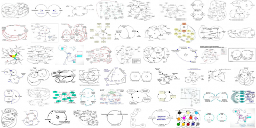
Return of the Afghan spaghetti

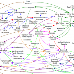
The Afghanistan counterinsurgency causal loop diagram makes another appearance in this TED talk, in which Eric Berlow shows the hypnotized chickens the light:
https://www.ted.com/talks/eric_berlow_simplifying_complexity/transcript?language=en

I’m of two minds about this talk. I love that it embraces complexity rather than reacting with the knee-jerk “eeewww … gross” espoused by so many NYT commenters. The network view of the system highlights some interesting relationships, particularly when colored by the flavor of each sphere (military, ethnic, religious … ). Also, the generic categorization of variables that are actionable (unlike terrain) is useful. The insights from ecosystem simplification are potentially quite interesting, though we really only get a tantalizing hint at what might lie beneath.

However, I think the fundamental analogy between the system CLD and a food web or other network may only partially hold. That means that the insight, that influence typically lies within a few degrees of connectivity of the concept of interest, may not be generalizable. Generically, a dynamic model is a network of gains among state variables, and there are perhaps some reasons to think that, due to signal attenuation and so forth, that most influences are local. However, there are some important differences between the Afghan CLD and typical network diagrams.

In a food web, the nodes are all similar agents (species) which have a few generic relationships (eat or be eaten) with associated flows of information or resources. In a CLD, the nodes are a varied mix of agents, concepts, and resources. As a result, their interactions may differ wildly: the interaction between “relative popularity of insurgents” and “funding for insurgents” (from the diagram) is qualitatively different from that between “targeted strikes” and “perceived damages.” I suspect that in many models, the important behavior modes are driven by dynamics that span most of the diagram or model. That may be deliberate, because we’d like to construct models that describe a dynamic hypothesis, without a lot of extraneous material.

Probably the best way to confirm or deny my hypothesis would be to look at eigenvalue analysis of existing models. I don’t have time to dig into this, but Kampmann & Oliva’s analysis of Mass’ economic model is an interesting case study. In that model, the dominant structures responsible for oscillatory modes in the economy are a real mixed bag, with important contributions from both short and longish loops.

This bears further thought … please share yours, especially if you have a chance to look at Berlow’s PNAS article on food webs.

Interactive diagrams – obesity dynamics

Food-nutrition-health-exercise-energy interactions are an amazing nest of positive feedbacks, with many win-win opportunities, but more on that another time.

Instead, I’m hoisting an interesting influence diagram about obesity from the comments. At first glance, it’s just another plate of spaghetti.

ForesightObesity

But when you follow the link (do it now), there’s an interesting innovation: the diagram is interactive. You can zoom, scroll, and highlight particular sectors and dynamics. There’s some narrative here and here. (Update: the interactive link seems to be down, but the diagram is still here: https://assets.publishing.service.gov.uk/government/uploads/system/uploads/attachment_data/file/295153/07-1177-obesity-system-atlas.pdf)

It took me a while to decide whether I’d call this a causal loop diagram or not. I think the primary distinction between a CLD and other kinds of mindmaps or process diagrams is the use of variables. On a CLD, each label represents a quantity that can vary, with a definite direction – TV Watching, Stress, Use of Medicines. Items on other kinds of diagrams might represent events or fuzzier constellations of concepts. This diagram doesn’t have link polarities (too bad) or loop polarities (which would be pretty incomprehensible anyway), but many other CLDs also avoid such labels for simplicity.

I think there’s a lot of potential for further exploration of this idea. There’s a lot you could do to relate structure to behavior, or at least to explain the rationale for structure (both shortcomings of the diagram). Each link, for example, could have its tale revealed when clicked, and key loops could be animated individually, with stories told. Drill-down could be extended to provide links between top-level subsystem relationships and more microscopic views.

I think huge diagrams like the one above are always going to be overwhelming to a layperson. Also, it’s hard to make even a small CLD good, so making a big one really accurate is tough. Therefore, I’d rather see advanced CLD presentations used to improve the communication of simpler stories, with a few loops. However, big or small, there might be many common technological benefits from dedicated diagramming software.

When sea level chartjunk attacks

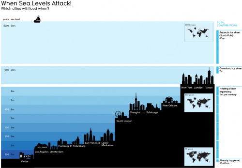
SeaLevelAttack

This informationisbeautiful graphic is pretty, but I don’t find it informative. The y scale is nonlinear, and I don’t know if the x scale conveys anything. It’s hard to work out the timing of inundation, which is really the key. The focus on the low points of big cities in developed countries is misleading, because those will be defended for a long time. Ho Chi Minh city should be on there, as well as the US gulf coast. USA Today would love this.

Bifurcating Salmon

A nifty paper on nonlinear dynamics of salmon populations caught my eye on ArXiv.org today. The math is straightforward and elegant, so I replicated the model in Vensim.

A three-species model explaining cyclic dominance of pacific salmon

Authors: Christian Guill, Barbara Drossel, Wolfram Just, Eddy Carmack

Abstract: The four-year oscillations of the number of spawning sockeye salmon (Oncorhynchus nerka) that return to their native stream within the Fraser River basin in Canada are a striking example of population oscillations. The period of the oscillation corresponds to the dominant generation time of these fish. Various – not fully convincing – explanations for these oscillations have been proposed, including stochastic influences, depensatory fishing, or genetic effects. Here, we show that the oscillations can be explained as a stable dynamical attractor of the population dynamics, resulting from a strong resonance near a Neimark Sacker bifurcation. This explains not only the long-term persistence of these oscillations, but also reproduces correctly the empirical sequence of salmon abundance within one period of the oscillations. Furthermore, it explains the observation that these oscillations occur only in sockeye stocks originating from large oligotrophic lakes, and that they are usually not observed in salmon species that have a longer generation time.

The paper does a nice job of connecting behavior to structure, and of relating the emergence of oscillations to eigenvalues in the linearized system.

Units balance, though I had to add a couple implicit scale factors to do so.

The general results are qualitatitively replicable. I haven’t tried to precisely reproduce the authors’ bifurcation diagram and other experiments, in part because I couldn’t find a precise specification of numerical methods used (time step, integration method), so I wouldn’t expect to succeed.

Unlike most SD models, this is a hybrid discrete-continuous system. Salmon, predator and zooplankton populations evolve continuously during a growing season, but with discrete transitions between seasons.

The model uses SAMPLE IF TRUE, so you need an advanced version of Vensim to run it, or the free Model Reader. (It should be possible to replace the SAMPLE IF TRUE if an enterprising person wanted a PLE version). It would also be a good candidate for an application of SHIFT IF TRUE if someone wanted to experiment with the cohort age structure.

sockeye.vmf

For a more policy-oriented take on salmon, check out Andy Ford’s work on smolt migration.

Urban Dynamics

This is an updated version of Urban Dynamics, the classic by Forrester et al.

John Richardson upgraded the diagrams and cleaned up a few variable names that had typos.

I added some units equivalents and fixed a few variables in order to resolve existing errors. The model is now free of units errors, except for 7 warnings about use of dimensioned inputs to lookups (not uncommon practice, but it would be good to normalize these to suppress the warnings and make the model parameterization more flexible). There are also some runtime warnings about lookup bounds that I have not investigated (take a look – there could be a good paper lurking here).

Behavior is identical to that of the original from the standard Vensim distribution.

Urban Dynamics 2010-06-14.vpm

Urban Dynamics 2010-06-14.mdl

Urban Dynamics 2010-06-14.vmf

DICE

This is a replication of William Nordhaus’ original DICE model, as described in Managing the Global Commons and a 1992 Science article and Cowles Foundation working paper that preceded it.

There are many good things about this model, but also some bad. If you are thinking of using it as a platform for expansion, read my dissertation first.

Units balance.

I provide several versions:

  1. Model with simple heuristics replacing the time-vector decisions in the original; runs in Vensim PLE
  2. Full model, with decisions implemented as vectors of points over time; requires Vensim Pro or DSS
  3. Same as #2, but with VECTOR LOOKUP replaced with VECTOR ELM MAP; supports earlier versions of Pro or DSS
    • DICE-vec-6-elm.mdl (you’ll also want a copy of DICE-vec-6.vpm above, so that you can extract the supporting optimization control files)

Note that there may be minor variances from the published versions, e.g. that transversality coefficients for the state variables (i.e. terminal values of the states for optimization) are not included. The optimizations use fewer time decision points than the original GAMS equivalents. These do not have any significant effect on the outcome.

Dynamics on the iPhone

Scott Johnson asks about C-LITE, an ultra-simple version of C-ROADS, built in Processing – a cool visually-oriented language.

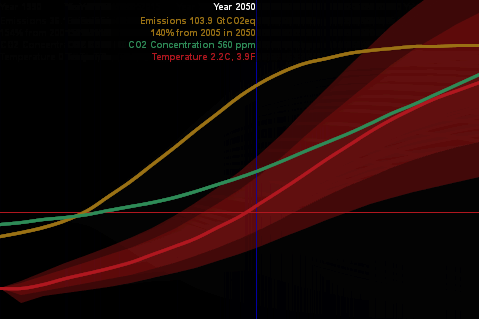
C-LITE

(Click the image to try it).

With this experiment, I was striving for a couple things:

  • A reduced-form version of the climate model, with “good enough” accuracy and interactive speed, as in Vensim’s Synthesim mode (no client-server latency).
  • Tufte-like simplicity of the UI (no grids or axis labels to waste electrons). Moving the mouse around changes the emissions trajectory, and sweeps an indicator line that gives the scale of input and outputs.
  • Pervasive representation of uncertainty (indicated by shading on temperature as a start).

This is just a prototype, but it’s already more fun than models with traditional interfaces.

I wanted to run it on the iPhone, but was stymied by problems translating the model to Processing.js (javascript) and had to set it aside. Recently Travis Franck stepped in and did a manual translation, proving the concept, so I took another look at the problem. In the meantime, a neat export tool has made it easy. It turns out that my code problem was as simple as replacing “float []” with “float[]” so now I have a javascript version here. It runs well in Firefox, but there are a few glitches on Safari and iPhones – text doesn’t render properly, and I don’t quite understand the event model. Still, it’s cool that modest dynamic models can run realtime on the iPhone. [Update: forgot to mention that I sued Michael Schieben’s touchmove function modification to processing.js.]

The learning curve for all of this is remarkably short. If you’re familiar with Java, it’s very easy to pick up Processing (it’s probably easy coming from other languages as well). I spent just a few days fooling around before I had the hang of building this app. The core model is just standard Euler ODE code:

initialize parameters
initialize levels
do while time < final time
compute rates & auxiliaries
compute levels

The only hassle is that equations have to be ordered manually. I built a Vensim prototype of the model halfway through, in order to stay clear on the structure as I flew seat-of-the pants.

With the latest Processing.js tools, it’s very easy to port to javascript, which runs on nearly everything. Getting it running on the iPhone (almost) was just a matter of discovering viewport meta tags and a line of CSS to set zero margins. The total codebase for my most complicated version so far is only 500 lines. I think there’s a lot of potential for sharing model insights through simple, appealing browser tools and handheld platforms.

As an aside, I always wondered why javascript didn’t seem to have much to do with Java. The answer is in this funny programming timeline. It’s basically false advertising.

Java Vensim helper

MIT’s Climate Collaboratorium has posted java code that it used to wrap C-LEARN as a web service using the multicontext .dll. If you’re doing something similar, you may find the code useful, particularly the VensimHelper class. The liberal MIT license applies. However, be aware that you’ll need a license for the Vensim multicontext .dll to go with it.